How I Come Back to Paintings I’ve Already “Finished”

A Day at Mossbrae Falls, 20×30
I often go through a back and forth process when painting, where I think I'm done, and set the painting aside, only to pick it back up a week or two later. Time away from a work can be really valuable! I have the wall of my studio covered with these magnetic tacks, which I use to hang all my recent work (no holes! This is a lovely and simple product).
Generally, when I think I'm done, I'm done. But sometimes... Well, sometimes with time away I see color or value relationships much more clearly... and independently from the reference photo. This can be invaluable. I start to just see the painting as its own matrix of relationships and contexts, which leads to a new sort of vision experience.
These sorts of conversations work best with examples though. I’m going to share a variety of recent paintings, to give you a sense of what I'm doing.
"The Shady Side"

One step before the end…

The final image. 24” x 36”
Lets start with this big boy. Here you can compare the finished version and where I was at one step before that. Most of the painting stays exactly the same, but there are two big changes I decided to make.
First, I decided to weave the blue of the house into more of the painting, pushing the shadows in the meadow and down in the foreground. This is primarily just to help the whole space of the canvas to feel integrated with itself.
However, the second change seemed just as important, which was that I felt the second building was competing too much with the main focal point. At this stage of the painting, there's really only one way to go- darker. Very gently, I began to apply a wash to all of my once-upon-a-time preserved highlights, helping the secondary house to recede.
Combined, I thought the two shifts really helped push this painting to completion.
"Burst of Light”


Burst of Light, 11” x 14”
Here in this second painting, I "completed" it, but was not entirely satisfied with things. So I put it up on the wall, and went about a variety of other paintings over the next month or two. But it kept bugging me. :P Of course, you can always ruin a painting by overworking it, but I've also long been of the opinion that if you're not really satisfied with your initial results, then it's really just an opportunity to learn-- to either improve it or finally kills it. LOL.
I decided that the biggest issue I had was that this subject was not properly focused on that shaft of light coming around the trunk. I aimed to accentuate this by changing two elements- a) lifting the base of the trunk up into the painting more, and b) bringing the sky "down" into the painting, by gently darkening its value with a soft wash of blue (feathered into the existing foliage with clean water and a soft brush). The combo really helps hold your eye at the shaft of light.
Second, I just wanted more punch with the light in general. It's really the whole reason for the painting! For this I mix some white gouache with my watercolors and paint thickly, dry brushing in highlights using the paper texture. I'm not often one for using pure white-- I generally prefer some color in my highlights. You can the results most clearly in the yellow-white bush right behind the trunk of the central tree, and also the pale orange twigs and such to the right.
“The Heart of the Woods”

Heart of the Woods, 11” x 14’
I did this painting plein air a few years ago, up in Mendocino. It’s always had a soft spot for it— it was such a lovely day there. But I felt it was sort of missing something. In anticipation of my new shows coming up, I came back to it after a long time away. What became clear to me was that there wasn’t enough separation between the foreground and background, my lights and my darks.
I set about remedying this with two basic approaches- first, by sharpening and darkening my foreground, while simultaneously giving my highlights a bit of punch (on the boulder, and the little pops of light on the far bank), and second, by focusing on the water. In the first version, it just wasn’t immediately clear that the boulder is sitting in a little stream. You can get bits of sky reflection on water, and that’s what I went about dropping in to this. Just little ripples and bits of sparkle. Was it just like that when I was there? I don’t really remember. But the painting clearly needed it, so I told the story that best communicated the experience and memory.
What was nice is this let me fix a little scratch I had initially tried to make for a twig. You can see it crossing the creek in the original, and going up the bank. Through the judicious use of some darks, plus a little blue on the water, voila! All gone. Now my eye can focus on other things.
"Shady Redwood Creek"


Shady Redwood Creek, 14” x 18”
This was one I noodled away on for quite a while, used various wet into wet techniques, but as I approached the end I recognized that I really wanted to elevate the light in the foreground, that "glow", and how it communicated with the brightness just around the bend. So, it was a two-fold exercise.
This involved wetting and lifting some from the back area, just above the creek. Scrubbing and softening edges there. Plus some new leaf highlights made with thick applications of watercolor- no gouache here, just a rich, thick mixture of Cad Yellow and Cobalt Turquoise, which works because they're both such pale values naturally. You can see these on the fallen log, and behind the tree trunks. All of this, to me, is just about putting a little light back into the painting.
Next came the risky part of the endeavor- a thick opaque application to the water in the foreground. I like so much about this image, but I just really needed to see what the effect of the light would be. Particularly because I want to paint this one ever bigger. For me, the results were worth it.
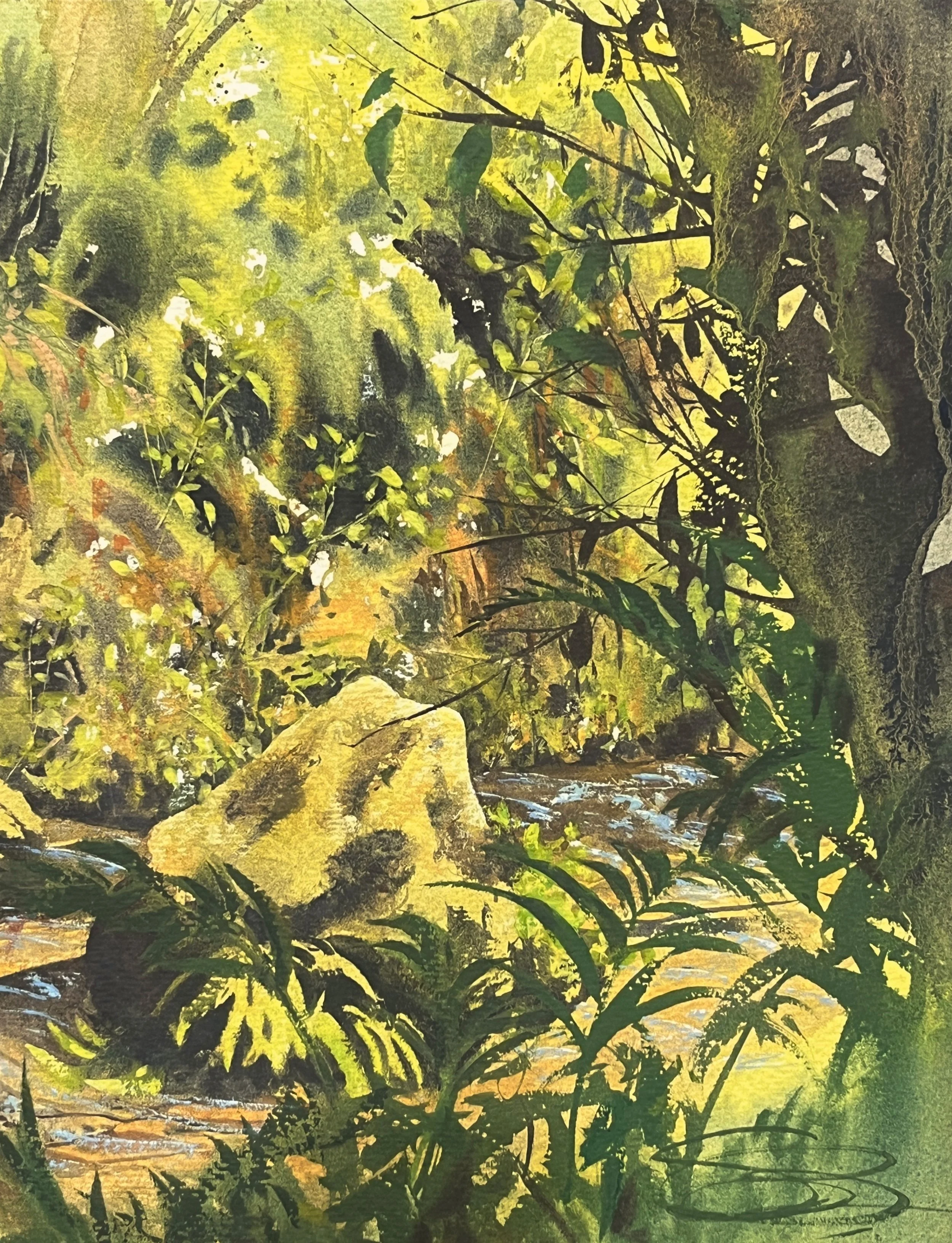
"Hidden Falls"

A Day at Mossbrae Falls, 20” x 30”
This is a bigger, full sheet version of the earlier waterfall painting I did. As is often the case, expanding the composition created new complications, which I had to figure out along the way.
The first big change is up top. The trees were new, and they ended being too monolithic to me. I found them visually boring, but beyond that, they just didn't recede. The painting felt too flat. I was little nervous about screwing around with things, but I was really only happy with the middle section of the painting-- which I had already painted before.
Here, I did a mixture of three things. First, I did a wash of clean water on the trees on the far right, scrubbing and lifting them to push them back. For the center tree, I mixed up a combo of white gouache and cobalt blue, and poked little "sky holes" into its canopy. For the left-most tree, I darkened its shadows even more, with a soft wash.
Finally, a sense of distance receding!
Next up was to bring the light into the focal area of the painting- that band 1/3 down, and over to the right. Once again, I mixed up my favorite opaque watercolors, and with a small, thirsty brush began to create little glowing highlights-- grasses drooping down amongst the waterfalls, and little bit of foliage catching the light as it falls askance the cliff face. Now I feel like the light on the waterfalls has a proper sense of context.
...
What's often really interesting about these experiences is that I know (if I'm making change) the painting is still interesting to me. Still alive. That's almost always the most compelling experience. This is often where I grow and learn new techniques, as creating solutions often requires experimentation. When I do work like this and it turns out, I often know I have the beginnings of an even larger, more ambitious version of the subject in my future! And that's exciting news. :D