How I Learn Through Artistic Experimentation, pt. 2
For this post, I wanted to share about another “experimentation technique” I’ve been using- deliberately trying to take on the aesthetic approach of another artist. I call it “Masking” because it requires fewer words! :P Of course, you choose an artist whose work you admire, or there atleast needs to be an element of their work that excites you and piques your interest. I have an ongoing list on my phone of contemporary artists I think I might want to write a blog post about, as an example, with lots of great names. I find them all on Instagram. Marc Folly, Paul Evans, Linda Kemp, Kanta Harusaki, etc., folks I’ve actually written Spotlight blog posts on— Ping Long, Richard Thorn, etc. Besides the endless parade of classics, like Sargent, Monet, Klimt, Wyeth, etc.
I’ve done this before, and that’s ok with me. I think most folks learn through emulation, then assimilation, then application. The goal is to make it one’s own. Whether I practiced making clouds after watching videos by Sergei Temerev, worked on my wet into wet painting after watching Igor Mosiychuk do a demo, tried urban scenes after working with Joseph Zbukvic or Alvaro Castagnet, or endlessly practiced painting from the live figure after discovering Wendy Artin, there’s always been something to learn and get excited about.
This winter I’ve done three explorations, each with something specific in mind when I started. It needs to be focused. You have to know why you’re exploring that artist, and what you want to try. First, I approached a classic- Klimt (whose landscapes I adore), then I also did a follow up of the same subject, with Monet and Richard Thorn as inspiration for my colorwork. Finally, I worked on a new subject with a contemporary in mind- Paul Evans (whose color design is fantastic and super strong). Each is really my own painting, of course. I’m not making a copy of their work. Instead, I choose my own subject and assess- how might this painter approach this? What would they do differently than I would commonly do? What’s an approach of theirs I’d like to apply?
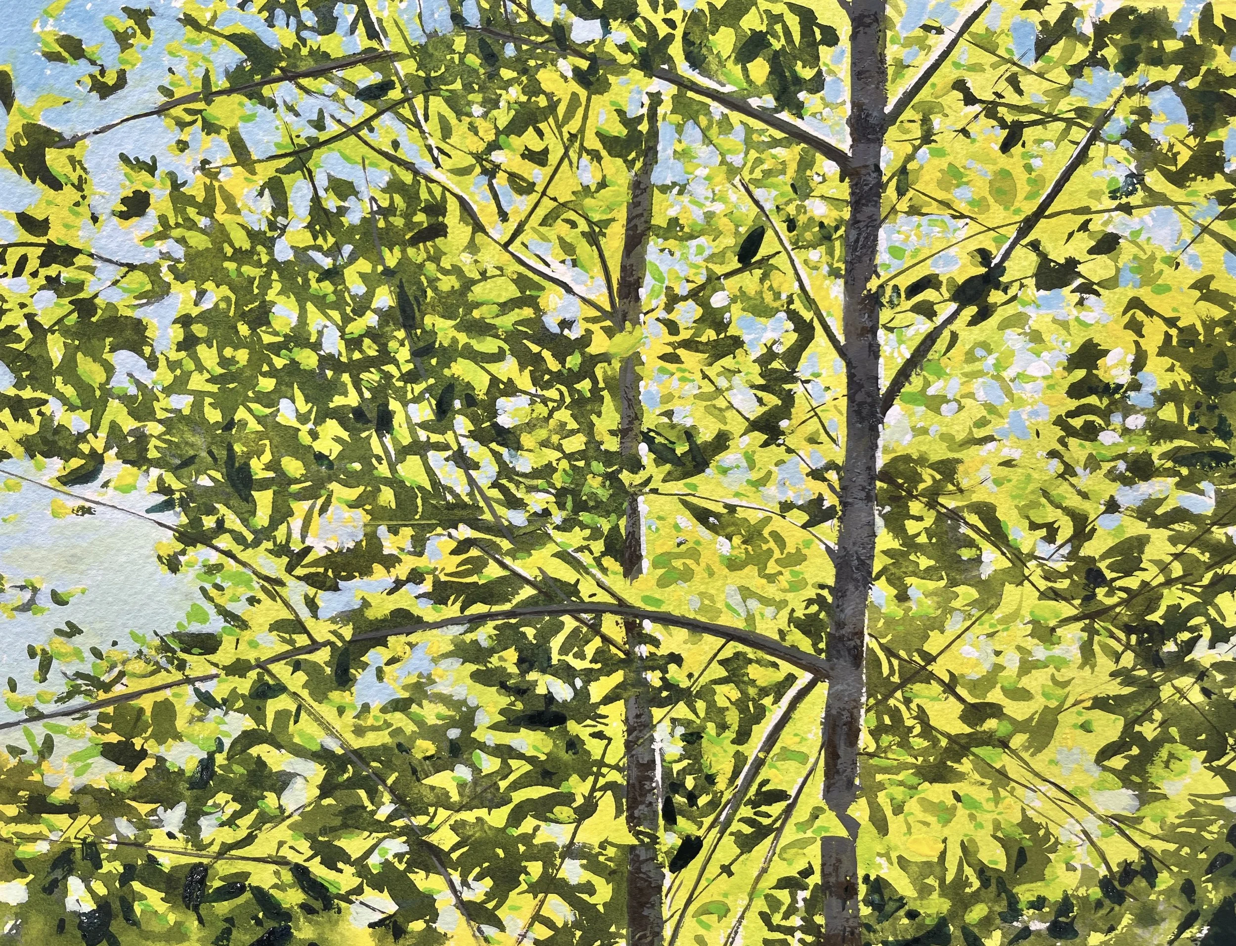
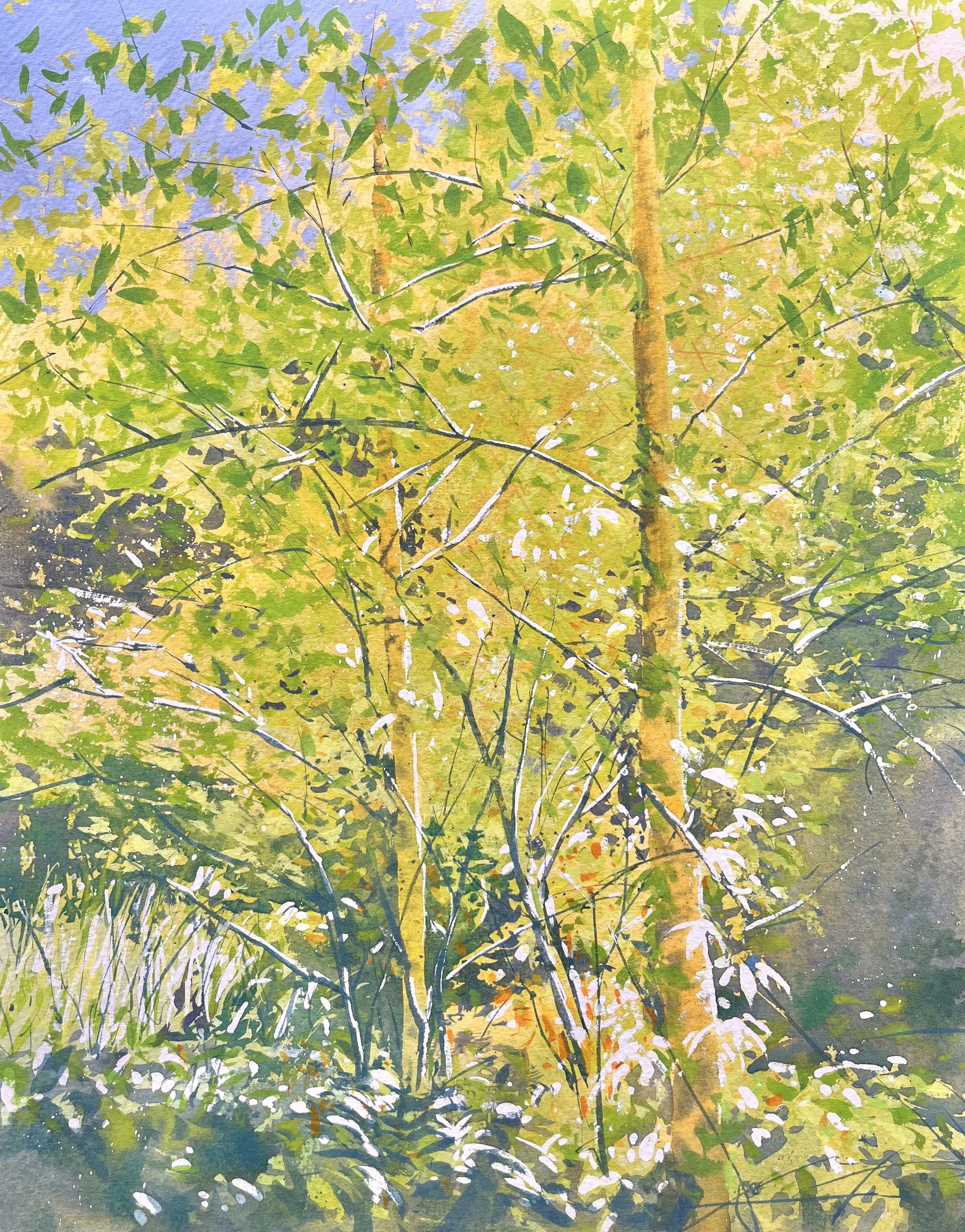
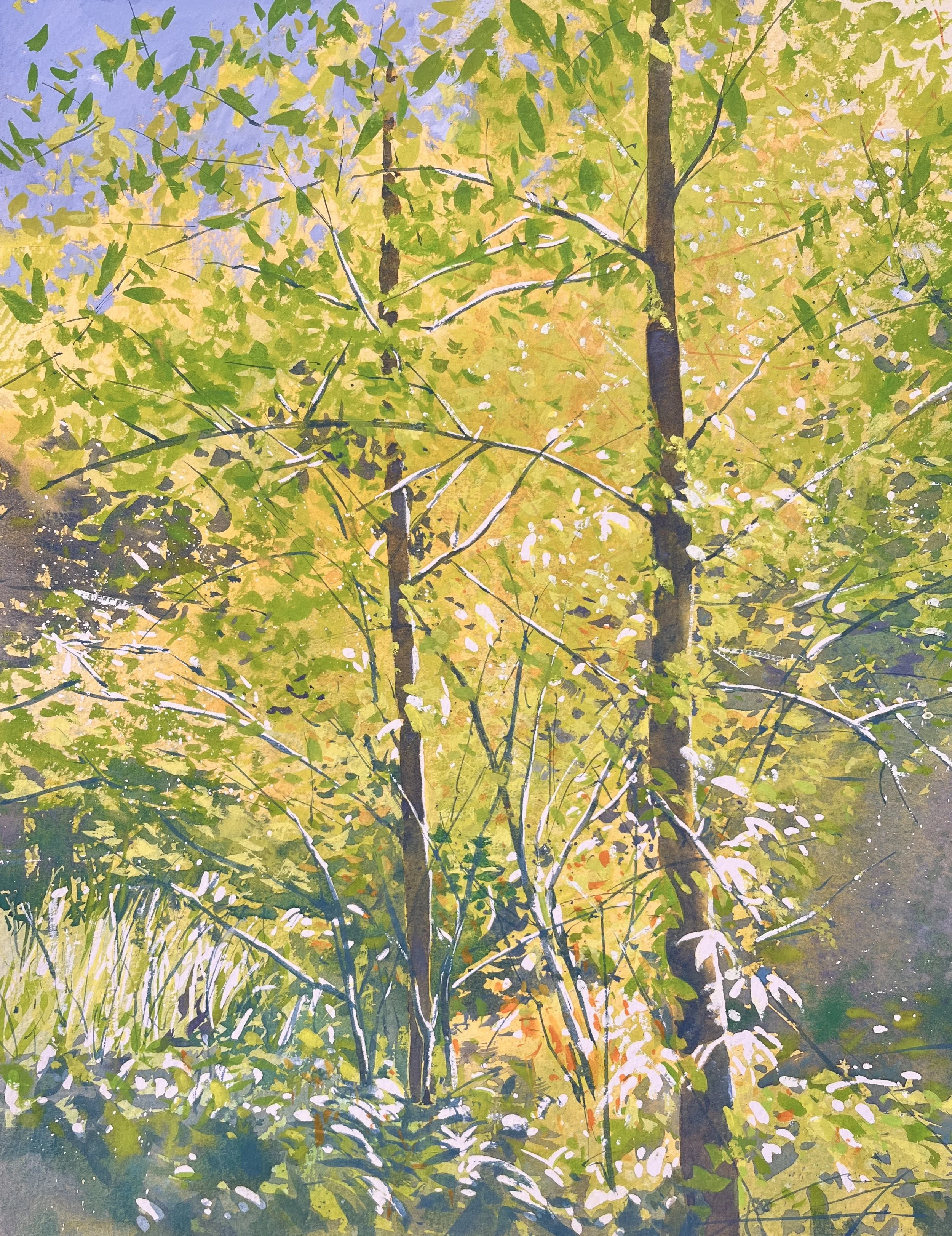
Gustav Klimt- Patterns of Foliage
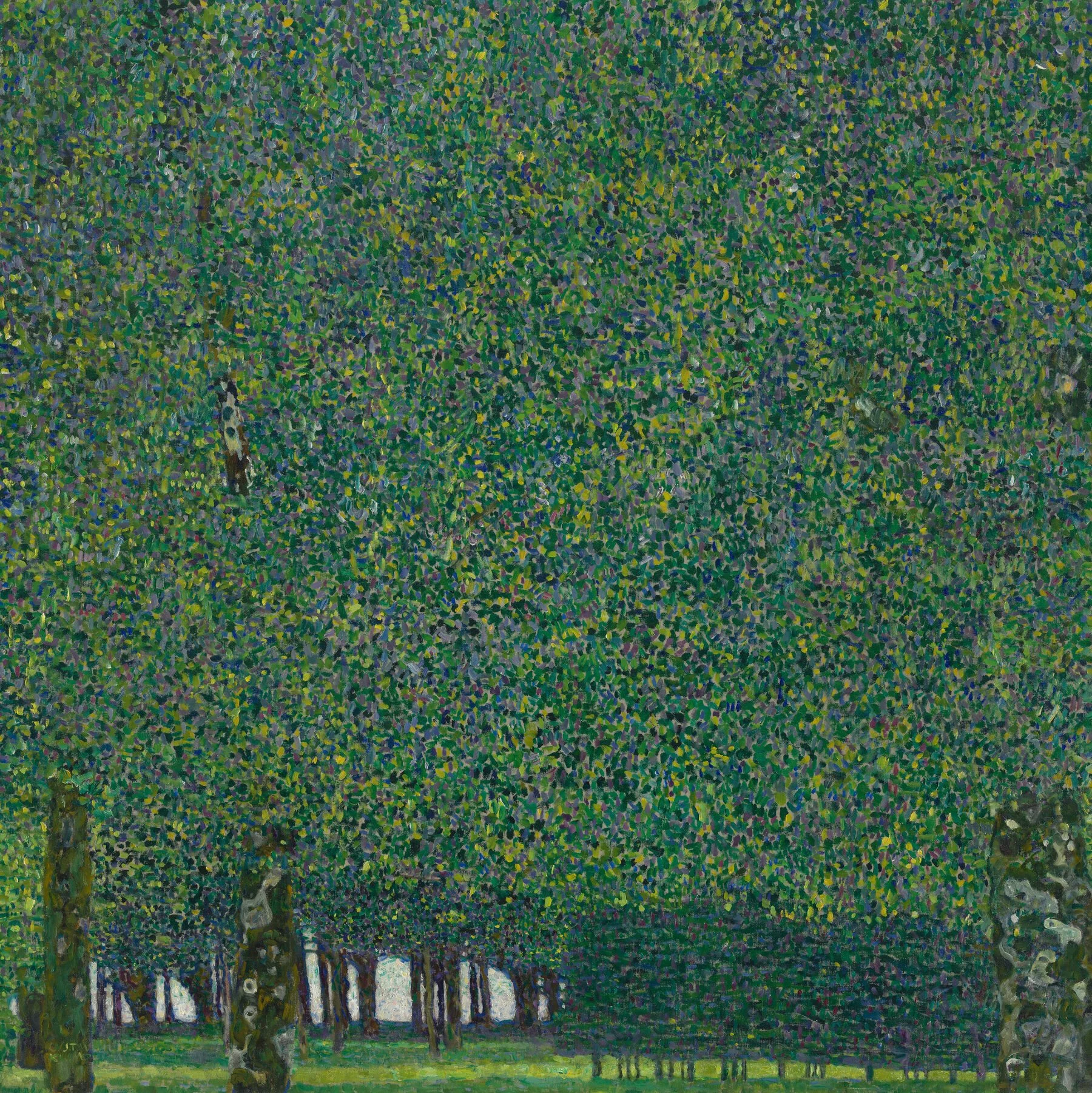
Gustav Klimt- love this!
Gustav Klimt- all about pattern
I really find Klimt’s landscapes fascinating. The deep exploration of texture and pattern, with empty spaces as a relief and focus are special and compelling. I always know when I’m seeing a Klimt- the subject has clearly passed through his filter.
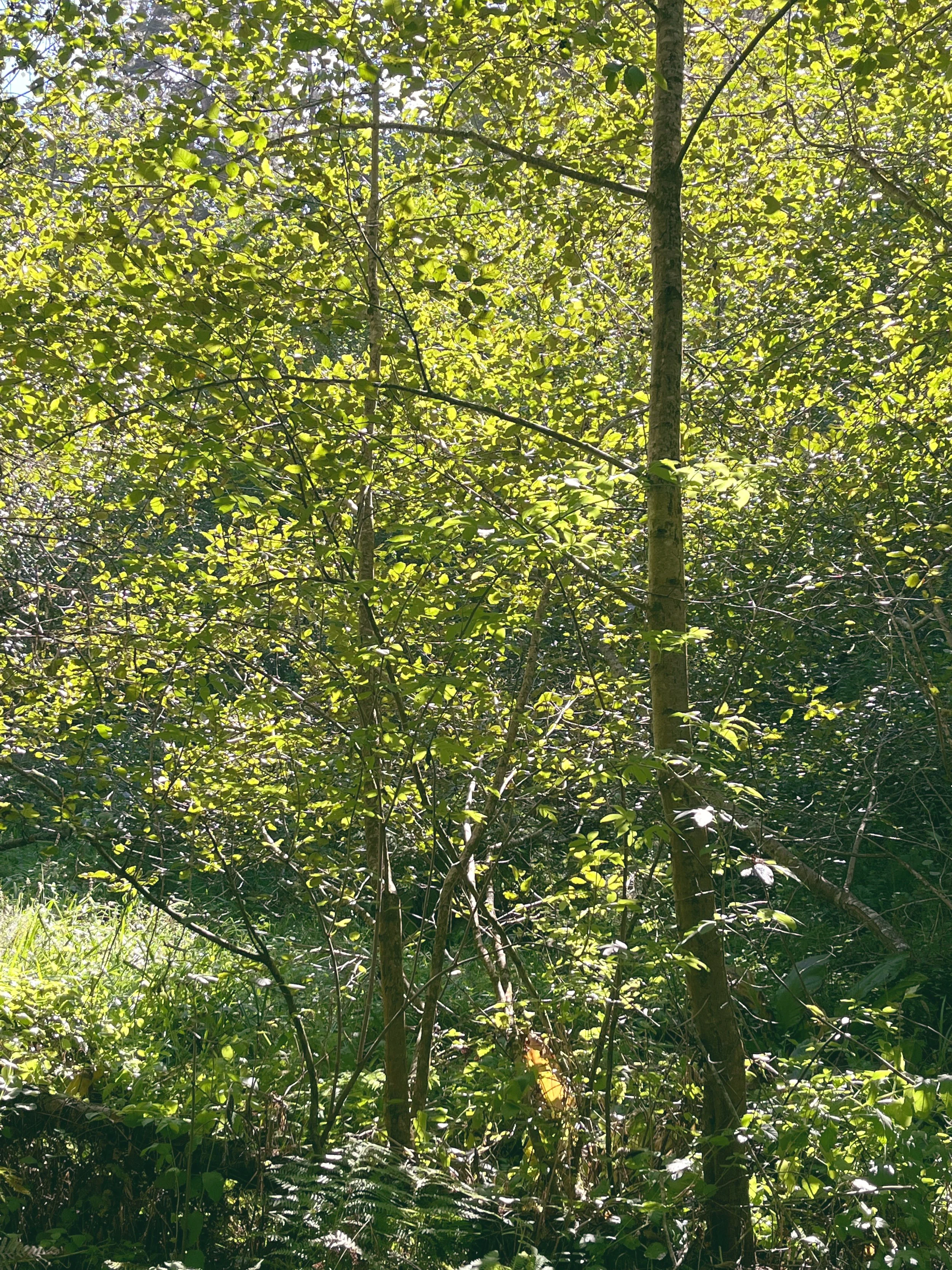
Much like my experiments with masking fluid and flat brushes from the last post, I zoomed in on my new subject, just to see if I could make it work “up close”, before I included the whole composition. I jumped in, just trying to get a handle on applying that many strokes. My first pass was… okay. It wasn’t quite what I was looking for. Here’s the reference photo and image, for comparison.
I sort of lost my way part way through, but I worked my way to the end and learned what there was to learn. I guess I thought it was a bit of a bust, but we’ll see below where I took things a few months later.
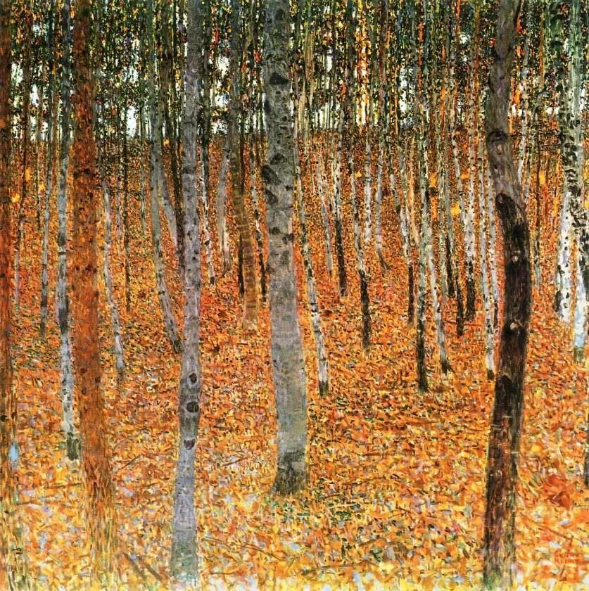
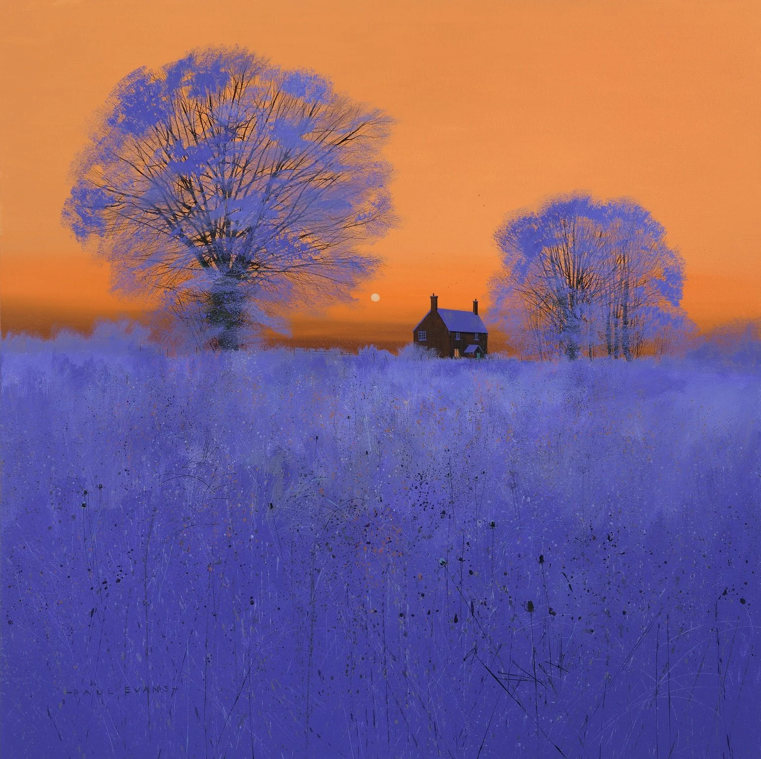
Richard Thorn- Letting Go of Blacks
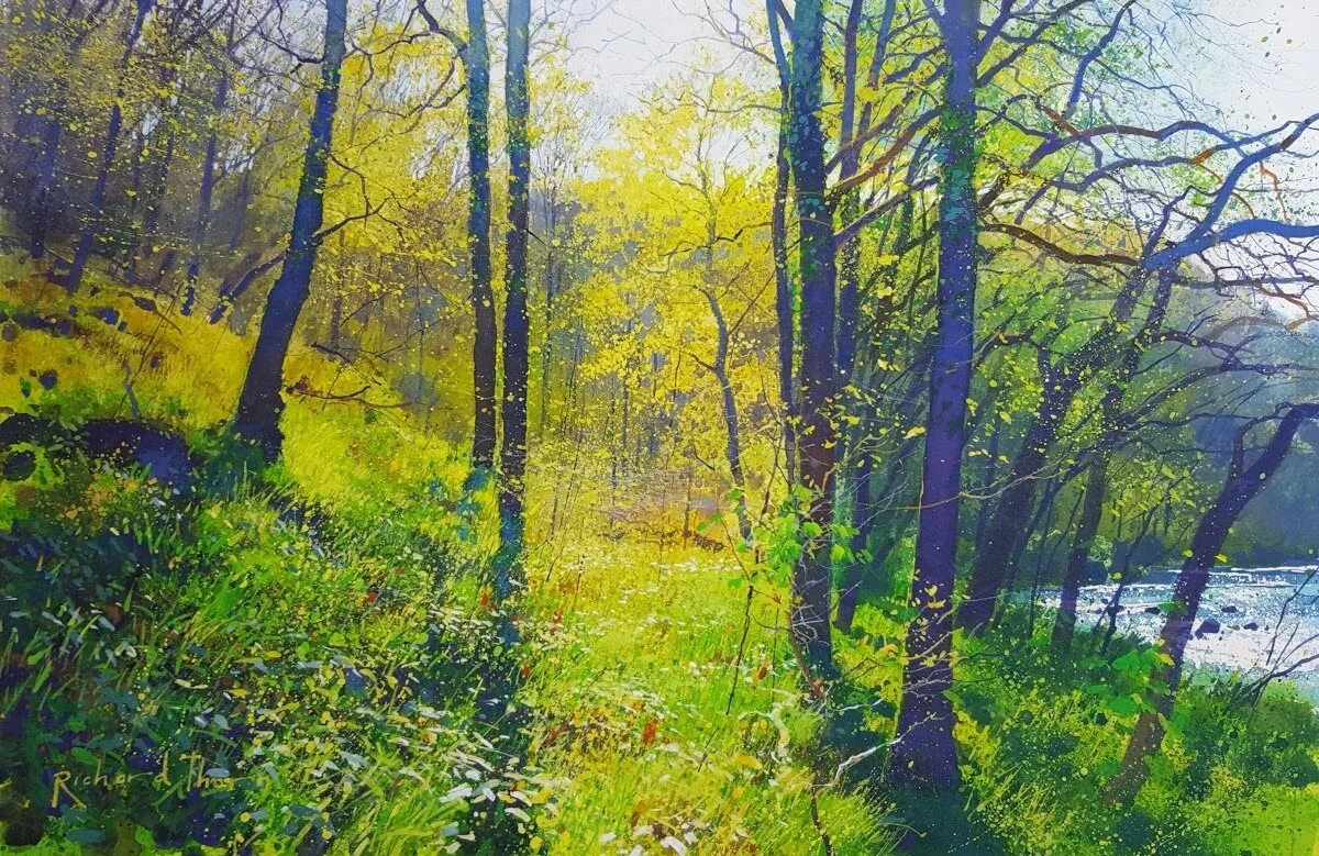
Richard Thorn- helluva painting
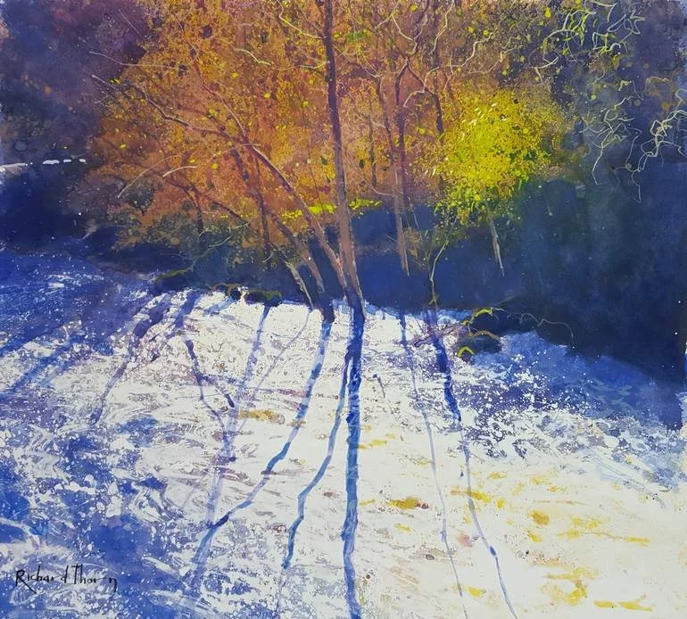
Richard Thorn- another gem
Years ago, I took a color class where we were required to create a small study where all the values of the colors were as close to each other as possible. This was fascinating and so very very difficult for me! What really stuck out to me was just how dependent I was on value as the primary moving force for all my compositions. Of course, value is super important, but I mostly felt handicapped by the exercise— I hadn’t really developed much of a sense of color (and how to use or manipulate it) at that time. Well, I decided it was time to give this a go again.
Part of what I like about the work of artists like Thorn (and many others too, I’m sure) is the color he gets in to his darks. I thought back to the Spotlight I had written on him years ago, and remembered how he sort of “shifted” his whole value set towards white one or two steps. He had much more white than normal (IMO), and his darks were never really super dark. I came back to the Klimtian foliage I had done a month or two earlier, and decided to apply this sort of “high key” strategy to my color application.
This painting is really half watercolor, half “body color”- what I call watercolors when I add a bit of white. I did an early wash, then applied my mixes thickly. Sometimes its just thick watercolors, sometimes I use a bit of white mixed in.
I really loved the first step where everything is a negative shape, and might do more color explorations with this. I continued on though— I thought I was aiming for the second version, but in the end, I decided the subject was too busy.
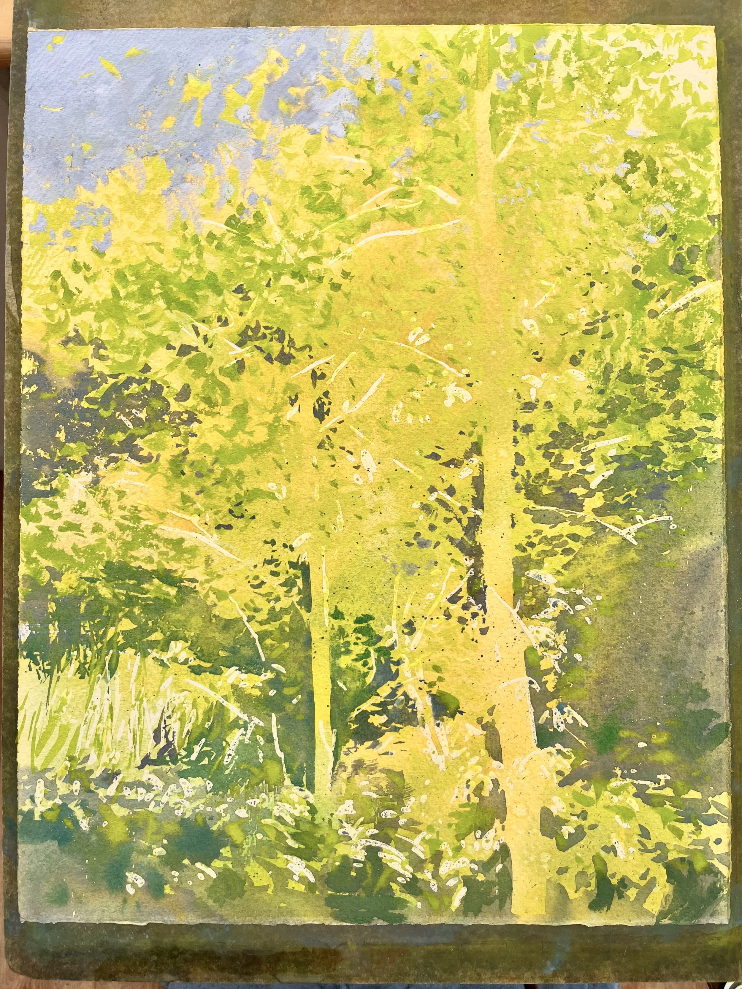
I felt like I was sort of sitting on the fence- neither being abstract enough (like it looked earlier), nor being realistic enough to sit things down with a bit of weight. Part of what I love (and hate) about watercolors is that there’s no way to go but forward- much like life. I can’t just paint over things or scrape the oil paint off. Perhaps I could have made other decisions, but that was all in the past now. Given where I was, I needed some sort of stronger values to tie things together. So, I added in the trunks… darker, but not too dark! For me, this whole value set is really quite high key.
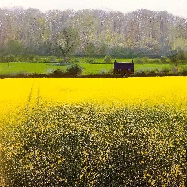
Paul Evans- Using Color With Clarity
Paul Evans- All About Color
Paul Evans again
What I love about Paul Evans work is that, at its best, his use of color is so strong that it’s always clear how he’s leading you. The work borders on the edge of realism, but he’s not afraid to elevate color for effect. As I soon discovered, its easy to say or see that, but it can feel very daring and a little scary to apply that mentality yourself.
I did a little sketch at the beginning of the year. This one below. I liked it enough, and I liked the light on the building. I thought- this is a subject that Paul Evans might have painted. So I decided to give it a go again, pushing the light even more.
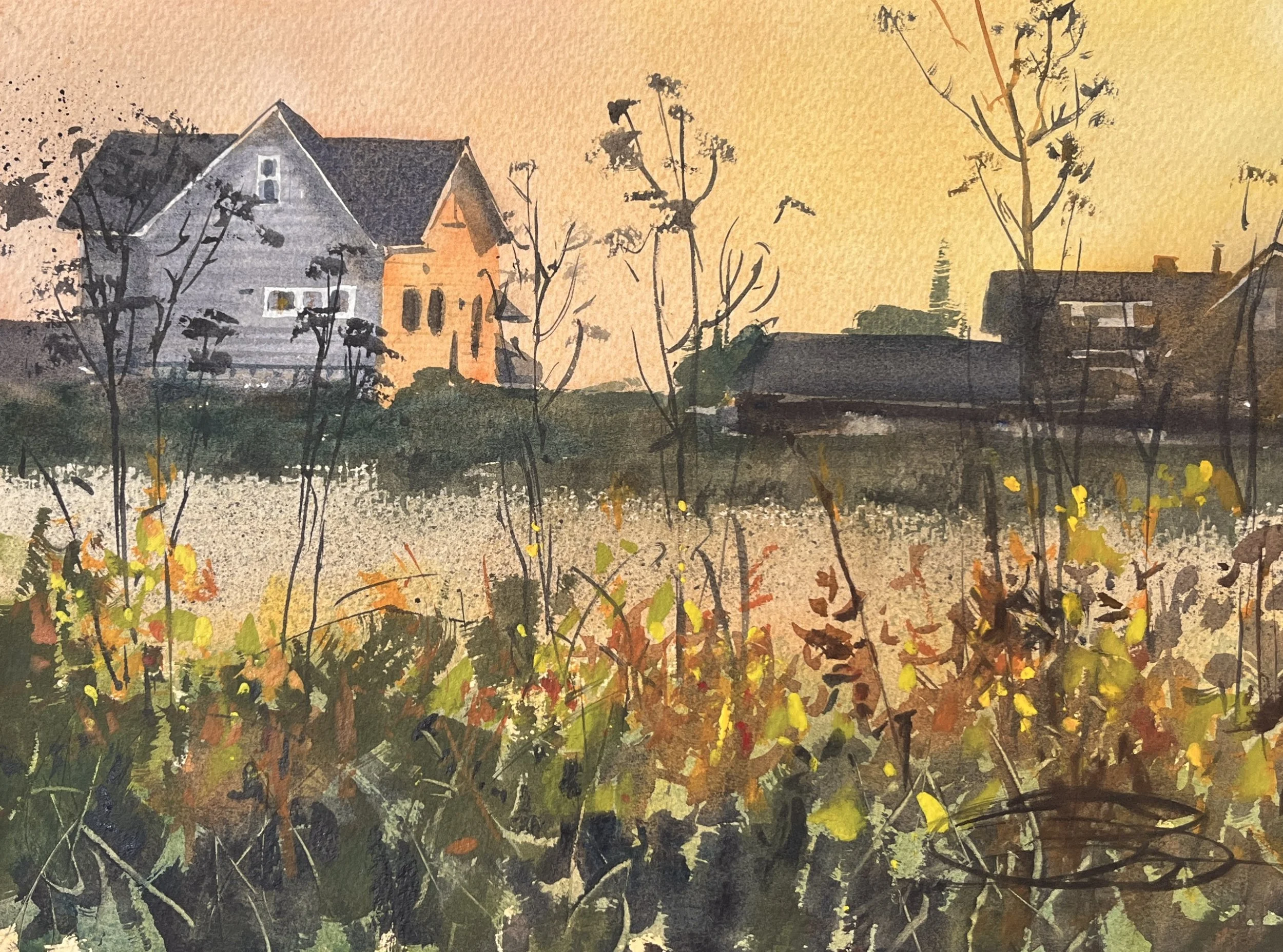
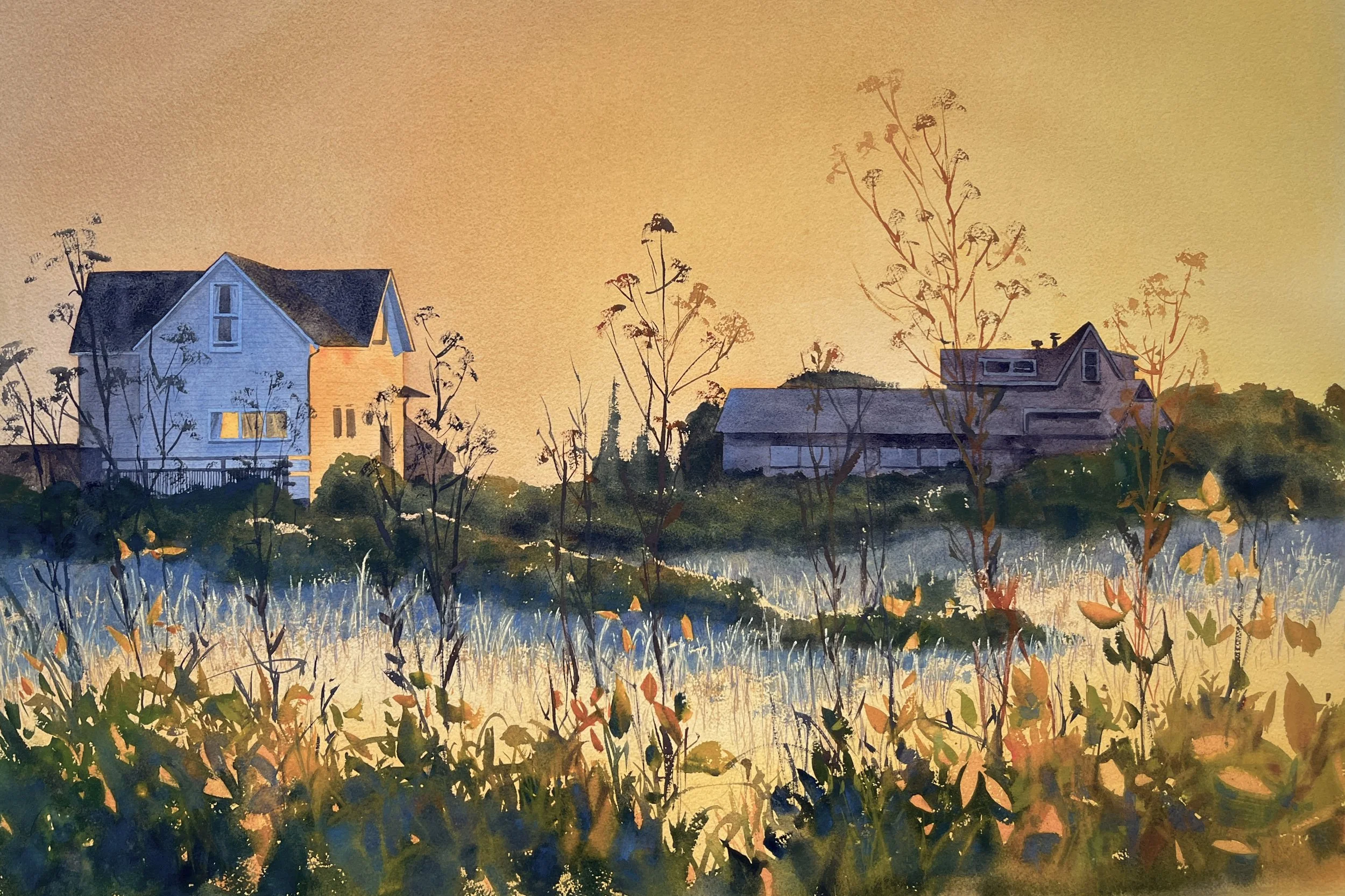
“The Sunny Side”, 22” x 30”
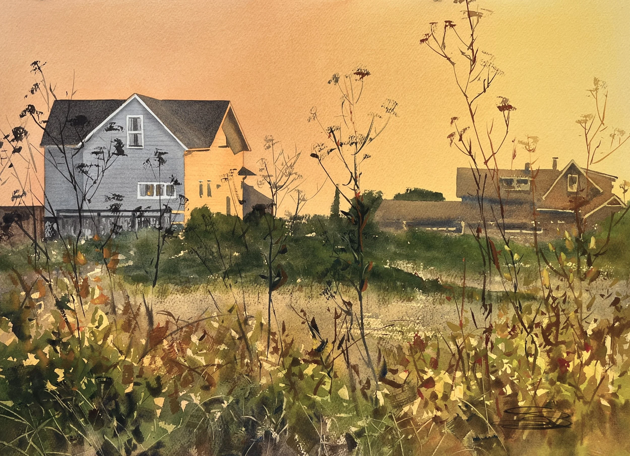
Once I did that, I thought, “Ok. Better, but how could I push this even farther? What could I do that would be really out of my comfort zone? That might teach me something about color and let me see something new from myself, better or worse…” So I did it once more, a big one- 24” x 36”. And this time I sort of let go of realism (atleast in terms of color) and really try to let it fly. The goal (which is what I’ve enjoyed so much about Paul Evans work) is to use color for effect, not just realism. What I got was this—

The Shady Side, 24” x 36”
This was very exciting to me, and I’m hoping to explore this more! It was honestly very hard to push myself this far in my color use. LOL! But it was, in the end, fun and interesting. I don’t think I want to do all my work this way, but there was lots to learn and benefit from. If you haven’t explored experimenting like this, its worth doing.
As always, if you’re interested in purchasing a piece, please use the Contact page to email me, and we can go from there. !