Workshop Review with Bill Cone

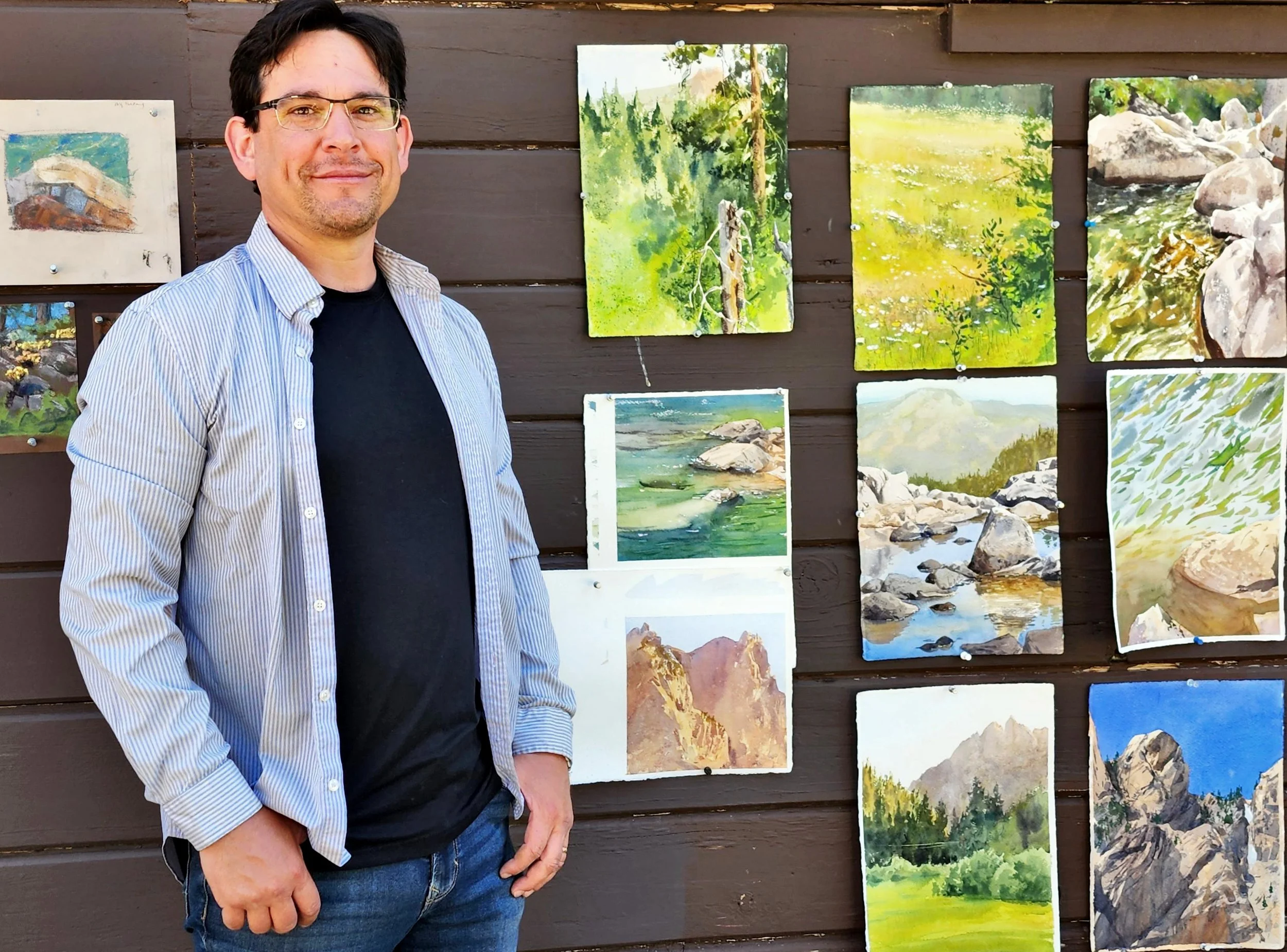
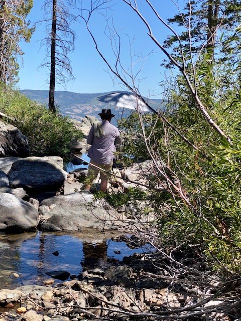
A pic of me, painting plein air at Frazier FAlls.
This summer I did a 5-day workshop up in the High Sierras with pastelist Bill Cone. Bill Cone worked for years for Pixar as a production designer, on a lot of films you’ve probably heard of (particularly if you’ve had a kid or a grandkid in the last 20 years), like, you know- Toy Story, Cars, A Bugs Life, and Inside Out. He also happens to be a fantastic fine artist, with a lot of experience painting in the Sierras and locally around the Bay Area. You can follow him on Instagram if you want to see his most recent work. You can also find him at his blog, where he talks about a few of his workshops, with photos and such, here.
“The atmosphere is a luminous ocean of particles that capture and express the light.” -Bill Cone


Big strong shapes, and that transition of color!
Little blue highlights in the shadows, reflecting the sky
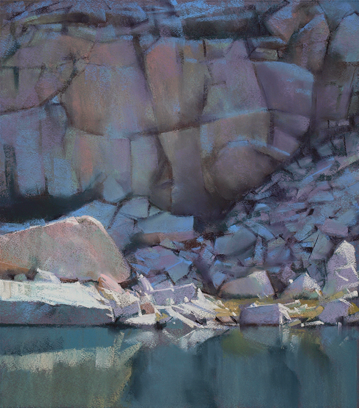
Bill is an ardent proponent of plein air painting, and its value educationally for painters. There’s nothing like being there, looking through your own 2 camera lenses, in the mix of nature, to really gather to yourself the details of the natural world. Bill’s plein air work is unpretentious in the best way. They are all studies of natural phenomenon. He’s interested in the nuts and bolts of light and shadow, and is really drawn, in my opinion, to painting stone and water. If you look at his work, the movement of details and local color from warm to cool, from light to shadow, through atmospheric perspective or down into the depths of a lake is amazing.


This painting, subject-wise, is about nothing. GaH!! It’s so good.
Why Pastels?
Isn’t this blog about watercolors?
Well, in my experience, it can be super educational to learn from someone painting in a medium different from your own. Different mediums have different strengths and weaknesses, and each often requires the artist to solve problems in different ways. This can be very mind-opening.
Watercolors are fast and responsive, and very good at building up value but are transparent, and color application tends to be less exuberant once the “vehicle” (i.e. water) dries up and the pigment sinks into the body of the paper. This has led me to explore how other mediums use color, to try and stretch beyond my own limitations. For example, the pigments for oils permanently float in the body of the vehicle itself (linseed oil, for example) and so color application stays very vibrant. It’s also three dimensional and rather “static” unless you thin it. This combination can lead to some stellar color work, and I’ve learned a lot by studying masters like Monet and Sargent. I’ve also learned a lot being in the same festivals and galleries as contemporary oil painters. Seeing their work side by side with my own has helped me grow and be more daring with my own color. Comparatively, professional-grade pastels are densely packed with pigment that sits right on top of the paper (much like oils) and are opaque (like oils) but also quick, easy to transport, and done on paper (like watercolors). On the flip side, it has a harder time building up rich darks, but that resultant play in the middle-values (often where Color work its mojo best) is part of the magic of pastels. Lets dive in!
Camping at the Sierra Nevada Field Campus-


For this workshop, we were up at the SFSU Sierra Nevada Field Campus. This camping-only campus hosts a variety of really interesting classes throughout the summer- naturalism stuff, science stuff, art stuff, etc. The site is beautiful, and way up by the Yuba Pass, an hour and a half outside of Grass Valley. I’ve camped at a workshop before, years ago in Yosemite with Frank Eber, but it wasn’t the whole group, and we didn’t eat together. This experience was very different, and led to a lot of time to visit, eat together, and get to know each other. The campus also provides a cafeteria where they served really quite nice meals (way better than my typical camp fare), and bathrooms and showers, but everyone camps. I was in heaven. I loved being there.
Bill kept us busy, with many hours of painting and lecture. He really went above and beyond. Breakfast was from 7-8, and we were often on site and painting by 9, or even earlier. Dinner was from 6-7, and a few times we went out to paint afterwards, at dusk (totally extracurricular, and just for fun). In between, we were painting and generally on site somewhere fantastically gorgeous, or having a rest while listening to a lecture back at camp. Each day required some small amount of hiking, a good umbrella, and swimming trunks!
We also had a stellar set of artists and conversationalists. I had such a good time visiting and painting with everyone. Really. Just a marvelous time. One of my favorite groups ever. Animators, oil painters, pastelists, two artists that did some gouache, one repeat student from Boulder, Colorado (Hi Kelly!), and myself. It was a privilege to get to paint with them all.

painting the buttes at dusk

Demos and Lectures-
Bill did demos every day, although this cadre of artists was relatively self-driven, so the demos weren’t the primary focus of his curriculum. That was very different for me.
It’s very interesting to watch someone paint in a different medium. Most watercolorists paint light to dark (edited for correctness!), but as a pastelist, Bill would often lay in middle values on toned paper, and then push back and forth to get to the darks and lights. The most vibrant opaque lights often go on last, and this allows a kind of brevity and freedom to the mark-making that’s hard to replicate with negative painting in watercolors. Here’s an example-


One of the things that fascinated me was Bill’s discussion about color application with pastels. The basic idea was that you’re never going to have the exact right hue, since each stick is already pre-manufactured (and there’s only so much mixing on the paper you can really do, and so many sticks you can bring), so you need instead to focus more on value. Of course, he generally seemed to be aiming for color accuracy, but it also seemed to liberate him from more traditional, purely representational color choices. It leads, IMO, to some really dynamic color-work that I don’t think I would have gone for as a watercolorist. Some learning definitely occurred for me here. I found his color choices particularly interesting in this painting here-
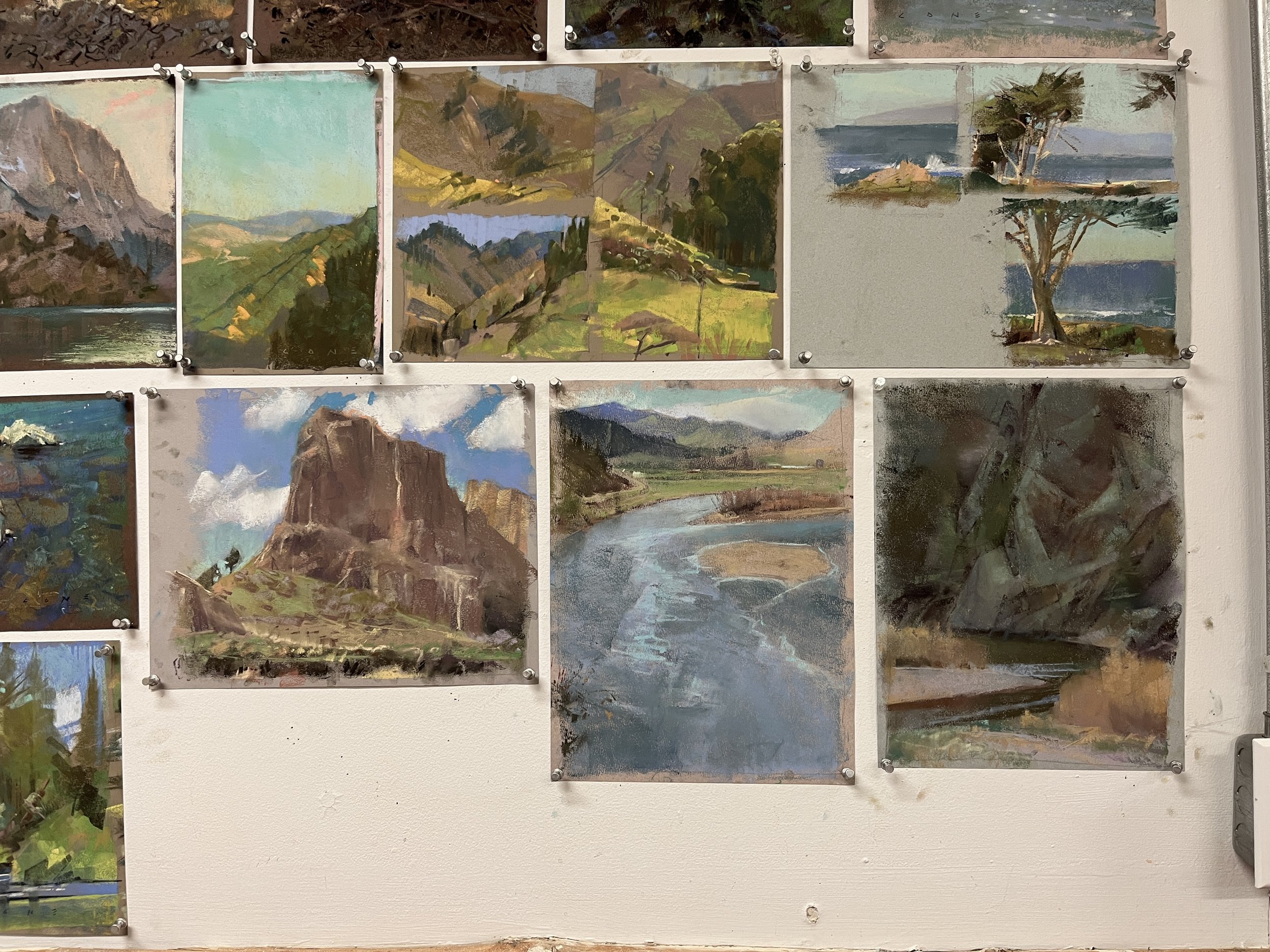
Check out some of the sketches (below) that he brought to the workshop to illustrate various points. You can really see a lot about his creative (and by my standards liberated) color choices in these sketches-

My Own Work-
I decided to stick with watercolors for most of my work for the class. I actually was gifted a set of pastels and some paper for the class by a friend, and I did give it a go each day for a while. But eventually I decided that I wanted to focus on applying the color-knowledge Bill was sharing to the best of my ability, so I stuck with a medium I was already familiar with. In my defense, Bill did say that it was ok to use other mediums! :D The most essential part of the course, for me, was definitely his mental approach to color, light, and shadow, and not necessarily his technical knowledge of pastels.
For this first painting, we went to Frazier Falls. It’s a little hike in (perhaps a mile?), and there were tons of things to paint- a meadow, strange trees, etc., but I went for the most obvious (but gorgeous!) view on this one.


I was told the water was low this year, but on arrival, I could see how fantastic it would be to paint it. It’s rare that I get to see a waterfall from up top! I immediately saw the warm versus cool, blue/orange contrast, and knew that’s what I wanted to stick too. It's interesting to compare the photo and the painting. The photo definitely isn't able to show the variety of hues in the shadows. It also dramatically overstates the value difference between the shadows and the light.
We were there for 2-3 hours, visiting and painting. I keep an umbrella up to help shade my canvas and my palette. It’s not actually for me!! That's why you need that dapper hat you see below! :P I do love my Stetson though. Sigh! :D Keeping my canvas and palette in the shade helps me see values and hues better, as well as keeping my paper moist longer. The sun warms everything up. And since paintings are shown indoors on walls, working in the shade when outdoors also helps approximate a similar lighting scheme.
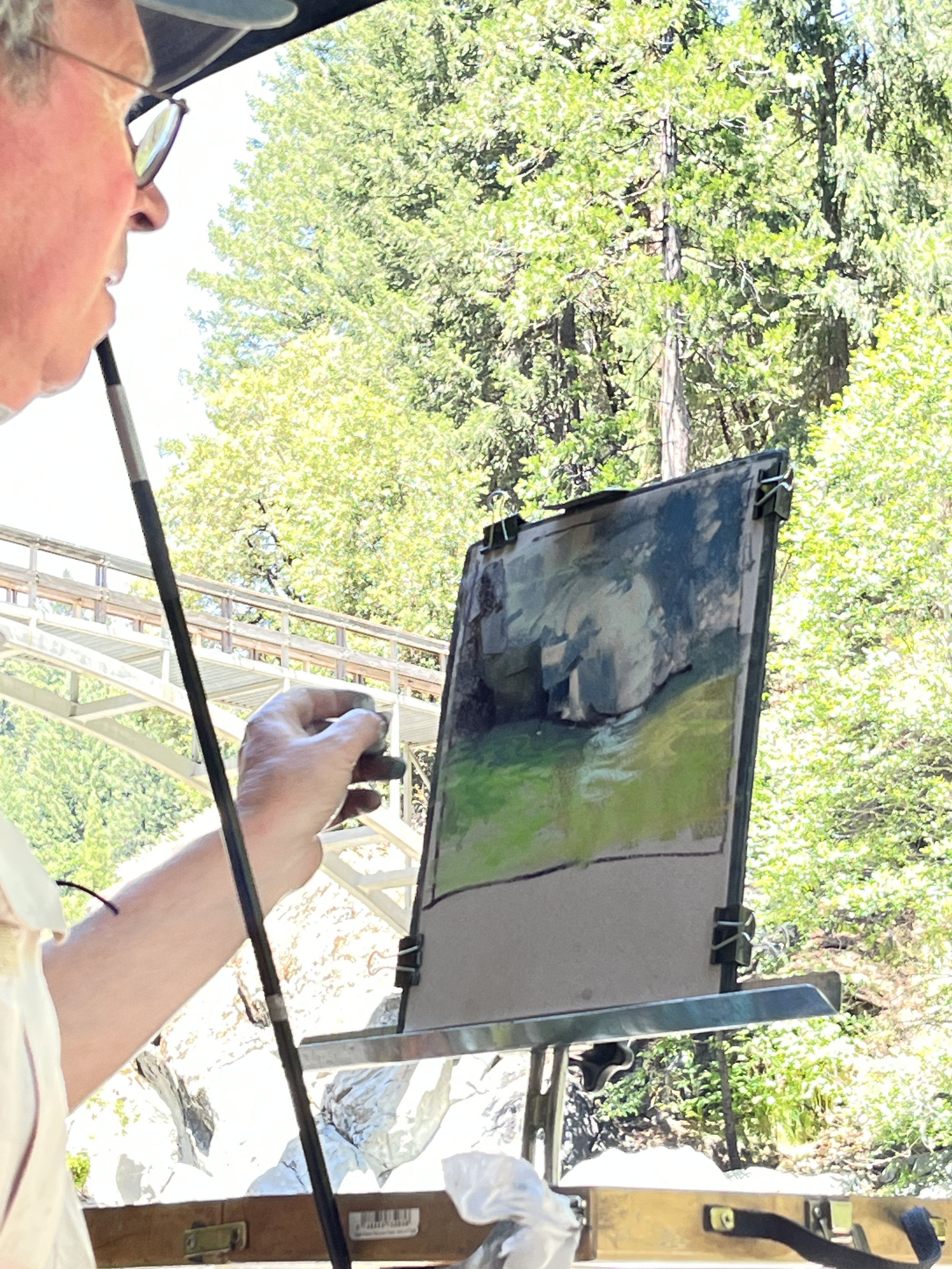
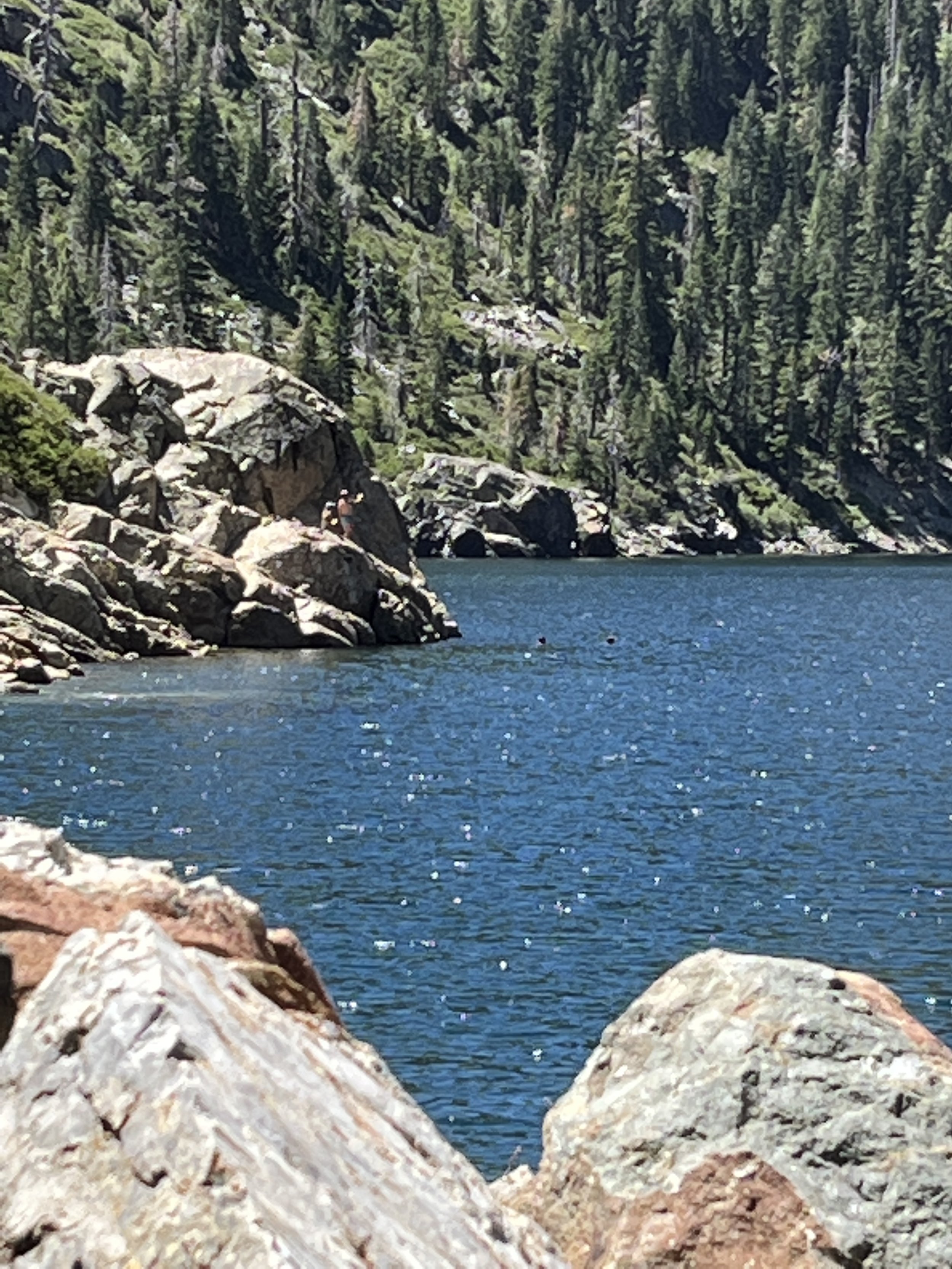
This second painting was done at Loves Falls. We got to hike a tiny bit on the Pacific Crest Trail to get down to the falls. That's bucket list task for me, so it was fun to get to walk it even for a little.

I skipped the more obvious subject on this one (the beautiful roaring falls you can see below), and painted this little scene to the side, where the light was falling on the boulders and through the water.


We got there early in the morning, but the light was changing all day. That's one of the challenges with painting plein air. It's painted from observation over time, so it's rarely a portrait of a single moment. Rather, it depicts the total impression of the place for the duration of your visit. It's something special that can't be arrived at from a photo alone.
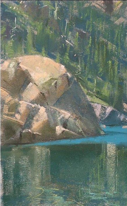
For this one, it was a hot and dry afternoon. I had done a subpar painting in the morning, so I cut my paper down smaller, to an 8x8 square, and zoomed in (all advice I typically give my own students). Paint was practically drying as I laid it down. I couldn’t wet the back either, because some wind was up- so I had to tape my paper down and just go for it. I was getting blossoms here and there, but I had to accept them and push forward, so I could focus on really trying to see what was there and pay attention to what Bill had been teaching.

the zoomed in photo doesn’t do justice…

…to the varied and opalescent colors in the water.
In truth, there’s a freshness to this piece that comes, I think, from the brevity and sort of faux-confidence of my strokes. The elements forced my hand-- I knew I had no choice but to lay down my strokes and let them be. Some of it really wasn’t on purpose. I just knew that I’d ruin it if I tried to fix it, it was drying so fast. So I had to get out of my own way.
I learned a lot making this. This was my most surprising piece from the week. I was so frustrated at first. The paint was really not behaving, not doing what I wanted, but then I threw up my hands and let watercolors be itself. Now, 6 weeks later, looking at this piece independently, there’s a kind of beauty in there that I can’t quite achieve when I’m fully in control.
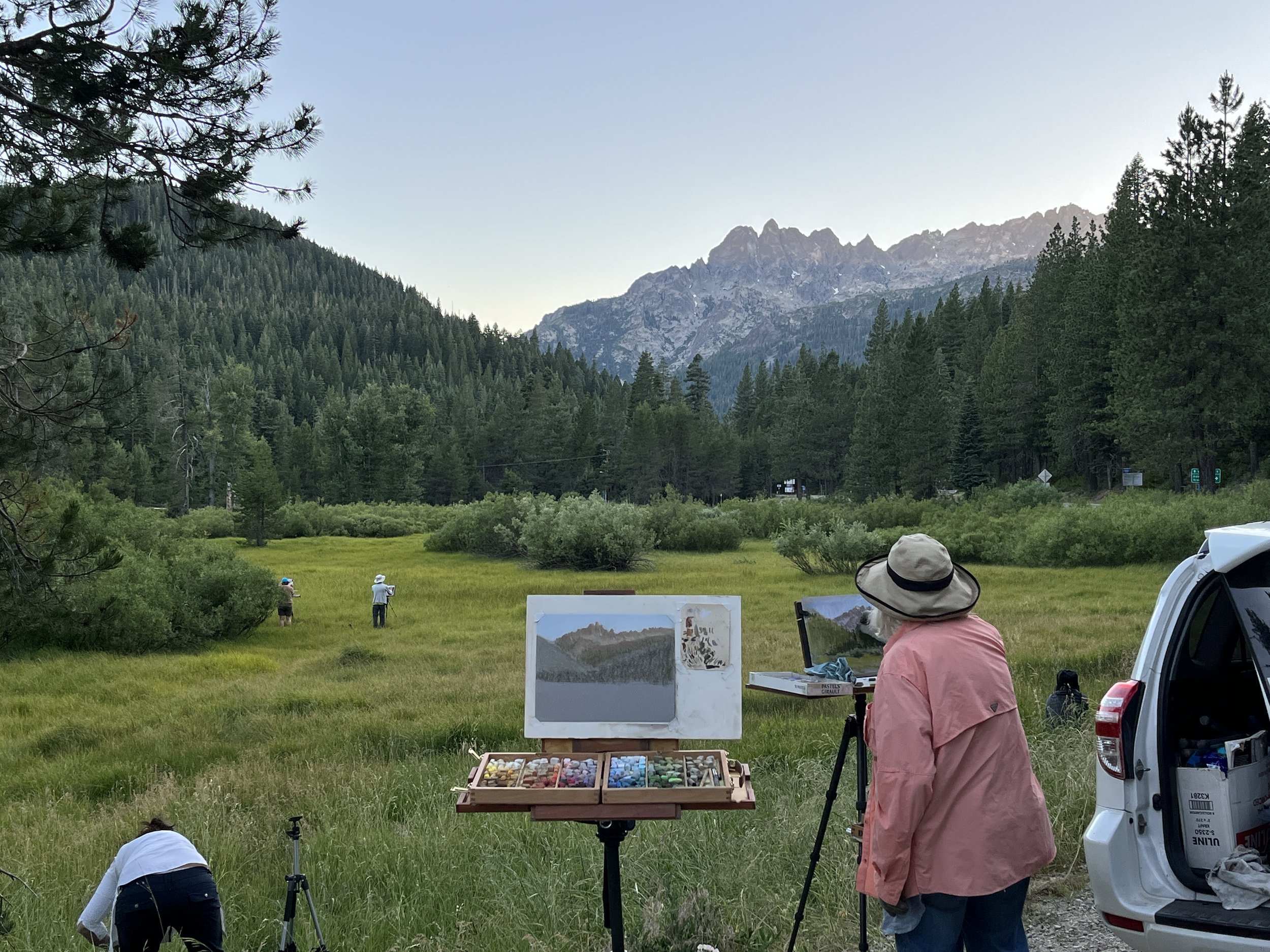
On the last day, we went up to Yuba Pass, and painted at a meadow there. I LOVED this location. So beautiful.


I got a kick out of working on this one. Bill came along when I was about 90% done, and pushed me to take it farther. I’m glad he did. I worked opaque to drop the flowers in, and worked on my color application, shifting the fat white strokes in the foreground, to pale blues in the shade, or little dots of creamy yellow in the distance. It’s something that’s hard to see in the photo, but the drifts of wildflowers really helped accentuate that feeling of distance.
Trips like this can be magic. We don't just paint. There's time enough to talk and share, to flop on a rock, or take a dip and do some lake swimming. That vibe definitely gets into the art. It's a good place to be. :)