Laundry Day- Zoom Demo Recording and Follow-up
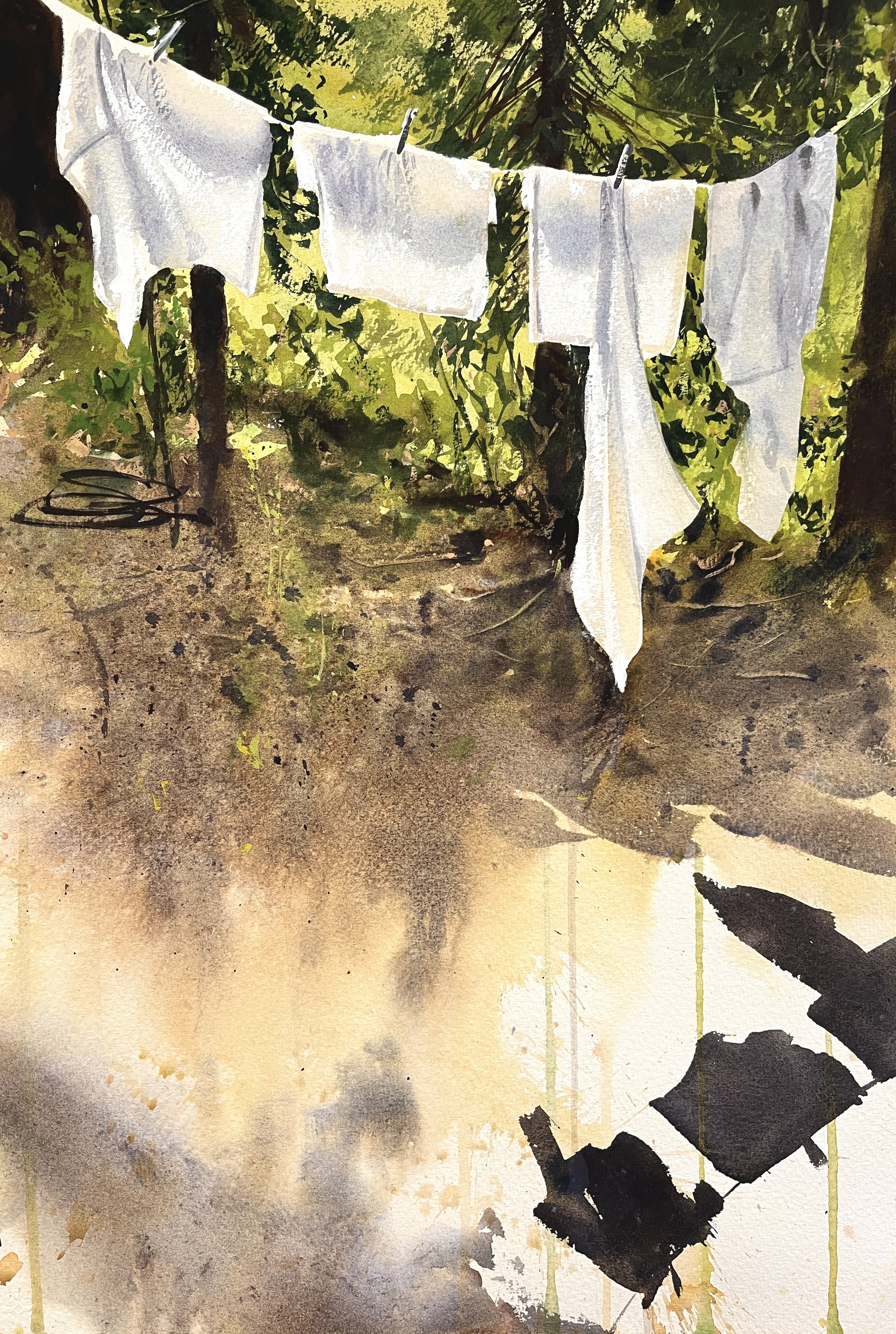
In early August, I did a “lunch hour” zoom demo, and I wanted to share it here for those who weren’t able to make it. Later on, I painted a different photo of the same subject/timeframe, as I figured out better what I wanted to do. That’s what you see up above. Follow the demo and read below, as I guide you through my process!
So, this is from a recent painting class/ excursion I took this July up to the Sierras (more on that in next week’s post!). My original photo is all about the broader scene, but as I got ready to paint it, I knew I really wanted to focus on the warm and cool light on those white sheets, so I cropped things dramatically.
Here’s the demo I did. Some stuff you just have to do to learn what you want.
Of course, how I could I not be influenced by Sargent? Perhaps it’s something you’ve just got to try on your own, to learn what there is to learn from such a subject! Here’s the comparison. Lots to be desired, but that’s the way it goes!
Afterwards, I decided I wasn’t entirely happy with my results. I liked it just fine, but, for me, the sheets were too tight, and I needed a more dynamic collection of shapes- something to draw you in to the image and hold your attention with their interesting edges and integration with the background. I also wanted a more direct connection between the sheets and their shadows, to better express the light. Finally, I’ve been wanting to loosen up some- to play more with my paint, with drips and splatters and that kinetic energy. So, I decided to try and bring that into this subject.
I got ahold of an alternate reference photo from the same site, and decided to give it another go! I ended being much happier with this version. Here’s the reference photo and the first two steps of the process-
I got to this point and thought I was done. But the background was still too flat for me. So about a week later, after staring at it on my wall repeatedly as I passed, by, I rewet the back, and slapped it on to my board. I began to paint negatively around my sheets, to accentuate those flat clean shapes with a busier, more dynamic, active background. I speckled in bits of texture on the ground plane too, to make it read better as flat and approaching us.
As I like to say- “It’s never to late to ruin a painting!! “ :P But honestly, if you’re not really satisfied with a subject, there’s nothing to be lost from pushing it farther— only a mediocre painting you weren’t happy with anyways. I’m glad I pushed it that last 10%! It’s not Sargent, but maybe it’s more me. :)
Laundry Day, 15” x 22”


