Color Mixing, pt. 1- Navigating the Color Wheel
Color Recipes versus Navigating the Color Wheel
When I've gone to workshops, I've often been surprised that many painters still don't have a firm handle on how to navigate the color wheel. If the teacher chats about a mix, the students feverishly write down the mixes of this color with that color, like a recipe. There is a real fear that they're not going to be able to approximate the mix the teacher is doing. And probably rightly so, as a lot of (unanticipated) mud is whipped up. So, there are always many questions about "Which color did you use for that?" I've seen teachers in workshops get frustrated. Even they don't always remember which colors they used. A little of this mixed with a little of that? They're nudging their mix around the Color Wheel with this or that pigment, until they get the shade they want. They're "navigating" the Color Wheel, like a map. Sailing the seas of color! Arrr, matey!
Of course, there are times when different pigments have particular functions, and which pigment used is important, but many many times a variety of pigments are interchangeable in terms of hue when you are mixing them together, and what's really important is that you're able to navigate the color wheel and get predictable results when you combine pigments. If the teacher mixes up a red-brown, you should be able to do so too, even if you don't know what pigments he or she used; if the teacher mixes up a dull plum-violet, you should be able too- regardless of the pigments you have. The real goal when learning color mixing isn't to copy down recipes for you to later replicate, but for you to understand the Color Wheel (and the pigments on your palette!) well enough that later, when you are painting on your own, you'll be able to navigate the map it provides you and consistently mix your own hues.
So, the point of the post isn't to talk color vibrancy, or what makes a painting sing, or how the color of your shadows depends on local color plus the type of light casting the shadow, or if your color combinations on the canvas will look good. It's really about mixing a few colors on your palette (or on the paper!) and trying to get predictable results. What you then do with those colors is a whole other thing! My goal is to share how I create a mix, and then "nudge" it around the palette, based on the other pigments add.
Locating Pigments on the Map-
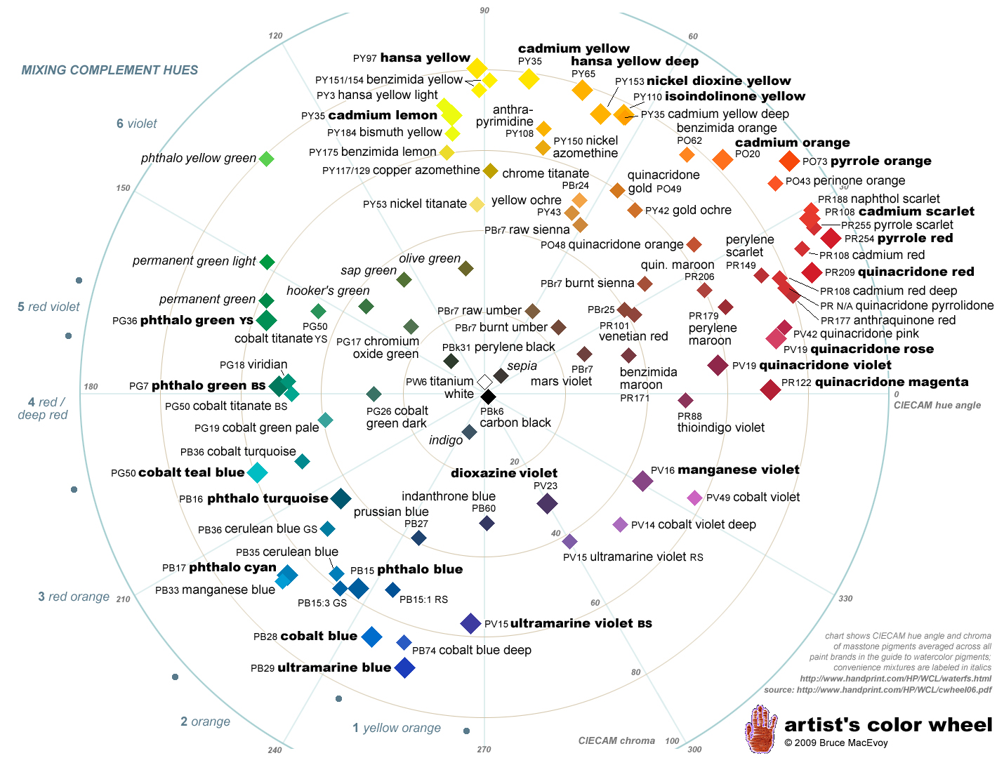
Now, there are many, many books and videos out there on mixing color, so I don't feel a need to go about remaking the wheel. I'll simply say that I find Bruce MacEvoy's "Artist's Color Wheel" (pictured above) exceptionally useful. Here's a link to the page where you can download the PDF for yourself. You can go to his website and read all about how he used a colorometer to read the hue and chroma of each pigment, how he tested different brands and created an average for each pigment, or how he nudged pigments around based on their green or red reflectancy, etc. or... you can just take this amazing tool and use it. Did I read it all? Yeah, mostly, but I'm that kind of nerd. I'm not sure it's needed to use the tool effectively. Regardless, there are lot of different Color Wheel's out there, and all they really are are representations of different ways of thinking about color. Generally, they're not more or less "true", they're opinions. They are ways of making sense of color.
So, what makes this chart so helpful? First, he discards the idea of focusing on ideal colors ("Blue", "Red", etc), and instead places actual pigments in different locations. As we (as artists) work with pigments and not ideals, this is good. Each location charts not only the pigment's hue (is it a warm blue or a cool blue? is it a warm red or a cool red? is it a warm green or a cool green?) but also the pigment's chroma (is it a dull blue or a clean blue? is it a dull red or a bright red?). From there, we can begin to locate our pigments on the wheel. This is very important!!! By connecting two pigments, we can begin to approximate what color results we can get when we mix them. Approximate is the operative word. Pigments aren't ideal mediums, and lots of funny things can happen on the way.
Mixing 2 colors, or Connecting the Dots-
Here's the same chart with some examples of what I'm talking about, but with mixing lines for 2 color combinations-
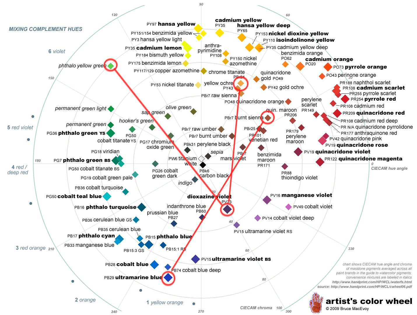
This is the easy part. 2 pigments. In truth, this is a lot like using a recipe- we are aiming for the same results each time. However, you need to know what pigments you're painting with, and you need to be able to locate them on the color wheel. I've done that for 5 pigments as an example- Ultramarine Blue, Dioxazine Purple, Burnt Sienna, Yellow Ochre, and Pthalo Yellow Green. As an aside, in my opinion, it's important if you want to improve to actually know what pigments you are using- not just their name, but the actual pigment. That's how you can locate them on the color wheel, but it's also how you learn about other properties- lightfastness, mixing ability, staining properties, etc. Once you've got them located, you connect the dots. In a nutshell, these are your mixing lines- the results you'll probably get when you mix those two colors. It's that straight forward.
Most everyone has long since learned that Ultramarine Blue (PB29) and Burnt Sienna (PR101) tend to make a good grey, though it's really often a warm grey. It definitely doesn't create green. This is what the Artist's Color Wheel shows. Alternately, I have Pthalo Yellow Green (a convenience mix) and Dioxazine Purple (PV23) on my palette. They're a great mixing pair, as I can move from a very pure green, down to a sap green, to an almost grey, right across in to muted purples. This is what the wheel shows, and it's also what they do. The third example is mixing a Yellow Ochre (PY43) with Dioxazine Purple (PV23)- if we follow the connecting line, this mix creates a consistent range of dull brown yellows that move into dull red browns, down into warm, muted, plum purples. It's a good way to dull down a yellow and not make a green while doing it.
When I get a new pigment, I go through the process of playing and mixing. I try color combos with different pigments and make gradated washes. I test them out on the backs of paintings I don't like, and see the results. Some people make really nice, organized color gradients and stuff. You should check out Jane Blundell's website if you're that kind of person. It's a wonderful resource, but more organized than I care to be. My stuff looks more like this, messy but educational. I learn through making these mixes and small compositions. The primary goal to figure out how a new color will play with existing pigments on my palette, and to see what the mixing lines between pigments will produce. It's my "get to know you" phase.


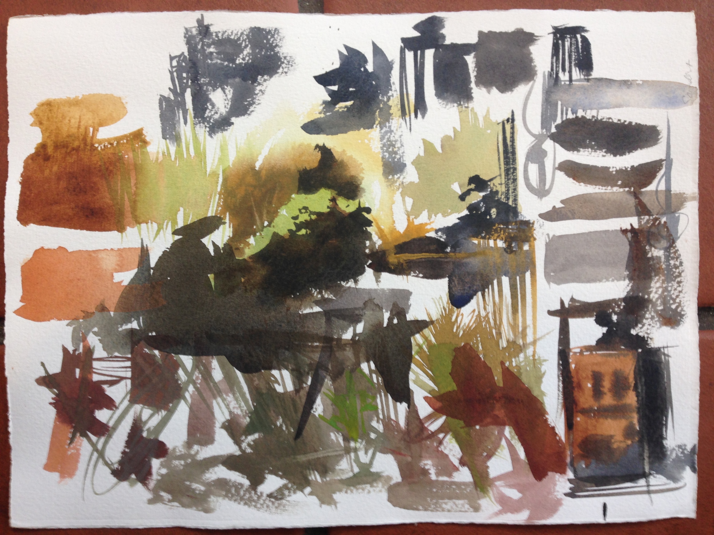


Little mini-compositions help too- it's good to see a new pigment applied. you can see its applications better when its in context.
Mixing Three Colors-
Here's where we can begin to play with more sophisticated results. I start by first mixing only 2 colors, just like before, to get the hue I want. Mix a Blue and a Yellow to get a Green, mix a Red and a Green to get a Brown, etc. This sort of idea. Then I use the third color to play with the chroma- how dull or grey the mix will become. On the wheel, it forms a "T". I think of it like pulling on a string with a rubberband. Let me show you.
First, I mix two colors together. Here, I'm mixing Pthalos Yellow Green and Yellow Ochre. My goal is a dull Olive Green. I mix them together, and arrive at the red dot. Of course, that dot could be anywhere on the spectrum between the two pigments, depending on my ratio. Regarless, my result is too chromatic. Perhaps the trees are far away, and need to be duller and recede. How do I dull down the chroma and grey it out? That's the next part.

Step 1- mixing only two colors
Like pulling on a rubber band, I drop a third color in and pull the mix in a new direction. For this example it's Dioxazine Purple. Just a dab will do ya'- it's a strong mixer. But dropping the color into the mix grey's out the yellow green I'd made in Step 1. Now, I've got a much more muted Olive Green. I've arrived at the desired hue and chroma and I can use the color.
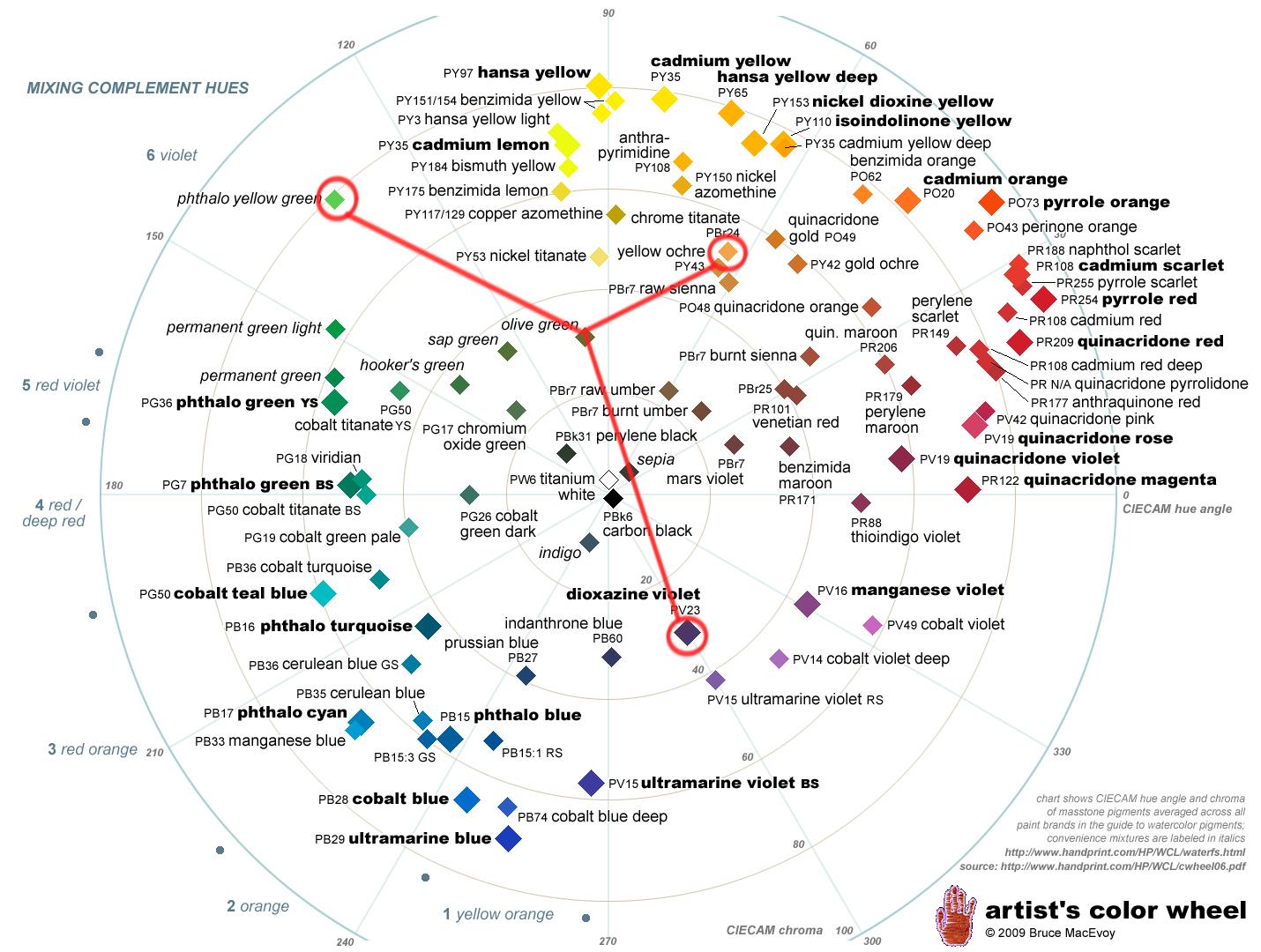
Step 2- adding a third color, Dioxazine purple
What's interesting to note is that if I took Step 1 and used an alternate color, like Ultramarine Blue, I would get a different result. I'd be pulling the rubber band in a new direction. At first, the difference is subtle. Instead of a dull Olive Green, trending towards brown (the mixing path when you add Purple), I would get a dull, dark green blue. The mixing path looks like this-

alternate step 2- adding a third color, ultramarine blue.
And, of course, it's all about ratios. If I just keep on adding more and more Ultramarine Blue, eventually I get a dull, dark blue. Nothing at all like the first two colors. Then the mixing path would look like this, because the Blue would would be so strong. Sometimes this even happens by accident, if you grab too much color. Oops!

alternate step 2- adding __a lot__ of ultramarine blue.
An interesting learning test is to look at a photo or an object in real life, and then try and mix that color. This can be quite hard at first! Much like the last post about practicing technique separate from composition, the idea is to practice color mixing separate from making paintings. Learn how your colors work together first, then use that knowledge when painting. Practicing this will, at the very least, help you mix colors faster when you're in the midst of a painting, without having to labor over how to get a dull green or a violet sky blue, etc.
Next week, I'll do a post on my palette, and how I use it. I share the location of the pigments on the Artist's Color Wheel, and talk about the mixing paths I get from different pigments. I also have a few specialty pigments I use, and I'll try and go over them as well. For now, I hope this post is of value to others! If you've got questions, please post them in the Comments section. I'm sure there are different kinds of details I've forgotten to include.