Color Mixing, pt. 2- Mixing Your Greens
I wanted to follow up on the last post and talk about how I mix my greens.
This is a mysterious sort of color for a lot of people, and many novice painters are steered away from using them. Bah! I love green. It's the stuff of life. Literally. The instant it was suggested they weren't worth using, I bullheadedly determined I was going to learn to master them. So... my continuing journey, documented in these paintings. Still, on a basic level, I can understand why people avoid them. I can make a pale wash of Cerulean Blue for my sky, and it's as easy as diluting it and making a good wash, but a green taken straight from the tube is very garish 9 out of 10 times. Some folks use convenience mixes instead, like Sap Green or Hooker's Green, as a "home base". Power to them if it works. But the truth is I don't even have them on my palette. All my greens are mixed, and this gives me lots of control and variety.
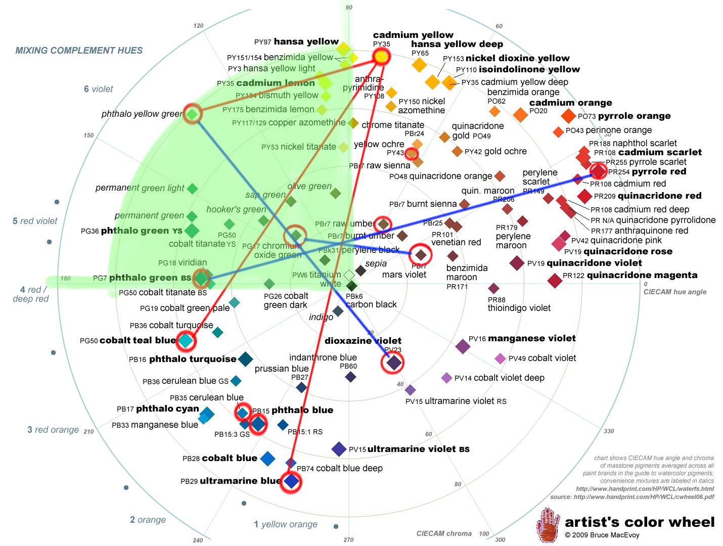
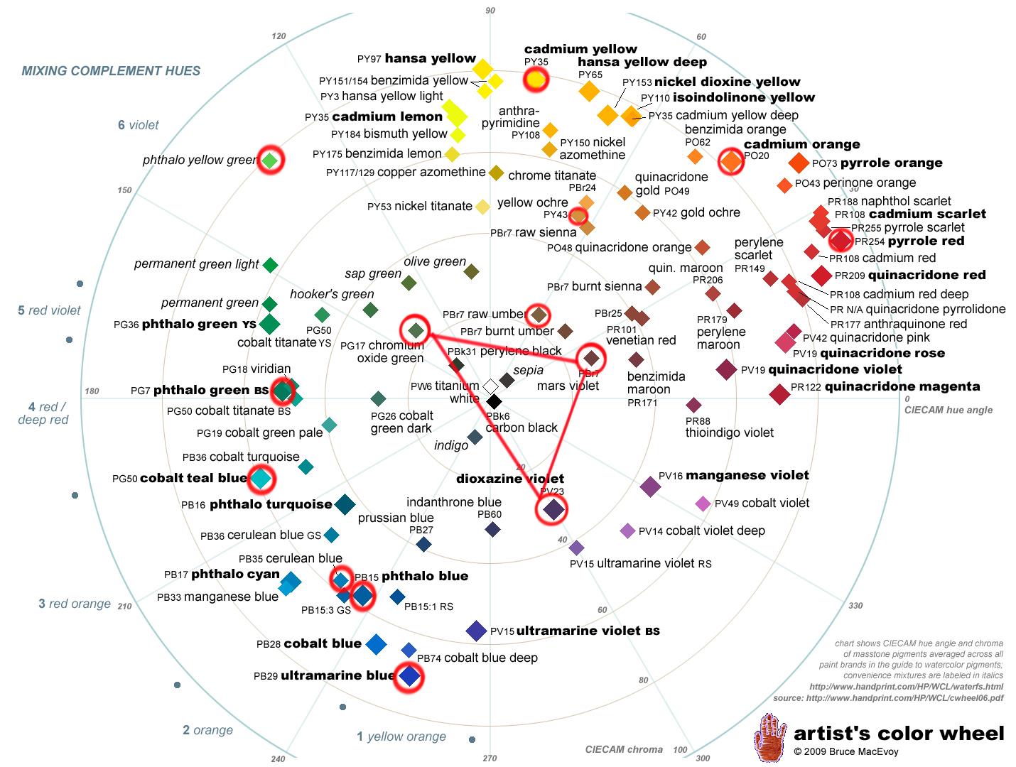
I'm going to be going over some of the mixing pairs I use, as well as the complementary colors I go back to again and again, in order to darken and mute my greens. The red lines on the Artist's Color Wheel represent mixing paths that I get when I'm mixing my hue. Basically, when I'm mixing a blue and a yellow at first. The blue lines represent complimentary colors that dull or darken my greens- the "rubberbands". So, I'll be talking about pigments and using the Artists Color Wheel, but all of it's going to be in the context of paintings I've actually done, instead of it being purely academic.
Finding Your Hue
Much like I discussed in the previous post, I generally start by trying to find the right hue. All my greens basically come from an assortment of blues mixed with one of two yellows I keep on my palette. There's a couple of shortcuts and specific ideas that I'll share later, but generally, again and again and again, I start with 1 of these 3 basic options...
Pthalo Yellow Green + Cadmium Yellow (PY 35)
Cobalt Teal Blue (PG 50) + Cadmium Yellow (PY 35)
Ultramarine Blue (PB 29) + Cadmium Yellow (PY 35)
...or one of these mixes with Yellow Ochre, if I know I want something more muted, earthy, and warmer-
Mixing Bright Natural Greens-
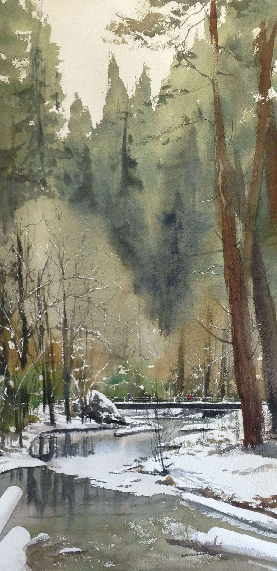
In this painting, "Misty Muir Woods", we have lots of bright yellow-greens leaning towards yellow for the foliage. The trunk tends towards darker green-blue (not grey), as its deeper in shadow. Below, we'll look at the mixing paths that got us here.
For this painting, I used Cobalt Teal Blue and Cad Yellow for my basic mix. For the foliage, I moved back and forth on the red mixing path, depending on how yellow I wanted the green to be. This is as clean as my mix will be. For the trunk, I wanted a darker blue green, so I not only added things like Caput Mortem (I circled Mars Violet because it's the closest color I could find on the chart) or Dioxazine Violet (to darken the mix), but also Ultramarine Blue, to keep the mix dark, but richly colorful.
Mixing Muted Grey Greens-
These pines are a muted, yellowy green in "To Yosemite Falls". Nothing too bright or sunny. Over the top of these greens, the blue greens of the shadowy pines negatively form the shape of the trees in the mid-ground.
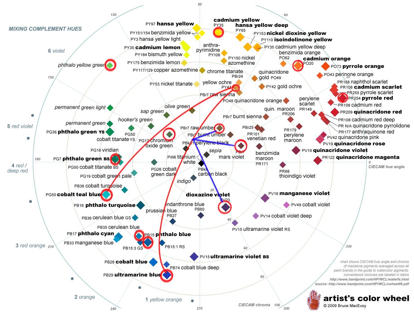
For this sort of green, I mix Ultramarine Blue with a Yellow, which always leads me down a mixing path to a muted green. Therefore, my mixing compliments are also dark from the get go- reddish purple pigments like Dioxazine Purple, Caput Mortem, or Raw Umber. I don't even go for the oranges or clean reds, because I know that's not where I'm aiming when I start. Only for areas where I want a clear kind of pop, along the horizon line or at the focal point, did I add some orange or a very vibrant green-- these color choices are really for compositional reasons though, not because I wanted to mix natural looking greens.
Muted Grey Greens, pt. 2-
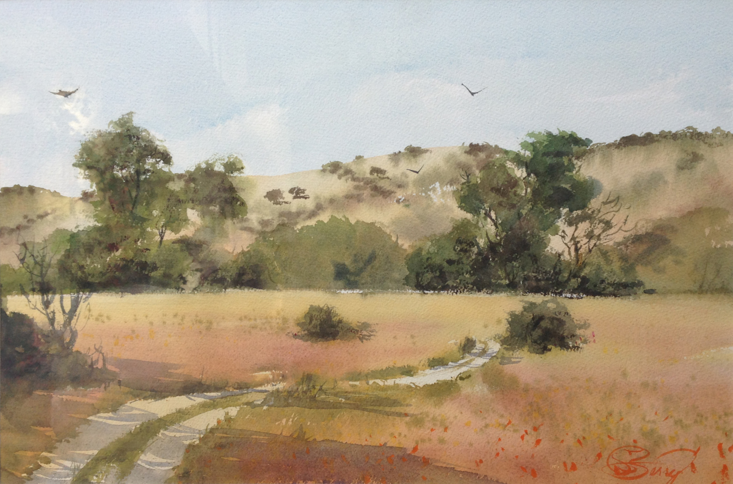
This painting from Garland Park was done plein air down in Carmel. The greens are all muted grey greens with a bit of yellow in them. My aim is to work within a pretty natural color palette, and to let the warmer oranges and rusty reds in the foreground work as compliments to the muted greens. Nothing too flashy. Subtle and calm was the desired affect. However, I was working plein air, and so I had to work quick. No glazing and saving too many of my highlights. Instead, I let some of my opaque pigments do the heavy lifting (which I'll talk about below) with a couple of uncommon paints I use.
This batch uses the same blues as usual, but I mix Yellow Ochre with them. I know I don't want anything too chromatic, and would prefer something "dusty" and more on the orange side, so I just cut to the chase and mix up a muted green that is farther in on the color wheel. The first mixture with Teal Blue goes in for the brighter sections of the trees and grass. Then I mix Ultramarine Blue in and get the second batch, for the shadows. I want to dull some of the trees in the distance and so use some of the various compliments noted below. I'm not too finicky about which. Sometimes I use them all, and just make a muddy green. I won't be lifting, and I don't need anything chromatic, so almost anything will do, as long as I get the right dark, pukey green. ;)
Sometimes, though, you really need something muted, dark, and opaque. Then I use these "specialty paints". Chromium Oxide Green and Caput Mortem are like house paint. Super opaque. They're also near compliments, and so grey each other out. Perfect for a certain amount of California foliage- particularly when I need to cover up layers underneath. I used this opaque grey-green mix for those tiny oaks on the distant hills, some of the taller trees in the midground that cross the line where those hills meet the sky, as well as the shrubs in the foreground. When I have an existing green, and I need to quickly mute it and make it more opaque, I'll drop some of these colors in, and it's a great help. They aren't used much by many painters, but are an indispensable part of my nature plein air kit. I almost never use Chromium Oxide in urban sketching, but here, it's just right. But don't use it if you want bright, clean greens or anything transparent. It's more about quick layering of shapes, and getting subtle, muted, natural greens.
Mixing Very Clean, Saturated Greens-
Sometimes, my goal is to start with as clean and bright of a yellow green as I can find. These sunny, bright leaves in "On the Forest Floor" fall into that category. From there, I mix it with yellow, and get my range of super sunny greens. I don't normally use this- it's only for special situations. It would look garish in the wrong setting, but it feels true for me in this composition from Honduras.
For this, I defer to Pthalo Yellow Green- a very limey green, mixing it with my Cad. For the silhouettes in the upper 1/3, where I moved from a blue-green on the left to almost purely yellow on the right, I added Ultramarine Blue to the mix. It dulls the initial mix and puts it in shadow.
For the deep, dark, dark greens down at the bottom that edge towards black, I used Pthalo Green and Red. They're a good mixing pair, and produce a good, dark black. So, there's no blue in that mix- just a blueish-green (Pthalo Green) and a deep red.
I also wanted to briefly share an alternate, earlier version of "On the Forest Floor." This used a similar palette, with Pthalo Y-G for the limey greens, and Pthalo Green and Red for the very dark darks. However, this image had no blue in it, and no true yellows. The sense of temperature shift, which plays into the feeling of a light source, is missing, and because of that the painting plays very differently. Yes, some of it has to do with value in the upper third, but in my opinion, the visual affects have as much to do with color choices.
Super Crazy Green-
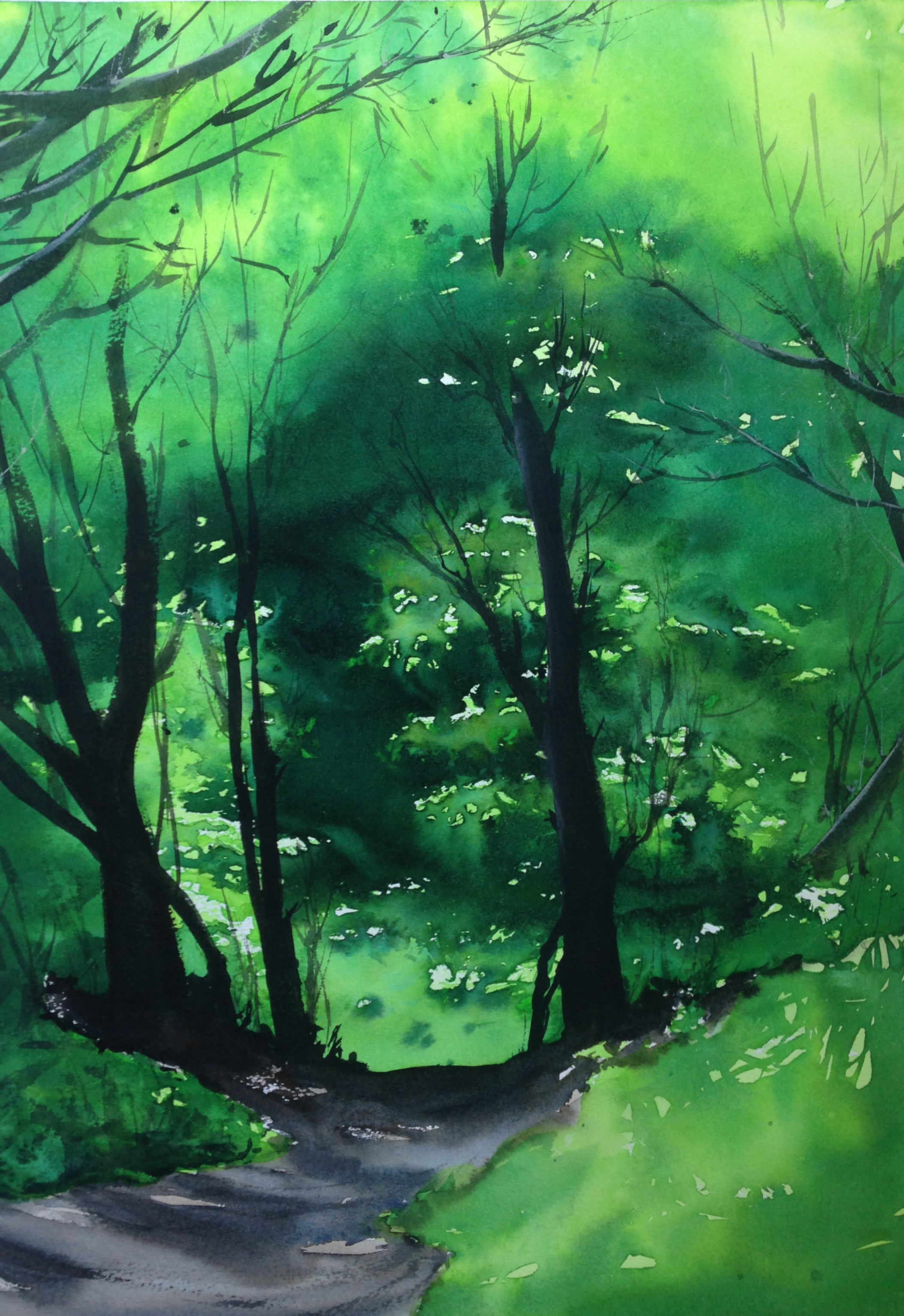
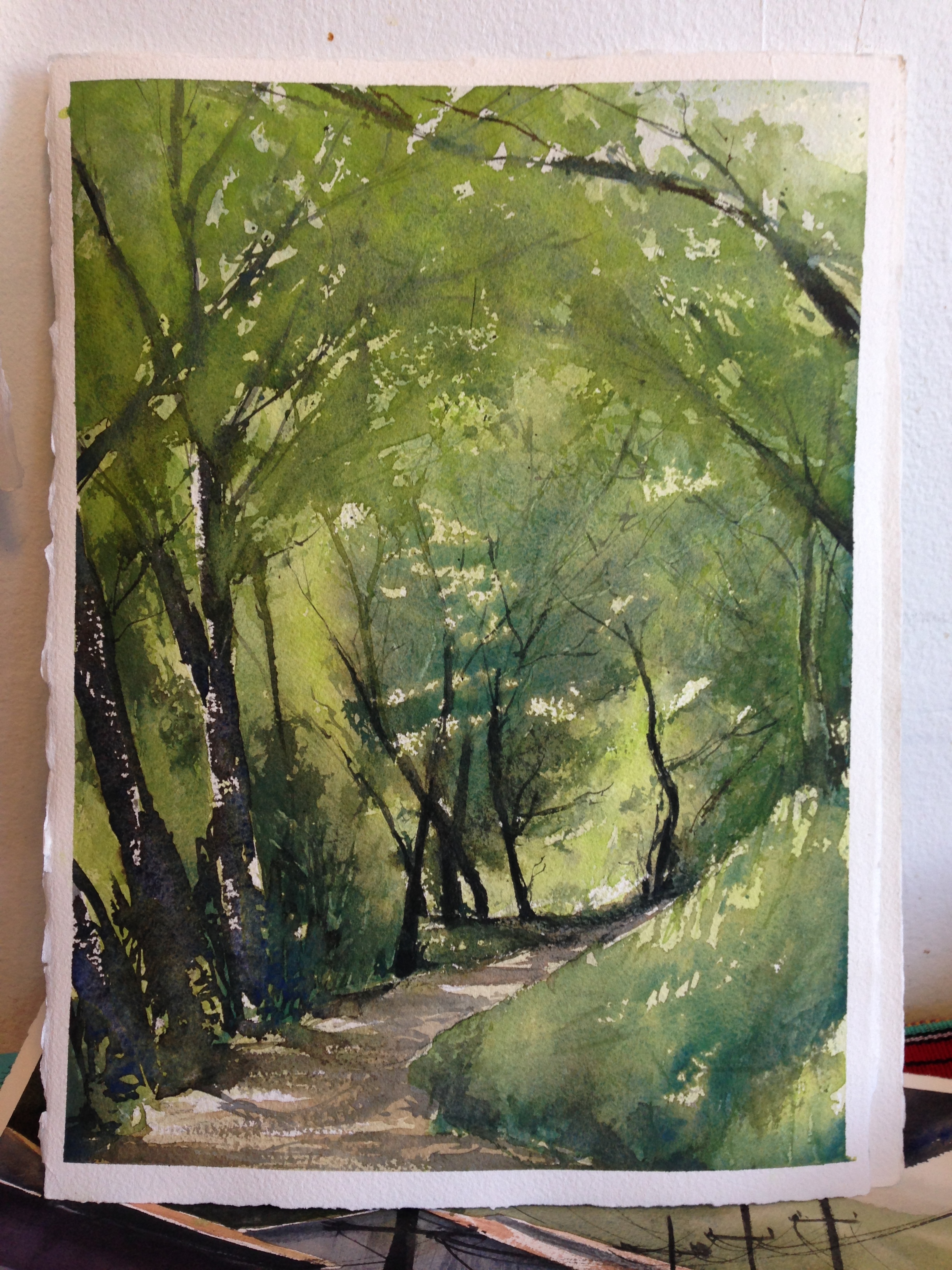
Super Crazy Green. That's a technical term. I included "Forest Path" just to show the full range of greens I've worked with. I would absolutely never include this sort of green in a typical California painting. I almost never use Pthalo Green as one of my greens. It's why I didn't include it in the first diagram with mixing paths. But in this painting from Honduras, I wanted to capture that light and the feeling I had in the jungle there- an overabundance of life and green... well, energy. The sunny areas are the same combo as before (Pthalo Yellow Green and Cad Yellow), but what's different are the shadows. What's important to see is that even the shadows are highly chromatic here. The green is dark and blue, but not black in any way. Pthalo Green is so dark in mass tone that it almost reads as black when it's very dense, but it still feels rich and chromatic. So, when I'm thinking about shadows, sometimes I go blue, and sometimes I go grey. It depends on the painting's subject and my intent.
Also, look how different this painting feels when I paint it with different greens. I did this iteration earlier on with a much duller, yellowy-brown mix. More like Sap Green or an Olive Green. Yes, the composition is slightly different, but beyond that, It just wasn't the same experience for me. It's the greens. Although it does rather look a lot like a path through the woods in California. So, how you use the Greens matters! :)
