Forest Path in Honduras
This painting started with a very very rough plein air sketch in Honduras. Here's a photo of the location, and the plein air sketch-
A month or so later, I came back and painted it again at home- tighter and cleaner. Too clean. But it let me get a handle on the image, and how I was going to need to approach the logistics of painting it. Of course, I almost never just duplicate the previous painting. So, I also played with the composition and backed up some. It has much more in common with the photo.
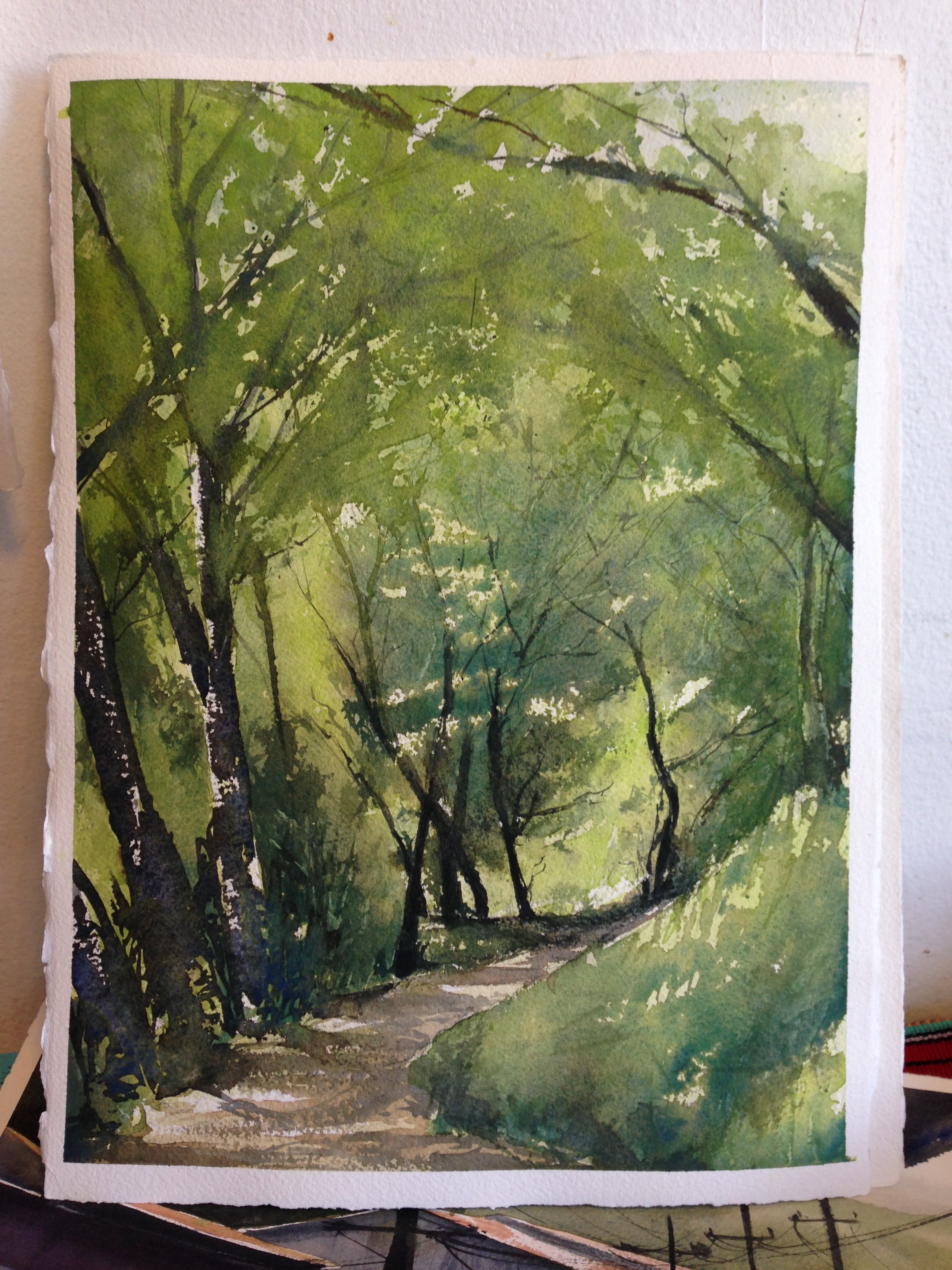
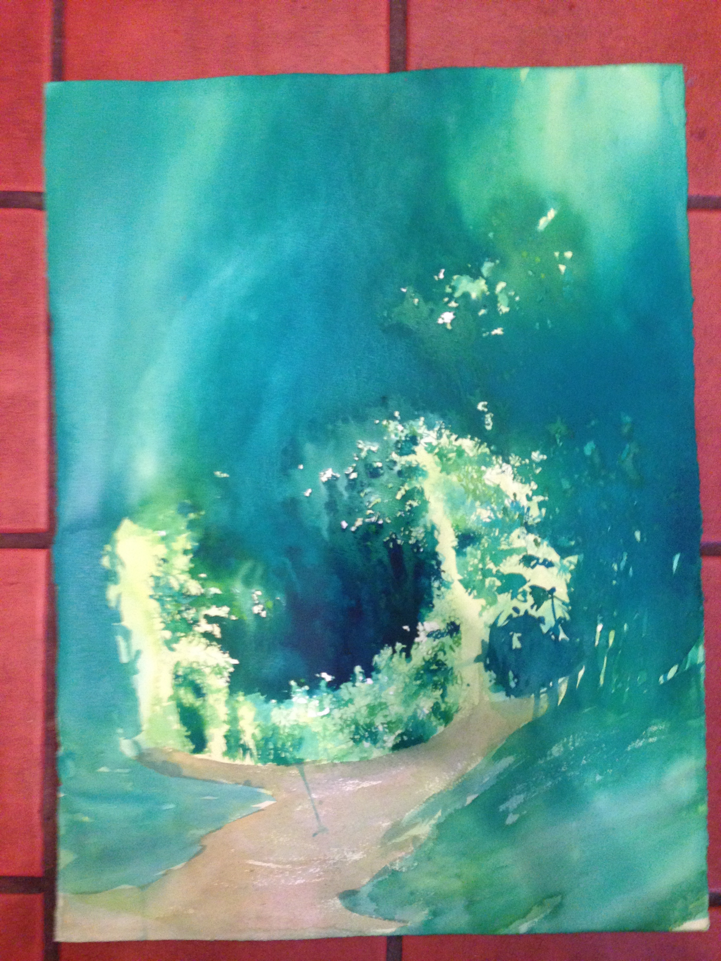
Then I decided to try some wet into wet work, and I switched my pigments and brought in Thalo Green and Thalo blue, to get cleaner greens. Even when going very dark, the greens are very chromatic, instead of being chromatically muted. They're also generally much "greener" greens, instead of being so yellow, as in the first image. From this, I got the primary image you see up top. I wish I had taken more progress photos, but here's what I've got. I did a wash earlier, and let it dry. You can tell because I have hard edges with a different color under them. Of particular interest is how the photos record the desaturation that occurs as pigments dry.
Hyper chromatic greens...
dry to something a bit duller.
the final image with the 3rd layer wet on dry, on top of the previous photos.
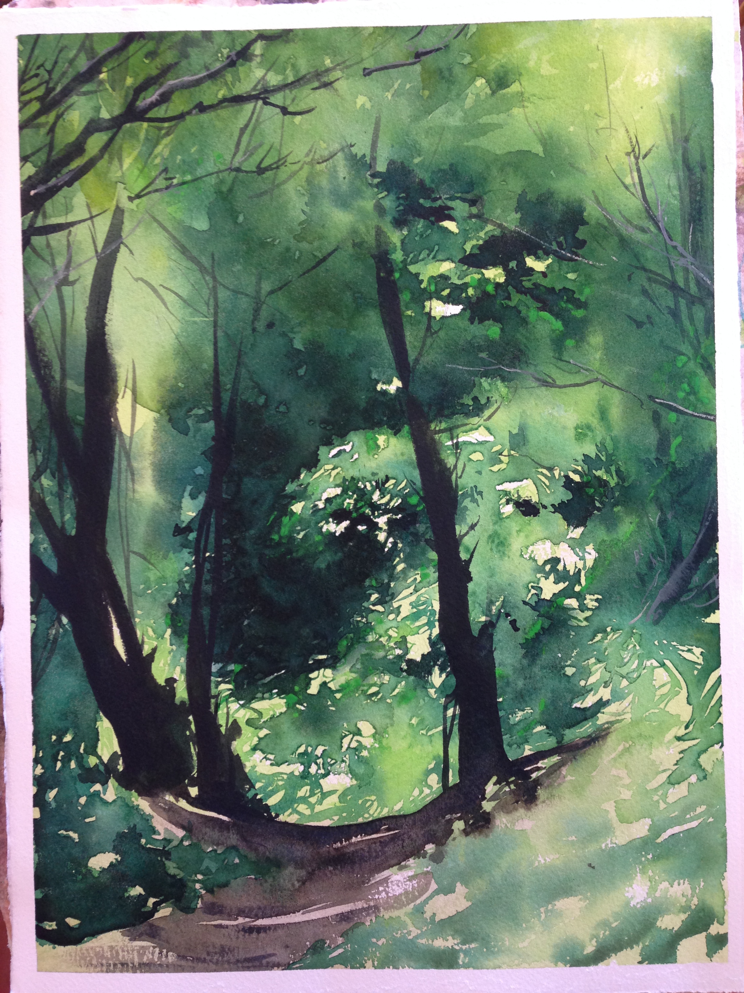
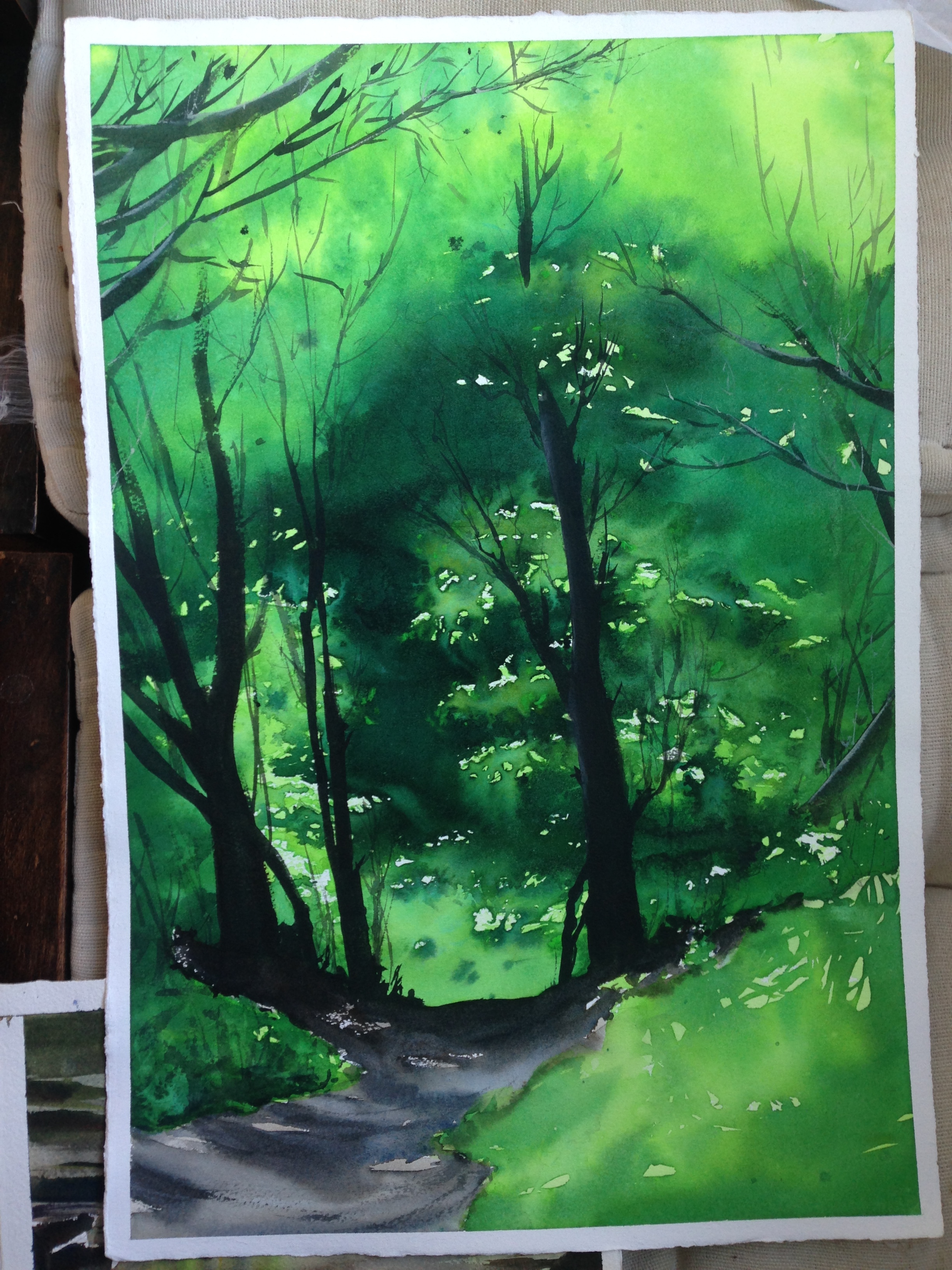
I tried enlarging it. I liked it, but not quite as much. I suppose its a matter of taste. The trees have a more detail as I "grew" them, and this ended up drawing the eye to them, more than past them to the sunlit trees in the distance. My vision had always been to take you down the path and then into the deeper woods. I wanted the trees to be like a gate leading you to the primary subject, rather than being the subject themselves. Unfortunately (as I saw), the added detail stops and holds the eye at the tree trunks instead. I even tried doing it again, full sheet, but no go. I just let it go. My greens were way too blue (I had brought some Viridian in- a bad mistake, since it's too blue), and I lost my way.
1/2 sheet attempt
full sheet attempt
In the end the smaller version appealed to me most. Perhaps it's another example of "smaller is sometimes better." Most important was that the detail is in the right location, to pull the eye and have it stop where I want it to go. I also had issues with the wet into wet work in the later versions, so that's its own problem. The three images are not duplicates, that's for sure, despite their similarities.


