Growing a Painting- To Yosemite Falls
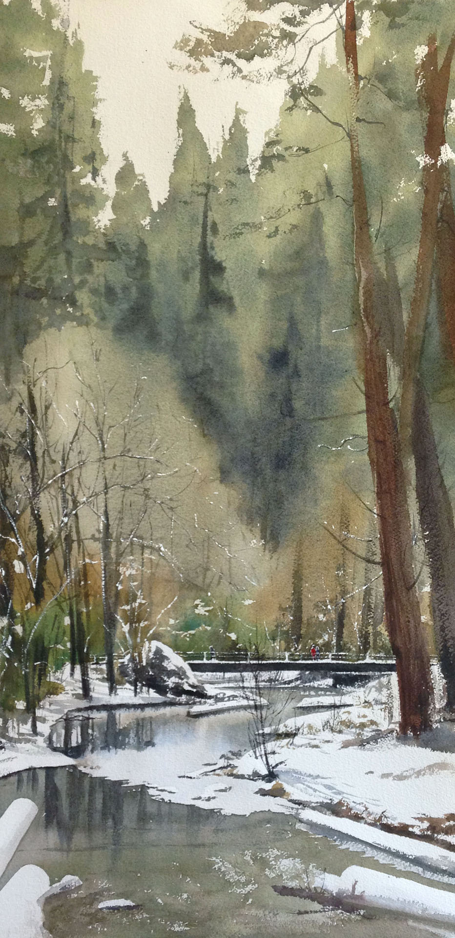
"to yosemite falls", 15" x 30"
I developed "To Yosemite Falls" for the juried show "Celebrating National Parks in California", and it got accepted to the Wilding Gallery's exhibit. Yay! :) I'll be framing and shipping this off late next month for the kick off at the gallery in June. I definitely don't make them all, so it's nice when it happens.
Last I posted, I'd been talking for a few weeks about how smaller paintings are sometimes better, and I wanted to share the other side of the coin-- situations where making things bigger seems to help the composition. Of course, when I repaint things I explore changes in color temperature or values, but for much of that I could keep the image size the same. If I'm expanding the painting into a larger sheet it's for reasons besides that. Generally, either the composition is the same but I want to show more detail (essentially, I "zoom in" by painting it larger) or I expand the composition, but the amount of detail is the same in the area I painted the first time around.
For "To Yosemite Falls" I started with this smaller, 1/4 sheet sketch. Pardon the color and values on the right- the photo had uneven lighting.
Successful enough to go for something bigger. I liked the composition leading you in a meandering line to the couple with the red jacket. I liked the darker values at the focal point, and some details like the ice on the water. So, I went back to the drawing board. But my goal wasn't to simply paint it bigger. I actually liked what I had done earlier, and didn't feel a need to change that part. Instead, I worked expanding the composition to complement the focal point and provide other points of interest for the eye to roam around. Of primary importance to me was to really share that grandeur I feel when I'm walking amongst those trees. To help reflect that, the final painting is tall and vertical-
If you compare it to the original, you can see that the original section of the painting is very similar. It's the rest that I've "grown" and expanded the image into that is new, including a slightly larger foreground and the vast upper area with the trees.
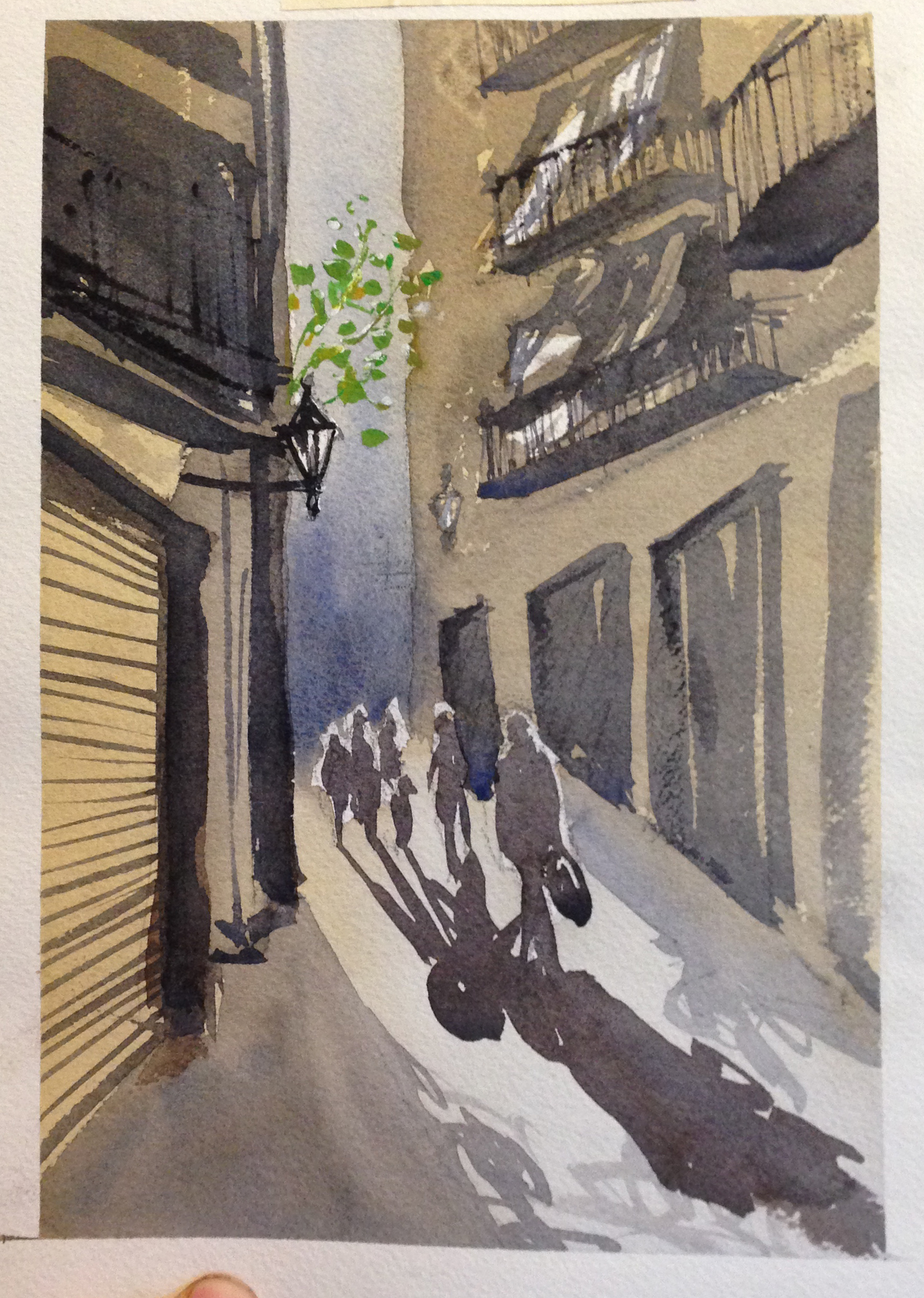
In this painting from Barcelona, you can see two different changes- from 1/8 sheet to 1/4 sheet, and then finally to the largest of all. Each move either zooms in and gives more detail (1st to 2nd painting) or expands the composition to include a wider view (2nd to 3rd painting).
#1- 1/8 sheet sketch. very quick and simple value study.
#2- 1/4 sheet painting. very similar composition, just a lot more detail.
#3- bigger painting, with the primary goal of changing the composition and making it more vertical. the level of detail is actually pretty much the same as the last iteration.
In these paintings below, you can see that the painting is grown with each iteration. As before, I'm exploring value and color shifts with each new painting, as well as the general finesse the image required technically, but beyond all of that, the level of detail is really very similar between the three images. The actual area covered by the mountains and foreground is physically the same in each painting. They're all actually the same width- 15". Instead, I'm exploring the composition as I grow the image and shift the ratios of sky to land.
11 x 15. my 2nd attempt as I played with color in different ways. where's the first attempt? who knows...!
15" x 22". My 3rd attempt. Playing with color and value, but mostly with composition. The level of detail is the same, as the bottom is similar to the previous attempt
11" x 30". the fourth and final attempt. Some changes with value and color again, but the primary difference is composition. the painting gets taller and taller, and I've made the foreground bigger as well.
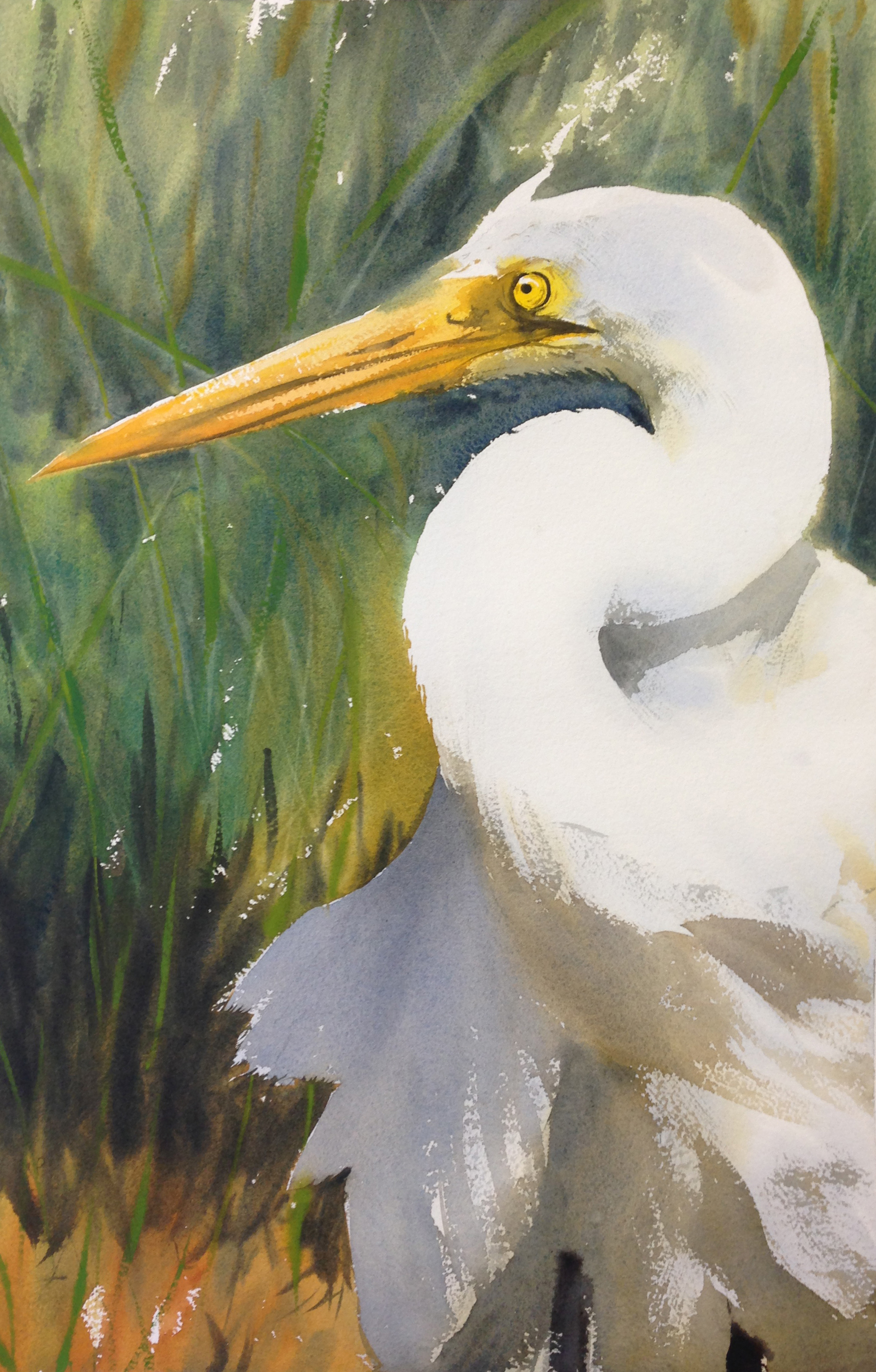
Here are the 2 Snowy Egret paintings I did last winter. The two paintings are different sizes (15 x 22 versus 22 x 30), but the egret is basically the same physical size in each, with the same amount of detail. Instead, the composition changes to allow more breathing room- the ratio of open space to bird shifts, and the birds location in the greater context changes. It also allows for a greater variety of values and color shifts (warm to cool) to provide contrast for the bird.
the first attempt on a 1/2 sheet.
the 2nd attempt on a full sheet. the bird is actually the same size as the first bird- it's the composition that is changing, not the level of detail.
And one more go. This one shows the shift from less to more detail as I "zoom in" and paint the scene bigger. The composition is almost exactly the same in each. The primary difference is the level of detail I'm allowed to more easily put in. This is a less common path for me, but wet into wet work is harder to do freely when the image is smaller. The larger canvas allowed me the ability to do wet into wet work and have the level of detail and nuance I wanted.
#1- 1/8 sheet sketch.
#2- 1/4 sheet sketch. same composition, just more detail. Also, it's shifted to wet into wet.
#3- 1/2 sheet. same composition, just bigger and with greater detail.
It's also worth saying that the last time I posted I got a variety of really interesting comments about painting larger. A repeated motif was to paint larger but not necessarily to include more detail. The gist would be that you would use larger brushes, I presume. I admit I've not painted this way much, and so can't comment on the process, but it's clear if you look at the work of artists like Alvaro Castagnet that you can paint larger and keep your image simple and very compelling. Good design is still good design, of course. Perhaps this is an approach I'll have to try, but for now I'll have to put in the "to be done" column. It's not something I can really offer much input on yet. I love that people are giving input though, and engaging in the conversation. Thanks for the thought provoking comments!


