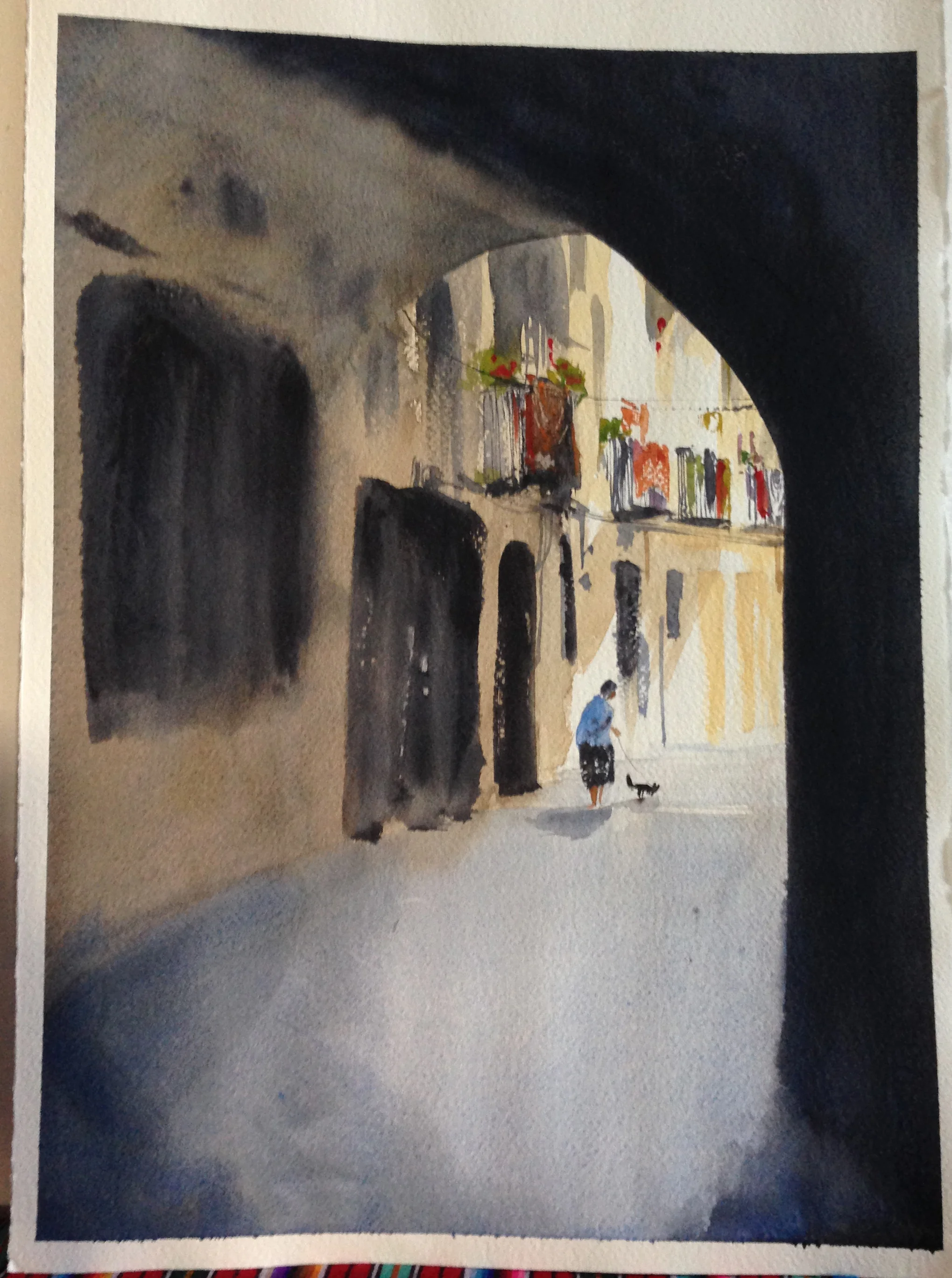
Sometimes Smaller is Better- Dog Walking in Barcelona
Deciding what size you want your painting to be is an interesting subject. Nicholas Simmons liked to say, "Go big or go home!", Alvaro Castagnet almost always seems to paint 1/2 sheet in classes (which he said was because it helped students better see the work during demonstrations- a comment I've read elsewhere from others), whereas Chien Chung Wei often painted as small as an 1/8th sheet, since he thought it helped his students to see him paint on paper the same size as theirs. There's a lot of perspectives out there, and I think a lot of it has to do with how you work- what your tools are like, how wet or dry you paint, how broad your movements are, etc.
I like to paint 1/4 sheet for my sketches, and rarely work 1/8 sheet currently. If I mess up, or don't like the composition, it's only a 1/4 sheet anyways. Beyond that, I like broader movements with bigger brushes, and wet into wet work (which I'm doing more and more of) seems to require a bit more room to breathe and soften. Still, not everything is a sketch, and as I work on more "finished" paintings, I often start to work bigger.
Working bigger can be exciting and challenging. It is, definitively, a very different experience to walk up to a painting that is so big it eventually encompasses your field of vision. As an artist and as a viewer, you can roam around in it more and explore different details in different areas of the composition. The bigger it gets, the more the image can also play on two levels simultaneously- as abstract brush marks and as a realist image. Back up, and it coalesces, zoom in and it explodes.
But sometimes, I feel, smaller really is better. This is something Joseph Zbukvic commented on in the workshop. As he felt it, some subjects were just fine on a smaller piece. Where would you take it on a larger canvas? I recently did this painting of a woman walking her dog in Barcelona, and it drove that lesson home.
Here's the reference photo and the sketch I did-
Interesting bold shapes and contrast, a clear subject, a little drama. I was sold!
I did the first painting as a quarter sheet and liked it.
So I grew it to 1/2 sheet, and the results were..... meh.
The next week I did it again, changing a few other things, trying to recapture that magic from the first attempt. Nope.
There's actually a middle one somewhere that I also did. I think I just threw it away. Anyways, I showed the paintings to someone else, and as we were comparing them she said, "I really like how you did this final one here"... while she pointed at the first one I'd done. And eventually I thought... maybe this one is just better smaller.
Now, some of the issue has to do with the fact that painting larger requires a different set of skills. It's harder to do, wet into wet. You have to control moisture levels over a broad area, etc. So, IMO, the 1/4 sheet shows more technical skill because things are easier to control at that size. But still...
First, this composition is a simple one. One of the things that became clear is that, as I grew the image, I didn't really have more to say. I noticed I began to include more details in the sunny focal area, but it was mostly because it felt so empty otherwise. The space called to be used, but I had no function for it. Also, the composition didn't really change as I painted the scene larger. There aren't multiple focal points to move through. The powerful lines of the shadowy corridor lead you like a bullet to the old lady walking her dog (or cat?!?). When I made the image bigger, there wasn't particularly more compelling detail to explore. Instead, the dark swaths of dark corridor became sort of giant blank spaces. I made it bigger out of a desire to perhaps make it a more compelling viewing experience, but in the end... I just felt like it accentuated the limitations the composition had from the get-go.
I really do think smaller is sometimes better.


