Step by Step- Both Above and Below
Big Ideas About the Drafting Process-
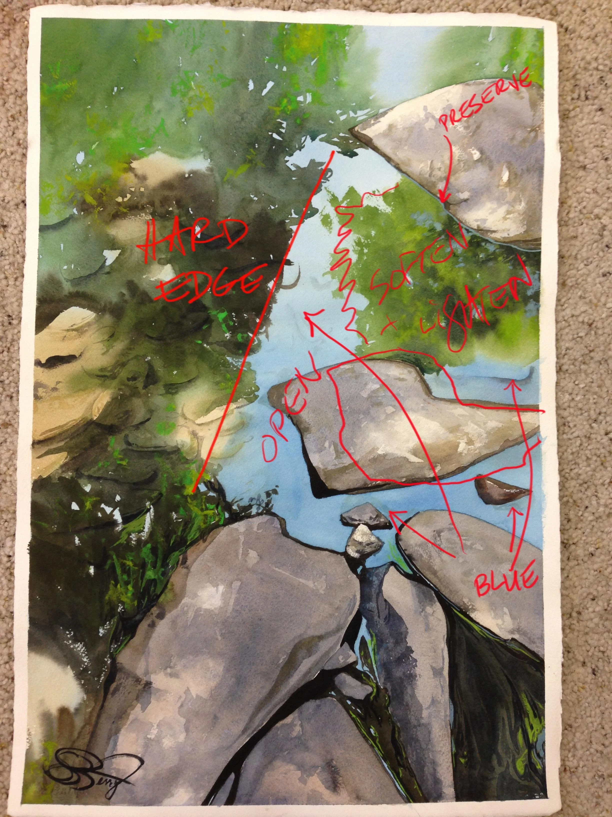
Last week, I spoke about drafting and "growing" paintings. Here's the notes I made for "Both Above and Below"-
I liked the underwater rocks on the center left, the softness of the area in the upper left, and how the composition led my eyes. I thought the tree on the upper right was too strong, that the edge of the tree reflections on the left was too hard and dark, and that the center area needed to be opened up. I also felt that the dry, above-water stones weren't rugged enough in the first go, that my darks were far too dark, and that this sort of "rim" I had around some of the stones was working against constructing a sense of directional light.
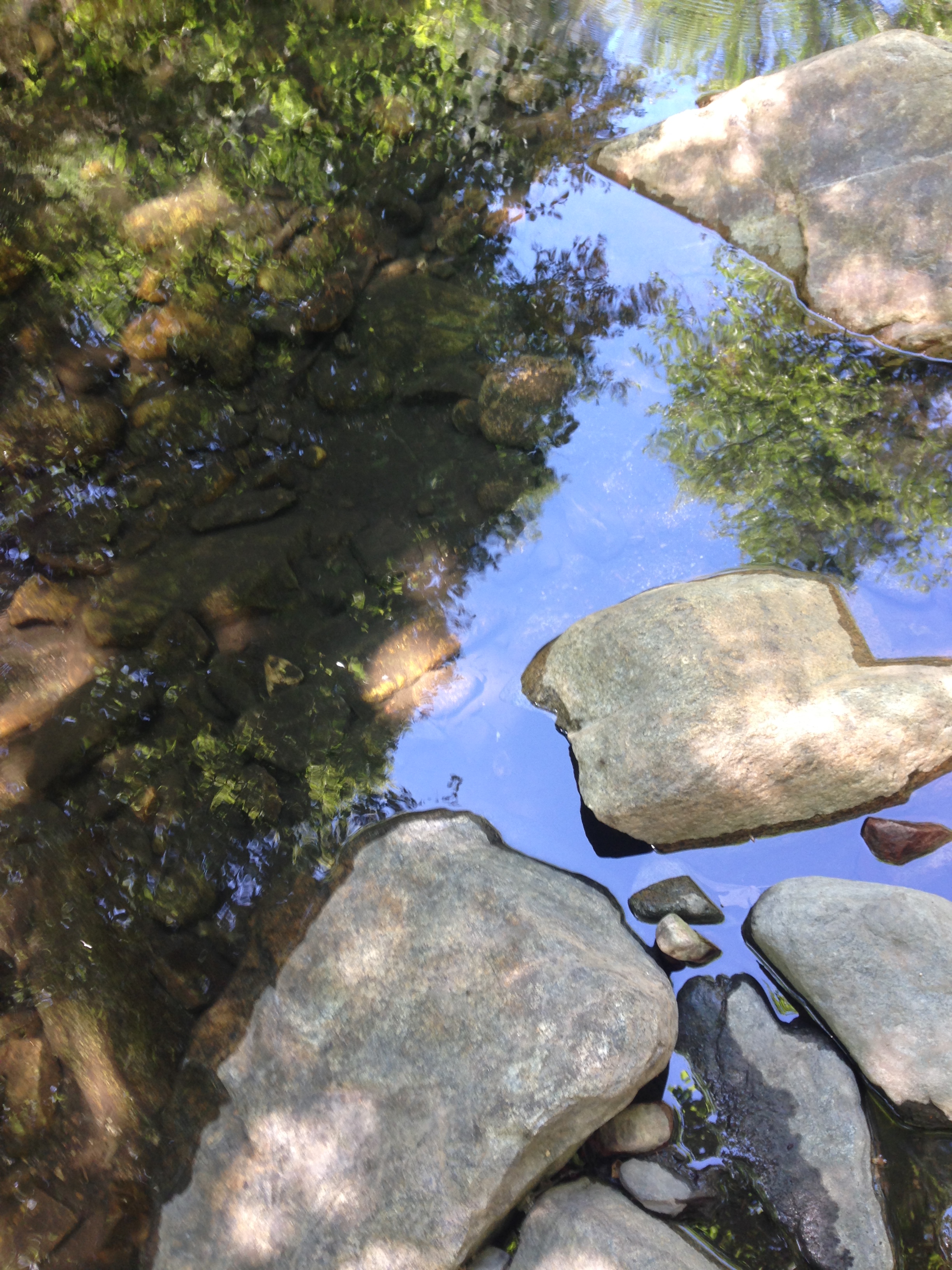
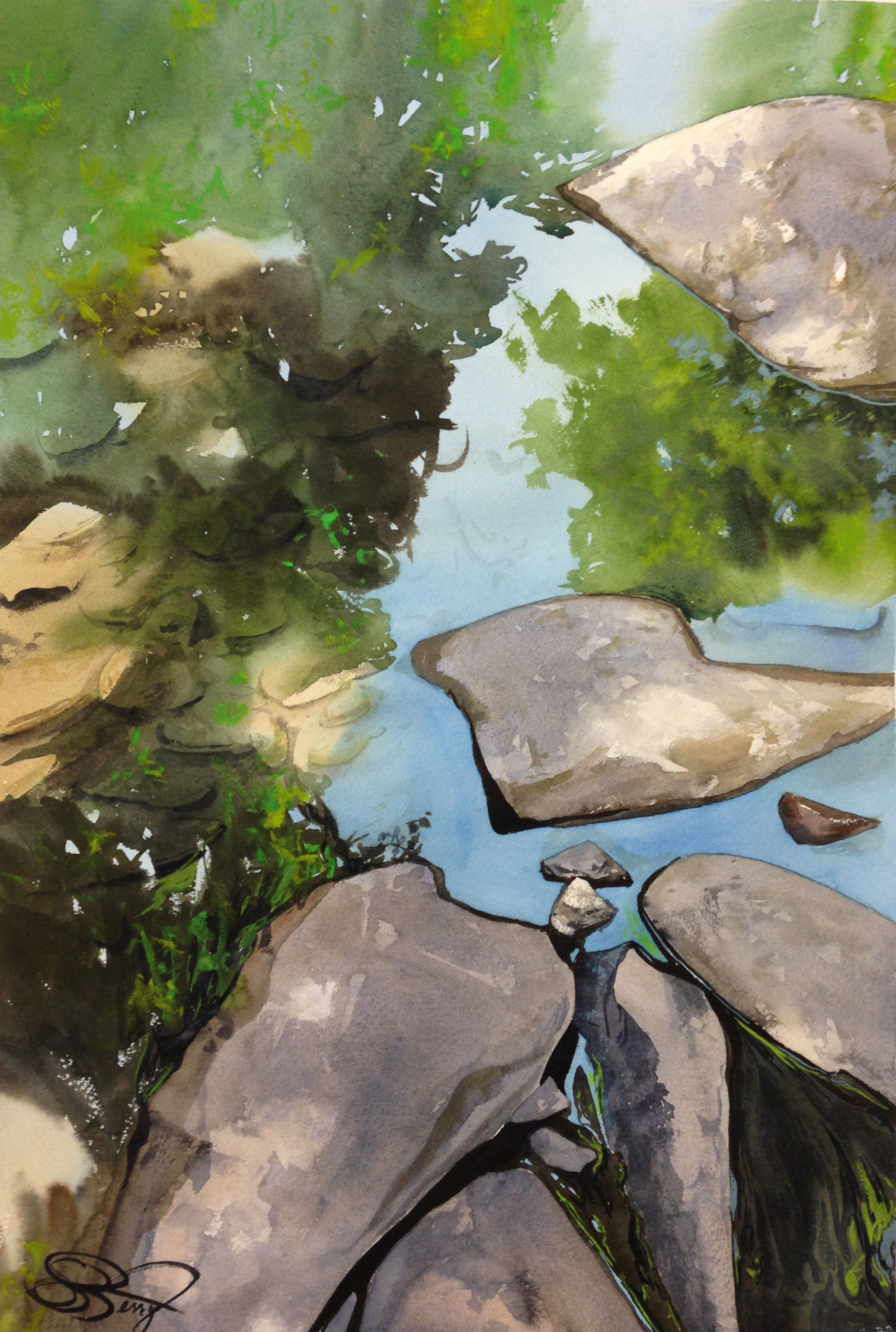
Here's the original photo, the first draft, and the final one. All 3 have their appeal to me, but they're definitely not the same. In particular, with the final painting I was trying to "open up" the darker areas of the photo and first draft, so I could see deeper into the water and create a more sophisticated sense of visual hierarchy. I want the eye to switch back and forth between the water's surface and the stones beneath. Let's see how I did what I did, as I transitioned from a 1/2 sheet to a full sheet. The whole process for the full sheet took about 6-7 hours- a pretty long time for my typical style of painting.
Step by Step Details-
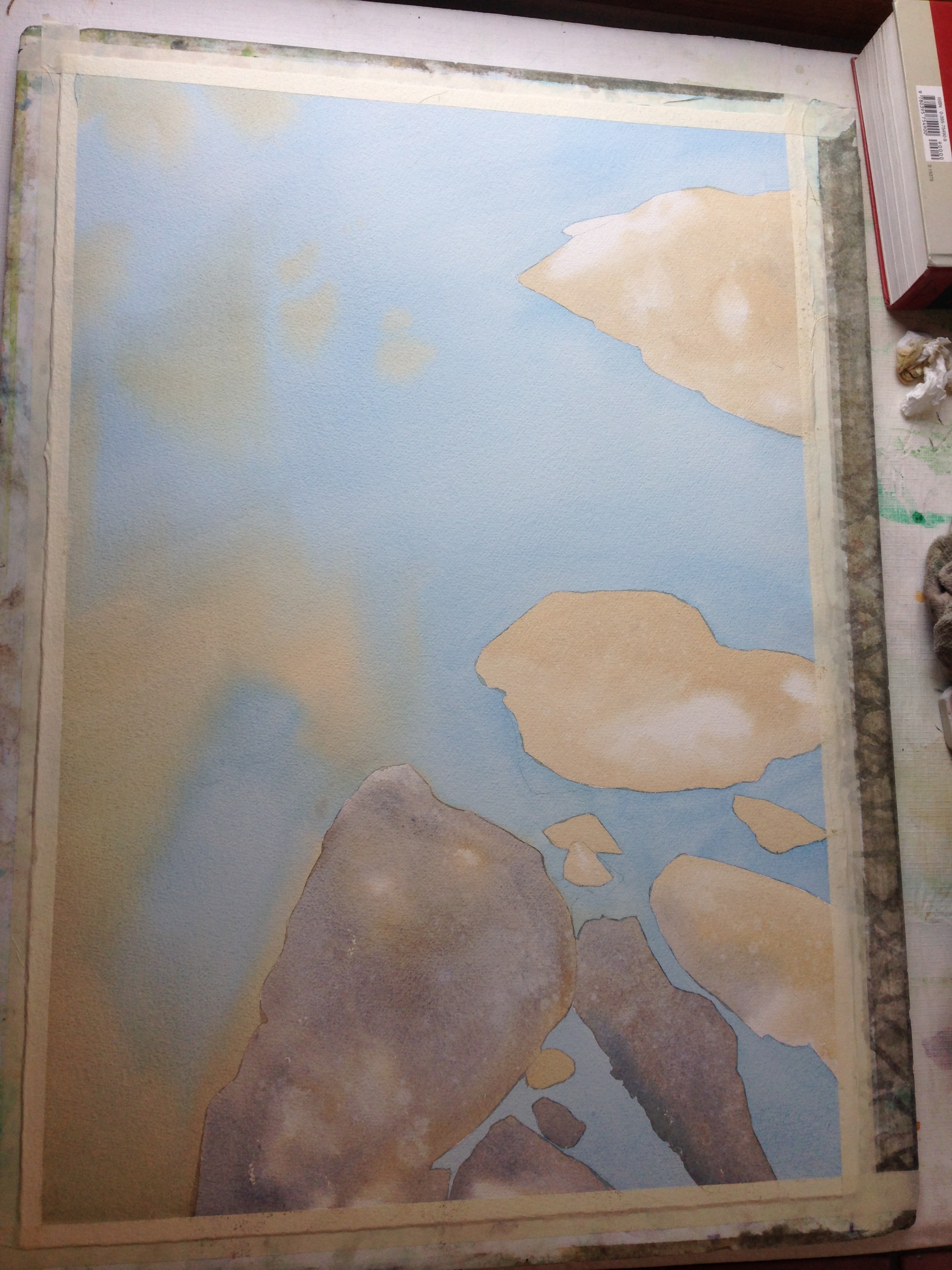
Step 1 and 2 are pretty straight forward. I drew a simple yet controlled sketch of the stones, getting the location of the above-water-focal-point just where I wanted it. The two washes are the base colors- warm versus cold. The stones and the water have a similar value, even though their hues are different. Therefore, because the edges are hard, I had to do them one at a time. Note how I preserved white sunlit areas on the stones, wet into wet, with soft edges.
step 1- the water with pthalo blue and a muted yellow ochre mix (yellow ochre, ultramarine blue, and burnt sienna), wet into wet.
step 2- the stones, with the same muted yellow Ochre mix.
Once the water and stones were dry, I glazed in the dark masses of the tree reflections for Step 3. Some edges are soft and some are hard. Some edges I laid down the pigment and then softened the edge, other times I prepped the area with water and moved the pigment into it. The goals here were three-fold- 1) I wanted to draw your eye to the details, and to let less important areas drift away, 2) I wanted the shadows to be less dominant in terms of value, and 3) I wanted to break up the edge of that very hard shadow on the left, so your eye would want to wander into that area more and look "into" the water to the rocks below.
step 3- the tree reflections go in. The paper is dry when I start, so I can control when I get hard and soft edges.
step 4- I start detailing the stones, with my first wash of ultramarine blue and burnt sienna. Yes, I'm spitting on the stones to get that speckled look. :P
Painting the stones is a painstaking process of paying attention. For step 4, I glaze in the first shadowy layer, softening my edges to preserve soft speckled sunlight, and spitting on it very delicately as things dry to get that peppered look. Step 5 is all the "scruffy" stone work- dry on dry scrumbling with the edge of the brush for texture, and the opaque Jaune Brilliant No. 1, very thickly applied with the side of the brush, so it also catches the texture of the paper.
step 5- 3rd and final round on the rocks. this is almost dry on dry.
step 6- the rocks under the water go in, very softly in terms of value.
From here, it's the home stretch. I begin to lay in the shapes of the underwater rocks and I drop it in the richer, cleaner blue in the bottom right area, to "lay down" the water, so it fades to a paler blue up top. This is part of the subtle "visual hierarchy" I was talking about earlier.
Step 7, below, is the final painting. I drop in another rich layer of shadows for the underwater stones, and then another again, but each time I graduate the value outwards from the darkest, richest area (bottom left third). This ends up being a surprisingly important part of the process to me, because the underwater stones there and the speckled blue light on the water's surface, are the compliments to other more obvious points of interest, like the "above water" stones. The two areas need to act in tandem, and have comparable levels of interest, to allow my eye to travel back and forth and dwell in each space. I even dropped another quick blue wash on top of the speckled sunlit areas to push the richness of the chroma, so they'd really pop. Those very pale shadows towards the center of the painting, where the yellow-brown reflections transition to a mirror-like blue sky, become critical for the mental transition from one visual plane (the water's surface) to the other (stones below the water), so I kept the value of the tree reflections and the stone shadows very similar and muted. It's like a pale "door", where many different shapes meet and overlap.


