Learning to Critique Your Own Work- 4 Examples
I've had the opportunity to make some new paintings recently, some plein air and some studio pieces, and as I critiqued them (both for the good and the bad), I thought- this is an opportunity! A number of these I'm thinking about painting again, either at the same size or bigger, and as I ponder that sort of process, I'm always assessing my own work. I brought it up in my article in The Art of Watercolor too, but I didn't really have an opportunity to really talk about how one might go about it. There simply wasn't enough room. And so, todays post...
Of course, before I start working on a painting, I plan some things out and think about it- composition and subject matter, the logistics of building it, etc. But nothing really replaces the experience of knuckling down and just getting to work. The best place to learn about painting is through doing it! It's after I'm done, as I assess my work, that I notice things. Of course, I'm always seeing things I could do better, but sometimes it's things... that I didn't even consciously mean to do, but which I like nonetheless. The goal is also to assess the successes like these, so that I can keep them actively in mind the next time I paint.
To help with thinking about both results- the good and the bad- I've made two versions of each panting. In each of the paired pictures, the blue lines represent what I liked, and the red what I thought I could improve on. I'm sure you'll see a theme as I work my way through, but as a sort of cheat sheet, here's the broad, repeated ideas-
1) Peers- Getting input from others really helps!!! If your eyes are not fresh enough yet, the eyes of others may be. Quite a few ideas I share below came from crits I got from other people.
2) Come Back Later- Looking at your own work off site also helps you see deficiencies that aren't clear when you're on site and dealing with the location- particularly compositional issues, where your eye wants to naturally wander. It's a great pleasure (that's also very useful!!) to be a critical viewer of your own work, after the fact, instead of just the maker.
3) Learn From Your Happy Accidents- Finding happy accidents that you like is an important part of figuring out how to make them "intentional happy accidents" later on. Critiquing your own work can help you see these things better. Don't deny the value of teaming up with watercolors. If you really like an effect that you didn't do on purpose, the goal should be to start practicing it soon after the last painting (a few days later? a week later?), so you figure out how you can repeat it on purpose.
4) What's The Story?- When you no longer have to compete with the site (it's so big and beautiful and right in front of you!!), and all your left with is your painting, the STORY it tells or doesn't tell becomes much more critical. If you set out to do something on purpose, here's you chance to see if it really works. Does the painting still interest you, now that you're no longer there?
Ok. Let's dive in!
Santa Cruz Cliffs-
In this piece below, I wanted that pair of silhouetted trees to be my subject. I placed them at the 1/3 mark, and spent some time on them. I really like that area. I also took the big mass of trees up to the top of the paper, to try and divide the painting into different shapes, so the sky wouldn't be so dominant. I liked the wet into wet work down below, on the beach, and at the end I added in the weeds in front. I was happy with the largest weed, in particular, which I deliberately used as a tool to bond different areas of the painting together, and to "point" up to the trees. I did intend for the distant trees to be grey and muted, but, a bit by accident, there's also a diffused, mottled look to that area which really expresses the misty roar that was going on that afternoon. This was more in the "pleasant surprise" category, but noticing it afterwards, it's something I'd repeat 100%. Similarly, this misty, humid atmosphere really comes across down on the beach, where the sea spray was intense. Did I mean it to be wet into wet? Yes. But did I mean it to express that misty surf so well? No, honestly. But now that I've noticed that, I'd do it again too.
Having said all that, I wish I had done a number of things differently. I like the weeds as a tool, but looking back, I wish I had used them more delicately. If certain areas had been left empty, the weeds would have been even more useful as compositional tools, framing things. Speaking of composition, I wish I had cut off the far left, which bored me, and expanded the sea area a bit more. This fed in to my larger feeling, which was that the image was missing a powerful enough focal point. If I shifted the whole composition to the left, and opened up the weeds a bit on the right, I would have a great opportunity to gently frame and locate something down below on the beach- people, driftwood, a man with his dog, something of the sort. Basically, I'd create a closer focal point that the two distant trees could act as a compliment to. Besides that, I missed the opportunity to push the contrast of the path a bit more, which was there on the left, and would have led the eye back and forth better, to those distant trees I spent so much time on.
These sorts of things, where I begin to track my eye and how it moves, are a big part of how I refine a composition. I also often share my painting with others and get feedback. Not to be over-rated!! A number of ideas I listed here today came from other minds.
Davenport Pillar-
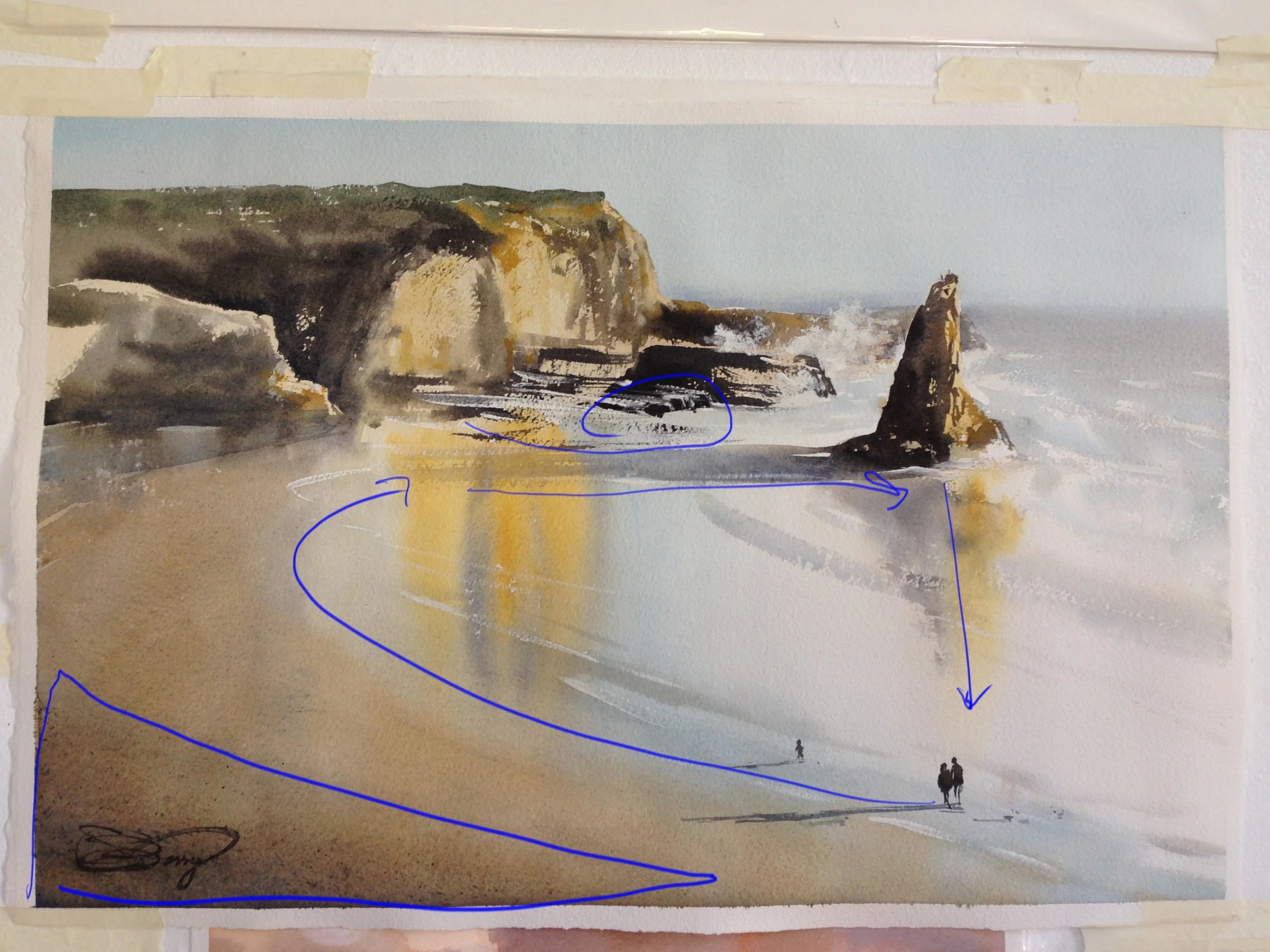
I liked this next one, honestly, quite a lot. I knew what I wanted from the get-go. I worked on the reflections and my values and the sense of late afternoon light we had while there. It was only after I finished on site work though, and really looked at it at home, that I began to notice how empty the bottom left felt. At that time, I hadn't yet darkened that corner (which draws it forward), nor put in the last few swipes of darker waves and their white highlights. So I taped it back up, and got to work on it. As I did this, my eye began to follow the new, stronger shift in value up the beach. I then followed it over to the pillar, and finally down its reflection. What was missing was a human subject, and a sense of scale. I put the people in, and repeated the long shadows that before were only seen stretching out from the pillar. Now they were a team, all expressing the same sort of light. All of that happened after I was "finished". This sort of post-completion thinking is what I try and take with me going forward. Hopefully, if I do this enough times, I'll be able to think about these things ahead of time!!
It's also worth saying that I was happy with the color scheme in this one. It has a strong warm "mother color", and I pushed those rich, warm reflections on purpose. I even pushed the blue reflections next to them. But as I pondered why I liked this painting, the more I saw how unified the color scheme was, warms versus cools, subtler muted colors versus the higher chroma ones. This sense of unity came from the subject, in truth. It was serendipitous. But seeing it here, now, makes me think about how I might want to build color schemes in the future.
Even then, with my general happiness in the painting, I got a few critiques when I shared it. One was to get closer somehow to the people and down lower, on the level of the beach. How? By increasing their scale. Also, the distant ocean shifts colors from the left to the right side. It's a detail no one else might notice, but it bugged the heck out of me.
Rio Grande Slough-
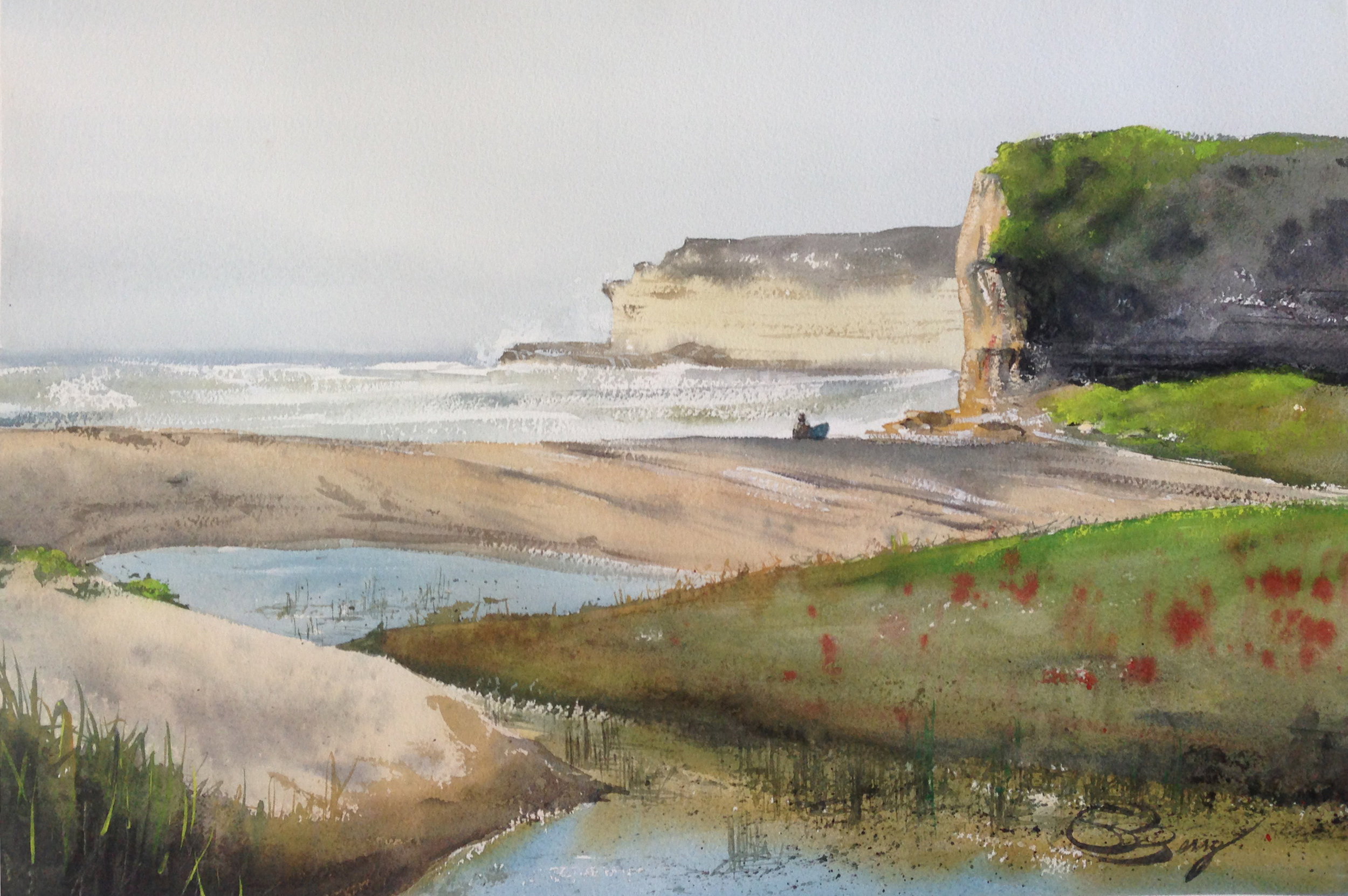
This next one was the hardest for me. All kinds of problems that I saw after the fact. For example, there's meant to be a spray of water behind that distant cliff, but the sky is too pale to make it pop. This became obvious to me, however, only after I'd critiqued Davenport Pillar and really looked at the crashing waves in it. So, one crit can feed another! I also didn't really care for the right hand shadows, behind the nearer cliff. They came out black, instead of shadowed- they should really be more blue than black. I liked the slough in the foreground, but the way I built it out sort of stopped the eye half way up the painting, and in the end, my feeling was the slough was too big, and took attention away from what was supposedly my subject- that sunlit cliff and the surfer at its foot.
Unfortunately, this issue about the subject only really became clear to me as I continued painting the scene. In the middle of it, a number of different people appeared, including a family over by the cliffs- one of them wearing a white shirt against those dark shadows! Lovely! Much more interesting than the lone surfer. Later again, a person walked by, simultaneously breaking the line of the horizon and casting their reflection down into the slough, connecting the two areas. It was an active beach, and including more people would express that better, but more importantly, having different subjects like this pulls your eye around to different places and can really push the sense of depth and scale.
Both Above and Beneath-
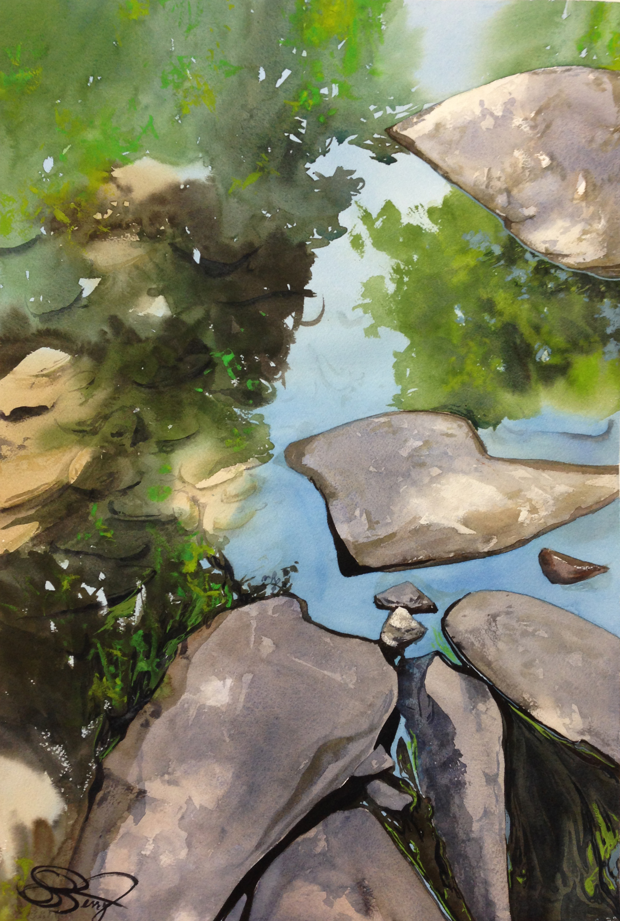
It's almost a right of passage, painting rocks in a stream, but I couldn't resist. It's both an abstract, and a nature scene! I took this photo and worked on it in my "studio." First, I really liked the composition, with the organization of the rocks naturally leading your eye to the 1/3 in the lower right. It's part of why I chose the picture. I also thought I successfully let the far corners be soft and painterly, keeping the detail (such as the rocks underwater, and rich texture of the water's surface in the bottom right) to the more important areas.
What to improve? Once I was done, and talking with others about it, it became clear that the central rock should have been moved a bit to the right- it's too centered, and stops your eye from moving up the "blue" stream in the middle of the painting. Similarly, it was suggested that the edge of tree shadows that run from the upper right down to the lower left are a hard, consistent line. Breaking it up some (even if the pic isn't like that) would help lead the eye into those darker shadow areas, so it could explore the painting more.
Finally, as I studied the rocks under water in the sunlit area, it became clear they're really a pale blue, not the greys I dropped in. I really came to recognize this because of a happy accident. There's an area where I had a darker patch of blue (I've pointed it out in blue), and to my eye it reads very much like a stone in that area. I'll be duplicating this effect more when I redo the painting larger. That process of paying attention after the fact can definitely pay dividends later on. It's most often how I pick up new tools and approaches to subject matter, and build up all that mileage, that helps me see compositional issues faster.
So, to reiterate-
1) Get others to help critique your work.
2) Wait and come back later. Let your eye wander naturally, like a viewer instead of a maker, and record where it goes (and doesn't go!).
3) Identify and learn from your happy accidents. Re-create them ASAP, before you forget how they happened.
4) Does the story work? Does it even have a story? If it doesn't, and you're feeling the piece is unsuccessful, it's often about the composition, and not the subject matter.


