The Joseph Zbukvic Workshop- Extra Demo #1!
It's been a little over a year since I wrapped up my series of posts on my Zbukvic workshop last year. But surprise, surprise! Hiding in my computer were two extra demos. :) I asked JZ, and he was ok with me sharing them. This was the very first painting Joseph worked on with us, and looking at it now, I can see why- it's very straight forward, there's little in the way of negative painting, there's not too much wet into wet, and it's full of gentle glazes one on top of another, where Mr. Bead plays a critical role. It's a good place to start. So... lets dig in!
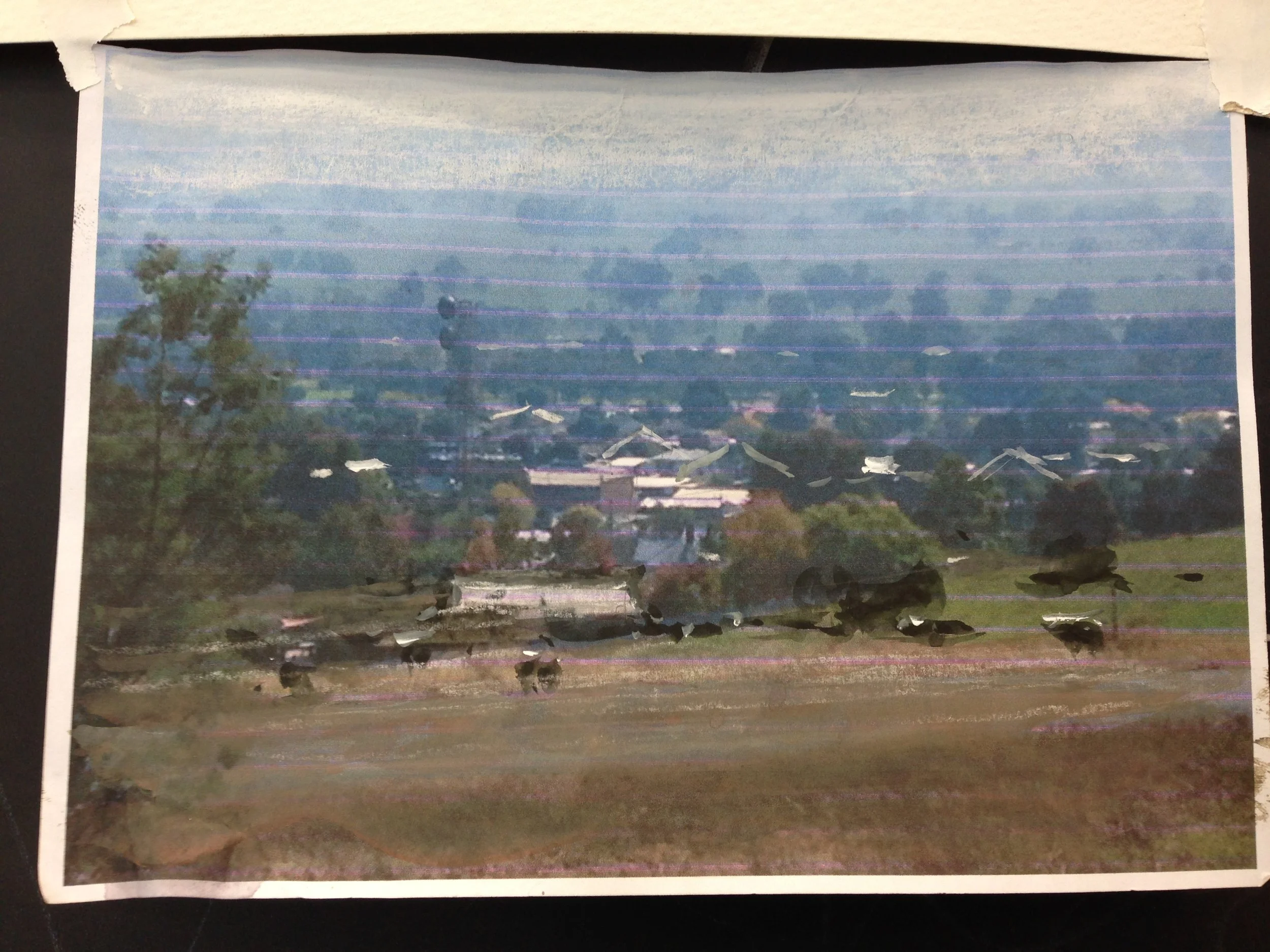
First, I really like that Joseph used these subpar printouts of his photos. They were small- about 4x6 or 5x7, and you can see where his printer was running out of ink. He doesn't care- this is just fuel for the creative fires. You can see how he erases detail in the distance to push it back, drops in some extra roofs for scale and interest in the midground, and puts some highlights and cows in the foreground, to bring that space forward, or how there's some sort of radio tower that he removes in the lefthand midground. The photo is just the photo. It's not the painting, and he makes it pretty clear from the get go that he doesn't have any reverence for it.
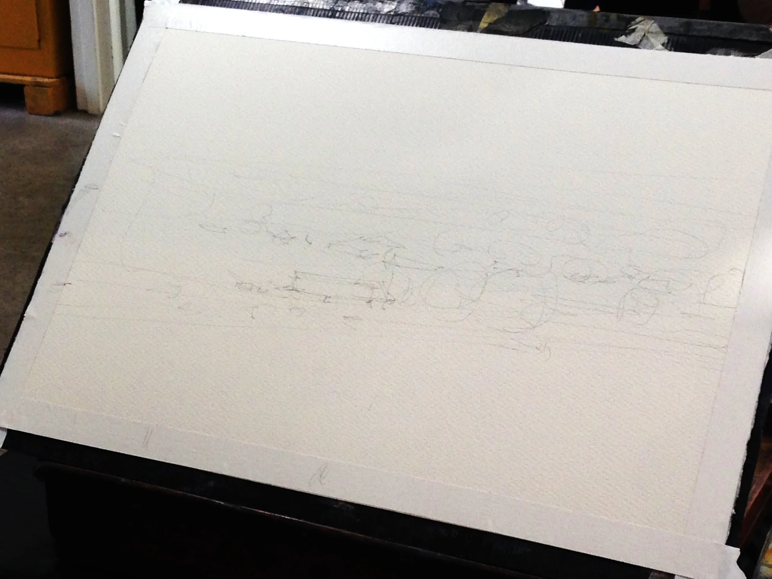
The sketch is rough- just circles for trees, with some back and forth lines to guide gradations of value as he lays in his washes. The only thing he's even remotely detailed about are the rooflines that he'll need to paint around negatively in the next step. It's also worth noting what he doesn't draw- cows. No cows!! And they're the subjects in his painting! All that will be done freehand and kept lively and fresh. :)
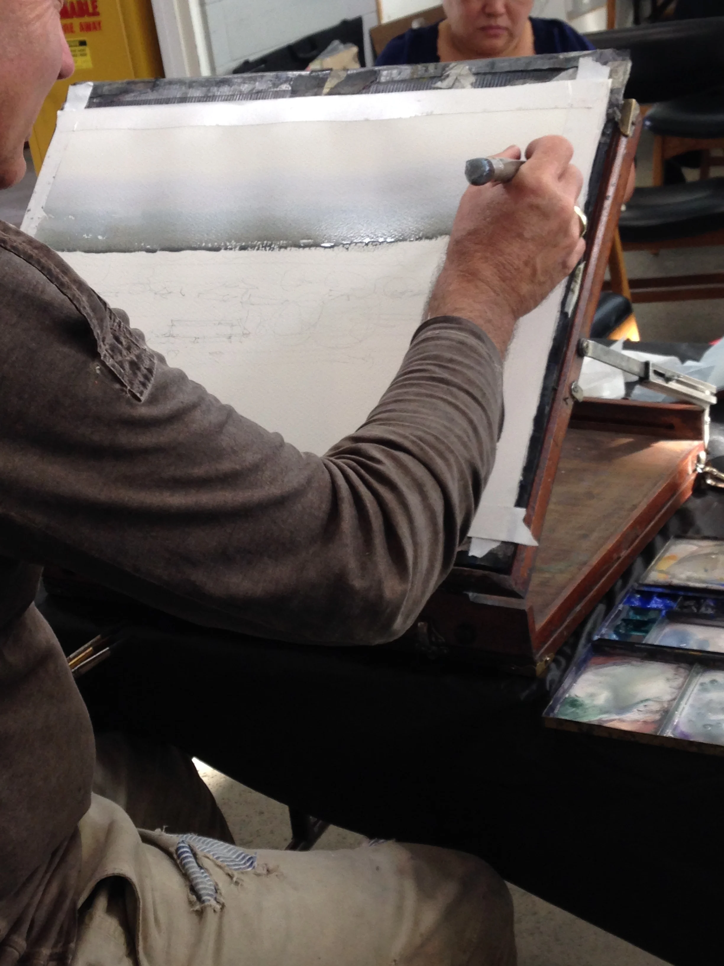
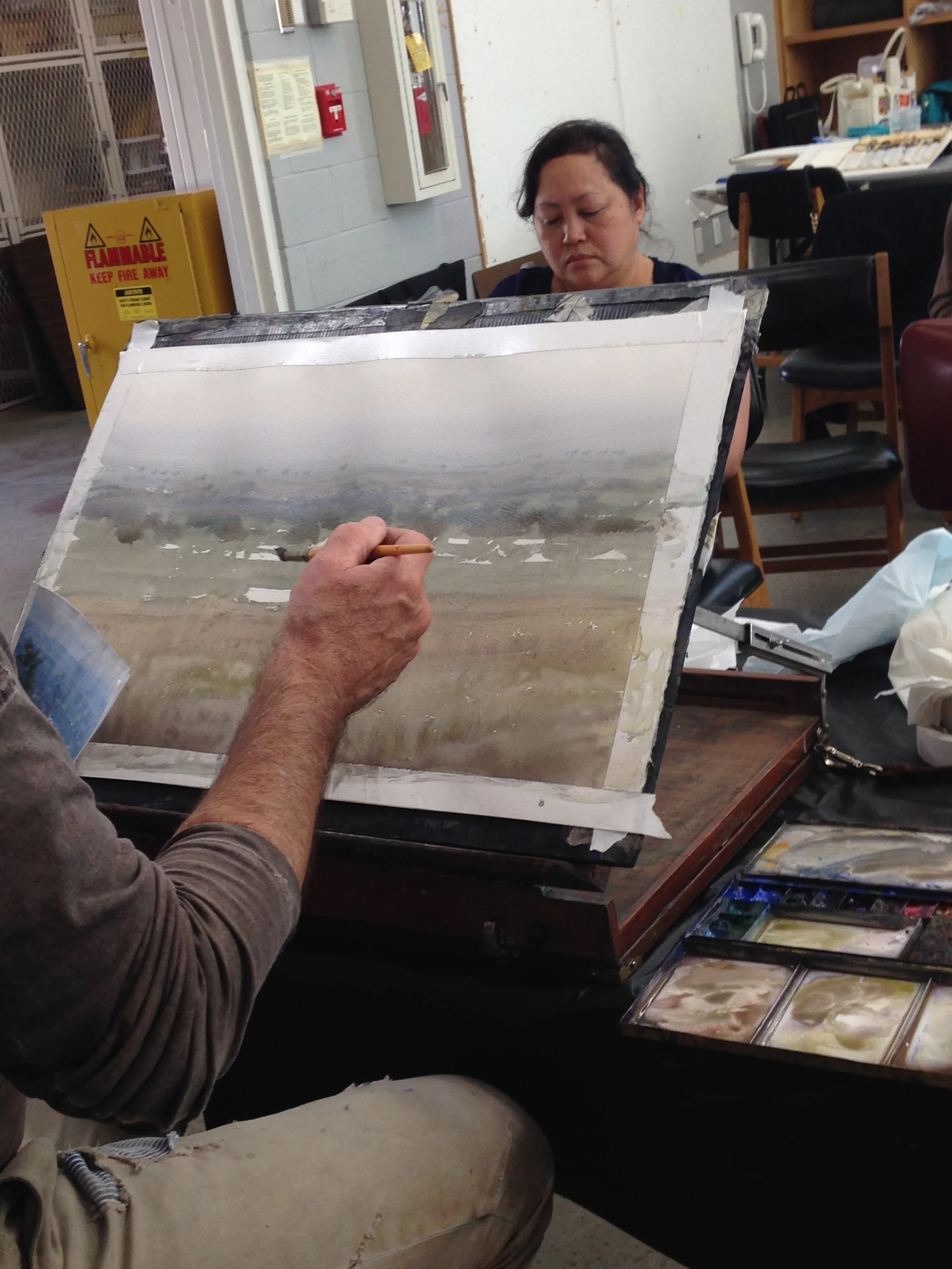
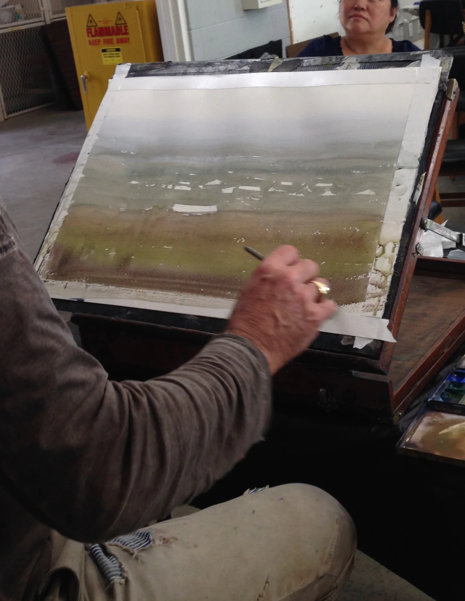
Down goes the initial wash. The board is tilted. Super pale in the distance, with Mr. Bead there to guide us in our endeavors. No going back in and mucking things up! Just lay it down and let it be! But it's also wet enough to collect a bead at the bottom. Easily the biggest mistake I see people make when doing washes is just not using enough water. Better to have an occasional drip fall (and it really is pretty dang rare), than to have chunky washes full of brush strokes, just because the brush wasn't full of enough water.
Here you can see how he's cut around the houses for later highlights. Check out all that banding and whatnot in the midground. JZ doesn't care- he'll use it later on, or it'll just get covered by other bits and pieces. Other people sometimes freak out over these things early on, but it's really not that critical if you drop your second wash in correctly.
It is worth saying that the foreground is where he gets sneaky and is doing some tough stuff. He actually goes back in and recharges the area after he's done the first glaze. Timing is really critical!!! The first wash has to dry a bit, but not actually be dry, and then you drop in the new brushstrokes of thick color. It'll bleed a bit and it streaks downwards into the other colors, because the area is still gentle moist. You can see he's dropped the green in, and has a rich purple at the bottom. When you get the next photo you'll begin to see the magic it does as it dries!!
Man, I just love love love that foreground grassy meadow. Ugh!!!! That bastard. LOL! :DHe makes it look easy, but it is anything but. I've tried it many times- truly many times, and I still can only get it right every once in a while. Joseph was very big on letting watercolors paint itself, and that's good to take to heart. There's a lot of stuff you can do with your brush, but a lot of the magic really happens when you start up a process and then ride it like a wave.
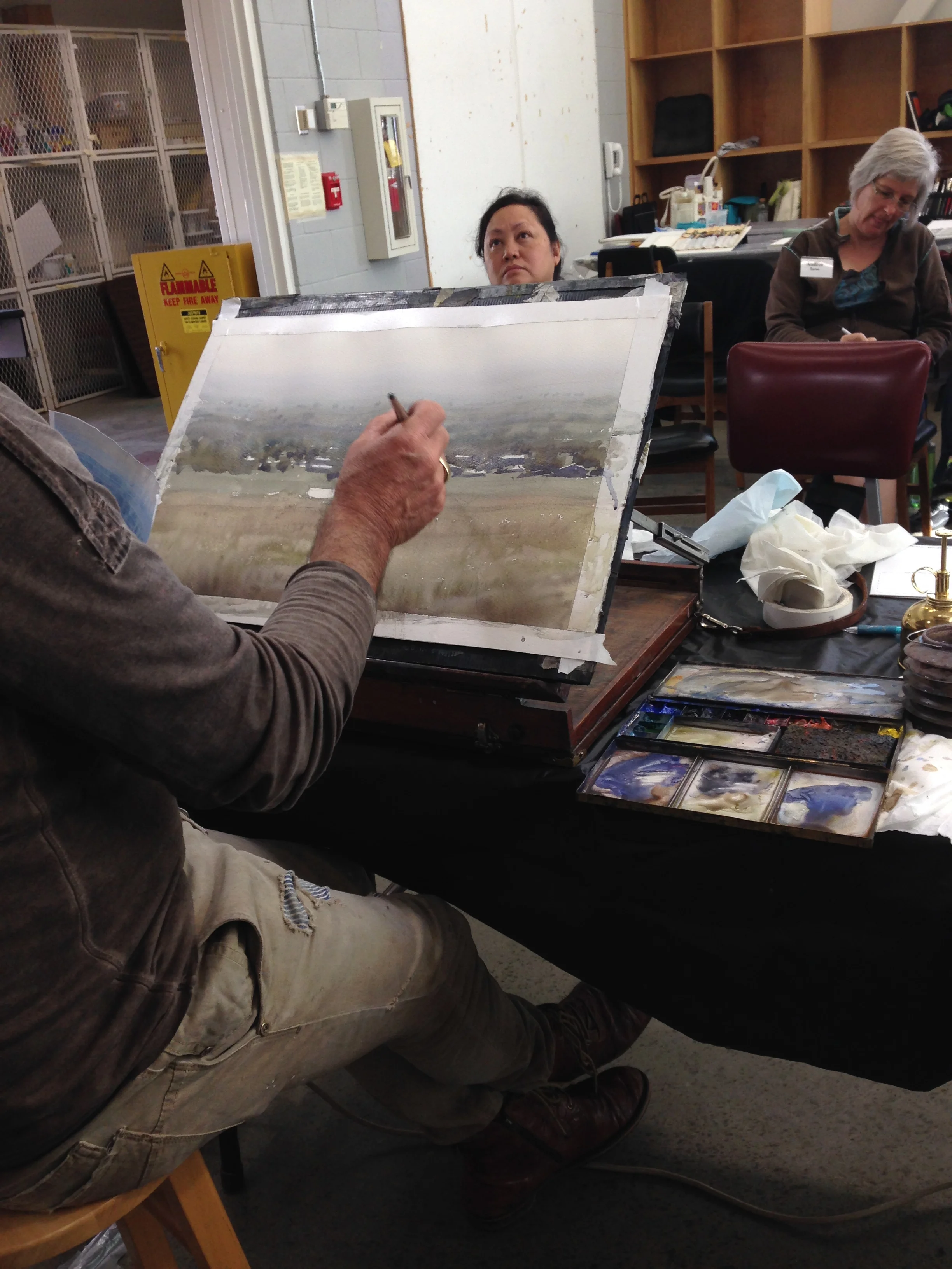
Anyways, once everything is dry, he lays in the bits of trees in the background and slowly builds up a bit of perspective. If memory serves, he actually re-wet the sky with a bit of dirty water, waited for it to dry a bit, and then started dropping in soft trees, wet into wet. But because everything dried first, he's not mucking up the first wash. It's settled into the paper and isn't reactivated by his new wash. Of course, he's also not working and working his brushstrokes (which really will reactivate an earlier wash if you do it enough). Instead, he goes in, makes he strokes, and gets out while the getting is good.
Next, although it's not really much of a "next" because it's the same wash, he transitions from painting the trees to painting roofs by "not painting them." You can also see how he's starting to drop in shadows on some of the objects- the faces of certain houses, the underside of certain trees- but he makes no separation between the objects. All the shapes are welded together in a single wash. It's the shifts in the hue and value that help him begin to separate things. They softly bleed one into another at their edges, but it doesn't matter. We can still read them.
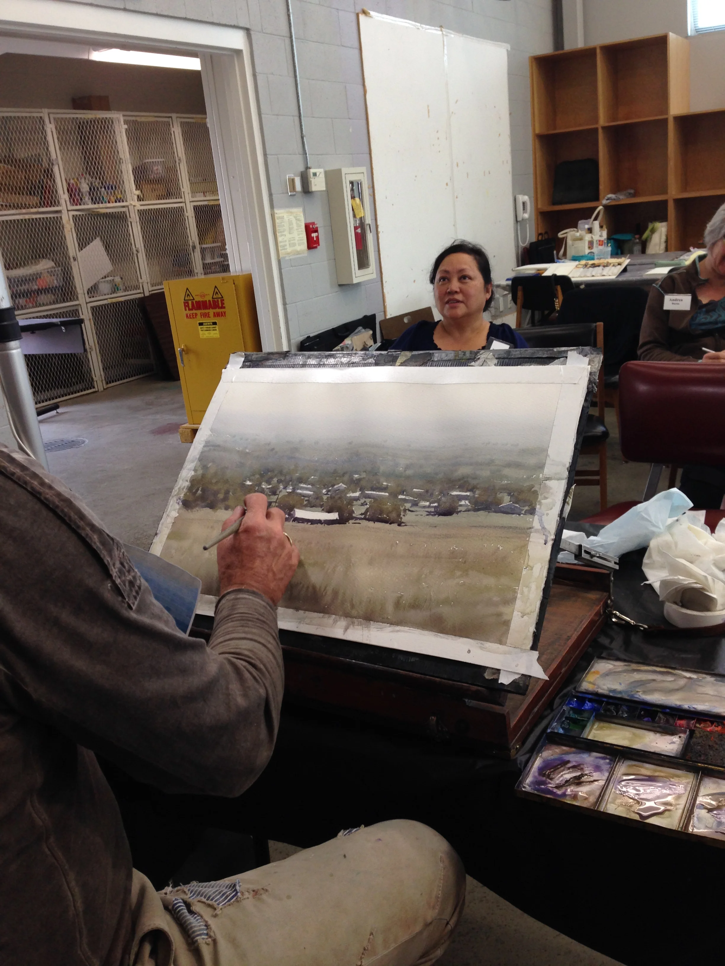
This is where we move into the "detailed" area. It's the harder part, IMO, because people begin to recognize what you're painting and so judge things differently. First, you can see that he's wrapped up the previous wash with some of the trees and their shadows. This is a great way to keep your washes from having hard, rigid edges that feel very artificial. Instead, the broken shapes and shadows capture little bits of light from the first wash, and begin to integrate the two values like interlocking blocks. A lot of it is very abstract, just dots and dashes- but those early roof lines are really critical for decoding the simple subject.
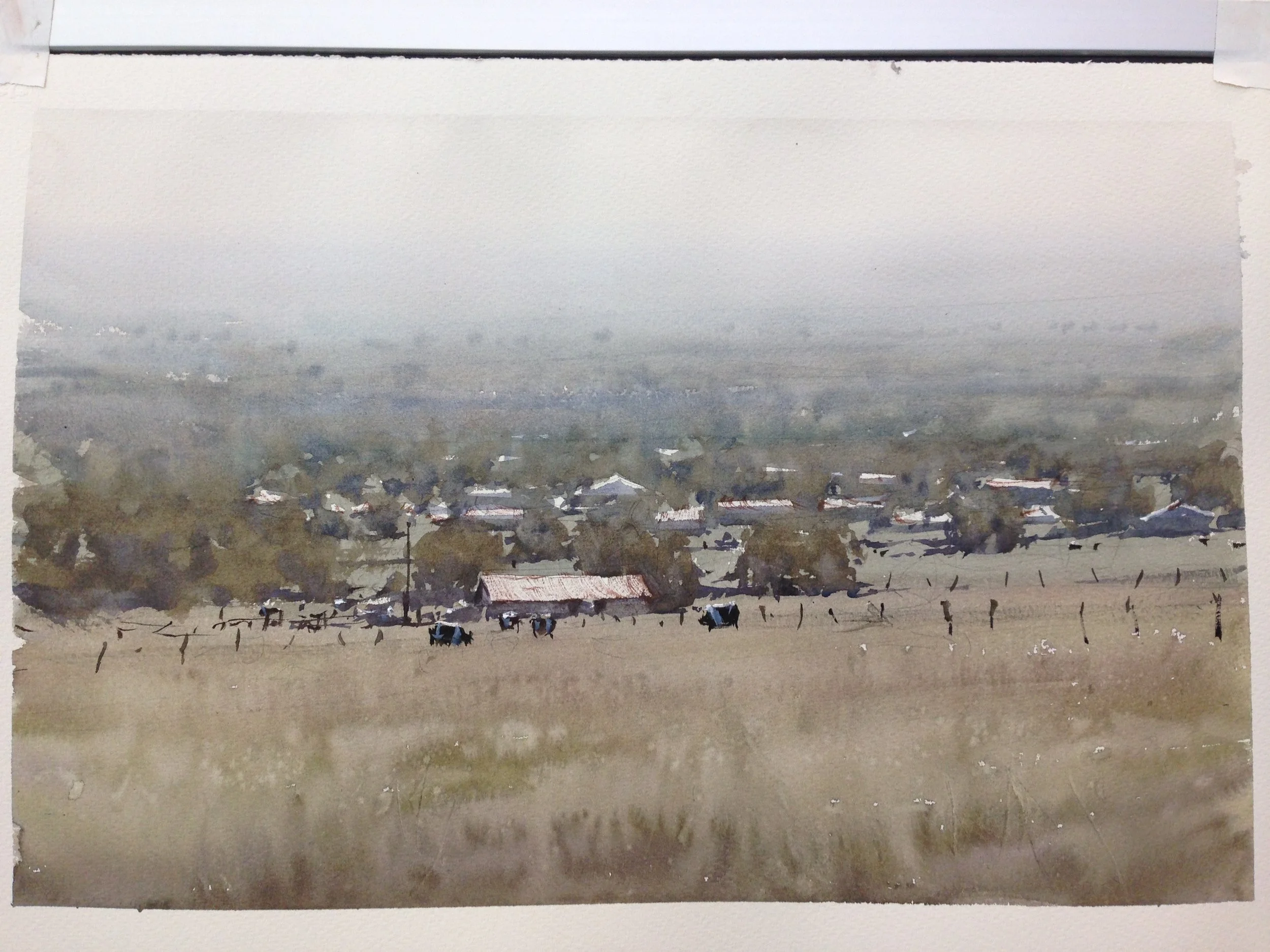
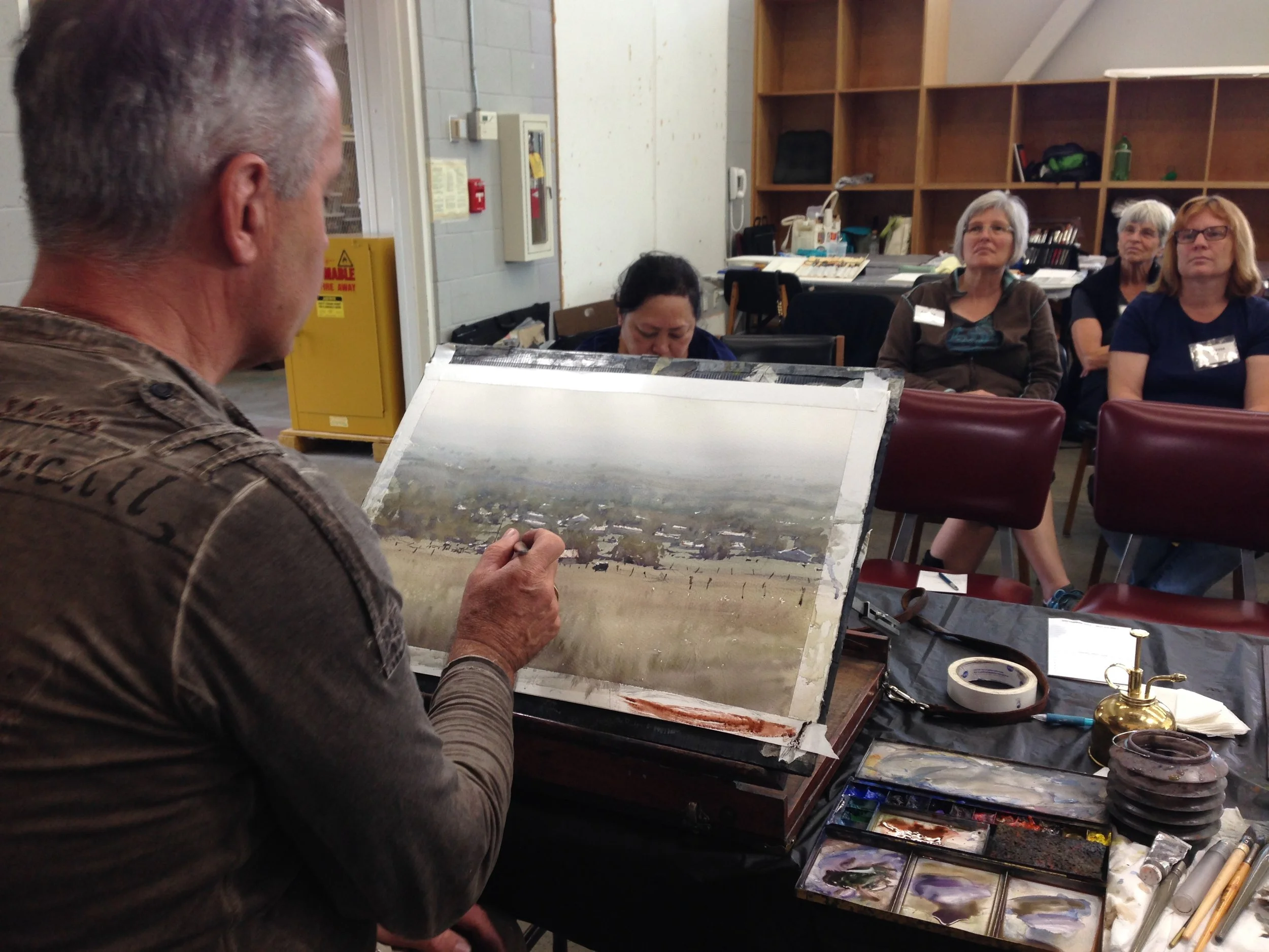
And now we get to the foreground. Some cows, some rustic fence posts, and a tiny bit of detailing of the roof of the foremost barn. Not much at all. Of course, you can still screw it up, if your cows look like very large kittens or chubby dogs... it's all been done before. Sigh. So, yeah, you've got to simplify them and practice them elsewhere before you drop them in. But once you've got them, they're not the hard part. Besides, all the delicious patterns of the grass were done wet into wet, way back at the beginning. That's the stuff I keep staring at over and over again. That's where the magic is, not the cows.
And what about all that banding? All those ugly bits we hate so much in the early stages of our paintings, when nothing seems to be going right? Remember those funky looking bits from earlier on? Well, when Joseph does them we think they're great, but when we do them, they're "funky looking bits"...
Here we are at the end, and nobody gives a damn. They're either a) swallowed up by the successive shapes layered on top, or b) used for effect later one (like where the posts of the fence lines go). In these last few minutes, he dropped a bit of white onto the backs of some of the cows (although he used some chance bits of white paper that were left over for the backs of others).
What most impresses me about something as simple as this painting is that, first, he suggests a lot by doing very little (for example, the fence is just a few posts, no wires or anything) and that, secondly, the most beautiful area is this fantastic foreground, where he drops his brush strokes in an lets the paint and water do the rest. It's really about control of timing and moisture, not about putting a lot of brushstrokes down.
Next week, I have another demo of his I'll be sharing, also from my "archives". Hee hee!! Thanks for reading, folks!
