Using Color Space, pt. 3- Color Creates Light
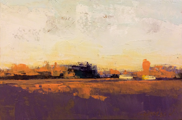
"In nature, light creates color; in painting, color creates light"- Hans Hoffman
Last month, I found this wonderful oil painter, Mary Gilkerson. (Sadly, Mary has since passed on, and her website no longer functions). Her discussion of the benefits and habit of daily painting. Wonderful stuff! She also has a couple of videos, both about using Color and about Composition, that I just loved. Is there stuff about oil painting, that doesn't really relate to watercolors? Yes. But if you skip around to the right parts of the video, you can get lots of wonderful input! Don't let it being about oils distract you too much. Yes, she talks about premixing her gradients of greys. Yes, she's going about laying in her opaque colors 100% differently. So, we need to build our paintings differently than she is. The order of things is different. But the concepts behind the building process, the thinking, is very similar.
So, lets dive in!
Minutes 4:00-14:00-
First, start at the 4 minute mark. There's a odd sort of loop at the beginning, where she lays out details and quotes, and then the video repeats them at the 4 minute mark. So, I would start there. There's good stuff here! And it relates to a lot of what she talks about later.
The biggest conceptual thread throughout the video is talking about two Hans Hoffman quotes. This is the first one-
#1- "In nature, light creates the color, but in paintings, color creates the light."
What does that really mean though? The short of it is the oft noted concept that you're not painting objects, but instead are painting the light that bounces off the object. The goal is to replicate the experience of seeing things in the real world, where light illuminates things, but to do so with pigments that have a far more limited spectrum to pull from. So, much like Monet in the last post, you've got to manipulate and combine the colors you've got in various illusory ways, to re-create that vivid experience of "being there"... even if the final painting doesn't look exactly like a photo does.
#2- "It's not the form that dictates the color, but the color that brings out the form"
This is about the difference between optical and local color. Namely, the color we see, rather than what we think the color is intellectually. Don't paint what you think an apple looks like (red), but instead practice seeing, so that you can paint what you see, even if it doesn't agree with what your mind presumes is true. A red apple that is brightly lit may come off as orange or yellow, instead of pale ("brighter") red.
Minutes 21:00- end
As watercolorists, IMO, we can skip minutes 14-21. This is where she spends a reasonable amount of time talking about materials. A lot of this doesn't apply to watercolorists, because she's discussing the details oil paints and how they work. Does she touch on having a warm and a cool of each hue? Yes. Does she note that painting with paints, instead of reading about colors, is the best way to learn color theory? Yep. But other than that, for us as watercolorists, we can skip to the 20 minute mark.


From here on out, Mary goes into a series of broadly applicable concepts, and shows some wonderful examples of how value and color can be used to express light, rather than value alone. The idea is to manipulate- 1) value, 2) intensity, and 3) temperature. She presents the idea of pre-mixing your colors, to help build a cohesive color scheme. She shows us some on location photos, so we can see how she is interpreting things. Much like the Monet paintings I shared last time, she takes apart a small painting she's done, and shows us a bit of how it works by desaturating it. Yes, there are value differences hiding in there, but in much of her paintings, it's really color work that is making the difference- the comparative values of the colors she's using (colors have values!), the comparative intensity of the colors she's using (grays versus pure colors), and the temperatures of her colors (warms versus cools).
It's a very interesting video, and quite relevant to all artists working with color- including watercolorists!