My Chein Chung-Wei Workshop Experience, pt. 3- Technique and Process
Each day, Chien did a number of paintings. I’ll be sharing process pics of them in this post and discussing his techniques, as I remember them. First, however, some Chien originals from the almighty Google-

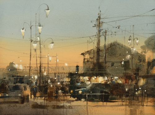


Applied Composition-
So, this simple little beauty is the painting I purchased from the workshop. It's a small 1/8th sheet (7.5" x 11"), as are many of his paintings. I wanted to use it as an opportunity to briefly review and demonstrate some elements of Chien's compositional approach that I shared in the last post. I've included the original photo he worked from too. I find it exceptionally interesting to see the photos paintings are sometimes taken from, not to demonstrate the "accuracy" of the painting, but because it can help one understand the thought process and changes made by the artist. For example, look how bare the foreground is in the photo, but how much interest Chien pulls down into it in the painting. Also of note- the roof has been dramatically darkened at the focal point.
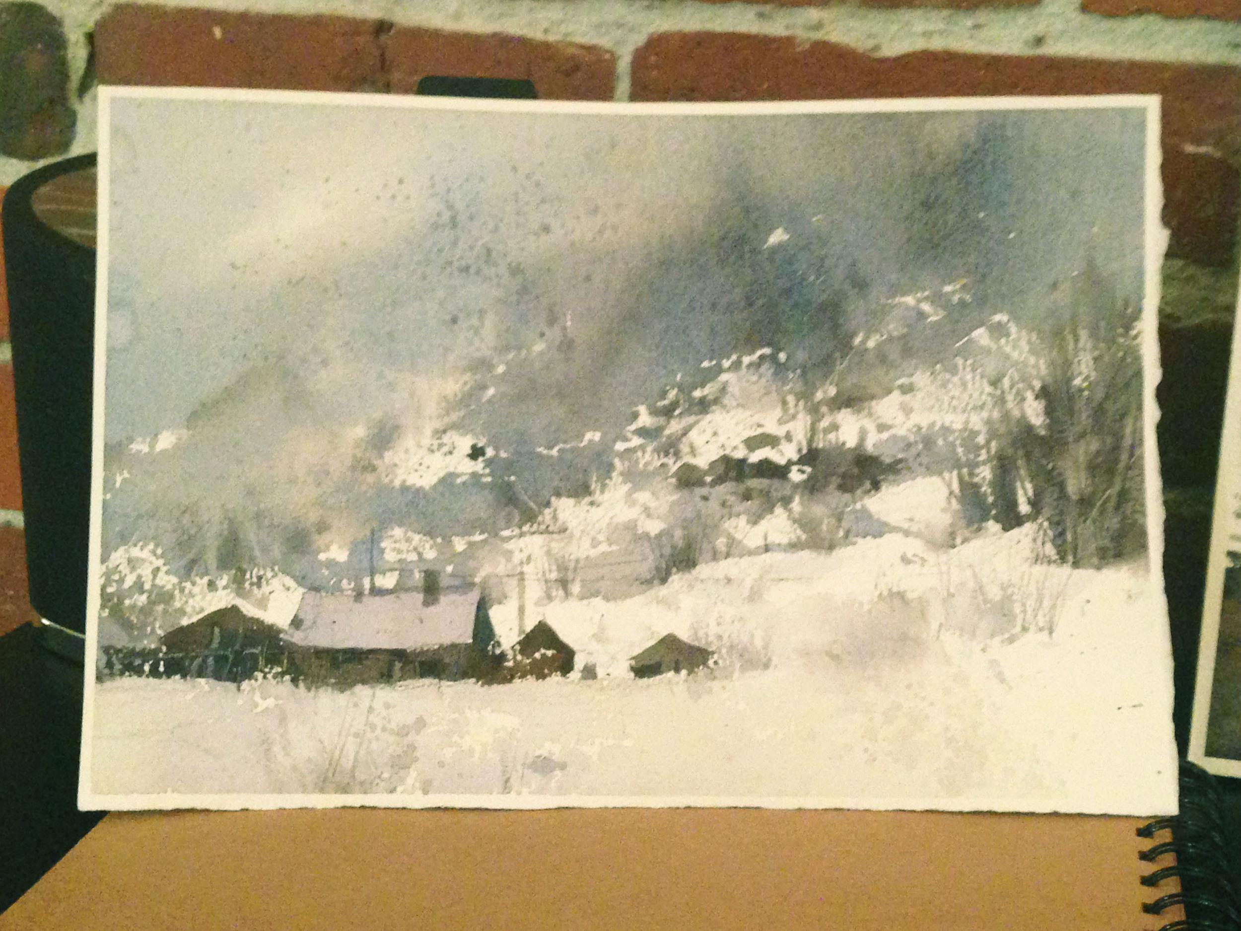
Below is the same painting marked up with notations on composition. I ought to say, right here, that this idea is 100% Chien's. I loved this teaching tool of his. He did stuff like this, just x50, with all kinds of different examples. Let's dig into what all this means....

Major, Minor, Jumper/ Big, Middle, Small- The red circles show us what I see as the Major, Minor, and Jumper. Also, note that even the Major grouping is actually composed of 3 smaller shapes- the Big center house with the roof, the Middle-sized one to the left, and the smaller one to the right. Even within each structure, he breaks things up with windows, doors, or abstract scratchings to create additional Big, Middle, Small groupings.
No Sameness- The blue ink notes how the distances between everything are just slightly different- the Jumper is closer to the Minor than it is to the Major for example, or that little building is pulled off to the right just a little from the main Major grouping.
Diagonal- The yellow ink shows us the diagonals, which are actually all over the place.
No Copying/ Diagonals/ Planes, Lines, Dots- The magenta labels show us some of the macro corner shapes, which is interesting to note, because, just as I described in the previous post, it's really where Chien played with the composition's balance. The little buildings in the lower left (the Major) were in that same position in the photo, but the mountain/sky didn't have the same dynamic variety of value to it that Chien's composition does... So, he was clearly changing things as needed for a better composition.
No Wholeness- Finally, as a small note, the orange writing points out Chien's desire to keep things organically shaped. It would have been easy for him to make the roof a perfect triangle, but he deliberately kept it loose. On the bottom of the roof, you can even see a bit of dry brush work, which he laid down and kept, to break the form. Also, note how the chimney is included, but is off center. It breaks the form without dividing it in half, and connects the structure to the background at the same time.
Process and Sequence-
Chien did this painting on a quarter sheet. It was of particular interest to me to see how he did his trees, as well as the sequence in which he built the image. First, he did the pale sky, but he shifted the value, and brought the soft blues down to the horizon to provide contrast against the snowy rooftops. This was not how it was in the photo. Then, he went about the flat planes of the buildings directly, no waiting, saving highlights as he went. He was able to do this so quick because the white roofs separated the buildings from the sky. The trees went in next, wet into wet at the top. You can see that best in the first pic. They're very soft. As things slowly dried, he added abstract detail to the buildings, and, eventually, dry brush work to the trees, including their trunks.

The first pass is abstract and more wet into wet.
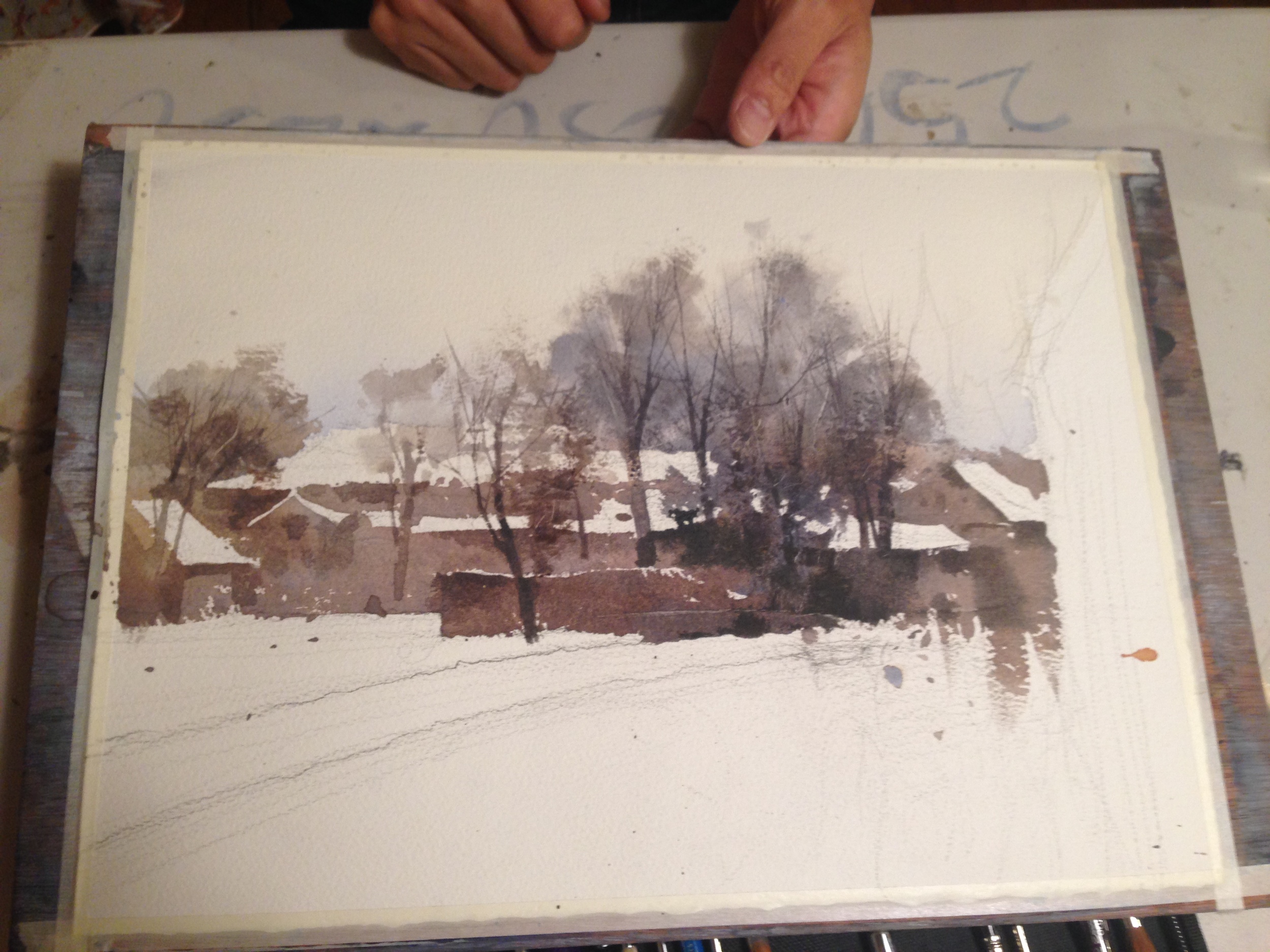
The trees take form but the inclusion of delicate dry brush work done on top of the earlier wet-into-wet work.
There was a surprising amount of detail in the trees. The comparative shape of the trees was important to him (Big/Middle/Small and Diagonal). The position of the trunks was considered and pondered too (No Sameness, Big/Middle/Small) , as they provided a great deal of abstract balance and interest. Even the twigs were given their due. As he built the structure, he turned the paper around, to use a more ergonomic sweep of his hand, and as he laid them down, he spoke about Big/Middle/Small.
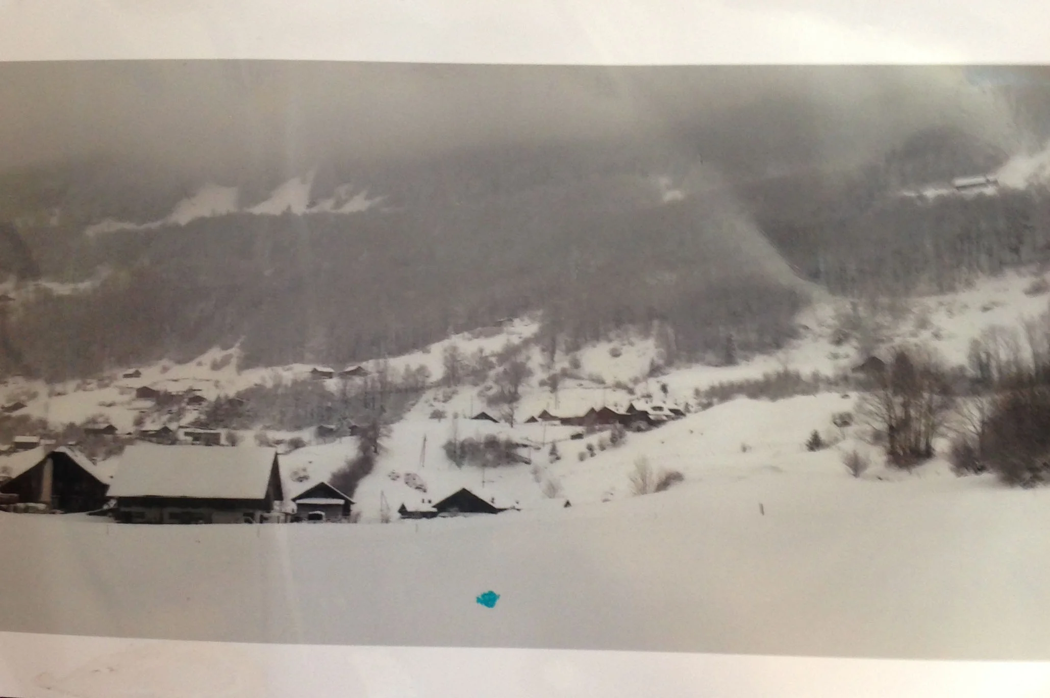
Here's (my blurry pic of) the original photo to compare Chien's final piece against. It's neat to see what he kept and what he removed. Of particular interest to me- the rather boring parking lot on the left. He totally destroys it in the painting, just using it for abstract shapes. Would we know it was a parking lot without having seen the original photo? Does it matter? What's the purpose of the pale abstract shapes in the final painting?

Many final details were included after the demo was done. Little windows, notches, shadows, etc. that add balance and variety.

The reflections were built much the way the trees were- wet into wet first, with dry brush work over them later, and scratching with his palette knife done last to express the surface of the water. Note the little reflections of the windows in the water. Love it! The final section was the very rough building on the right, which he pushed in gesturally, heavy and dark, to bring it into the foreground. Note how dark it is compared to the original photo, but how much more depth and range of value, comparatively, he pulls out of the more important grouping of trees.
Abstract Technique-
Chien talked a lot about the value of abstraction, particularly for details- "Details are not realistic. They are always abstract, but people feel they are real. I suggest them. And the human brain finishes them." More than once, he referred us back to the exercise we had done on the first day. This was a very important tool to him. There was a water scene he showed us, perhaps one of his Venice paintings (or perhaps the plein air painting below?), and he noted that "if I cut this section of the painting out, with the river, no one would know what it is. But in the context of the whole painting, everyone knows just what it is."


We had a specific conversation about this idea later in the workshop, where he expanded on the idea. The concept was that you need to look at things and understand just what it is that makes that object "it", what is the symbol for it that you can reduce things to. Reflections, for example, require a mirror image, trees have a trunk, boats a basic shape, roofs too, etc. He gave a critique for one painting, where he noted that the reflection of an important boat (the focal point) did not properly mimic the boat above it. This made it difficult to understand what all the other reflections were. However, once the primary reflection was corrected and made accurate, like a "key" it unlocked all the abstract reflections, and our minds knew how to read them.
All Together Now-
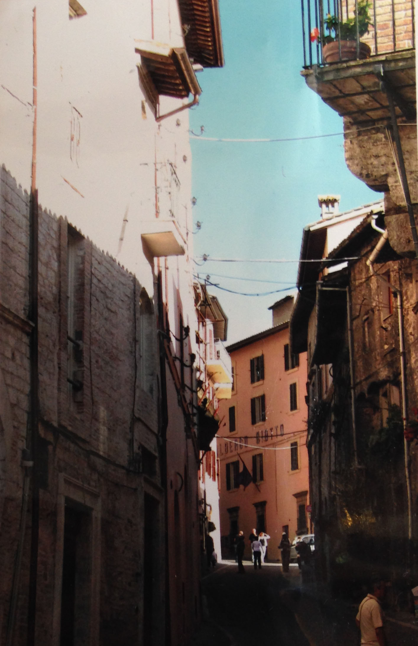
This last painting was much beloved by everyone in class, and was the final one Chien did. It brings together many different technical elements from various paintings.
First, the pencil sketch. That's not a blurry photo below- Chien actually drew that "softly". Following most of the sketching practices I brought up in an earlier post, he let gentle, wobbly, double lines appear as need be, letting the pencil float under his hand as it quite literally wandered around. Considering the bold final image, which is so self-assured, it's interesting to see how much of a "discovery" process the sketch indicates he went through in this early stage, as he sussed out the important forms and removed the unessential. You can also see that some lines are darker, the closer they are to the focal point, and some are lighter, as he approaches the edges of the painting. These lines helped guide him later on, in his painting process. The darker they were, the more firm his painting decisions. The looser and lighter they were, the more the pencil work only indicated an idea. Like little bread crumbs, he left them behind to guide himself.

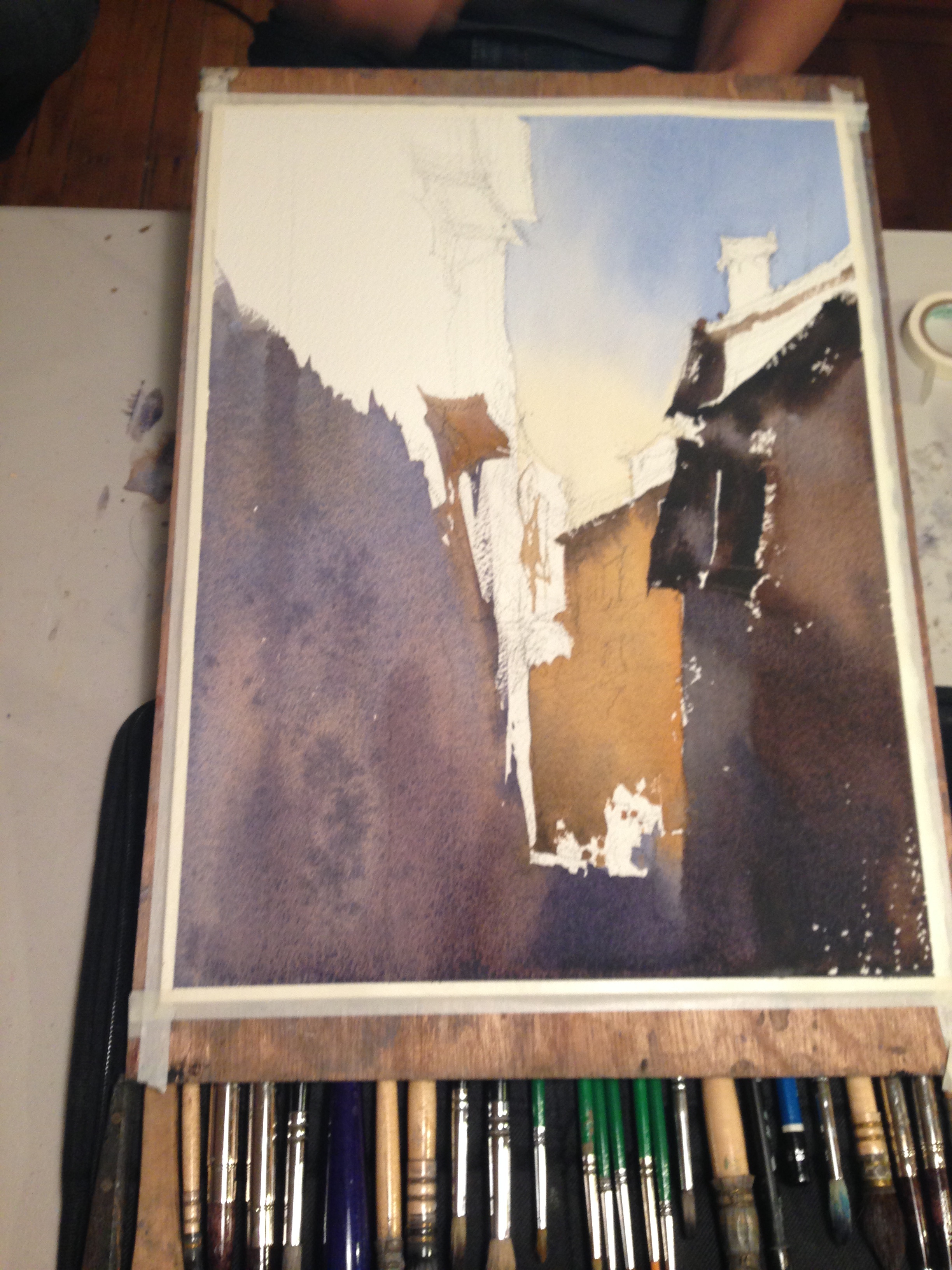
Next are the planes, in the second pic. He started with the sky, painting bottom to top, and then laid in the burnt yellow building, preserving some abstract whites for people. Then he dropped the purple shadows in on the left, wrapped around the bottom, and finished up with the darks on the right. To him, right here, the majority of the work is done. The rest is just the details- lines and dots.
Here's the final painting and the photo side by side. No need to include that balcony and second story wall up in the front right. Same for the person in the right foreground. He didn't give a second thought to removing them. What purpose did they serve? He was definitely not a slave to the photo. In the same vein, see how pale the windows are in the background, increasing the experience of depth, and yet how dark and abstract the building on the right is, pushing your eyes to the center of the painting? When he painted the balconies on the left, he noted that their shapes overlapped, and that they were too similar. No Sameness! So he altered the value and hue. "If two shapes meet, they must be different. Different values or sizes. The bigger they are they more different they just be- sky and water, buildings, etc. The smaller they are, they less it matters."
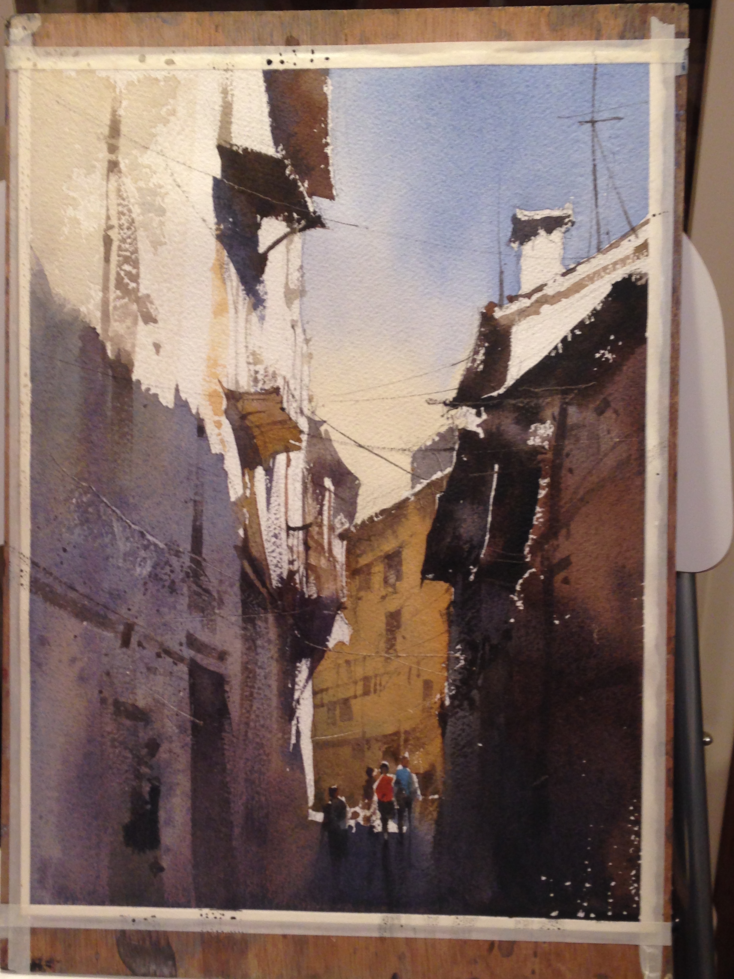
And then, finally, the details. In my opinion, the hardest part, because they're so easy to overdo and yet are very necessary and important. Chien started with the focal point (the yellow building) and once that was done, he sort of radiated outwards. The idea was that everything was supposed to relate back to the Major, because it's the most important thing. So, its best to start there. Other areas should have less detail, because they're less important. This is where it was very important to know why you were painting this in the first place. We, as painters, have to create the visual hierarchy, and detail is one of the tools. What really struck me was the thought that went into placement of things like windows and what I guess are pipes and whatnot- both at the Major, and up in the foreground. Enough to indicate, but not too much. When he put the people in, it changed the balance of things a bit, so he actually went back into the primary building and altered the pattern to better include them.
That's it for now. I thought I would get to my paintings and the critiques I got, but that will have to wait for the next (and final) blog post on the workshop.
edit, 7/26/17- This is a link to a post Chien did on Facebook that showed his process. I wanted to include it here for those who come to this post at a later date. Chien's post is in English and is written much like a blog post itself. It's well worth reading.