My Chien Chung-Wei Workshop Experience, pt. 2- Composition and "The DNA of Beauty"
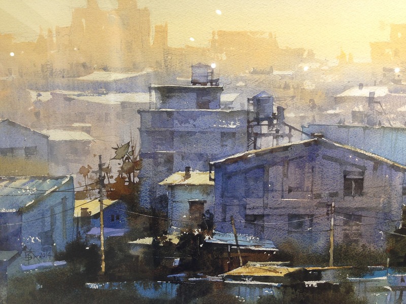
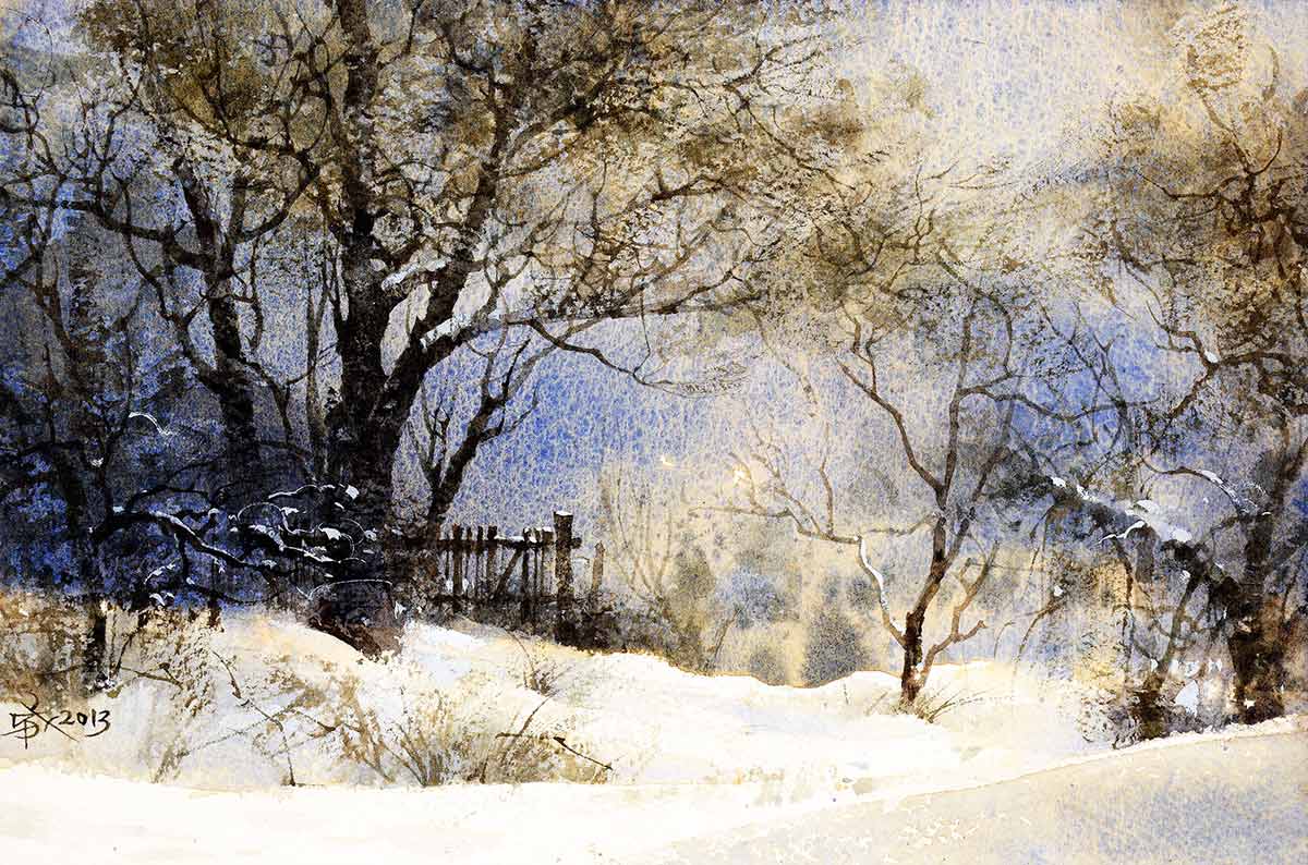
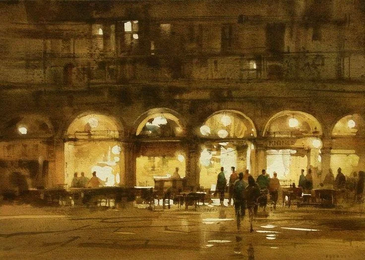
Ok, this is a big post full of info, so, first, lets start out with some more beautiful paintings by Chien-
Love 'em!
As I mentioned before, over the course of the workshop Chien focused heavily on design and composition. I don’t have a quote for it, but the gist was that technique is useful, but if your image isn’t composed well it won’t matter. Comparatively, if the painting is composed well, if the shapes and spatial relationships are good, it can still be interesting even if the technique isn’t so accomplished. So, first things first- concentrate on “the bones.”
The big question then is... "What are the bones, and how do I build with them?"
All of this, at root, stems from a kind of mastery of pattern. It is how we arrange basic things that determine a painting's success. Chien called it “The DNA of beauty.” To create something appealing to the eye, we have to use the human mind to mimic the unplanned experience of discovering beauty. Chien was very definitive that, in his opinion, to do this "the painter (must be) a liar. A very smart liar, because the brain is very lazy." (This was an oft-repeated motif with him... the Lazy Brain, and how we, as artists, interact with it). "If I make the composition beautiful, the brain will finish the rest."
I was reminded, on hearing this, of the idea that an artist must deliberately not copy everything he sees, in order to be true to the emotional experience of what is there. More can be less. This is where composition comes in as your primary tool. It is a spatial language, a code that speaks to the unconscious brain... not by putting more "stuff" in, but through the placement and relationships of what we choose to include. What is the hierarchy of importance? Where is the focal point? How is your eye meant to move? Where are you being led through an "active balance"? We must arrange the pieces. Composition is how you guide your viewer into the woods.
After the workshop, on reflection, as I strolled around Moodyville Park in North Vancouver, looking at the beauty in the trees and trying to compose an image, I came up with this quote, which I thought succinctly expressed what Chien was after—
"If beauty in nature is discovering patterns conjured by chance, then beauty in art is discovering chance conjured from patterns."
Even though it affects them, most viewers of art don't really know they're even reading this "coded language", but we, as artists, must consciously use these tools if we want to control our painting's composition and take our viewers gently by the hand. The big lecture on Day 1 outlined Chien’s approach to all this, with 10 basic principles. It was simply titled “6 yes and 4 no”. With Chien’s approval and consent, I share them with you, as I saw them-
"6 yes, 4 no"-
The six yes-
1) Big, middle, small.
This seems very simple, but is probably the most basic, consistent compositional element in his paintings. Just like DNA, it starts with his smallest gestures (literally his brushstrokes), but the principle builds upwards and he uses it to construct his largest shapes as well. Always, he’s thinking about his brush strokes and his shapes. He makes a big stroke, then uses some dots or a dash to tidy things up. Small shapes are accompanied by others. Big planes relate to smaller planes. Nothing is painted alone. “If you're painting has a, b, c, d,” he said, “you cannot just paint a. You paint a, but watch b, c, and d. They have to relate to each other.”
2) 3 Values-
No matter if your painting has a great many more values, the eye tends to reduce them to 3- the light value, the dark value, and the grey area. Interestingly, he calls the grey area “the rainbow area”. Basically, the darks and the lights are areas where it's hard to push your colors. It’s the mid-range that really lets you play with color. But even more than that, the idea was that, yes, you build form and interest with a variety of values, but when you’re composing the image, first simplify it. Then he sort of drills down in each area and lets it multiply out.
3) Plane, line, dot-
"When the plane is under control, when it works (big, middle, small), then you can add some lines. When they work, you can add some dots." Again, a simple idea that gets complex, but as we watched, this is how he would build his images. Big shapes first (the planes). Then, he built detail. It was very important to him that you not get too carried away with wrapping up some corner of the painting, before you had the basic composition working. He had a neat quote, which was that “If you can do what is simple, you can do the complex.” I felt like it applied here, where the idea was that your simple shapes, your planes, ought to work first (using big, middle, small), before you should delve into complex detail- namely, lines and dots.
4) Major, minor, jumper-
Focal point= major. If the major and minor are too far apart, you need to add a "jumper" (an additional, small, point of interest), to bridge the distance. This, along with “Big, middle, small” and “Diagonal”, was one of the most repeated concepts over the course of the workshop. Over and over, simple and consistent.
He sometimes referred to them as the “king and the princes” as well. The goal was to create a sense of dynamic balance. Nothing too static or centered. This keeps the image engaging, and lets your eye travel. If there is a jumper, it is always the smallest of the "big, middle, small". It connects the farthest prince (or minor) to the king.
"The prince that is furthest way is the most important, because it is for balance. Those closest princes bow to the king, the farthest create tension."
"When you paint plein air or take a picture, you always need to find the major first. But the minor and the jumper are (almost always) your design."
5) Gather, disperse, extend-
"You can't have a kingdom with just a king. You need others to control him."
For example, if you have a powerful red sky or object, you need a bit of red elsewhere to control it. Use less and less as you go outwards, like ripples. If something is too strong, you just extend and soften it, to more fully integrate it with the whole image. It can be a color, a value, etc.
6) Diagonals-
They make the eye move. They make the jumpers work. This was endlessly repeated, like “Big, Middle, Small”, because he integrates the simple concept into both macro and micro processes. You see it in the overall design, but also in all his little brush strokes. The goal is to make the painting interesting when you zoom in, as well as when you step back.
The 4 No's-
1) No wholeness
Nothing too exact. Nothing too strong or geometric. Break your shapes and lines. Remember- even when you break up an object, use big, middle, small. Often, when he would paint an edge, he would “break it” and deliberately not let it be too clean. No complete squares and whatnot. They just take over everything. They’re too strong. Instead, he would imply the shape with an incomplete shape.
2) No overdoing-
If you know you've done too much, then it's too late. This doesn't mean don't do any detail. Detail in important parts is necessary. The details finish the painting. You must walk the tightrope. Balance.
If you finish everything equally, you won't have contrast, you won't know where you're king is. You must leave areas unfinished. Don't paint every stone. Don't paint every window. Sometimes, if something was too clean or detailed, he would actually “destroy” it a bit, on purpose, to sort of open it up to interpretation and suggestion. Reminded me a bit of how you look at a star askance to make it brighter.
3) No sameness
Change the distance between things, the height of things, the shape of things. Give the eye something to hold on to. Don't use the same frequency or size. You’ll see, for example, when he paints things like windows, that he’ll do a few, but they’re all a bit different. Different values, different levels of detail, slightly different chroma. From there, he would let the rest be filled in by our minds.
4) No copying
Don't let the photo control everything. Where is the room for your thought? Don't let what you see in front of you control everything. Whether you paint outside or from a photo, the process should be no different. You should still be changing things, guiding your viewer, creating visual hierarchy.
One of the interesting things he said on this point was that "To learn from a masterpiece, you must pay attention to the corners, because this is where the artist changes things." Essentially, this is where they're making design choices that relate back to the focal point, to talk to us, the viewers. I agree, Chien. I'm watching the corners! :)
**
What’s fascinating is to take many of his images and apply these principles to them… build them backwards. You’ll often find you can actually break the image down into several smaller compositions, because he’s not just applying things on a larger, macro scale. Instead, the principles often also work on a brushstroke by brushstroke level, so even small areas of the paintings can be quite interesting and full of compositional elements that hold your interest. Its a very fun game to look at a painting of Chien's and try to find the "Big, middle, small", the "Diagonal", or the "Major, minor, jumper," etc. Almost always, they're waiting there. For example, if you scroll back up, there's lots of interesting stuff going on in the included paintings!
Additionally, these were the same principles that guided us when we did the abstracts I spoke of in the previous post. So, the idea isn’t that these principles are somehow specific to Chien's painting process, but that, as general design principles, he felt they applied to masters in a broader sense. They really were what he thought of as "The DNA of Beauty." It’s been just as educational to look at the work of various painters I love and, using Chien's "6 yes/ 4 no", apply my mind to their design process.
In the next post, I'll be sharing some of Chien's paintings from the workshop- talking about some of the techniques I saw him using, discussing what I learned from each painting, etc., as well sharing my own paintings from the workshop and the (very helpful) critiques I got from Chien.


