My Chien Chung-Wei Workshop Experience, pt. 4- My Paintings and Critiques
I'll be sharing my paintings from the workshop in this last post, as well as the critiques Chien gave me.
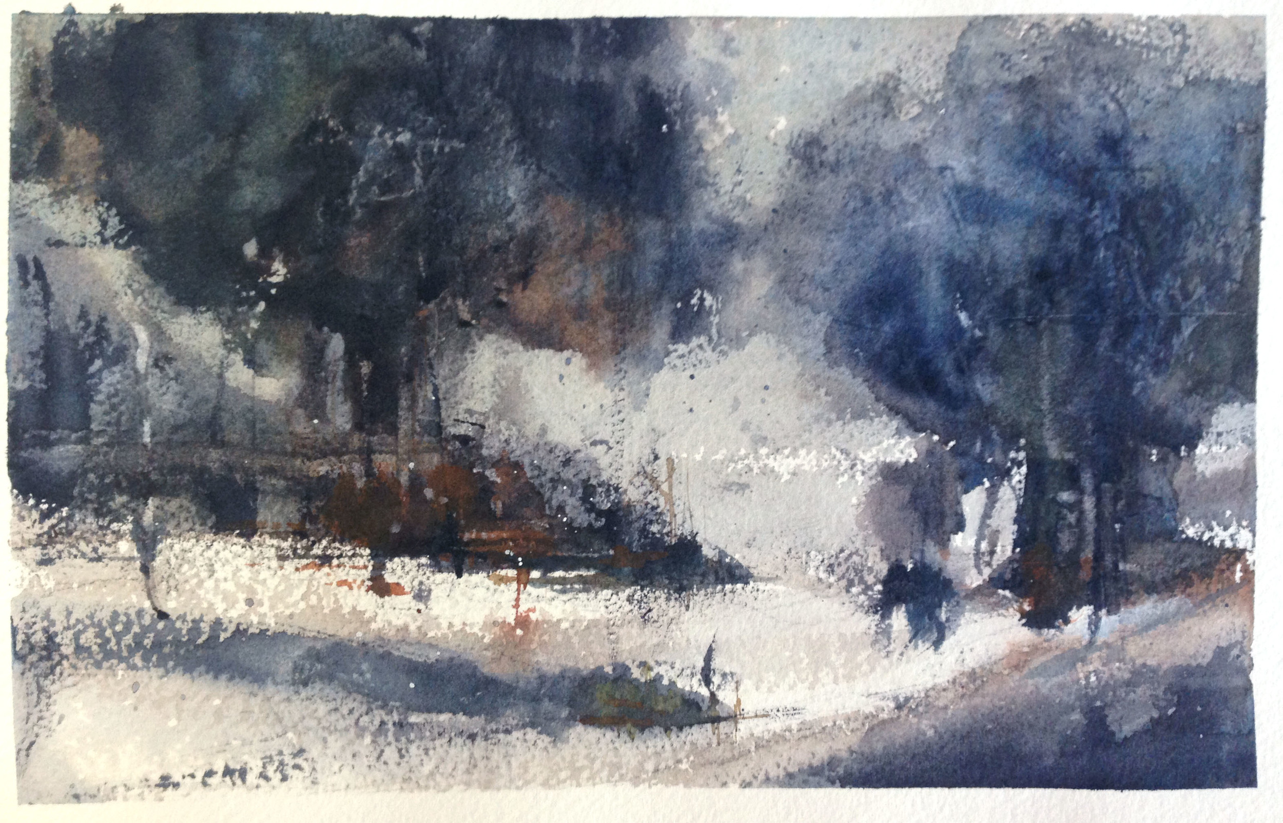
This first one is the abstract we did. The Chien painting I used is on the left, my abstract on the right. It was very hard to move past the shape of the trees!! Chien really pushed, however, for me to let go of the trunks and details, etc., and instead focus on the big shapes, dark and light, contrast, where's the focal point, the minor and the jumper, etc.
This next one is the snow scene, which I did on an 1/8th sheet. Here's the almost black and white photo we all used-
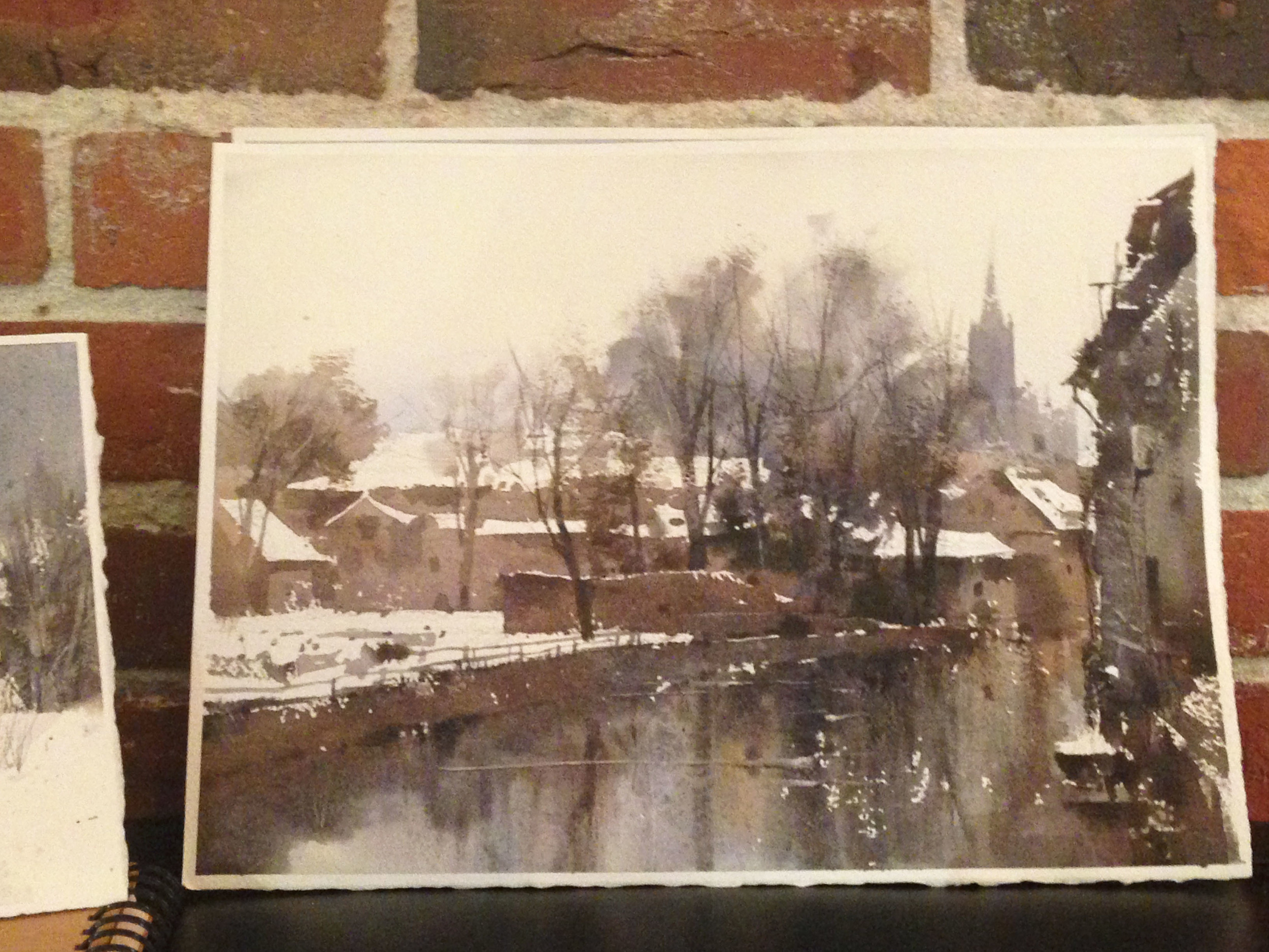
I thought it would be of value to share some comparative thoughts about Chien's and my versions. Chien didn't get around to critiquing this one, but the differences were obvious to me. 1) He has a great deal more warmth in his, besides the overall cool color palette. His greys fall to browns, in my opinion, rather than the blues. 2) His darks are not as dark as mine are. This is actually a repeated motif I've come to recognize, across almost all the pieces I did in the workshop (and elsewhere). His shadows have a greater depth to them, because he lets them breath a bit. He rarely has to go "dark dark", and therefore can reserve it for those tiny details that grab your eyes- windows, doors, cast shadows from awnings, etc. 3) He decided to darken the main snowy roof. This is a decision I never would have made, but it distinctly pulls my eye to his roof, where as mine blends in too much with the surrounding pale valued snow.
I don't know if I mentioned it before, but as I painted my trees to the far right, I suddenly recognized I hadn't left any white, to set its shape off from the background. I lifted some with a towel, which you can see a bit. When I went back and looked at Chien's, I saw that he had definitely left some dry brush white there. I was really struck by the fact that even here, in a relatively abstract shape to the side (a Prince, as he would call it), he was preserving his whites and looking ahead, just as I might do for something like a roof, elsewhere. So, abstract shape or defined architectural object, he was, in many ways, treating the shapes the same.
Chien's beauty...
My rendition...
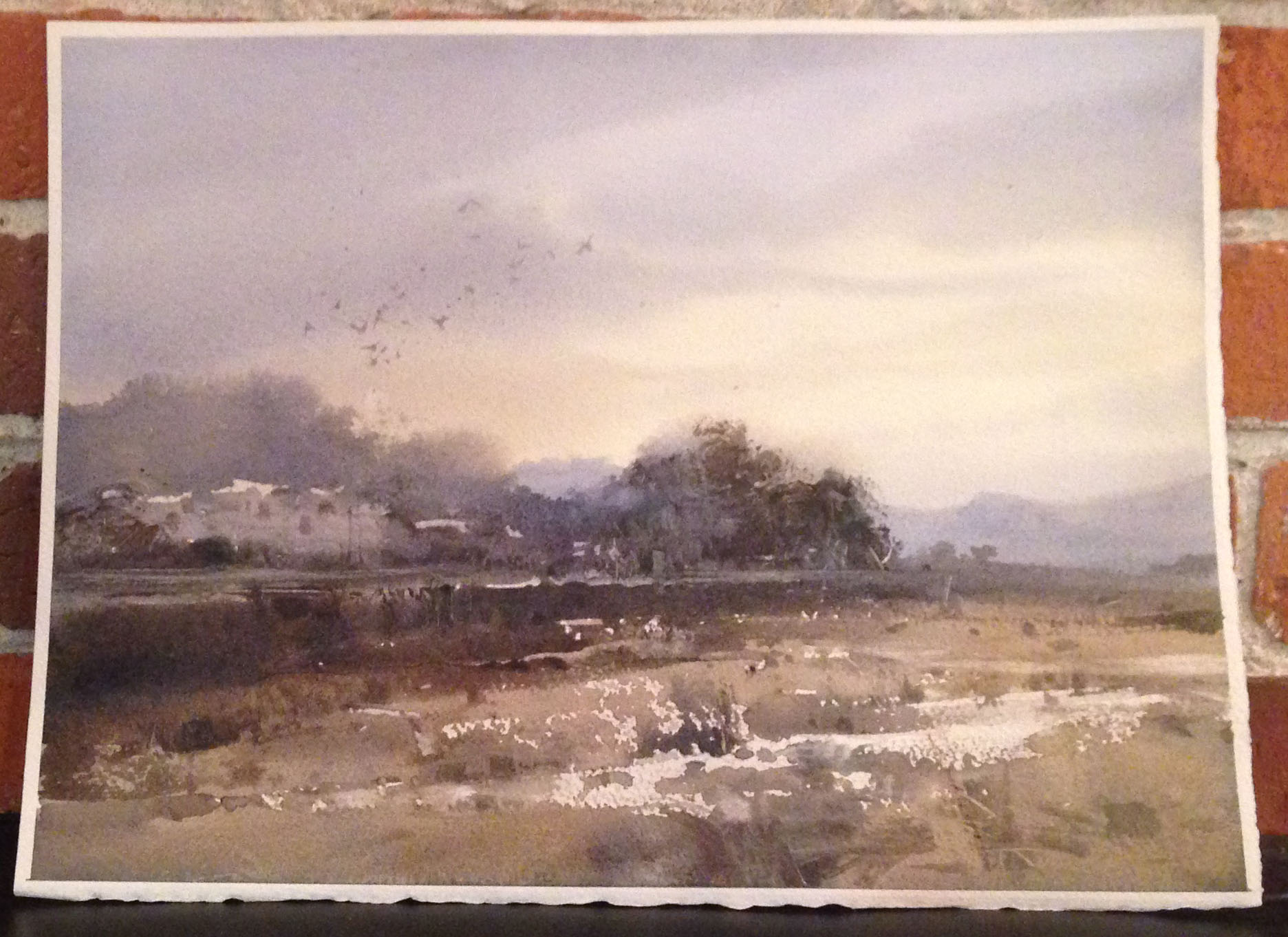
I also did this one below on an 1/8 sheet. I was honestly quite happy with it. It's the kind of subject that's already in my wheel house, so I felt pretty comfortable. I got to try some of Chien's "scratching" techniques, which was fun, as well as dry brush work. Chien also felt I'd done a good job. He said that the composition was good- at which point I noted it was really his composition, and he'd done all the heavy lifting! True, true.... He also felt like in his version of the image, it was quite clear that it was some sort of dry river bed or derelict road running through the foreground, while that sense of "form" was lost in mine. I agree. There's just enough of a continuing line in his to let you read it. It's hard to know when to let loose, and when to keep things tidy.... so it's very easy to lose your whites at times.
I also LOVE his clouds and the warmth in his sky, but I liked the orange in mine too. His clouds are very velvety and soft- my guess is he used the ubiquitous Verditer Blue and Jaune Brilliant No.1 (which both have white), where as I used Ultramarine Blue and it granulated. I actually normally like this, but his clouds are so delicious, it makes me want to explore the technique.
This next piece was when I moved up to 1/4 sheet. Here's the photo we worked from-
All in all, I liked what I did, although... again, a great deal of credit has to be given to Chien for the composition. Still, there's some of me in there. I liked the dull orange in the setting sky, and how roughly and quickly I set in the structure on the right. I've thought about adding a bit of reflective burnt orange in it, to pull it into the composition more. However, afterwards, I noted some of the same issues the first two images have- 1) I'm relying on darks that are too dark, instead of muted colors, as Chien has done, 2) My shadows are uniformly blue, whereas Chien's breath a bit and allow for a greater sense of warm in the image.
Chien came over while I was working on this one, and noted that while I had a very "free brush", which led to interesting dry brush work, I was leaving so many bit of "sparkle" behind that they began to loose their meaning and importance. His advice? "Do the first stroke 'romantically', quickly, then continue with the mind, breaking the line, closing gaps, finding the Big/ Middle/ Small and the Diagonals." So, the good ones stay behind where you want them and choose to keep them. Good advice, and something I noticed was the basis of his critique on my previous painting as well (the dry riverbed).
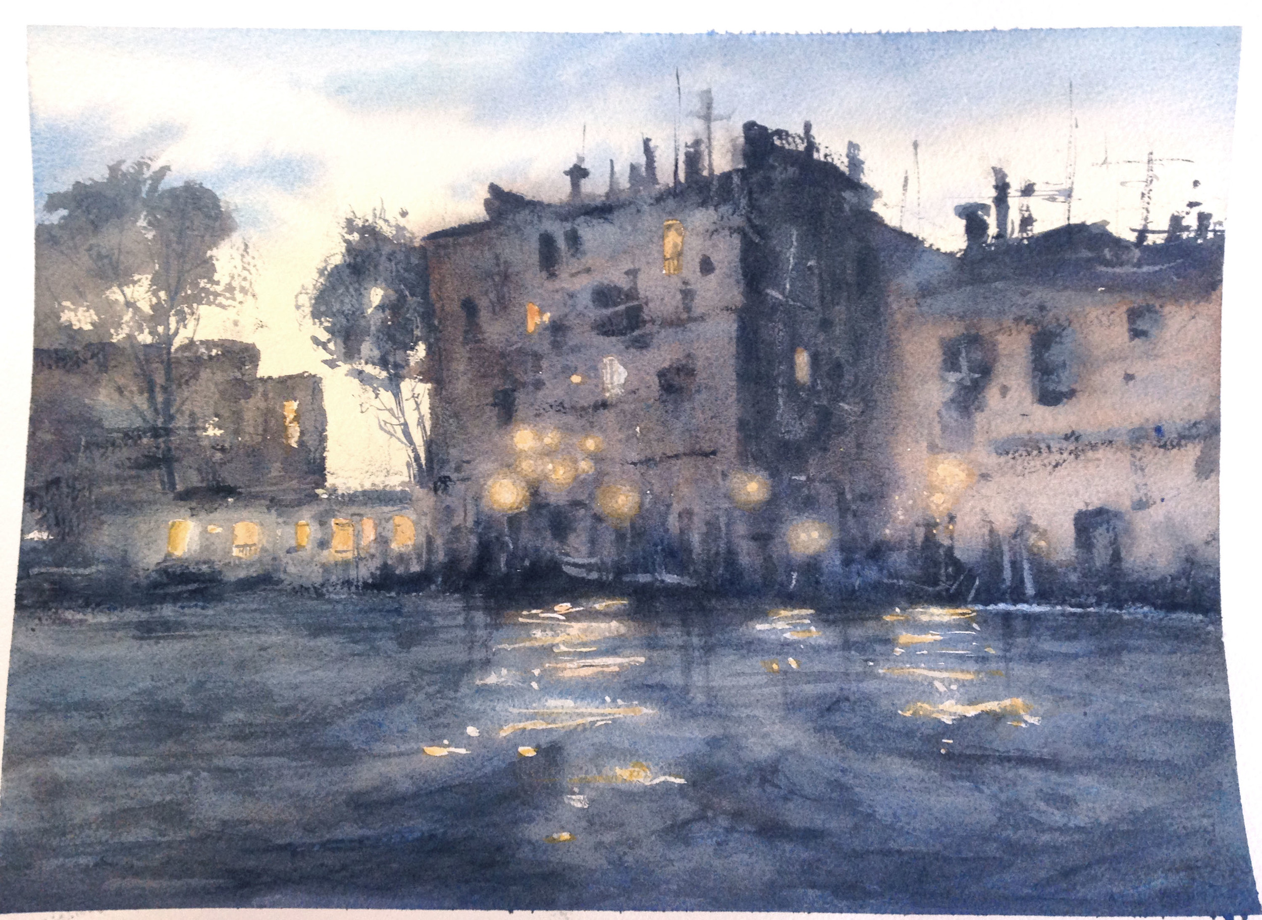
This 4th painting was very tough for me. Something I've noticed is that, despite the abstract detailing of his work, everything is actually appropriately plumb and straight in his painting. Yes, it's abstract, but it's very under control when he needs it to be. I don't mind some looseness at all, but, looking at Chien's, there would clearly be value in knowing when to slow down and really get an architectural element right, so the rest of the building would read better.
We used masking fluid for the lights, then went back in towards the end and softened the colors around it with lifting, as we laid in the yellows. Chien really had to come by and push me on this, as I was very tentative. He took my brush and did a few of them to demonstrate-- he really pushed the brush in there!! Finally, he did give me a bit of gentle ribbing for the very orderly windows in the lower left (which is supposed to be some sort of boat). No Sameness! Indeed... that was an oopsy! :)
Still, all in all, at this point in the workshop I was feeling pretty confident. I'd been learning stuff, for sure, but was also pleased enough with the work I'd be producing. Then we went plein air painting. Ugh. Plein air painting is something I've still not fallen in love with. I did a lot of it recently on a trip to Honduras, and had a hard time (more on that in an upcoming post). It's very overwhelming, building a composition on the fly. And that was really just confirmed by my experience at the workshop.
The painting below is ok at best, to me. As Chien (and I) noted, there's a giant hole in the lower right corner, and there's not real way to fix it. Also, the requisite jumper between the focal point and the ships on the right is missing. It's almost like two separate paintings. Finally, he pointed out that I had two very large shapes (the sky and the water) that were almost the same value. Bad news. Just as he did with the overlapping shapes of the balconies for the last painting of the workshop, I needed to help the eye separate the shapes. He suggested I make the water significantly darker and bluer, particularly in the foreground, if I wanted to give the image a sense of depth and make the relationship of the shapes more interesting.
And so I came out of the workshop feeling like... Chien was right. Composition probably really is more important than technique. I thought, "Hey, maybe my technique is atleast adequate now. That practice and playing is paying off. I can paint some. So I guess it's time to really focus on composition, because that last painting sucked." Chien spoke often of self-improvement, and said, "Why does an artist feel humble? Honest? Because they never know they've made their best work. They're never satisfied." Of course, he also said at one point that "To know is one thing, to paint another." Ha! So, you've got to put in the hours....
After the workshop ended, on the last day in Vancouver, I went out and painted plein air on my own. This 1/8th sheet sketch is what I got after an hour. Not perfect, but better, perhaps. At the very least, I was thinking consciously about the composition, not just my technique. Big/Middle/ Small, Diagonals, etc.
emerald Park, north vancouver
Finally, a week after I'd been back, I painted the following two images. The first on an 1/8th sheet, very quickly and loosely (1/2 hour), and the 2nd on a 1/4 sheet, slower and with more patience (1.5 hours). Both, to me, at the very least represent some attention to various things I learned in the workshop- No Sameness, Diagonals, how abstraction works, Big/Middle/Small, etc. Alternately, when I sort of goofed, I was atleast aware. That, in itself, is progress!
And that's it. Thanks for reading, everyone! It has been an pleasure writing this up. If you ever get the opportunity, my advice is to take a workshop with Chien. Great teacher. Cool guy! Wonderful painter...


