Exploring Nihonga as a watercolorist in Japan!
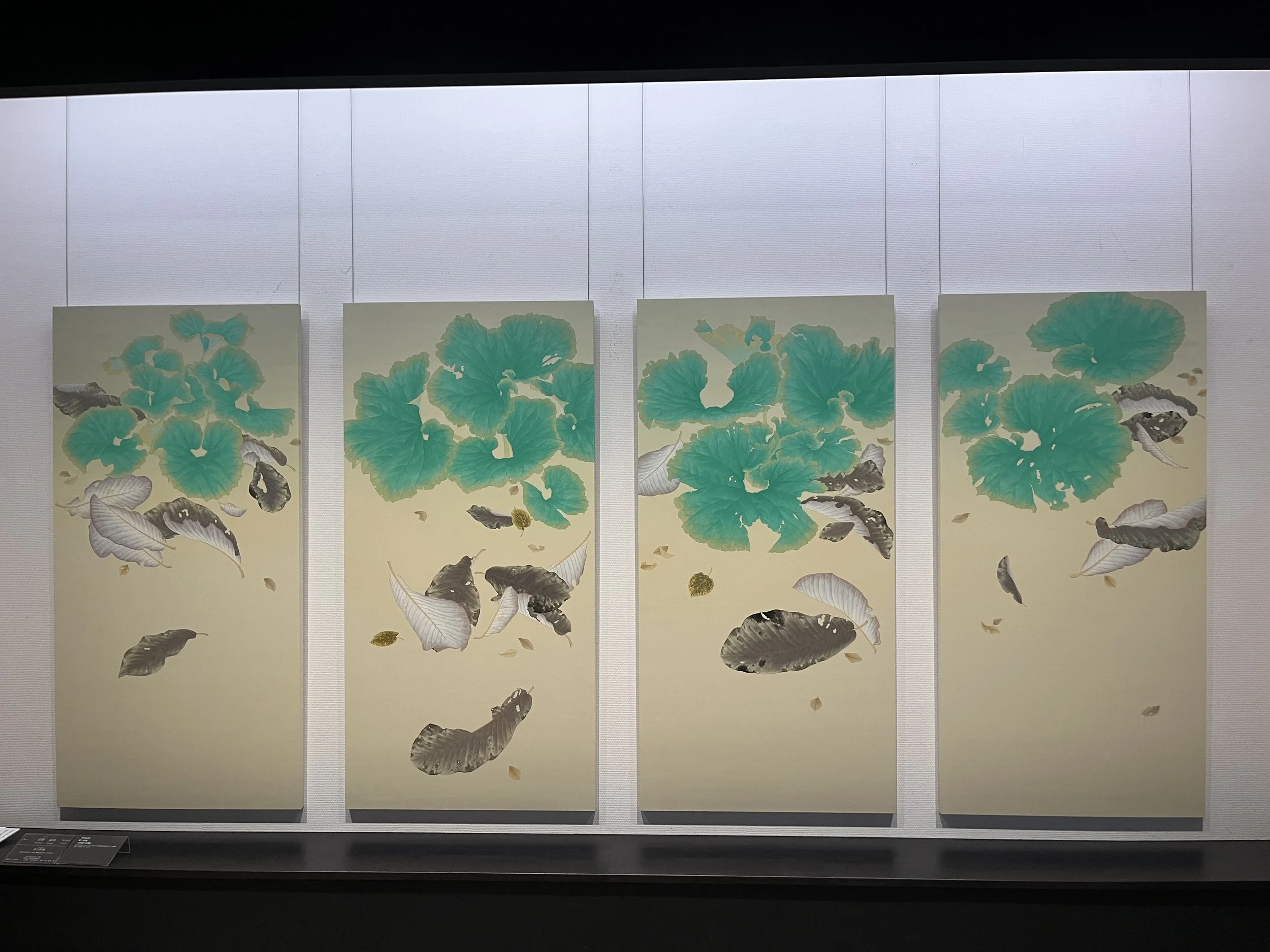
by Yasuhara Shigemi
While in Japan, I had the opportunity to visit a number of contemporary nihonga art shows and museums while in Tokyo, and I even took a brief 2-hour hands-on class at Pigment, a really interesting art store in Tokyo as well. What I got to see was very exciting and inspirational!
Over the last few years, I’ve been inching closer and closer to certain elements of what I’ll call the “Japanese aesthetic” for lack of better term— a desire for more empty space (“ma”) in my work, perhaps some sort of stronger connection to my black and white notans and how they simplify things, a daring that is needed to leave some things out and focus on others, and the freedoms that allows you to play with. Watercolor artists such as Claire Harkess and Kanta Harasuki have been exciting and compelling to follow, and I’ve sometimes looked for ways to integrate elements of their work into my own practice, as I’ve looked to stretch my limits.
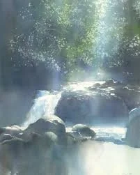
by Kanta Harasuki
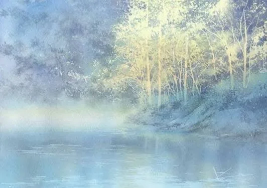
by Kanta Harasuki
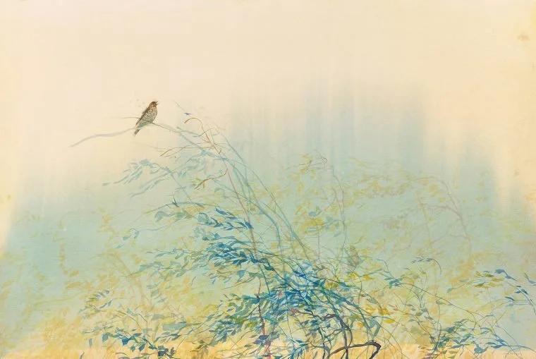
by Claire Harkess
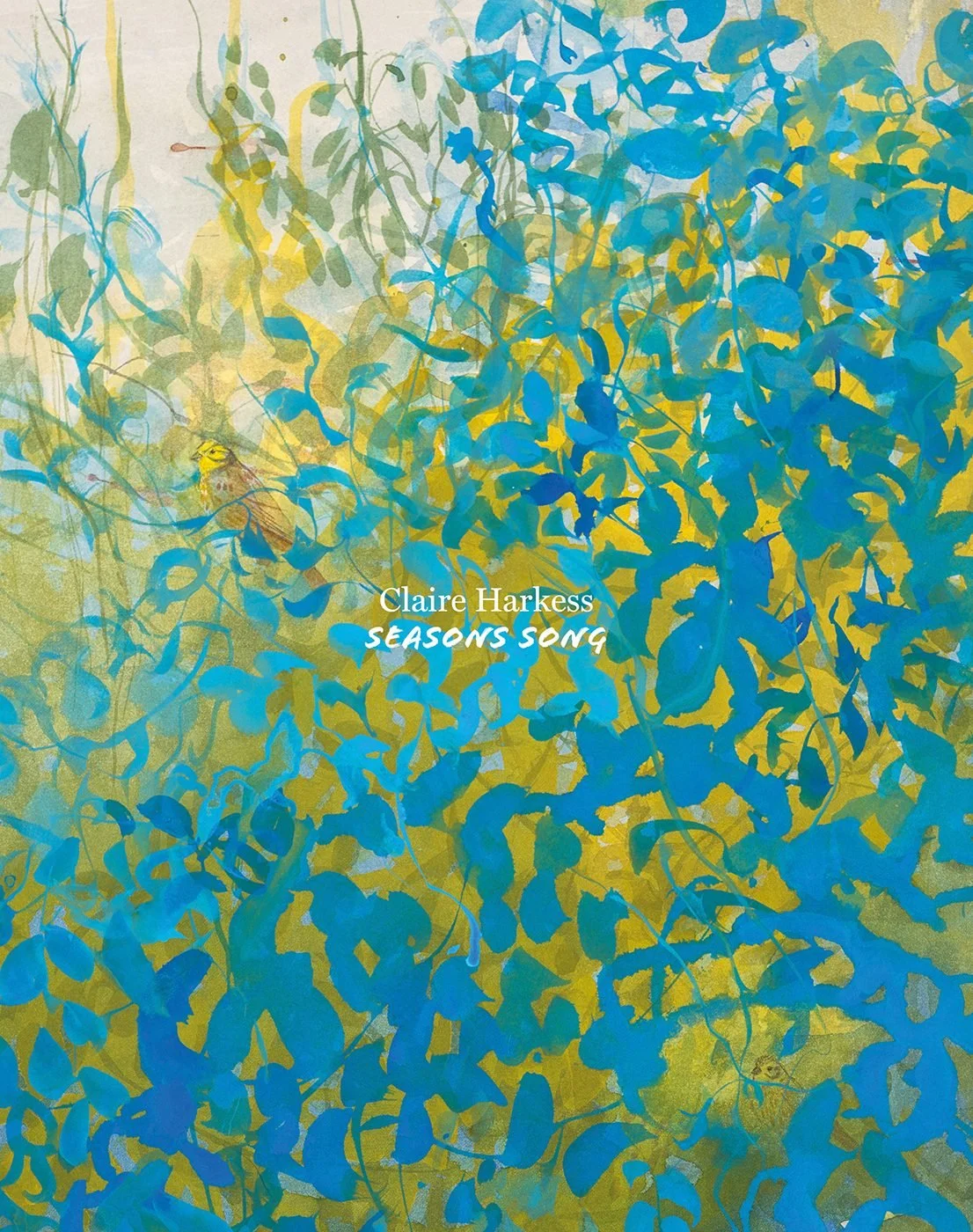
by Claire Harkess
All of which is to say that part of the excitement of this trip to Japan was that I was on the hunt for opportunities to explore nihonga in greater depth, in person, and to be that nutty artist one foot from a canvas, staring deeply into it!
Fortunately, Japan did not disappoint.
What is Nihonga and Why Do I Care?
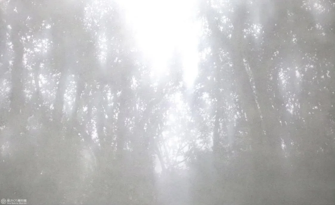
by Masaharu Fujishiro
Nihonga literally means “Nihon” + “ga” or “Japanese” + “art/painting”. There are various ways people apply it, but nihonga, as I’ll use the term here, is a painting medium made up of pulverized minerals (think- super chunky Daniel Smith Primatek colors) that are bound to a paper substrate with a mixture of animal glue and water, with the paper often mounted to a hard backing (much as I’ve been doing this last year, with watercolor paper on cradle boards). Because they use a diluted glue as a binder, you don’t need glass. And because they’re mounted to a backing, you can create very large works with multiple panels.
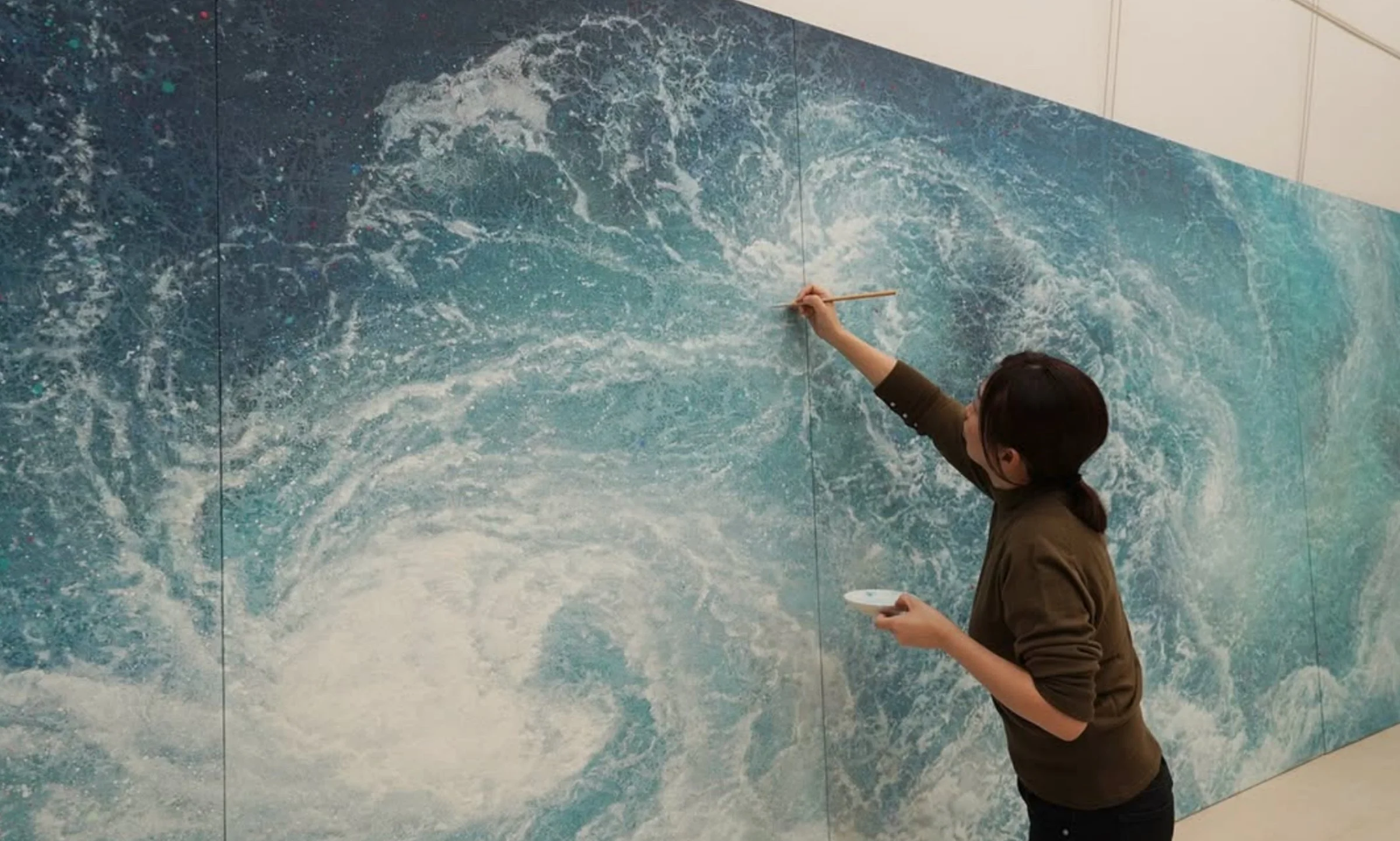
A huge, amazing painting by Mikiko Noji
What makes this all so fascinating to me, besides the fact that the results are beautiful, is that, while painting, it all acts remarkably like watercolors. A very heavy watercolor with no dispersant, but a watercolor just the same. You mix the pigment up with the animal glue and water. So it’s fluid. It’s on a different paper (washi paper or silk), but it’s still paper. It uses all the typical calligraphy and hake style brushes I already use. While it’s not what they call it, saying it’s “Japanese Watercolors” isn’t far from the truth in my eyes, as a westerner.
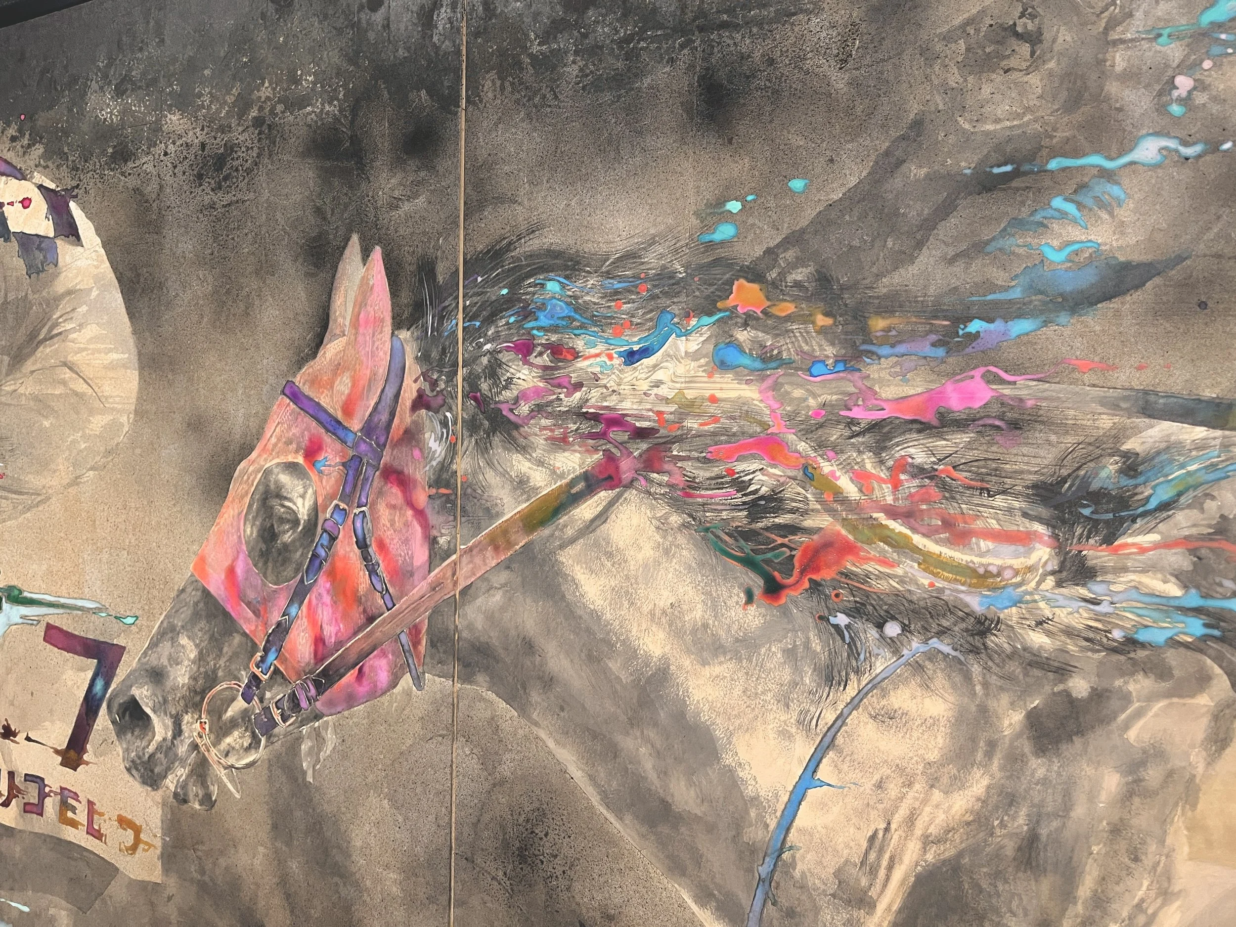
by Kawamata Satoshi
So when I went to some of these exhibits, and got to see what are essentially watercolors 6’ tall and sometimes 10 or 20’ long, it was incredibly eye opening. The ambition and scale was jaw dropping! The skill often exquisite. It was utterly unlike anything I’ve ever seen before.
What Makes it Different and Special?
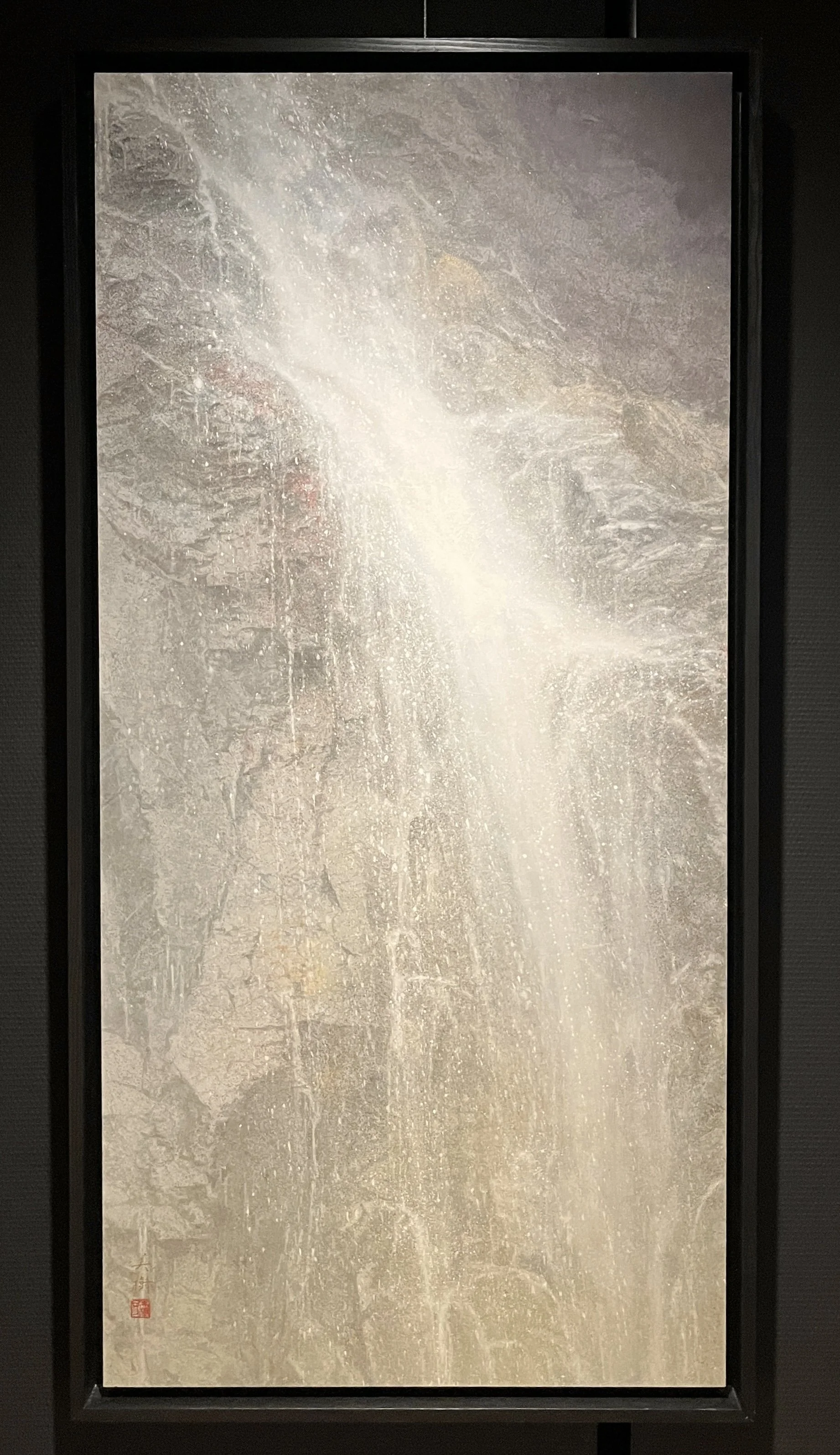
by Mikiko Noji
For a long time, many of the new approaches I’ve explored with watercolors (wetting the back of the paper, more use of masking fluid, mounting my paintings to cradle board, spray varnish, etc) have been my attempts to stretch the medium’s limits and allow myself the painting flexibility (and results) I’m desiring. I’ve wanted results that would allow me the fluidity of watercolors, that could be on paper, but that would dry more opaque, to allow layering. I’ll call it “fluid opaque layering”. And I’d like it to not need glass or varnish. And I want to paint big. But I don’t want to do it on canvas. But I’d like to still use granular pigments, as I’ve not cared for the texture of acrylics. It’s a tough order to meet!
Hahaha! You know— I want the porridge to be just right!
Well, of particular interest to me was that, given that the pigment particles it uses are relatively large (compared to the super fine dust of raw western pigments), nihonga can be quite opaque when dry, and yet, after things dry, the pigment is bound to the surface of the paper by the animal glue. Because of this, the pigment remains luminous and matte, but inactive when rewet. All of this means it combines traits of watercolors, gouache, and acrylics. It’s quite exciting, and allows for all kinds of alternative approaches!
Additionally, nihonga uses a material called “gofun” as a white pigment. It comes from a special ground up shell, also mixed with the animal glue. While it applies wet and fluid (allowing splatters and drops), it dries opaque, like what a thick buttery gouache application would do. And once dry it doesn’t reactivate (thus acting the way acrylics would act). It’s a very fascinating thing!
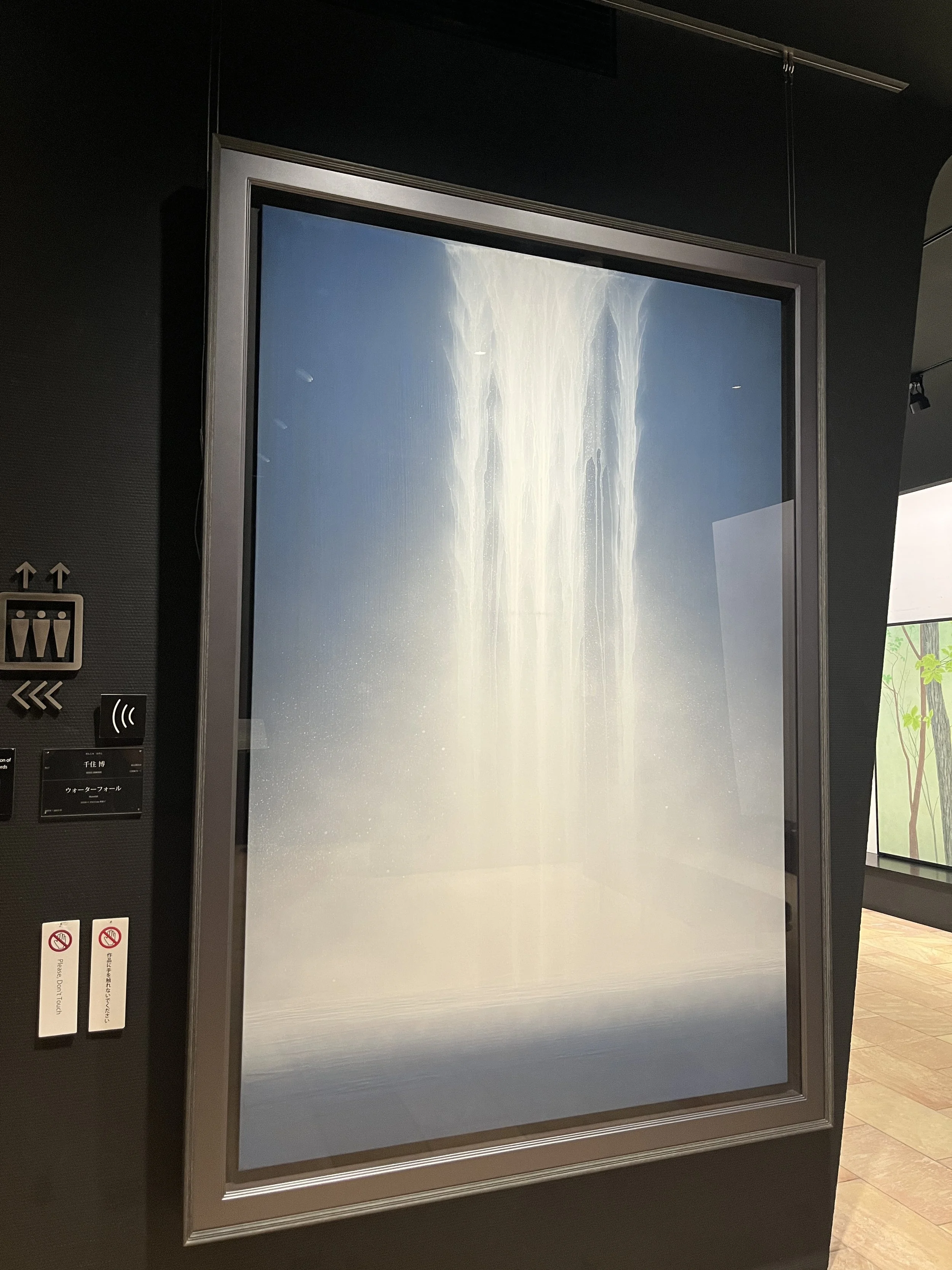
by Hiroshi Senju
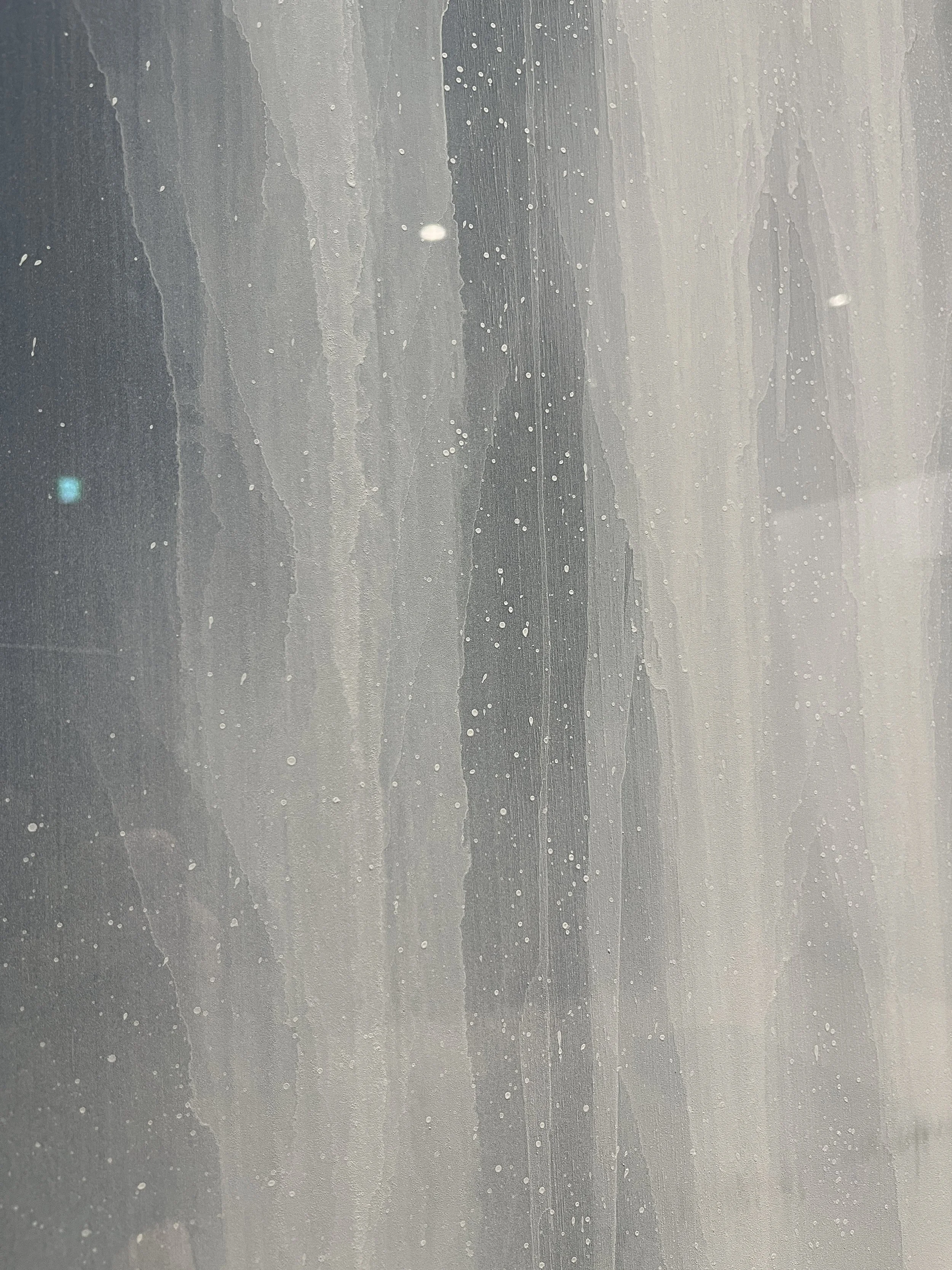
a close up of the waterfall
How I’m Exploring and Integrating Things
As is often the case, seeing how artists respond to the opportunities and restrictions of different mediums is almost always really illuminating to me. It can really open up doors in my mind for new approaches. I anticipate eventually getting my own nihonga supplies and trying them out back here in the US, either as a separate medium, or in conjunction with watercolors. In the meantime, I’m exploring the visual power of new approaches. This has meant a greater focus on negative space and simplification, much as I saw in the nihonga I got to view in Japan, even if I don’t have the same materials available.
As an example, I don’t have the gofun to paint my whites positively the way they do in nihonga, but I’ve been working with masking fluid as I try to inject similar energy and compositions into my works. Masking fluid is also painted with a positive brushstroke (instead of negative painting), and so you can feel a similar “dance of the hand and body” behind it, that I think feels quite different from negative painting. If you’ve seen any of my waterfalls from the last year, this is much in the vein of what I’m discussing.
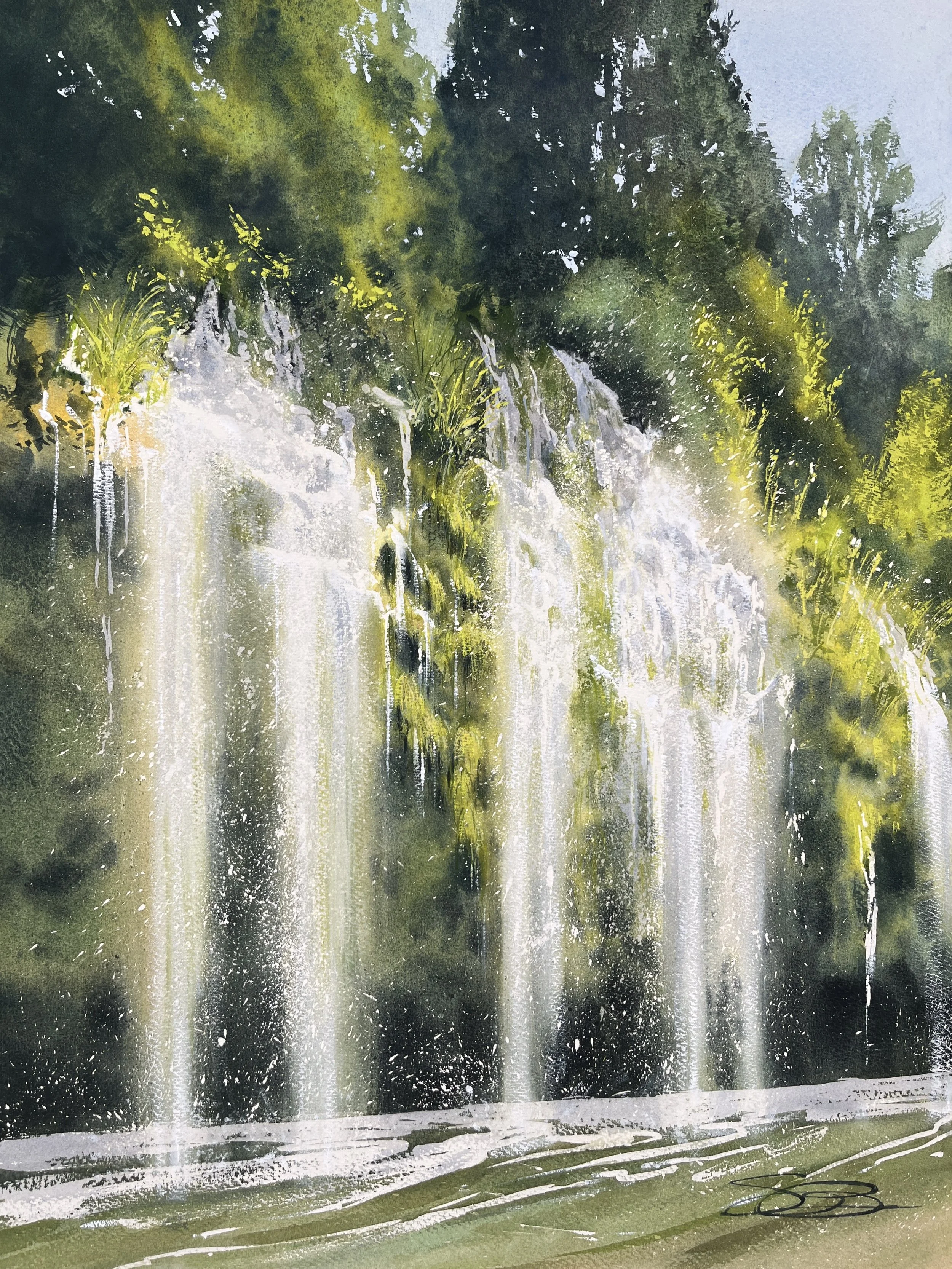
More recently, here's a piece painted since my return from Japan, using some of these techniques and approaches—
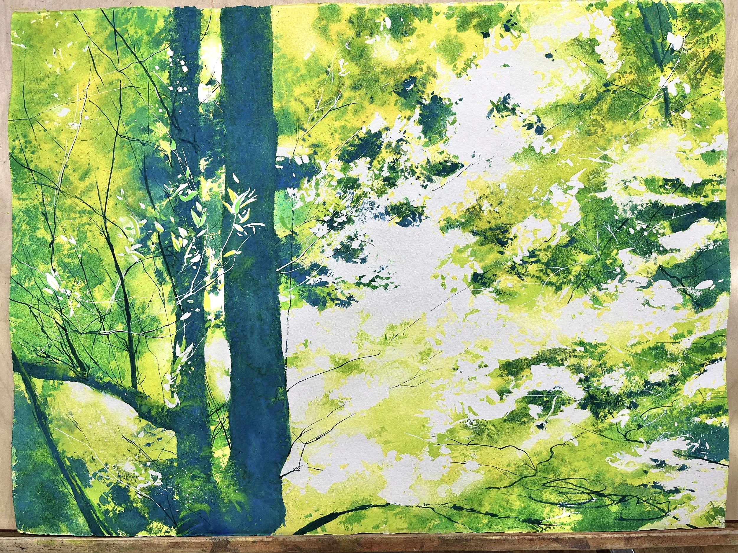
“Muir Woods Euphoria”, 22”x28”
You can click here to find Euphoria in the Store.
I’ve also recently repainted (in a larger size) some of my personal favorites from the last few years because I felt they really aligned with what I wanted to explore, such as maintaining the calligraphic energy of the brushstroke, simplifying my shapes, etc. This painting is a good example—
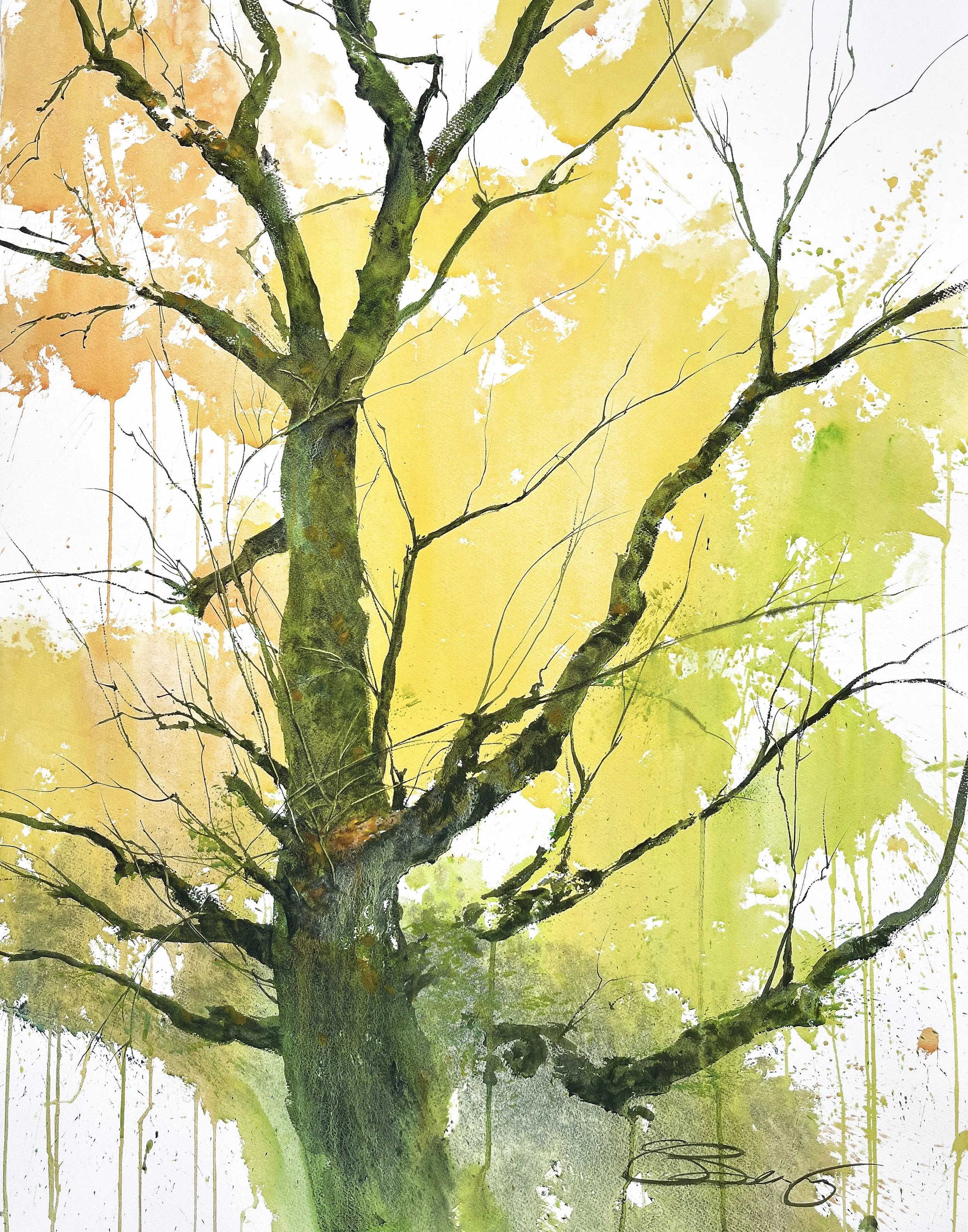
“Release”, 36”x48”
Click here to find “Release” in the Store!
Again, for example, here’s an older work of birches, that I’d like to repaint larger with some of these new approaches in mind. I’m sure you can see the similarities I’m discussing.
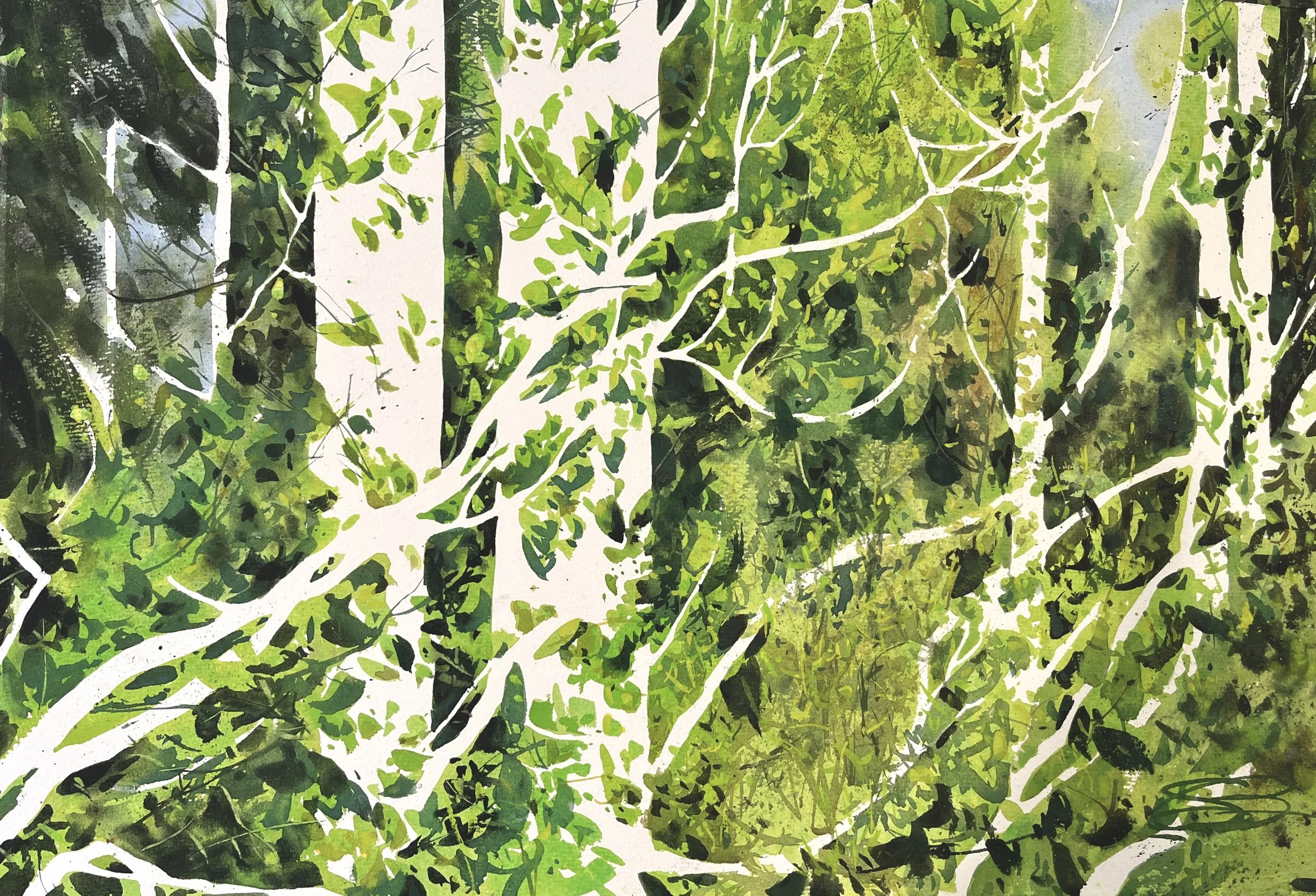
…birches, yet to be repainted!
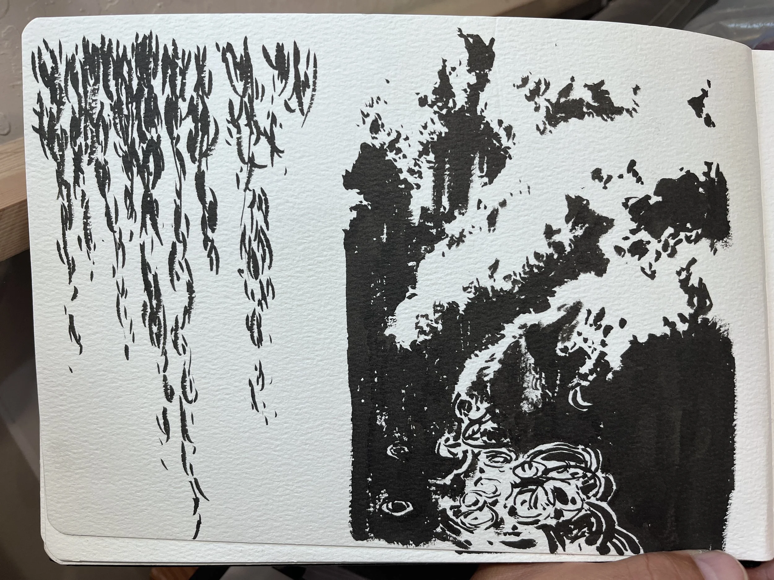
I also did a variety of notans in Japan, and my goal (given the inspiration of the trip) is to try and hew closer to the simplified aesthetic approach the notans represent, when I translate them into watercolors. Here are some examples of the notans I did and the photos that go along with them.
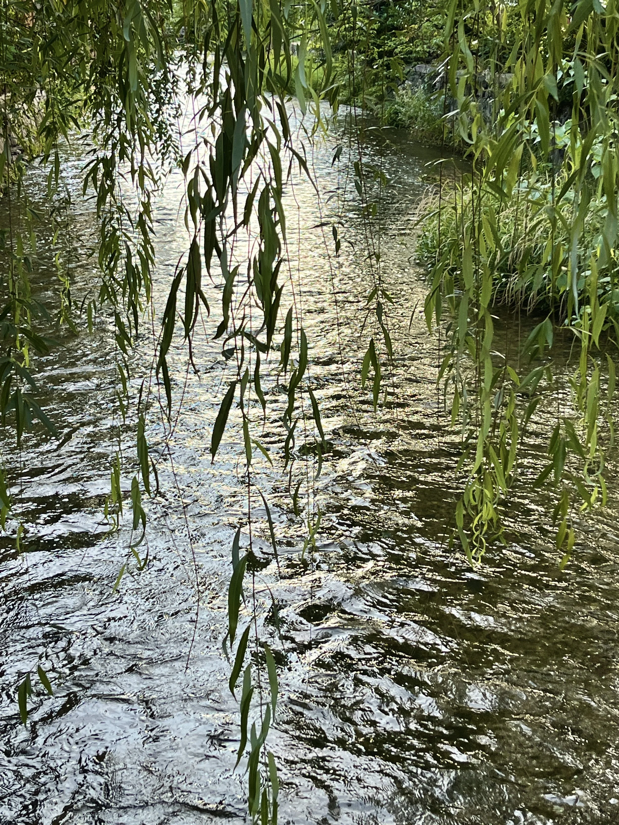
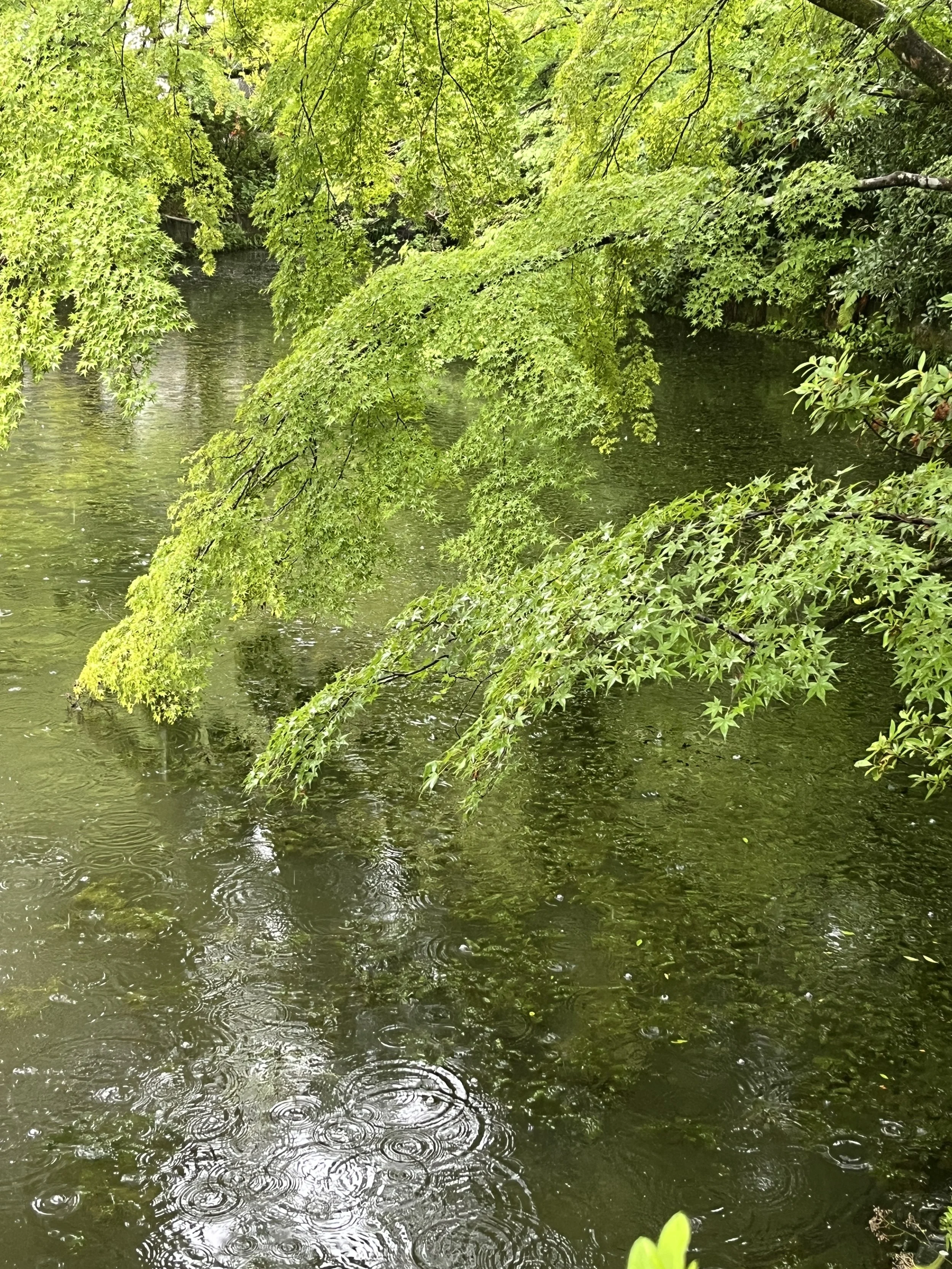
As is often the case with these pivots we make as artists, it’s almost never a clear break with what we’ve done before. Rather, it’s an ongoing journey of exploration. And when new things do bubble up in the finished creations, they’ve often been long-gestating, waiting for the right impetus to come to the surface!