Working With Opaque Watercolor Pigments
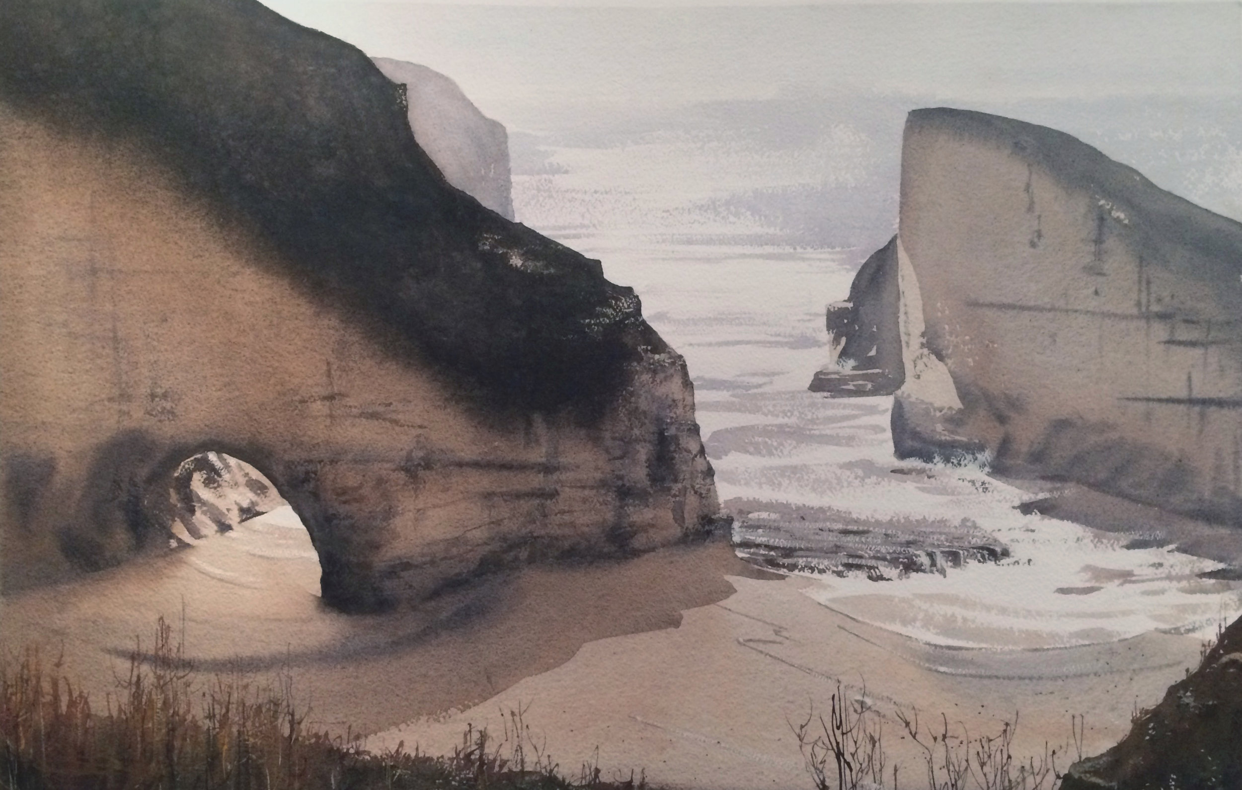
Shark Tooth Cove, North of Santa Cruz, 20" x 30".
This week, I want to share some of my thoughts on working with opaque paints. I'm definitely not a purist re: transparency, though I know many are. Whatever can get me where I want to get at the end is the tool I'll be using! Of course, many people who might be following my blog are also aware of Joseph Zbukvic and Alvaro Castagnet- both known for using those bits of opaque white for highlights on shoulders and whatnot. A very good tool!! Alvaro's stated opinion, in a gist, was that you shouldn't mess up a beautiful wash just to cut around tiny highlights. I took that to heart and have developed that approach for other applications. Lets take a look.
In this painting above, I definitely preserved a lot of white for the waves, but I also used Titanium White paints a number of times as well- particularly over the sandy beach areas and the stone outcropping. You can also see it used for the breaking waves.
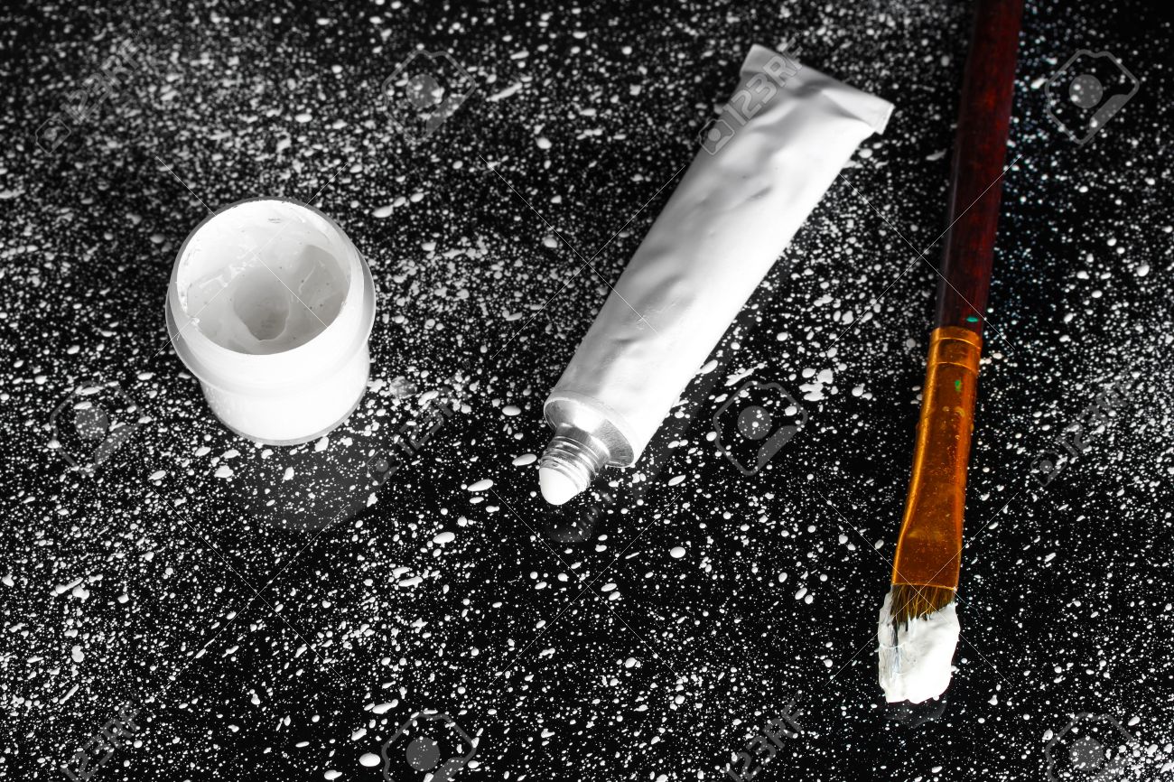
For this example, the paint is very thick on the brush. Goopy. I either dip the synthetic brush directly into the tube, or I get it very thick from the pan. Either way, I'm not loading the brush up with very much water, nor am I opening the paint up on my palette. Then, the goal is to dry brush it on so that it catches the tooth of the paper, which makes it look very natural. The secret is to not over work it. Go in once, catch the grain of the paper with a thick application of paint, and get out! Here's an example that is close to what it would look like on the brush, although I would use a much smaller, pointed brush that could fit into the end of the tube-
Here again, you cans see it on the cliff bluff. I used Jaune Brilliant No. 1 because it has yellow mixed in it. For stuff like these speckled dots, I just lay the side of the brush against the paper. I don't even swipe it, the way I do for the waves.
This same affect is also used on these rocks to bring back a few strategically located highlights on this rock. Like in oils or acrylics, I'm essentially scrumbling with a thick dry application of paint. This is Jaune Brilliant No. 1. White would be too garish.
I sometimes use opaques for grass as well, as it lets me lay in blades of varying opacity, organically building layers and effects. For this, first I laid in my mid-tones as a wash, then the darker ones with my needle brush, and then finally the highlights- done with Yellow Ochre and with Jaune Brilliant No.1 again, to catch little bits of light.
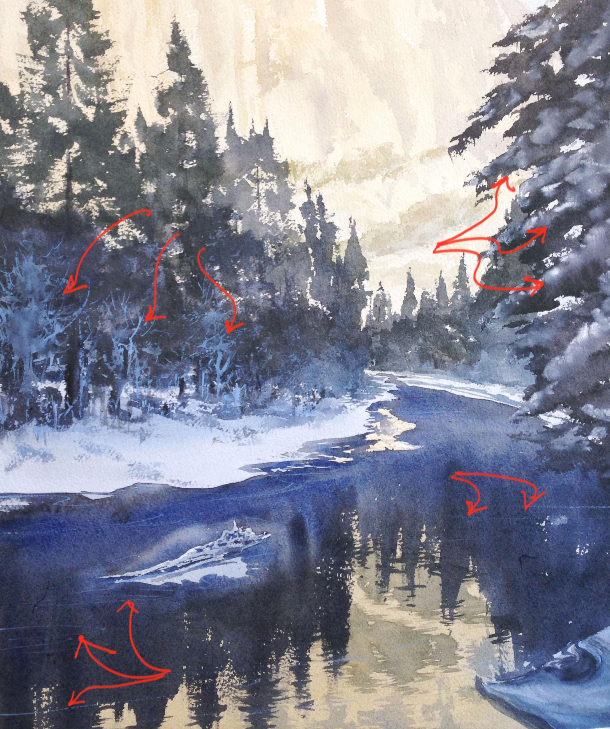
This is really the same method I'm using in the painting below for the pale blue trees on the right, or the thin, very delicate swipes across the water. For both of them, I mixed up some Cobalt Blue with Chinese White and using brisk, quick brushstrokes with a thick application of paint, I built up the paler values in front of the dark pine trees. These sorts of shapes are nearly impossible to get if you're painting negatively, atleast if you'd like them to be "fresh" and "spontaneous". This is where a series of active brushstrokes (instead of negative painting or using masking fluid) really makes a difference.
On the right, up top, I dropped Chinese White into the tree boughs, wet into wet, to get those soft, poofy drifts of snow. Again, the Chinese White was pretty thick, but not straight from the tube. I did the same thing on the painting down below, where I dropped white into a background that was wet to the horizon. As the white blossomed, I got soft, snow covered trees with it -
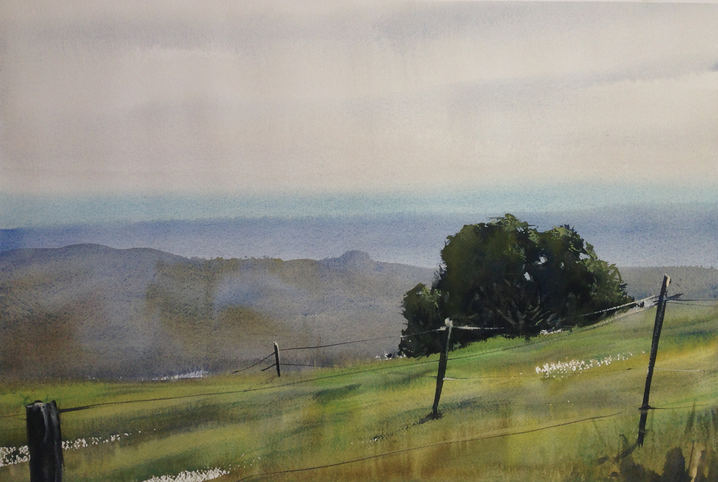
Additionally, I applied white to the foreground tree. Some was very thick. So thick and goopy that I actually "laid" it onto the tree in a stringy dollop. It was the last application of paint, so I let it dry- impasto style. Absolutely no painting over it!! It actually is raised, like braille. You can also see, in the notches of the trees, where the application of white was laid into a wet area and it partly diffused into the purple with "veins". A lovely affect, if you can get the paint you're laying it into to be just damp, instead of too wet. Once again, I got that effect elsewhere, in the "furred" highlights on the posts of the painting below-
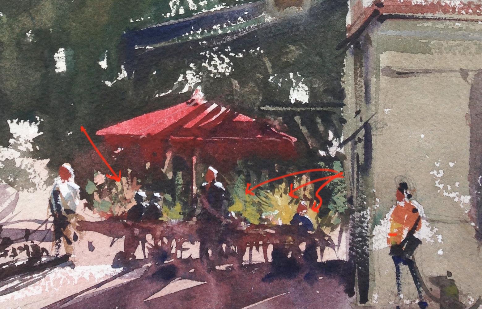
You can also see where I added rough application of a pale, muted, opaque green to the tree. As always, I mixed it up with Chinese White and daubed it on, very thick, in strategic locations. when I need to, I'm often mixing up a bit of a pale, muted color, to cut edges and provide highlights that have some local color. In the closeup shared below, you can see where I've mixed up just that. These highlights, that would have been near impossible to paint around negatively with any grace, where very very helpful in creating a sense of light and form for the people.
And that's really the focus of the tool- how to make the painting process easier. I like keeping highlights and cutting my shapes. That is a very useful, essential skill!! But there are times when it's both easier and far more expressive to daub in the essential bits of highlighted color with an "active" brushstroke.
