Using Color Space, pt. 4- Class Results
Ok, this week's post is the last in the series I'll be doing on Color Space.
1) First, we went over how to navigate color space to "arrive at the color you want". That was that post with all the videos.
2) In the next post, at the end of September, I introduced the idea of different kinds of color contrast- essentially, how to start thinking of color as a compositional tool (how to direct and lead the eye), and not just as a representational tool (how to duplicate what you see).
3) In mid-October, I did the post on rods and cones, where we saw color values manipulated in Monet's paintings.
4) Next, we had the post sharing oil painter Mary Gilkerson's video, and how she shes uses Color Intensity to create light (amongst many other things!).
Today, I wanted to wrap by just sharing what I actually did back in that class in September, and to share a bit about what can be learned from doing exercises like these. I wish I had photos of the work other people did, but I don't. Still, I wanted to stress that do it in a class environment was very helpful. There are lots of ways of exploring color, and you can learn stuff by viewing and assessing and exploring the work of others. I definitely did. So while, 100%, you can learn stuff from doing some of these sorts of exercises on your own, there's something to be said for learning in a group when you can.
Low vs. High Value-Contrast Experiments-
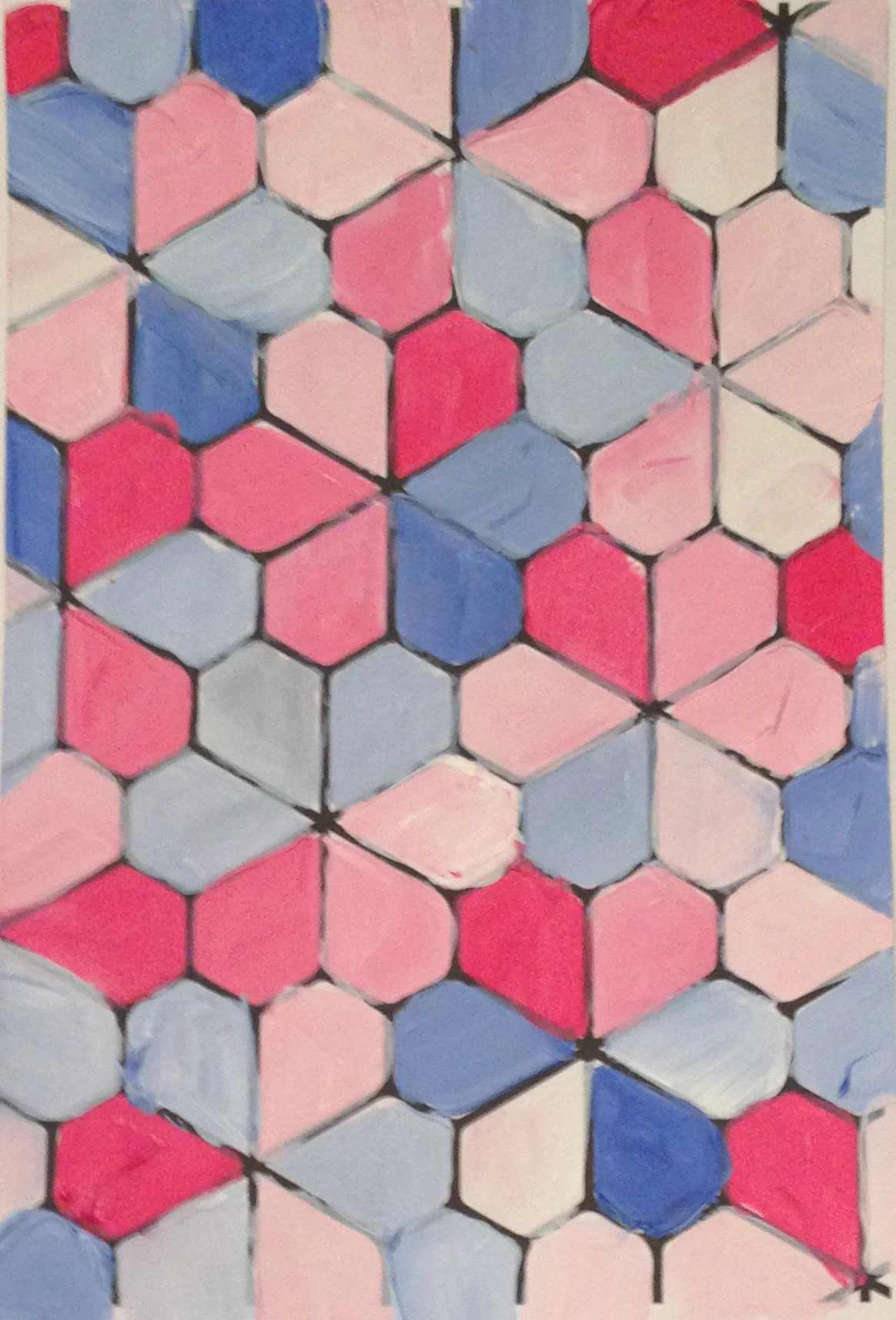
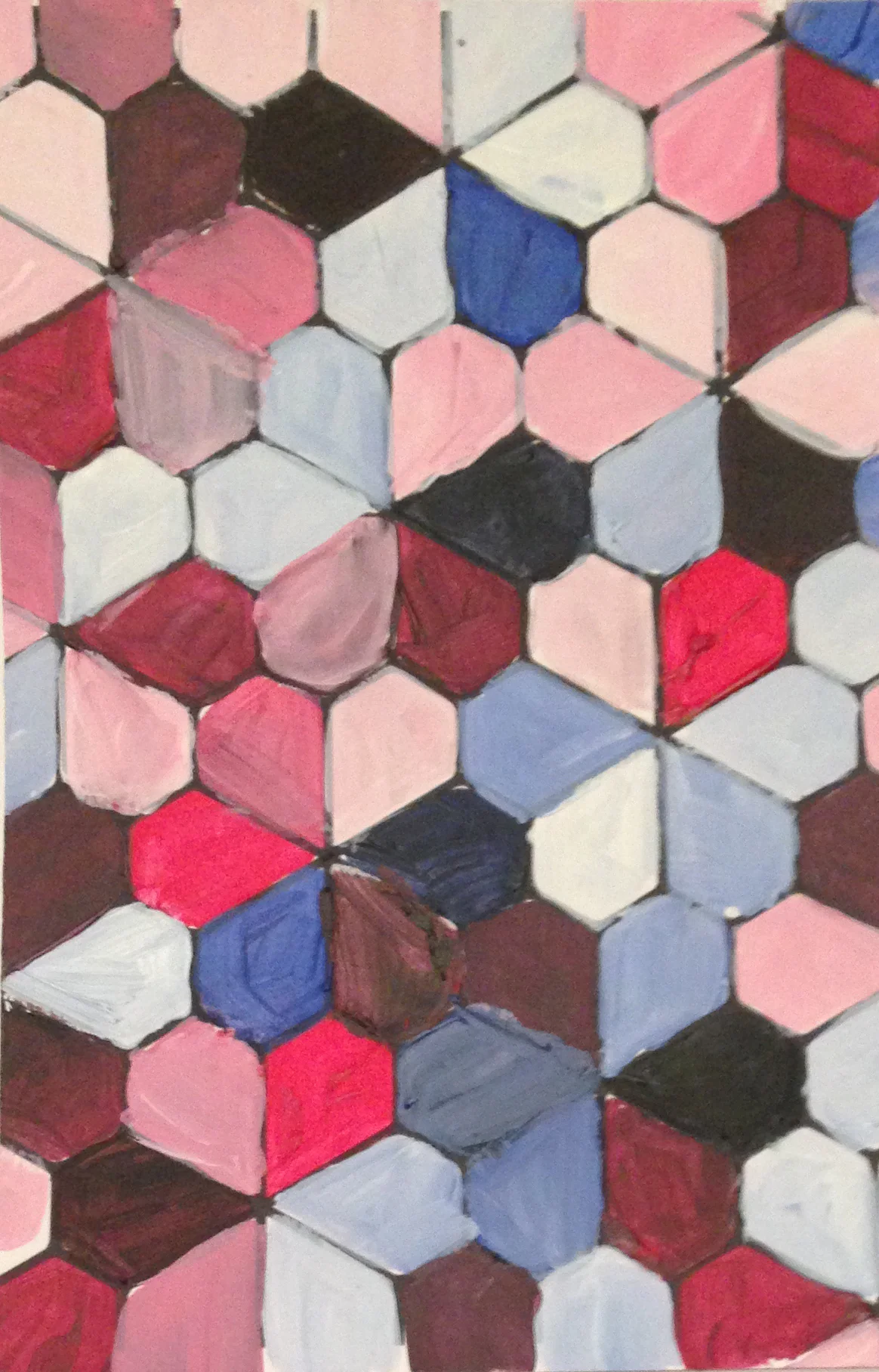
So, after the lectures, we started with two small sheets (6" x 10" or so). Everything was acrylics, but you could do it with watercolors. In the one on the left, the goal was to explore doing a painting that didn't rely on value. We were supposed to pick either all darker or lighter hues. This was surprisingly difficult for me!! I lightened the colors, and really had to work on the more subtle arrangement of complimentary hues. For the second one (on the right), we focused on composition through value. As a watercolorist, this came much more naturally to me. I have lots of experience doing this already. But at the end of class, when everyone put their work up on the wall and we all talked about the experience, I really felt like I preferred the more "pastel" versions. At the very least, I recognized how much I've relied on value to do all the heavy lifting, perhaps at the expense of other tools (namely, the other 6 types of color contrast).
Exploring Mixing Compliments-
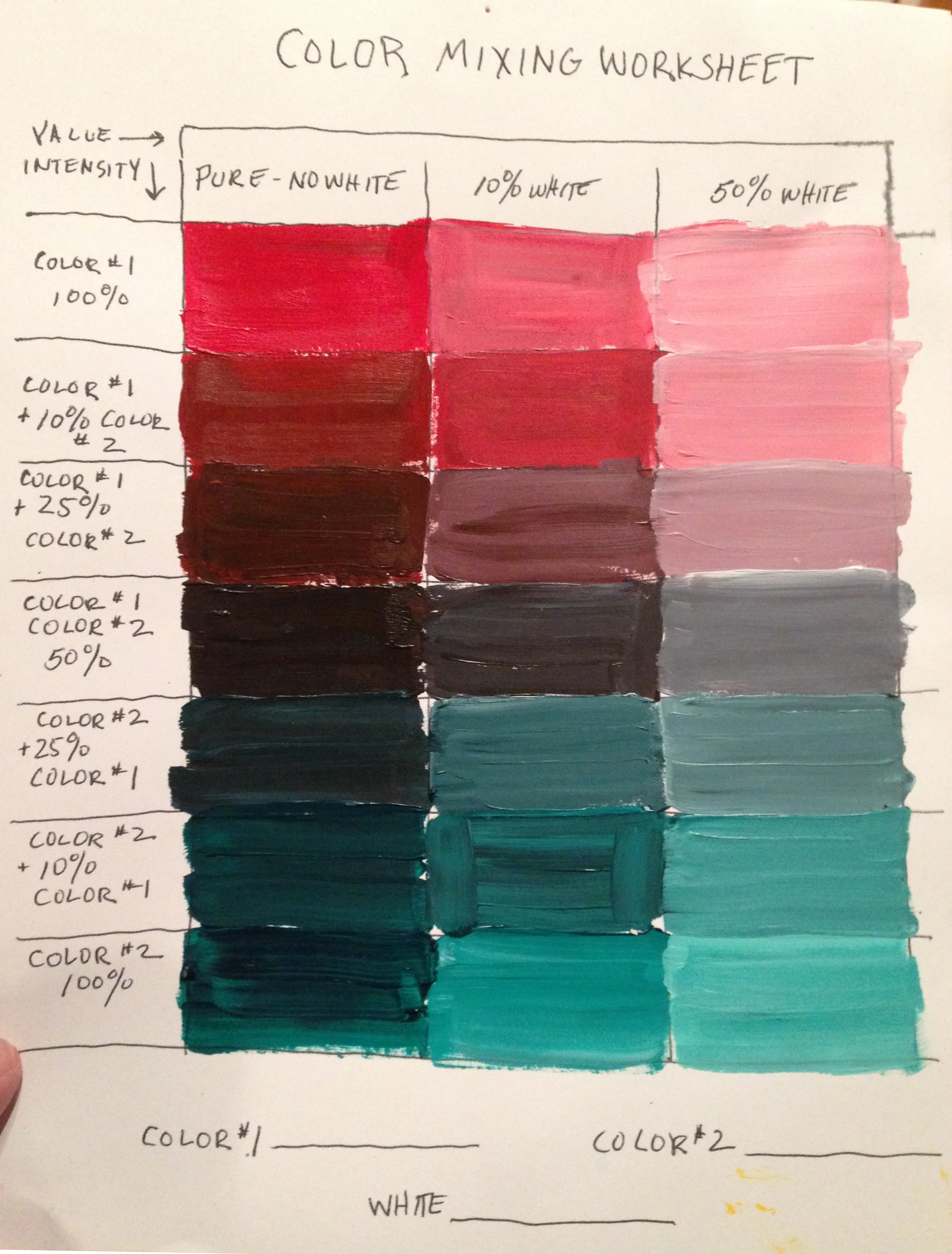
Next up was mixing compliments. I chose red and green, and got a delicious range of lavender greys. This was not a surprise for me, as I've done this sort of color work before, but for the next exercise we used these mixed colors to particularly interesting effect. I will say, however, that this was really a big deal to a lot of people in class! If you've not gone through the process of exploring your compliments, mixing them together to figure out what kinds of greys you can get, this is 100% worth doing.
Additionally, I just wanted to touch on the comparison of colors and muted hues you see in the chart below (done with acrylics), and how many watercolorists use their paint. Most (many?) watercolorists don't really use mass tone to much effect (the "pure" column on the left), but it can be done, and can have a powerful impact. Castagnet is a good example, when he globs on those rich strokes of red. Joseph calls it using Vegimite. It's when the paint is thick and goopy. Additionally, of course, we don't add white (generally) to our mixes. So, the 10% and 50% columns would need to be done by diluting your mixes with water. Much harder to quantify the % of white added, than with viscous acrylics! But the goal is not accurate math- the goal is to explore color. :) I will say that if you mix your colors thickly at first (so thick they don't drip when you tilt your palette), you'll get one (opaque) color experience, but that if you dilute it with water enough, the visual "expression" of hue will shift, much as you see in the chart below- like how a thick, dark black will become more clearly a blue-grey, or lavender-grey, or warm-grey as you dilute it with water. So don't let the fact that these experiments were done with acrylics stop you from doing them in watercolors!
Color Intensity Experiments-
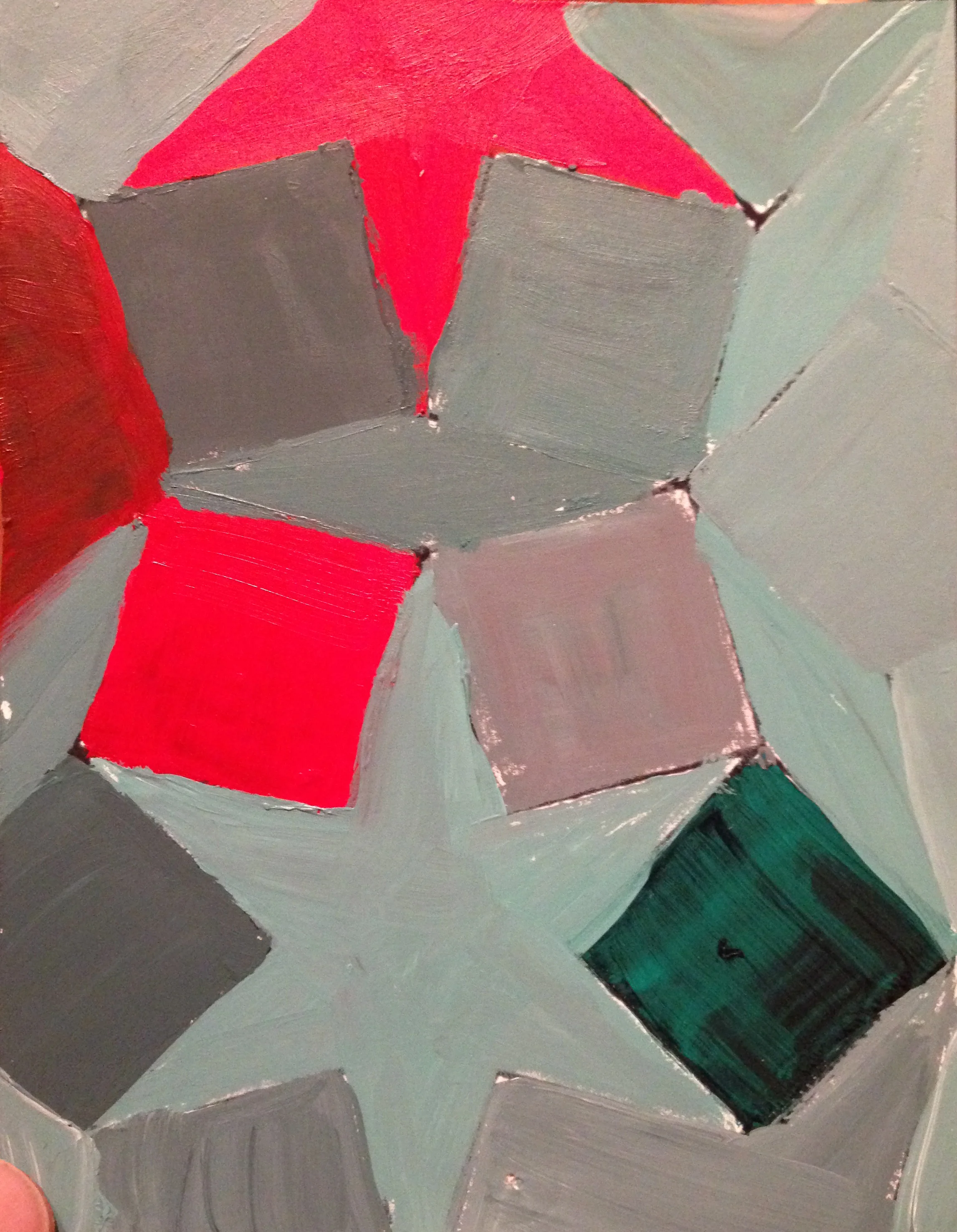
Finally, we built a composition using the colors we'd mixed. Very cool! This was meant to be about saturation as a tool, instead of value. Of course, value is still in action, but it's the chroma that really pulls your eye around in this composition.
Lots of greys mixed from the compliments, with only a few pops of hyper-chromatic color. This is where its very cool to do it in a class, because you can see so many different expressions of the same task. What it was mostly about was the power of using complimentary greys to make sections of high chroma really sing. This is a good example of Jean Dobie's "mouse colors"... or rather, Jean Dobie's "mouse colors" are a good example of this. ;)


