Studying with Richard Thorn, pt. 2
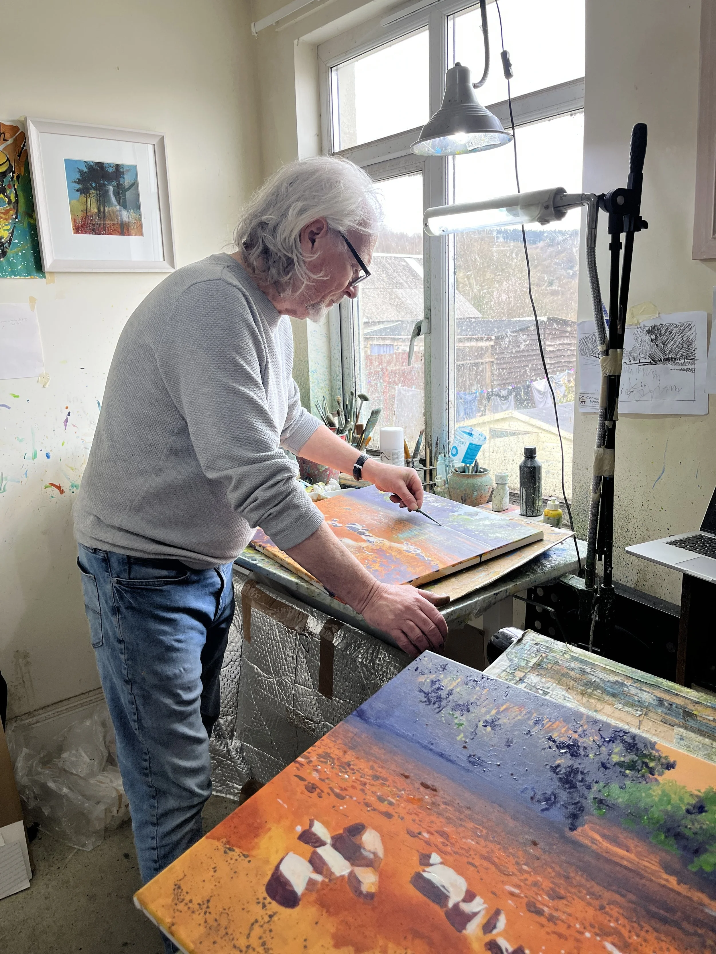
Since painting with Richard wasn’t a true “class”, I got to choose how to structure our time. After spending Day 1 painting acrylics on paper, for Day 2 I chose acrylics on Canvas, and Day 3 I did watercolors on paper. What I really love about his work is the combo of natural-looking texture and his use of color. I know both of the these can depend a lot on materials- particularly the application and “building” process of the painting. As such, I wanted some hands-on experience with the different tools and approaches he uses.
In a perfect world, I would have had a 4th day, as I love his approach to seascapes and water too. He often uses lifting, scrubbing, and masking fluid to create compelling effects. But I’d taken an online class with him through Domestika, and, at the very least, he’d covered it in that.
Day 2- Acrylics on canvas
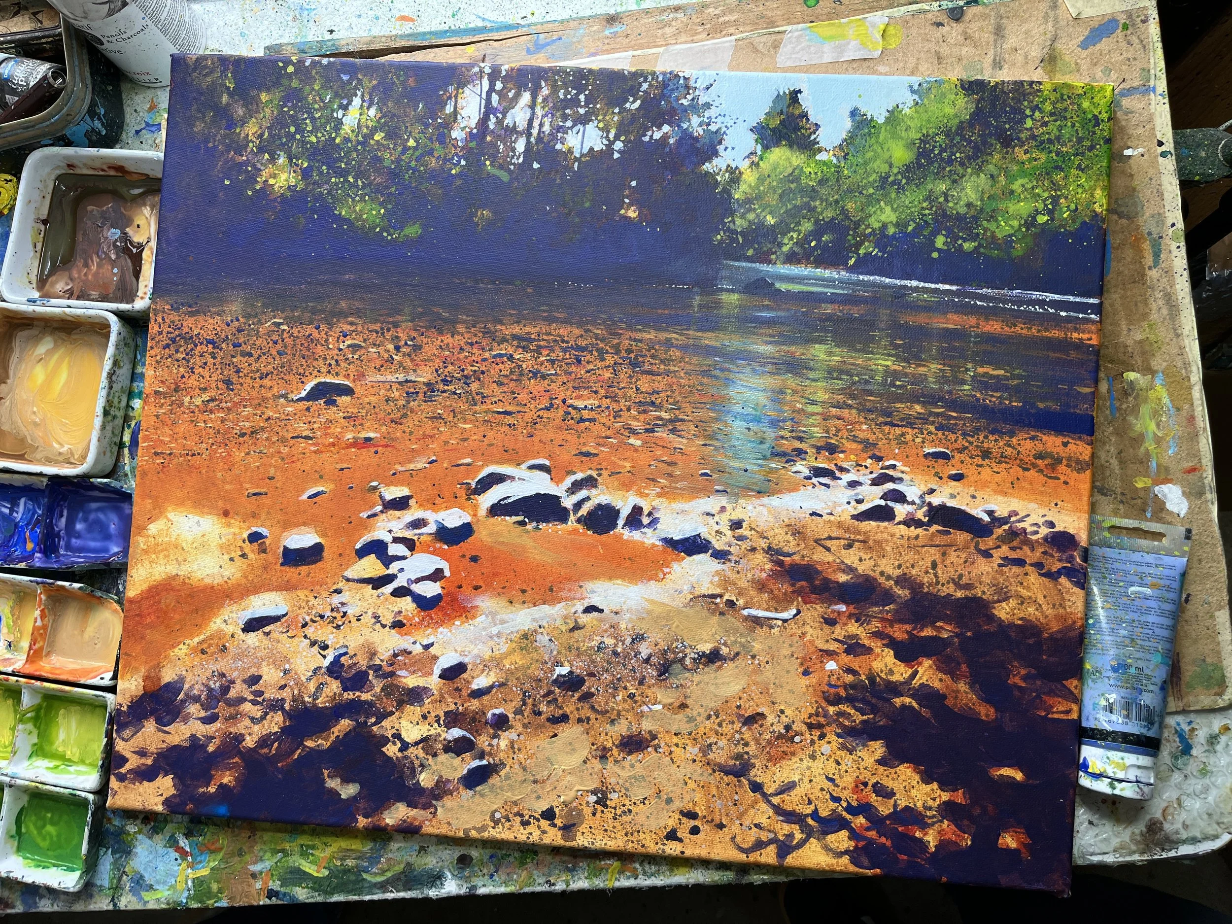
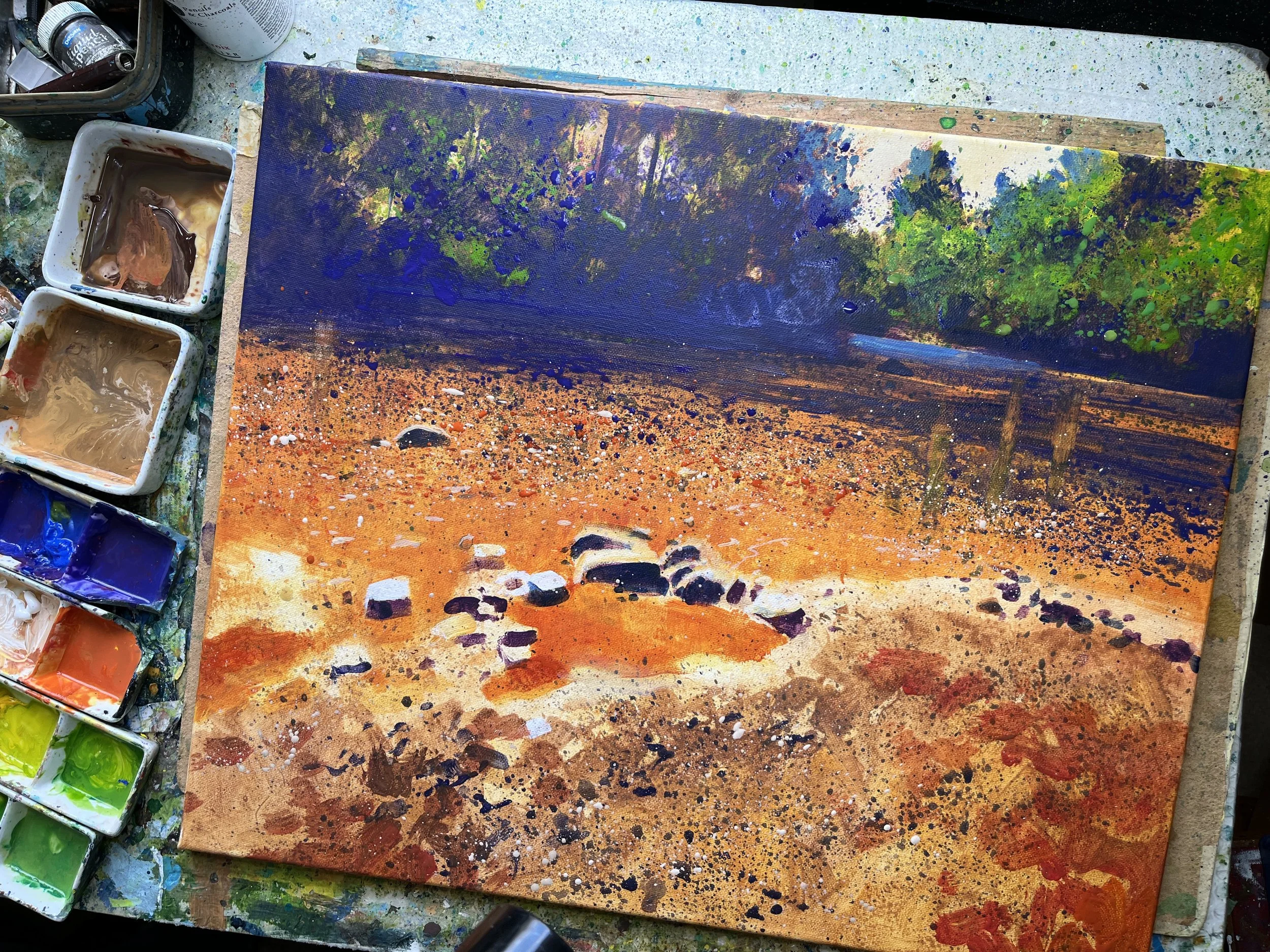
The results for Richard with his demo on Day 2. Acrylics on canvas.
First, it’s just worth saying that this was quite difficult for me. I’ve never painted on canvas before. And before Day 1 of this adventure, I’d never used acrylics. So the learning curve was steep. But then again, that was supposedly why I was there.
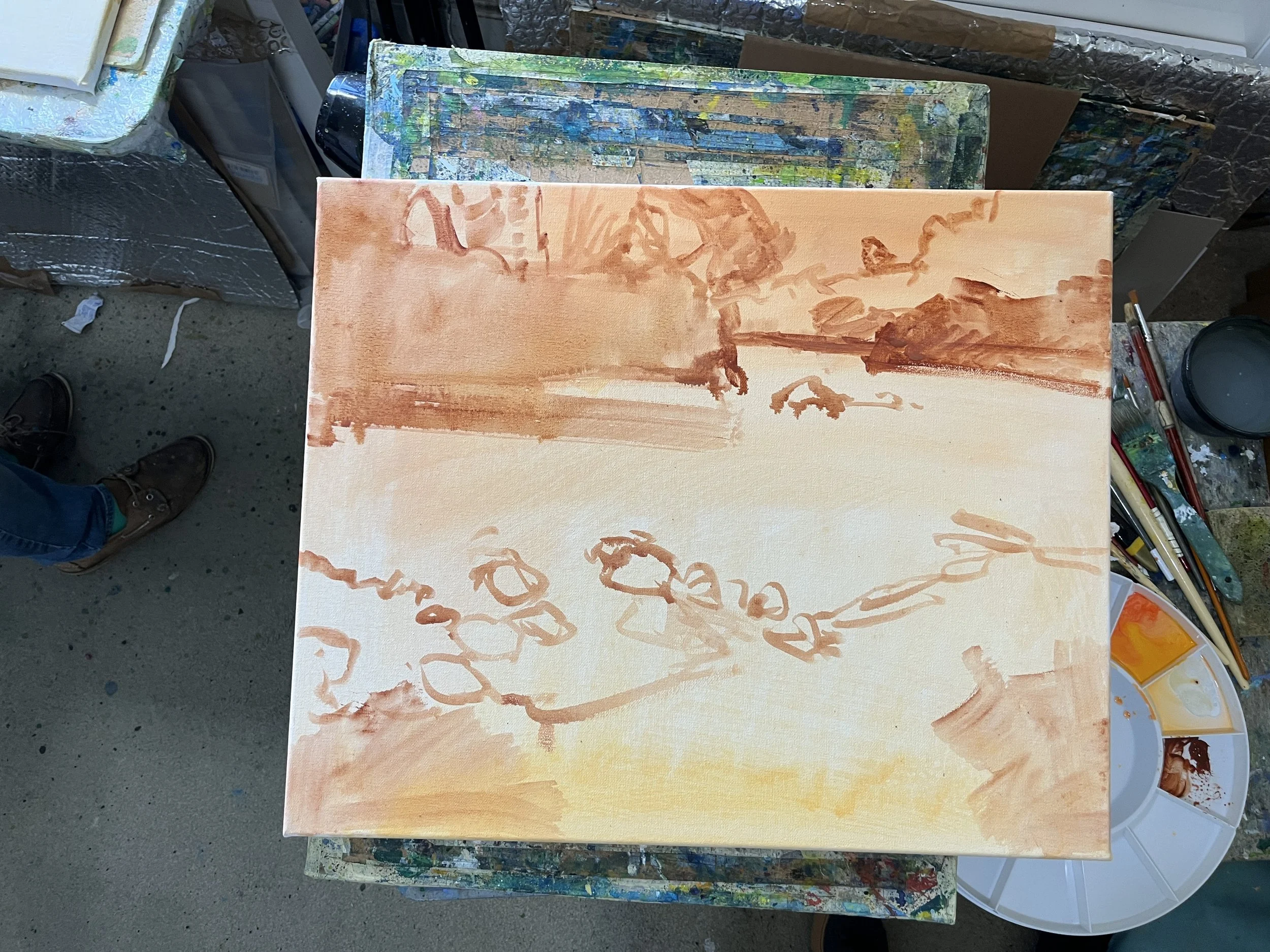
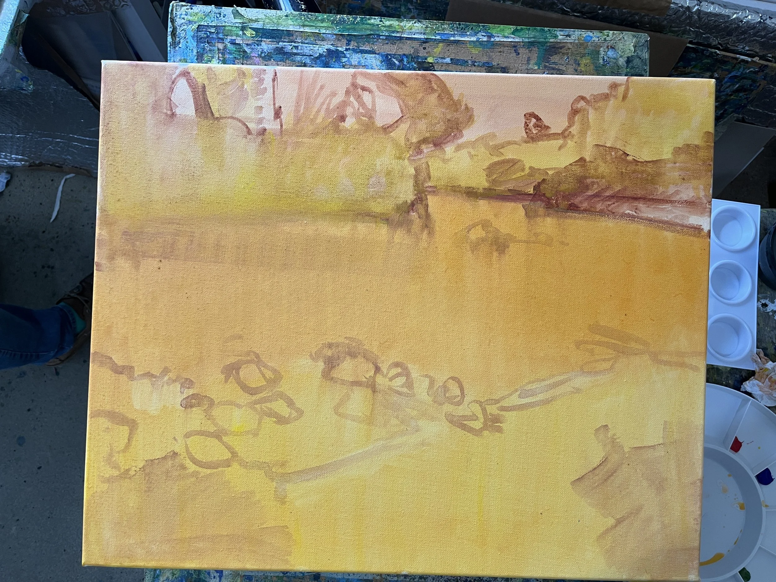
Richard started with a very basic rough sketch on the canvas, followed by some blocking in of basic shapes. Much like you’d see in many oil tutorials.
After this we started what I would call “real painting”. Richard blocked some middle values in, and then began to carve out highlights (and drop little tidbits of extra darks) into the foliage. This is definitely quite backwards from typical light to dark watercolors. As usual, however, he splattered on the water (and the trees) and began to develop that trademark textural quality.
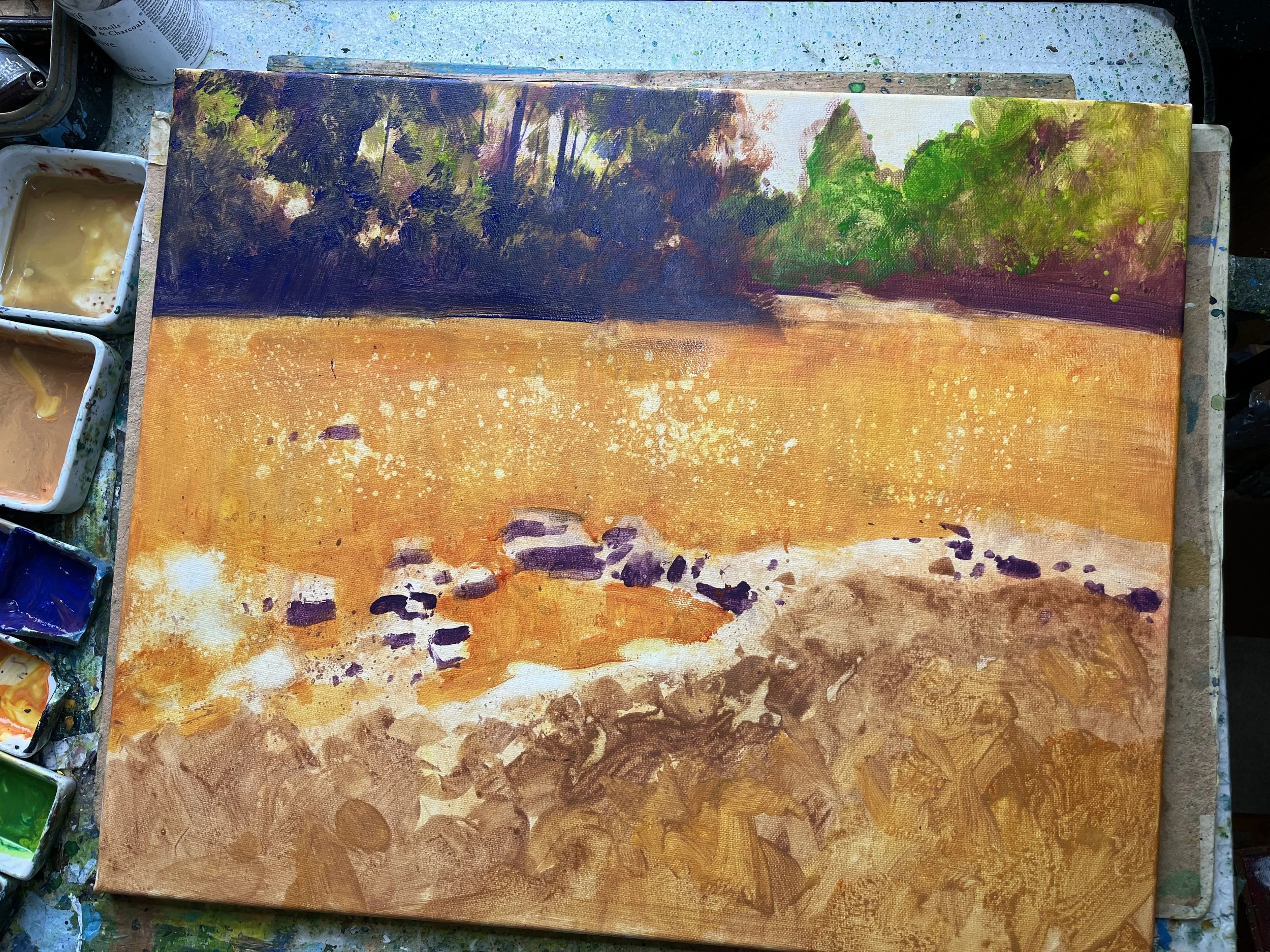
He did talk a little about the useful qualities of acrylics, particularly given his approach. The colors are punchy, and you can splatter, have it be fluid and yet remain a high value/ high chroma mix, while also having it still be pretty opaque. This is nearly impossible to do in watercolors. You can splatter dark on light, or a middle value on light, but if you really want to layer your values in this way you have get your mixtures thicker, and daub things in with a thirsty brush, or paint your highlights and use masking fluid. The short of it is that I you can get similar final results with watercolors, but it doesn’t quite have the same “back and forth” changeable process that Richard has developed when using acrylics.
Splattering Techniques
Generally, Richard controls splattering with brush technique. The bristles for this are short, stubby things. I cut mine and mutilated it to get what I wanted. He flicks them with his index finger with a come-hither gesture, with the brush slightly to the front of his hand. It’s a little ergonomically awkward, but this position allows a great deal of control. I had always done it facing myself (which is how the hand naturally rotates), and it got messy. Doing it his way took practice, but it works stellar. It’s remarkably controlled when he does it, given the very random and natural results.
If he needed tiny speckles, he used a smaller brush with less paint. Big splatters, bigger brush, etc. He also always “points” his brush in the direction he needs the paint to go. Don’t aim your brush to the sky if you don’t want splatters there. Instead, rotate your body, arm, hand, painting, etc. Its sounds stupidly straightforward, but it takes practice. He also definitely wasn’t thwacking his brush handle against his hand or another brush to get splatters. That just goes everywhere— a method I’d used and abused many times. :(
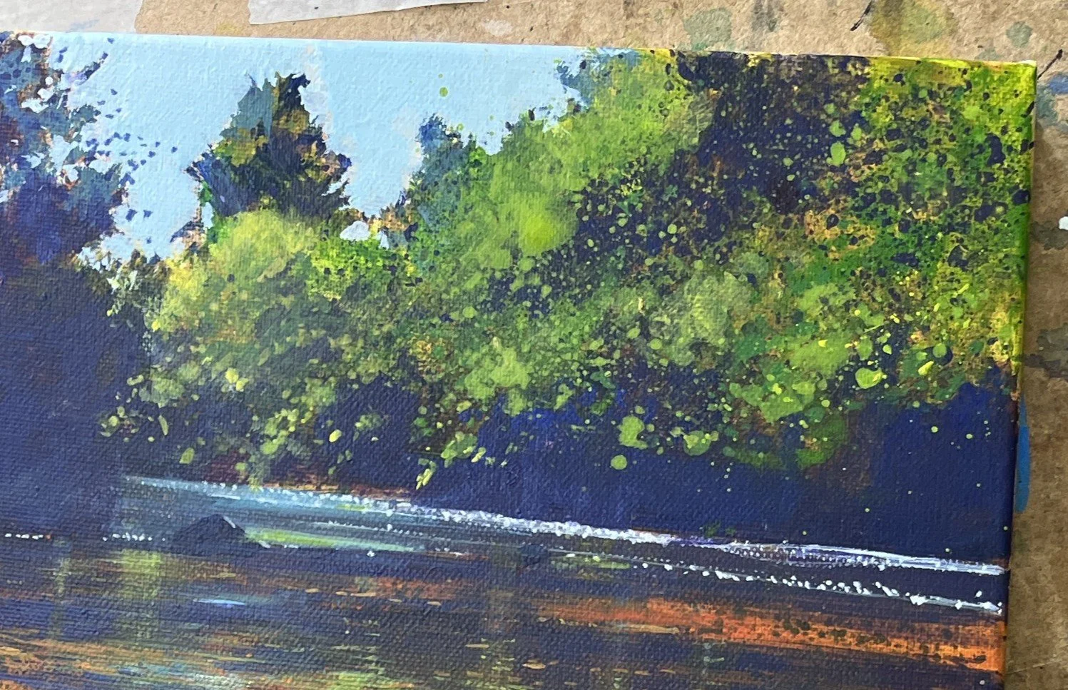
Richard Thorn really going to town with sideways “directional splattering”
However, when he wanted some splatters with some directionality, slashing across the painting, he really got his arm into it, slicing across the canvas. Then he would tidy things up and bond it to the context of the painting. This reminded me a lot of Chien Chung Wei’s approach, where he would talk about “big, little, small”, making a random mark and then corralling it, tidying it up, and taking advantage of it in the greater context of the painting. This is super hard to control. I’m sure its just about practice. I did this recently on one of my own paintings, and it works, but I have paint splatters all over my wall now. LOL.
Creating a Color Context
Here he keeps color in his darks.
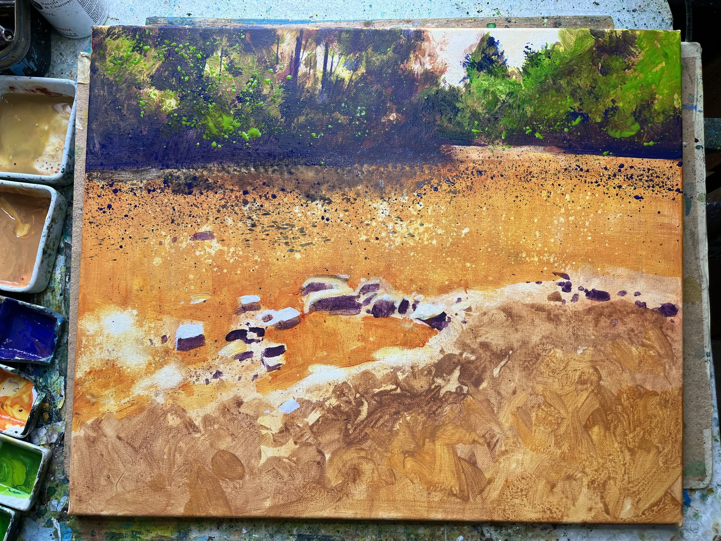
Here you can see how he has built up textures and values. Note the pale-to-mid values he’s dropped in. White splattered highlights, pale blue green highlights in the distant trees, etc. He really liked Permanent Mauve to mix into his darks. They were, by my standards, quite violet, but he was always interested in opportunities to play colors off of each other. Of course he was interested in value too, but I would propose that he would give up his darkest darks to get a more compelling color context instead. He almost never approached black, unlike, say, Alvaro Castagnet, who uses black a lot, to make his colors and value pop (and who was also a fantastic charcoal artist— you could see how the two media spoke to each other for him), and he’s almost never using greys, like, say, Joseph Zbukvic.
Mostly, my thought it to point out how many ways you can skin a cat. These are all absolutely fantastic artists, who are all quite different. Each very much themselves. Each offering different experiences through their art.
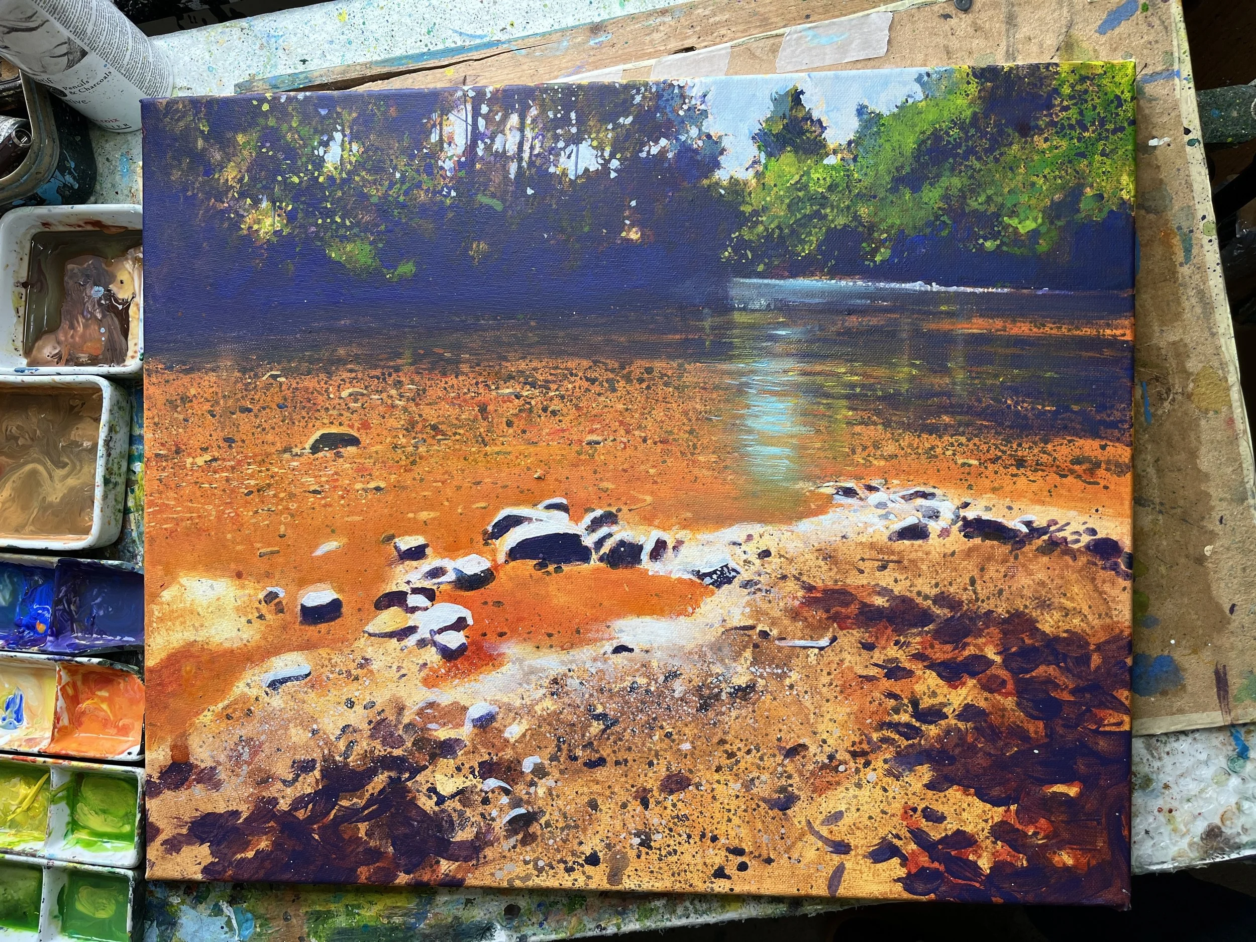
As he approached the end, you can really start to see the privileges of acrylics, based on his splattering technique. Note how he cleaned up the sky and the sky holes in the trees, by dropping in some highlights that have some color to them. He also dropped some daubed-in highlights in the trees, some yellow highlights on the stones in the river, and, of course, the refection of the sky on the water— something that would have been terribly difficult to do with watercolors. Note too the blue and white spectral highlights on the far away water, along the shore.
Equally interesting to me, however, are the distant trees to the far right, for example. Here he started with a pale, muddy yellow as his base laye— you can still see hints of it. Then he splattered a mid-valued green on top. Later comes the splattering of the permanent mauve shadows. Then finally, at the end, some opaque pale valued splatters. Some highlights are preserved from the beginning, some are opaque on top of darks. This area is really rather far away, and not as important as other areas, but it took time to build up, assessing color and value as he went.
“It Takes as Long As It Needs To”
Speaking of which, I asked him about the time it took to paint this- a little over 4 hours for perhaps a 16x20. Obviously too long for a typical demo, a learning format which we were liberated from in his studio. I loved his response, which felt, I guess, was rather liberating. He just said, “Well, it takes as long as it needs to take to get the results I want.” The end. LOL.
I think, with watercolors, there is often a push for brevity, which, of course, in many instances pays real dividends for students who labor too long over long-dead paintings that they should just let go of. LOL. This quick-and-dirty approach is really elevated by the modern workshop experience with traveling instructors like Zbukvic and Castagnet. Their approach, which gives up (IMO) complex arrangements of color contrast to focus, instead, on strong value relationships, clearly plays into certain watercolor strengths. It’s much easier to hammer out a compelling painting in an hour or so with their methods.
But there are always sacrifices for an approach, and it would be nearly impossible, IMO, to get these sorts of color + texture results if you went faster, did more washes, didn’t use masking fluid, or dry it more frequently, etc. It just seemed like the subject called for its own needs to be met, and I liked that Richard wasn’t in a hurry. I suppose his approach just speaks to me where I am now in my practice.
Day 3- Watercolor on Paper
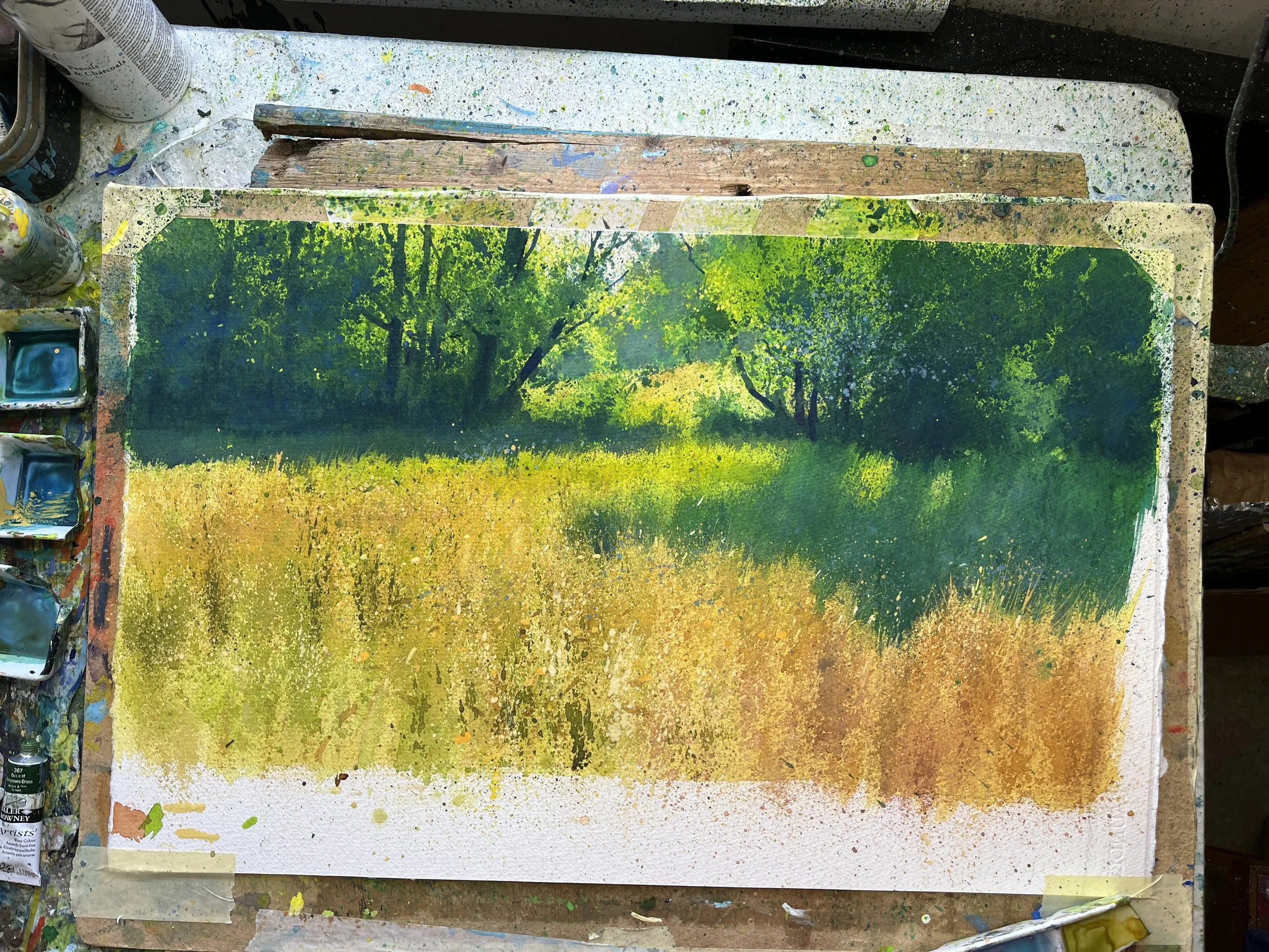
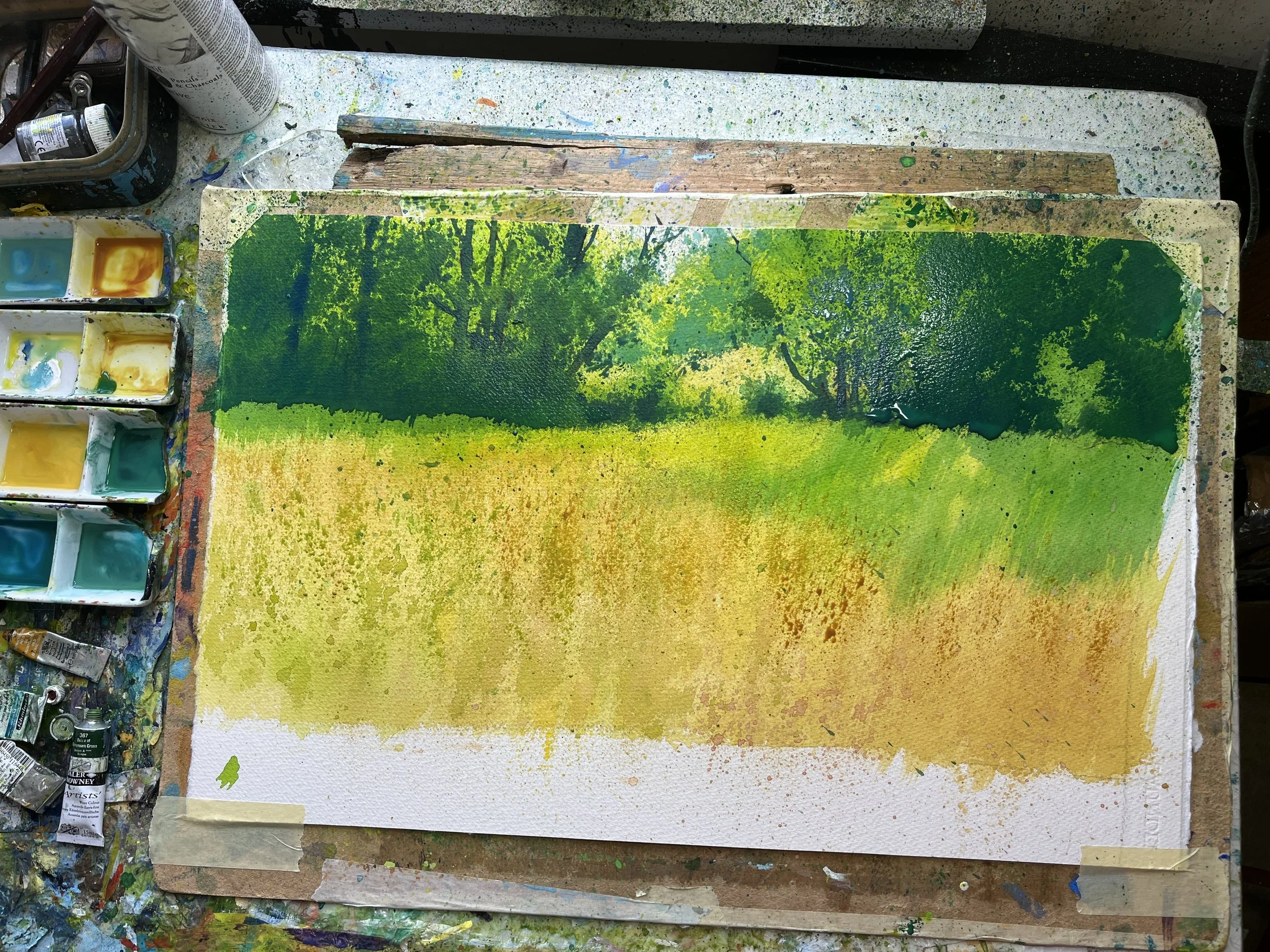
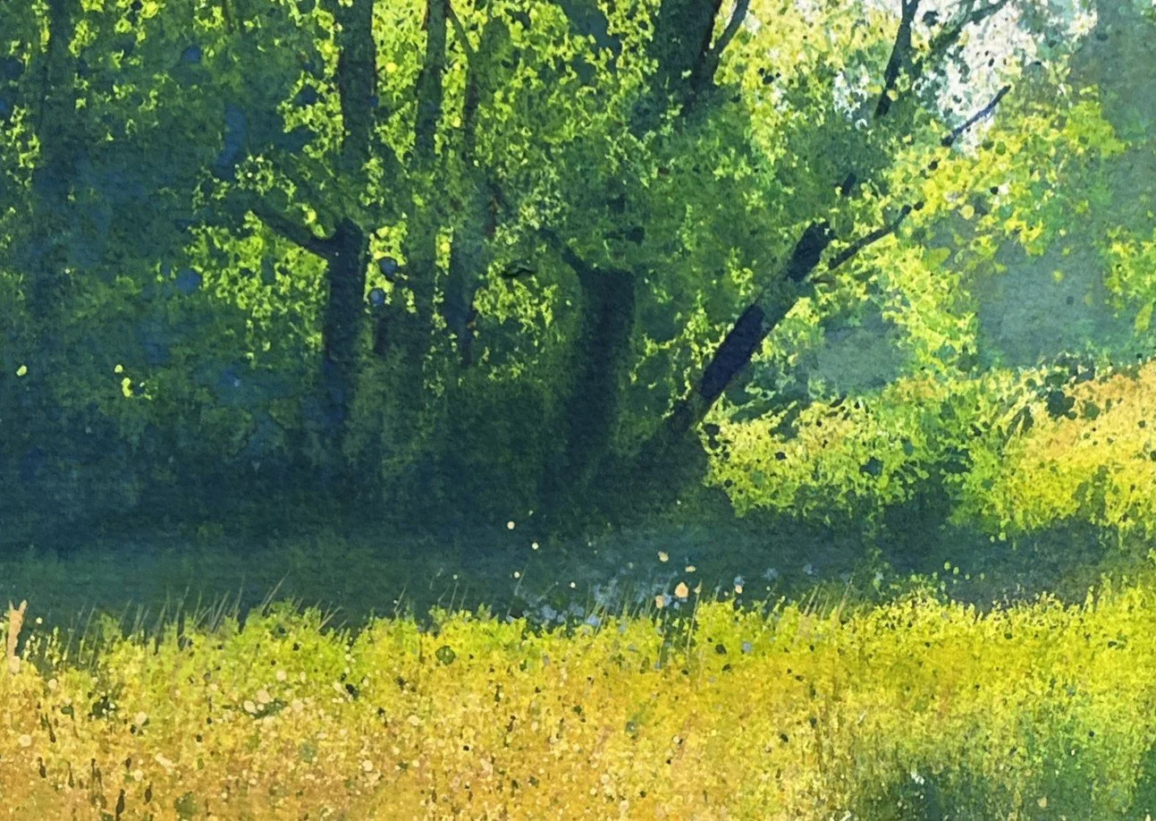
Painting a meadow with Richard Thorn. His final results.
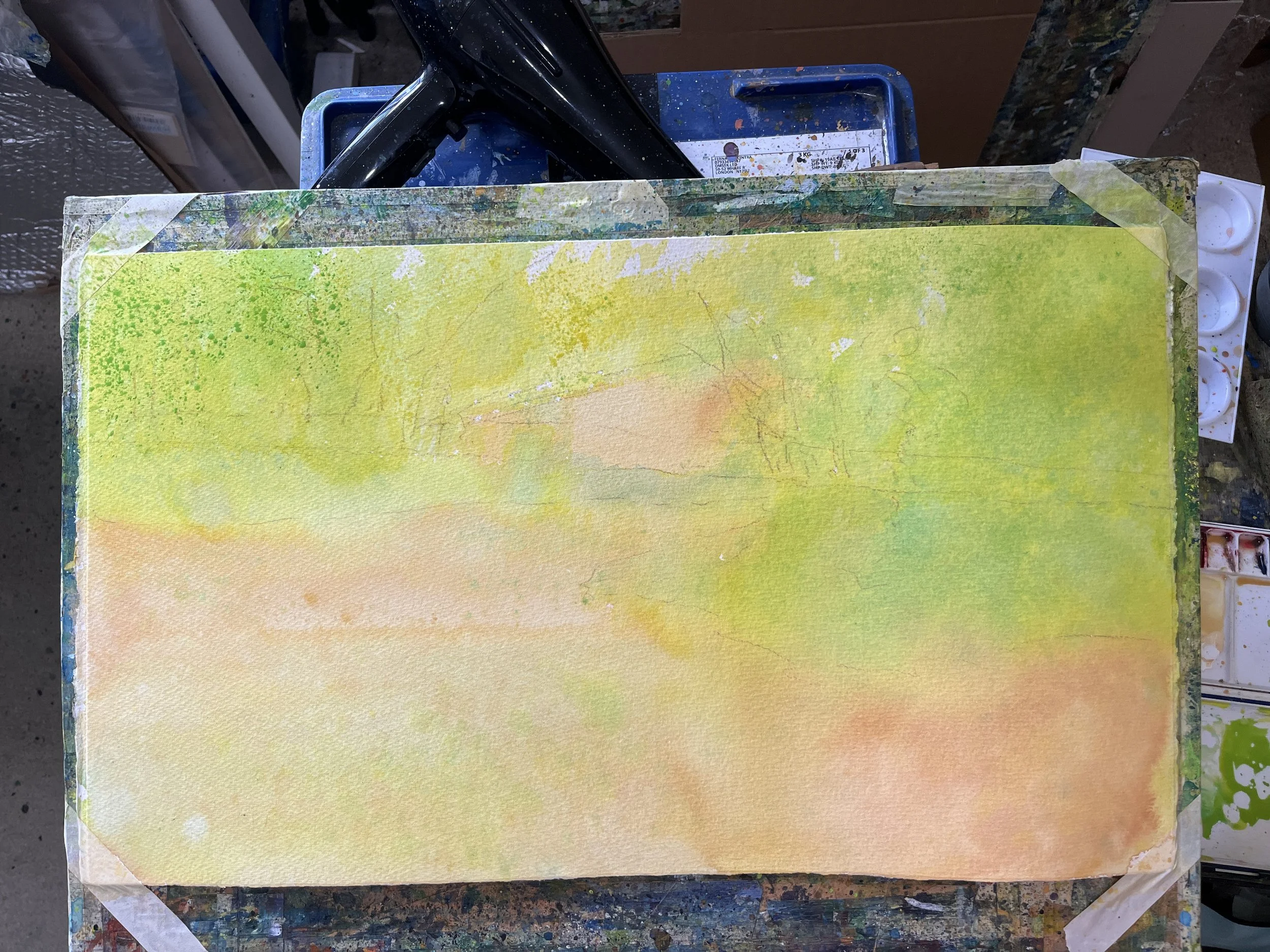
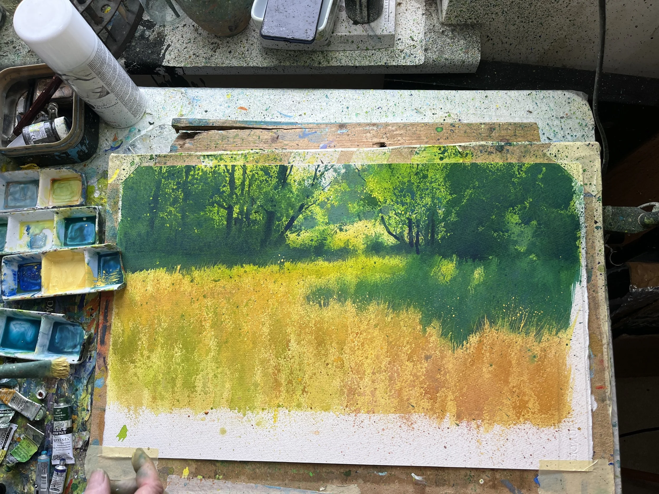
For day 3, we worked watercolor on paper. It’s crazy, but Richard just doesn’t really use washes. At the beginning, yes, 100%. It’s required to block in shapes, and get the intensity you need in your paler values. Here you can see how he dropped in his pale yellow-browns and greens, and then came back in and glazed in a richer application for the greens, on top. Although even here, he was splattering some, and building up initial texture.
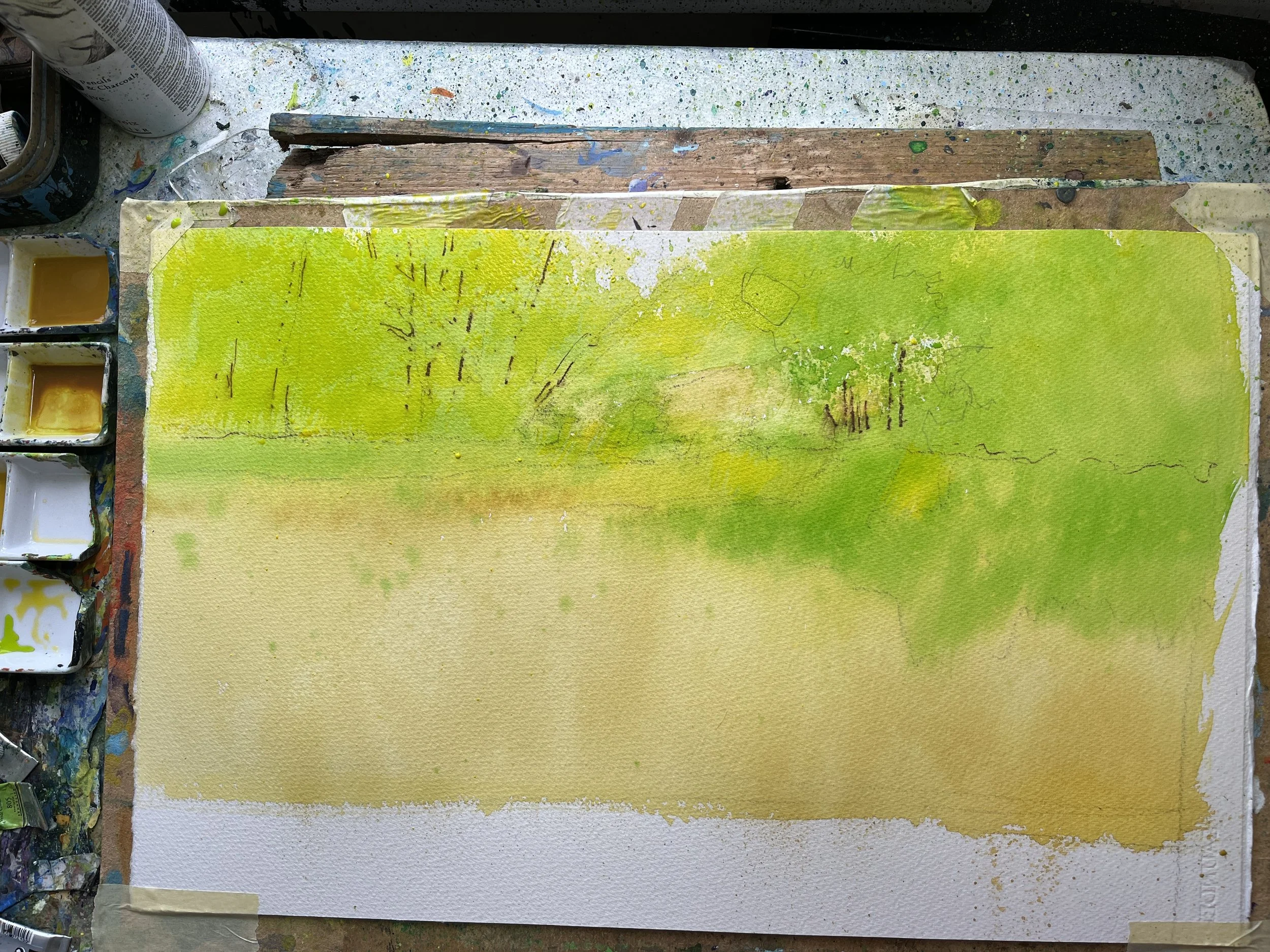
But after that, not really. Everything else in this scene (which is deeply express through texture) is done with layers upon layers of splattering.
At this stage, he did note to me that he knew the color was not a direct representation of what was in the photo. He was always interested in pushing the color farther than what was real. That was partly to create the experience required to match the vibrancy of real life, and it was partly because he knew that we could always go darker later, and that these vibrant hues would just end up being little pockets of highlights. But he’s always pushing the warmth of the highlights with more yellows and lime greens, and he’s always pushing the darkness of his darks with purples. There always seems to be a color contrast that’s he’s pushing, when he’s working on values, so he can take advantage of the contrast later.
He’s not muting his colors very much at all… ever. And he’s almost never really using black. And if he does, he’s always splattering something vibrant and colorful on top of it after it dries, to integrate it into the rest of the painting.
Splattering Pure-Hue “Washes”
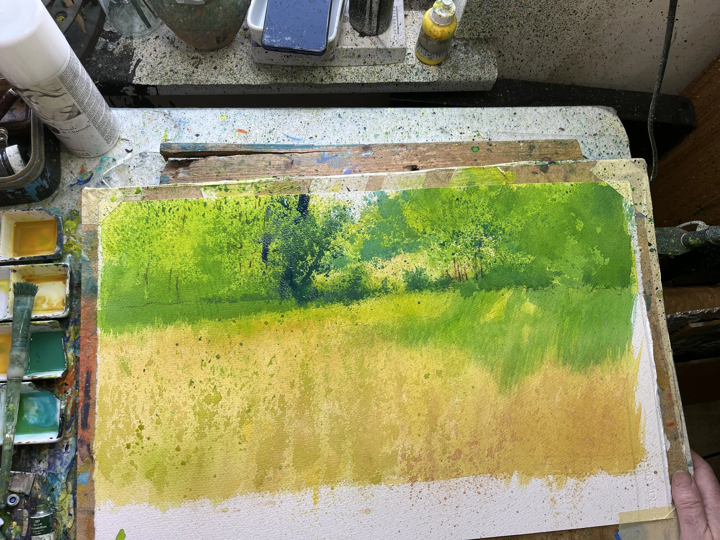
After this, Richard would do layer after layer of splattered and stippled “washes." He would go from yellows, to lime greens, to darker greens and onwards. He doesn’t really mix his colors on a pallet, the way I’ve seen … well, everybody else do. LOL. He has the little baby wells I brought up in the last post. He mixes pools of clean color in each of them. They’re all quite individuated, almost from the tube. Which is why I presume he has so many tubes of paint. He’ll dilute them, or nudge them around a little bit, but not much!
We actually had a conversation about how it was almost like “pixelating the color”. It’s very much broken color in the impressionist sense of the word, where you’re optically mixing things. This is because he’s splattering and stippling so much, of course. But it’s also a mixture, IMO, of other details. He’s often working wet on dry, so the splatters don’t mix very much into each other, but instead stack on top of each other, dry layer upon dry layer. And this is also facilitated by the 300 lb paper he uses, which dries quickly— or never really gets fully wet. On 140 lb paper, it’s thin enough that the water seems to embed itself in the paper more quickly and more fully. Not so with the super thick paper he uses. He also is totally at ease using mid-valued opaques, particularly things like cobalt blue, naples yellow, etc.
All in all, it’s a fascinating effect that is full of rich color experiences. It’s quite different from anybody else I’ve ever seen. Particularly because he’s not really very interested in “soft washes” as I think many watercolorists are. He gets pretty soft edges anyways, because they’re often broken up with splatters!
After we did all these values that were progressively getting darker, he noted that of this was really preliminary for him. It was just about building up texture and color that he could later take advantage of. It must’ve been an hour or two into the process before he was like “Ok, now we’re going to put in the darks.” In some ways, it was kind of like doing a notan (not sure what a notan is? Watch this video I made!), because he would often have strong value shifts between the very vibrantly colorful sections that were high key, versus the darker (yet still colorful!) sections.
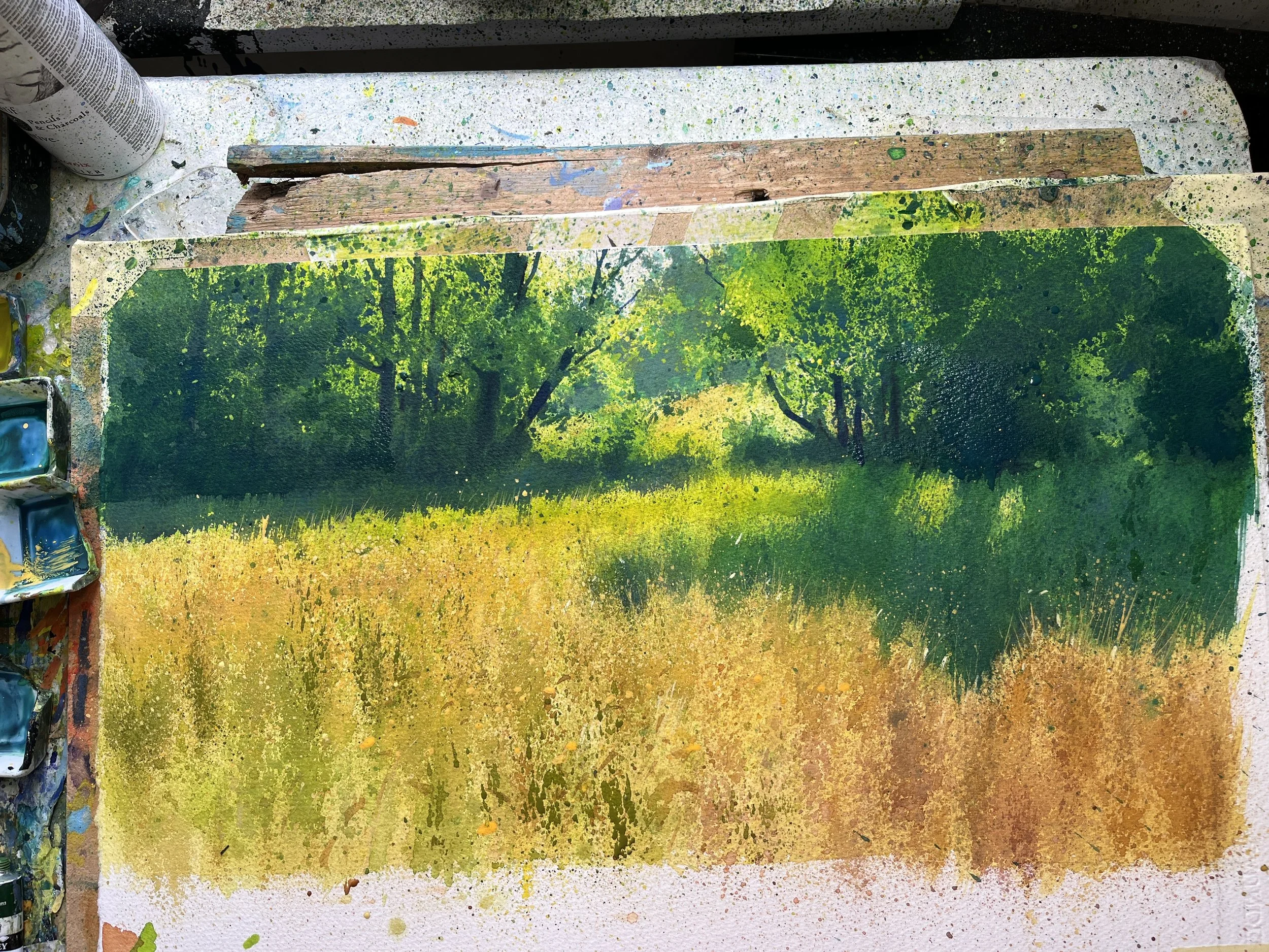
After he was done with the trees, he began to work more on the meadow, giving it more depth, warmth, and texture— and it was done by (you can guess it by now) splattering and stippling. Only at the very end did he go in with body color to put in flowers and highlights and such, that were used to weave the pale sections into the dark sections and vice versa.
And that was that.
So, after that, I packed up my things the next morning, and headed out of Bovey Tracey, down to Newton Abbot, took a train back to Heathrow, and flew home the next morning. It was really such a great experience. Learning with Richard was well worth the effort, time, and money. London was lovely, and England was a joy. Good weather for late March too! :D Some trips really are worth it. This was one of them.
Thank you, Richard!
Ways to learn from Richard-

In Person in the UK-
Just to say, of course you can go to his website and email him directly. https://www.richardthornart.co.uk/ . He advertises about it on his website, and it’s quite reasonable. This is what I did.
You can also try a number of good online classes he has. In the last post, folks shared in the comments other classes he has online. I share them here for you to check out.
Domestika-
This is the one I took. He paints a river scene- https://www.domestika.org/en/courses/4318-painting-realistic-watercolor-landscapes
Artefacto-
He also has an online course at Artefacto that focuses on coastal scenes. It’s actually a series of demos, and so is more expensive and (presumably) comprehensive. You can find it here.