Repainting a French Sunset for a Demo
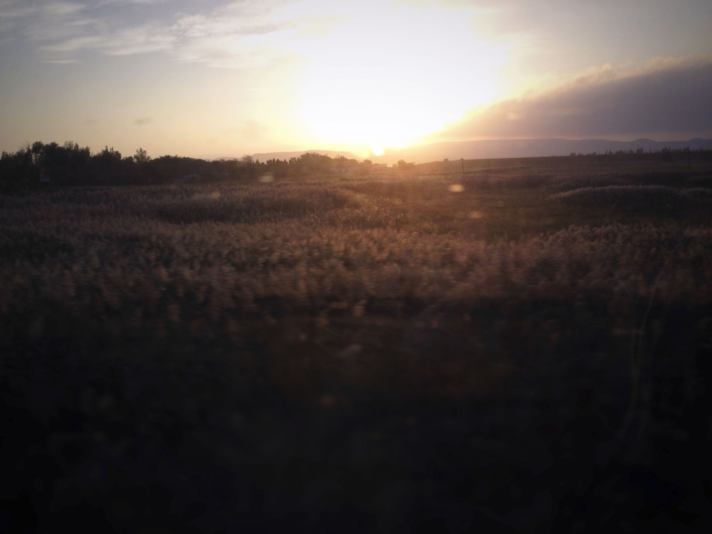
Last Saturday, I did a live demonstration down at the Firehouse Art Center in Pleasanton, and I wanted to share the resuls for those who weren’t able to make it. It was really a pleasure to get out and do a demo in person after atleast 2 years or more off! I decided to repaint this photo from years ago, when I was in the south of France on my birthday. A lovely memory. Went and saw an international watercolor exhibit on my own, strolled around Narbonne, and was on a train back to Barcelona in the late afternoon when I took this shot—
There’s honestly not a lot there. It’s more a memory than an assortment of details. But I liked the story about the backlit meadow in the countryside, and the warm light at dusk. Photos like this are often very fruitful, because they inspire me to do as I see fit, rather than dictate to me the details that I’m “required” to include in a “better” photo.
Here’s the original painting I did for fun (a little 8x8) and the follow up test version I did before the demo (11x15). I often do a preparatory painting a few days before a demo, to get a handle on things, and this time was no different. Both versions were painted wet into wet, and I could tell this subject would provide a good opportunity to share a lot of loose, playful techniques in a small amount of time.
Obviously, the first thing to see is that I shifted the hues. Its much warmer in the 2nd painting. Oranges and burnt plum over mauves and muted orange. But, additionally, the second image is much darker. On the edges in particular. I didn’t really notice this until I compared the two. It’s also more chromatic. Honestly, I like all three versions I painted, but comparison is often the beginning of judgement, and when I compared the first two paintings, I decided I wanted more light, to pull my eye into other areas of the image. But I liked it warmer. There was more drama. So I aimed to do a combo of the two for the demo.
For the demo, I started by wetting the back as I chatted. Then I rewet it again to get it fully saturated. After that, I prewet the area where the sun was going to be with clean water, and went to work. Yellow for the sun went in first, while everything was still clean, wet into wet with the water, to get a soft transition to pure white at the center. Around the yellow I dropped in a pale wash of muted burnt sienna. This allowed me a transition to blue up top and to the left without creating a green sky. Then I continued the yellow down the paper and into the vibrant oranges in the foreground. At this phase, I can be as vibrant as I want to be— I’m only going to get darker and more muted from here.
After that first wash, I used the blow dryer to dry the front of the paper. But underneath, things were still wet! This is important, because that water in the body of the paper really slows down the drying process, and makes wet into wet work much less hurried. For this phase, I worked light to dark, wet into wet. Warm orange-yellows mixed with burnt sienna, then muted purple-blues swiped in, to create little drifts of shadow.
The scene is backlit, and there are no real silhouettes or distinct shapes, besides the far away trees and mountains. For subjects like this, the typical focus on shape-arrangement and bold contrast has to step aside, and, instead, interest really depends on subtle textures, and shifts of hue and value. As such, I dropped in darker shadows here and there, to show the undulation of the land, to help accentuate a sense of depth. Then, once the darks were in, I went about painting with clean water (on a small synthetic brush! not much water is needed…), doing little splatters with pale washes of yellow and orange, applying bits of spittle, splattering with bits of darks, etc. Basically, doing whatever was needed to create that little bit of texture and variation that one wants, for the eye to hold on to.
Lastly, I blew the paper dry again, and dropped in the mountains in the distance. Each time, it’s surprised me how important this was to the subject. Often times, in semi-abstract paintings, there is a little piece that reads clearly and acts as a key, which unlocks the abstract elements elsewhere in the painting. That mountain range did it for me— perhaps because it helps us read the whole scene better, and develops a sense of perspective. Without it, things are very flat.
And that was that. Here’s all three lined up. Each tells a subtlely different story, occurs at a different time of day, etc. It wasn’t intentional, but I liked that.
Don’t forget- if you’re new to the blog, don’t forget to subscribe and get an email each time I share a new post! :)


