Building a Limited Palette
This is a painting I did from a limited palette I’ve been working on building. We’ll be exploring using a limited palette in my online workshop in April, focusing on color contrast and controlling mixtures. This palette has only 5 pigments. American Journey’s Ultramarine Blue (PB29), Burnt Sienna (PBr7), Cadmium Orange (PO20), and Joe’s Red (PR254- the same pigment Winsor Newton uses for Winsor Red), and Winsor Newton’s Cadmium Lemon (PY35). What’s the goal of a limited palette? Why explore using one? How do we build it?
Here’s what the color gamut looks like-

The Why
First, my opinion is that using a limited palette makes you pay attention. Fewer pigments to choose from forces you to be more deliberate in mixing your hues. You can’t just pick a pigment and apply it. You have to decide, “Is this the green I want? Or should I add a touch of orange? No… maybe a bit more blue to make it a chromatic dark?” It makes you choose, and that’s a good thing. If you’re learning to mix color this can be particularly useful as a learning tool, but it’s not a terrible thing for experienced painters either. I think that choosing is the beginning of what makes art… art.
In terms of actually deciding on the pigments themselves, I think having a specific focus is important- a shared attribute the selection amplifies (granulation? opacity? staining?), a subject you’d like to apply it to (florals, landscapes, urban scenes), or a specific color range it accentuates. You have to choose the colors yourself, and it’s helpful to have a method by which one judges success.
Want to know more about how pigments work? Here’s the first of a 3 part series I did on the subject.
The What
For this palette, I focused on the kinds of mixtures I most readily need for the nature-focused work I commonly do. That means a wide range of greens, but vibrant limes in particular, strong, dark browns and greys that I can quickly mix, vibrant yellows and oranges, and an occasional red haze or point of interest. I don’t use clean purples much at all, and so I chose a palette that better mixed the hues I most commonly need, rather than creating a palette that had the widest possible color gamut.
The reading I’ve done notes that humans are very good at seeing and separating hues in the red to yellow range. We can very much tell the difference between subtle shifts in hue in that range. For example, we have many many more names for colors in that range, comparative to an equal swath of blues or greens. A muted yellow becomes (in our mind) a kind of pea green. A muted orange a brown. In that sector of the color wheel, if you want a certain color you really have to land right on it sometimes. This is not the same experience for most blues or greens or purples. We have some special names like Plum or Violet or Prussian Blue or Emerald Green, but these are often not as specific. And a dark green is still a green, a dark blue still a blue. They don’t change their conceptual color, the way dark orange becomes brown. For example, is there even such a thing as “dark yellow”? A dark yellow really becomes a pea green or an orange, depending on temperature.
All of this is to say that easily navigating that yellow-to-red piece of the pie was important to me, and it was that desire which affected my pigment choices. Having the widest possible color gamut is nice theoretically (and good if you don’t know how or what you’re going to paint!), but my experience while painting has always been that easily arriving at common color mixtures is more important.
The How
Lets dig in to the process I went through. I began to noodle around with this back in September, and over the course of a few months I did these sheets, occasionally exploring different color combos, buying a new pigment if needed, and seeing what sort of mixing results I could get. Like many artists, I have a bag of unused tubes which I explore now and then. As always, I generally label my swatches with both the brand and pigment. It’s hard to remember later!

I started by just finding out if I could use a Cadmium Orange to mix the same range of hues as I do with Burnt Sienna, if I could get as dark of a dark, and if my grey with it would still be neutral. The short answer? Yes. So why do I have both Burnt Sienna and Cad Orange still on my palette? The basic reason is logistics. I found, after putting the palette to use, that it was very hard to keep my orange clean when using it to mix my darks all the time. I’m not one to keep my colors very clean, but Oranges and Yellows really do get muddy very quickly. With them one should be more delicate. Additionally, a warm dark like Burnt Sienna is very useful when muting other colors—mixed greens, reds, etc.— when a cool dark blue won’t give the desired results.
It’s also worth saying that if I was going to remove a color from this palette it would probably be Cad Orange. It’s my little luxury pigment in my choice of 5, but I really like sharp spots and bits of orange in my work. Those are easiest to achieve with a thick clean pigment. There are other mixing reasons too, which you’ll see below…


Here is where I began to play with my greens, trying different combos. Of course, some of these I already knew well, but I mixed them out just the same, to better be able to compare them.
I tried American Journey’s “Skips Green” with various pigments to see if I should keep a lime on the palette. Then I tried various blues and violets. I was just trying to see the mixes I could get, and which version gave me the most useful swatch of colors. That’s when it became clear to me that I needed to try a full tube of Lemon Yellow of some sort. I ordered a tube and waited a week.

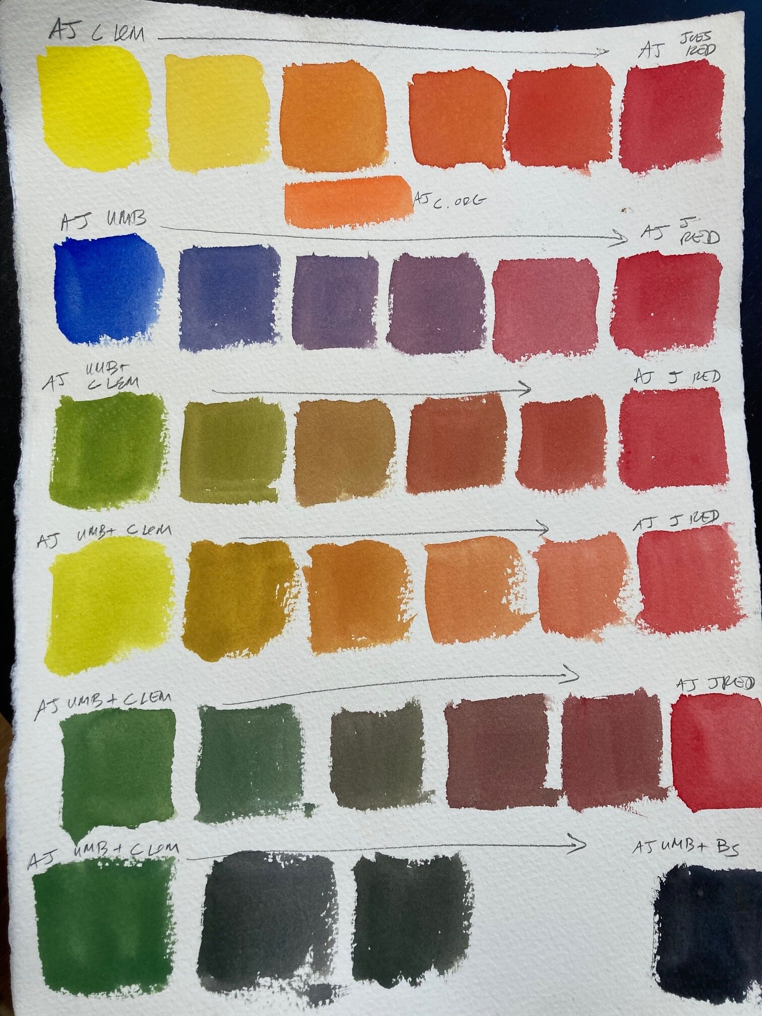
Here you can see my typical American Journey Cad Yellow mixed with various blues, compared with the one sample of Winsor Newton Cad Lemon (the 4th row down). My goal was to assess whether I could mix the same variety of useful hues with Cad Lemon that I could with my normal, warmer Cad Yellow. The short answer is yes. If you follow the little downward arrows, you can see me trying to judge how similar different swatches are. The Cad Lemon performed well and made the cut.

Cad Lemon and Ultramarine blue (the blue line) don’t mix as wide a gamut as all of the pigments combined. That’s clear. Viridian, Pthalo Blue, and Skips Green (the red lines) all make more vibrant hues in a particular cooler green region, but as each set of swatches got closer to Cadmium Yellow, they became almost indistinguishable to the swatches between UMB and Cad Lemon. Ultramarine Blue is the darkest and coolest of the set of blues I was using, but by choosing a cooler yellow to combine it with (Cad Lemon), I was able to match the swatches created by mixing greens and blue-greens with a warmer yellow. This provides much cleaner greens that what you would get with mixing UMB and Cad Yellow (the green line).
Interested in knowing more about how I mix pigments, and how visualizing mixing paths can help you control your mixtures? Here’s a series of blog posts I did on the subject.
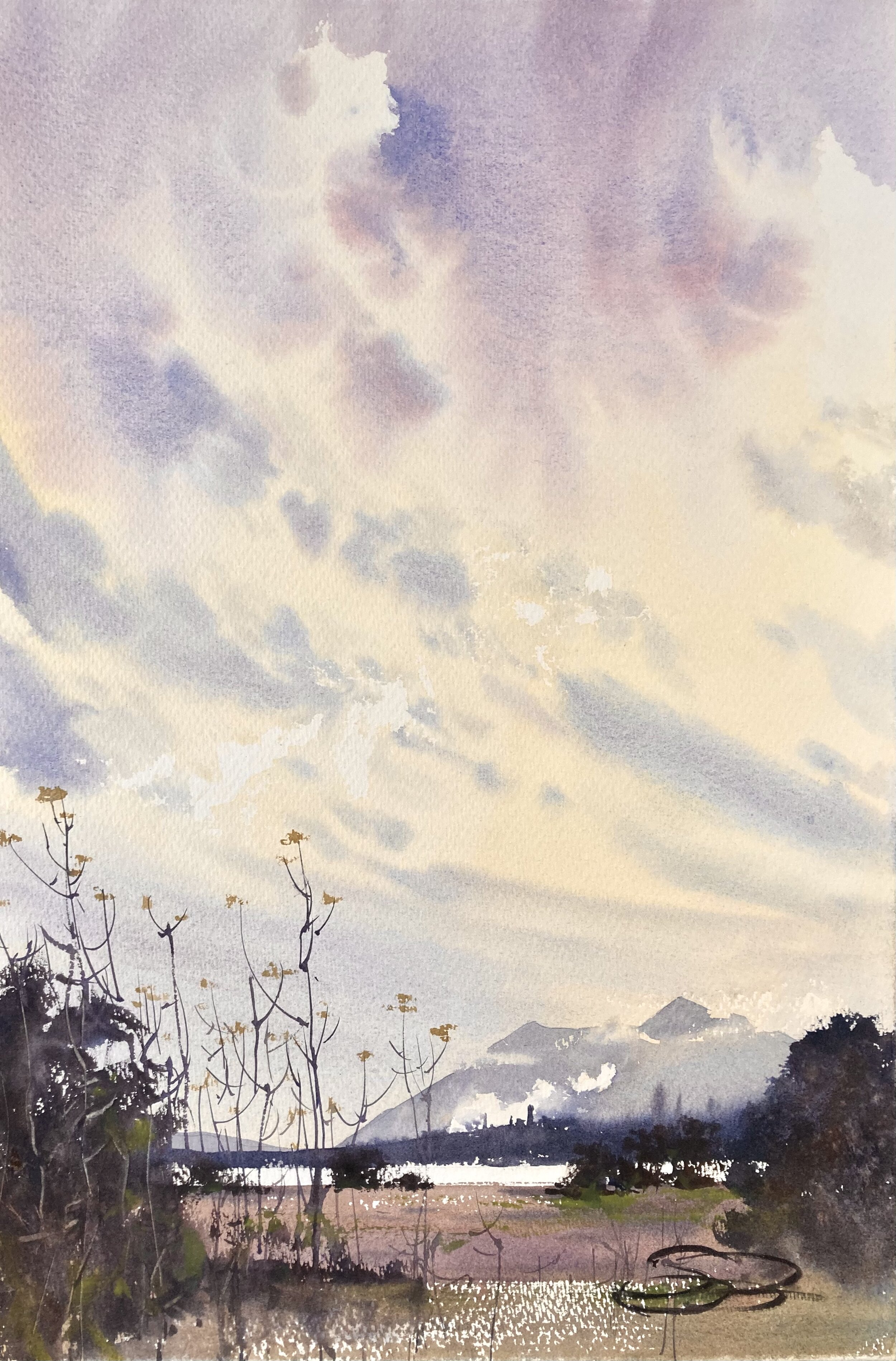

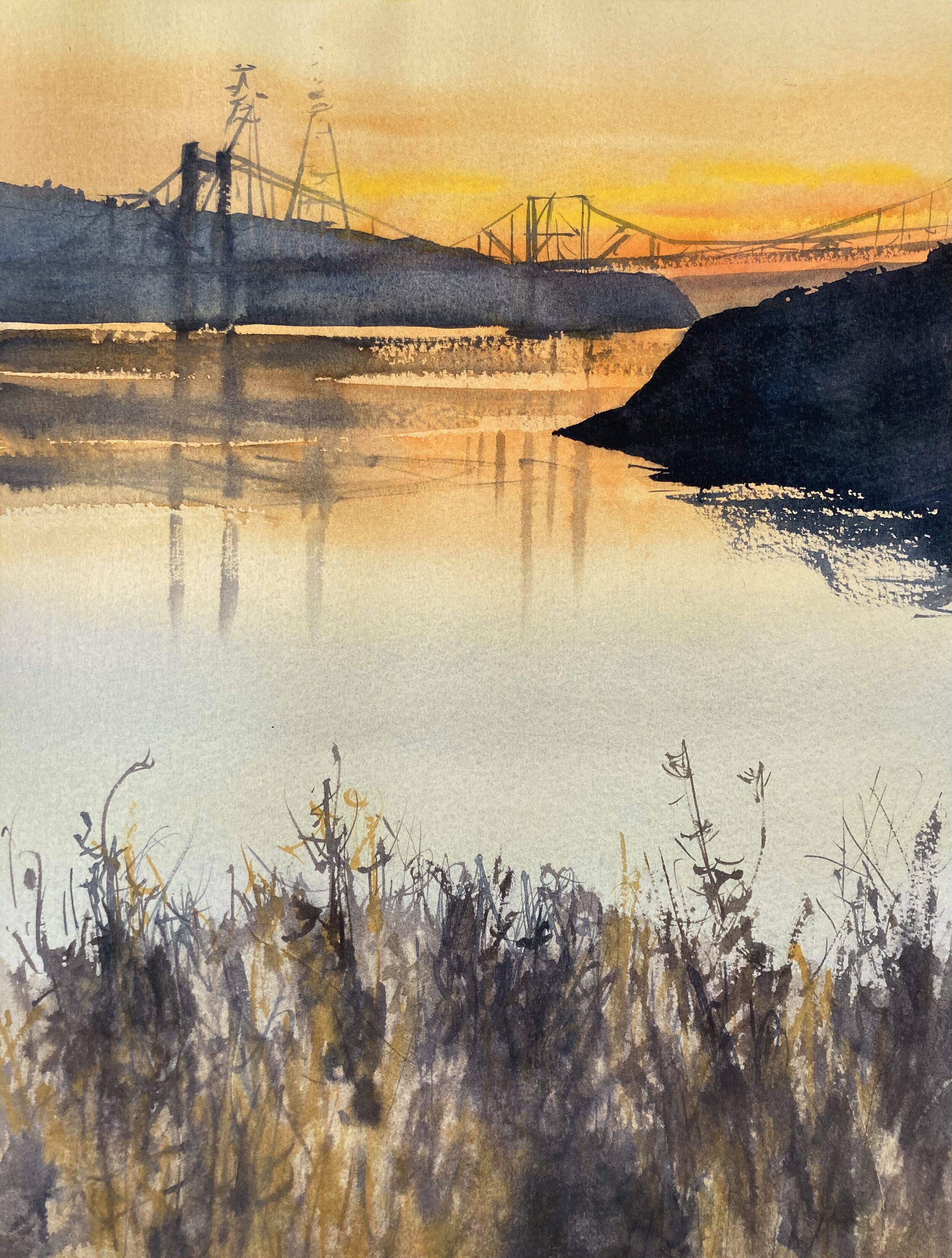
Here are two paintings I also did with the limited palette. It’s quite possible to mix a reasonable variety of greens and mauves.

This is where I started to figure out my warmer colors. This is where the Cad Orange became useful again. The first test (Row 1) is to see what happens when I mix Cad Lemon and Cad Orange. Can I mix the same hue as a normal Cad Yellow (Row 2)? Yes. It’s almost identical. What about when I compare it to mixing Naples Yellow with Cad Orange (Row 3)? Yes, also very very similar. Now, pigments have attributes beyond just the hue they mix, like whether they are staining or opaque, etc., but still… this is an important step.
Convinced of the value of using Cad Orange and Cad Lemon on the same palette, the rest of the sheet is where I start mixing them with other pigments, to see what my 5th and final color should be. Very difficult to choose!

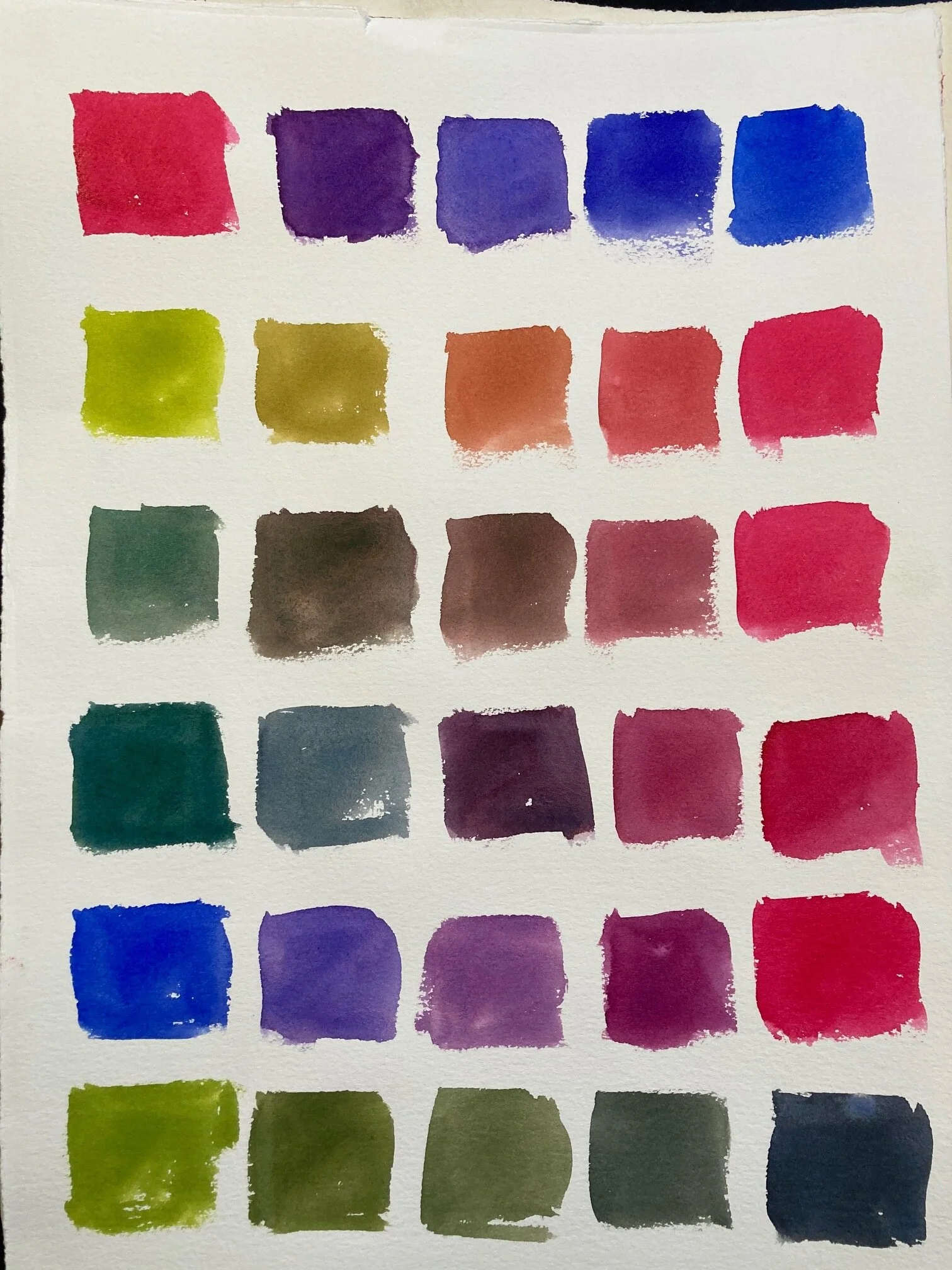

The big debate for me was whether to use a cool red like American Journey’s Joe’s Red (the same pigment as Winsor Red), or to use a kind of fuschia/ magenta hue instead. When you get this far into choosing a small palette, it’s all about relationships and final destination points. How will this new pigment mix with my other pigments? Can I recapture certain hues that I used to have a pigment for? How’s my color gamut? And most of all, how does this hue mix with color mixtures across the color wheel? For something like this, in the cool red portion of the palette, I’m not only thinking about purples and scarlets, but also about my mixed greens, and how this final pigment will help me work with them.
It’s all really a matter of opinion. Building a limited palette is about exploring color in some way. To paint a specific kind of subject matter, to experiment with certain pigment combos, or to help yourself master color mixing, etc. I mixed out a string of greens, and mixed each with Joe’s Red and with Permanent Rose. These are the results. Is one “better” than the other? Not really. But perhaps one is more useful for my application. It’s very subjective.
To me, the red mixes a set of swatches that I can easily imagine using. Muted warms and natural, muted greens. If I want to mix a green that’s very dark and neutral, I can easily mix UMB and Burnt Sienna to do so. If I want a dark cool green, I can just add more and more UMB. This is very diverse and most of all—applicable. If I want a natural, muted purple I can still actually mix one. And if I need a dollop of very bright red, I have it available.
So, in the end, I chose the Red. Can this palette paint everything? No, not really. I suppose if I wanted to paint some florals, I might prefer the Permanent Rose. The color gamut is wider with it, and that clean, bright fuschia is important for that kind of subject. But that is a very specific subject matter that I only sometimes paint. And there are other flowers where a clean bright red would do better. Choices, choices!
