A Reading Guide to Dow's "Composition", pt. 4- Deeper Into the Masters

The Beauty of Intermingling Lights and Darks-
I wanted to come back to master-studies, and talk more about what we can get from making notans in this way. Yes, when we do this we duplicate dark and light patterns. But so what? What does that really teach us? The learning process goes deeper than that- otherwise, we could have a computer do it for us and we would just look at the results! The goal of making a master-study is to explore the work ourselves and to understand compositional decisions in reverse. To, as I often say in workshops, “read the tea leaves.” It requires decision-making on our part because we must ponder the decision-making of the artist, based on the breadcrumbs he or she has left for us in the image. This is how we can train ourselves to compose better. It’s part of how we develop “appreciation”.
How can we do this? What should folks be looking out for? What are the breadcrumbs? Why can’t a computer just do it for us? :P
First, as before, we must assess how to apply those tricksy mid-values to re-create the most compelling arrangement of black and white shapes. But second is what Dow calls “the beauty of intermingling dark and light shapes”, which I’ll be going in to more in this post. These two elements, combined, are powerful compositional tools. The notan seems almost uniquely built to help us explore them.
“The beauty of intermingling dark and light shapes”? Yep. We come back here to ye’ ol’ yin and yang again, which is not, after all, just two shapes swirling around each other. No, they are intertwined, each with a piece of the other within in. Balance. Opposition. Motion, and interest.

We spend as much time staring at the two dots as we do at the swirls. Perhaps more. Therefore, each value not only defines the exterior of the other, but also "activates” the interior. A compelling notan should do the same.
I’ve provided a variety of master studies below, taken from a number of different sources. I’ve altered all of them in some way, to better represent my thinking and approach to notans. Some come from Mitch Albala’s blog, and some come from the Robinson video that I shared in the previous post, others thanks to Google search. Mitch’s blog, by the way, is superb. I can only imagine he must be an excellent teacher in person, as his thinking is already so clear on paper. Here is a introductory blog post he did on Notan, which is the original source for a number of photos I’m using today— https://blog.mitchalbala.com/the-wisdom-of-notan/ It’s worth a read too.
The point of making notan master-studies is to pay attention to compositional decisions that were made by the original painter- to train ourselves to better think and see, by looking through the eyes of another. Our notans should reflect this thinking. Hopefully, this approach will become clearer as we explore the examples below.
Example Studies-
Degas 1-
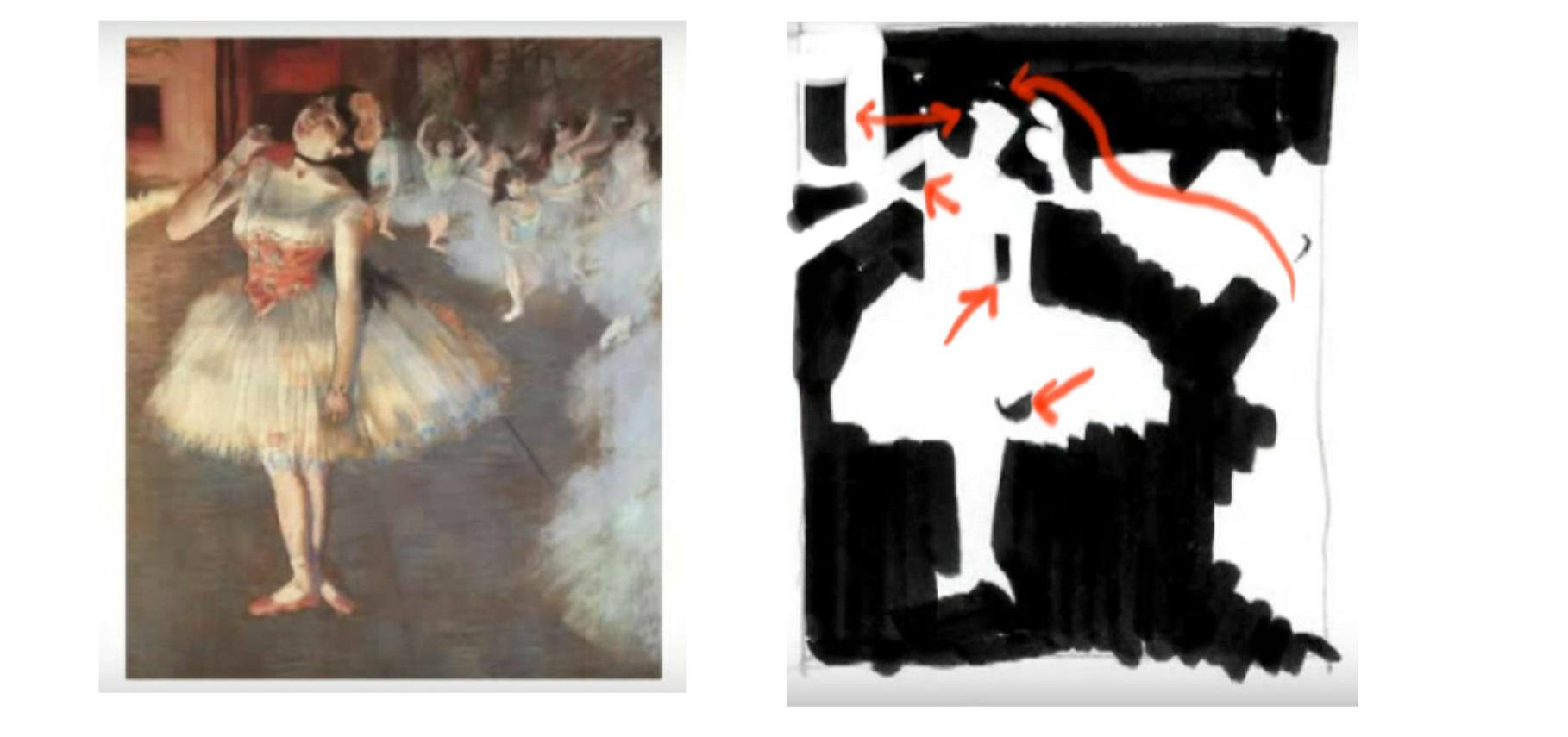
Here we have a Degas. Of course, the dances are pale, and the floor and background are dark. These are the big shapes that inter-relate, with the swirl of dancers on the right leading you to the head of the central figure. But also notice the important “intermingled” details that I’ve marked out with red arrows- the crook of both arms, the shadow of the hand, and the odd window and stage lights to the left. Particularly the window. The balance it provides to the head is important, and it would have been so easy to leave it out of the painting.
Note too how the head is almost completely surrounded by darks. Sometimes we find “secondary” objects on site (through providence) that do what we want, but really… we often have to introduce them, to create the contrasts we want, where we want them. I can’t imagine all those darks were just perfectly found there by accident, framing the dancer’s head. Degas placed them there to do a job, to highlight the face! Try removing some of them, and you’ll see how important they are.
Degas 2-
Notans can show us a lot about how an artist specifically placed things for certain effects. In this Degas below, look at the two sets of hands. Who knows where they were placed at first? They tell a story, yes, but they also break up the two deep, black areas. Speaking of which, the dark shape the two combined figures make is itself very interesting and sinuous- there is no separation between them! Instead, the two figures bond together, even with the shadows around them, to create a “river” for you to move through the painting on. The chair, of course, is like an arrow, breaking up the darkness and leading us back up to the faces and hands. The movement from dark to light to dark guides us through the image and creates points of interest. Try removing some of these intermingled lights, and you’ll see how valuable they are, providing points of interest in our viewing experience. Yin and Yang.

The window panes behind the man help make a compelling notan too. They are busy and active, with many strong lines that make us pay attention to the reader’s head. A very important location!! Don’t forget that funny little bit of dark fireplace on the left either, clearly there to break up the pale expanse of the mantel. I can easily imagine that the white mantle was wider in real life, and Degas had to bring the dark shape into the picture plane for balance. Even the books and papers on the table (all placed or serendipitously found there) are relevant to the composition, as their jumble of shapes in the bottom of the picture plane creates a kind of “mirror image” notan to the heads up top, very much like a reflection in a river scene.
Turner’s Storm-

Turner’s storm is swirling and guiding us in to the boat, but actually, it’s rather hard to make a notan out of it. Why? Because it’s almost entirely mid values, and all the edges are soft. The shapes aren’t obvious. But if you close one eye and let the other one go blurry, you can see them, as the middle values begin to separate from each other. Don’t forget- it’s the localized contrast that matters, not the lightest lights and darkest darks globally. Nothing else is as white as the sail, and almost nothing is as dark as the hull, but there is still a swirling notan in the rest of the composition, made up almost entirely of middle values and soft edges.
Whistler-
Here we have a Notan from Whistler. This is from Albala’s website. I’ve modified it slightly to reflect certain details I find important. Different notans of a subject ought to vary in some way, depending on the viewer and how you see the subject, and what contrasts you want to focus on. We’ll be talking about making multiple notan’s from a single subject in the next (and final) post in this series.

Again, we have some very strong, big shapes with the white dress against the very dark back ground. However, certain small, localized shifts in value, such as the reflected face or the flowers in front of the fireplace (both of which I added to the notan), are also very important. They help the eye transition from dark to light, and back again, as the two basic shapes “break apart” and intermingle. Almost all of these small intermingled shapes are of a middle value… almost none of them are as white as the dress, but they’re all critical.
Note too the recessive rectangular shape to the left of the woman’s hair. This helps define the back of her head. This is very much like that block of darkness behind the head of the ballerina way back in the first Degas I shared. I added this bit of white into Albala’s notan too. Why? Because it’s an example of how we can benefit from making notans ourselves.
I can just imagine Whistler working on this image, frustrated because the woman’s hair was not separating enough from the background, with her head just dissolving into the corner. The answer? Introduce an alternate-valued shape to the left, even a middle-valued recessive one. The shift is subtle but important in the original piece. In the notan, if you remove it, the need becomes very clear. As students learning from these studies, we have to look at the final piece, and try and think in reverse.
Vermeer’s Milkmaid-

Here again we have a notan that I’ve gently amended, but the truth is that this piece has a lovely strong composition, and a basic notan speaks to much of this- the big, bold swirling shapes of light versus dark (rather yin and yang, when seen as a notan), and the lovely jumble of shapes at the center of interest. Not how various elements point you there, from the arms of the milkmaid, to the fold in her gown, to the draping bits of table cloth, all of which become clear in the notan because of tonal contrasts. Just like with Degas’ readers, here we have a window with panes, active and busy, that draws the eye, but also note how it balances the composition and opens up the darker area, much like how the fireplace did in that same earlier Degas.
Finally, there are two odd bits of stuff that are worth pointing out- that quirky little box on the floor and the shiny kettle in the background. Why are they there? Is it part of a domestic narrative that most of us aren’t clued in to anymore? Perhaps... Most likely, even. But both also add to the composition, activating the floor and wall through contrast, so that that broad open, empty expanse of sunlit wall can remain open. So that it can feel open by comparison.
And that’s it for today. I hope these examples are of some use. That they direct you in your own notan-studies, and help make clear the little markers, contrasts, composition-choices you can be looking out for.
In the next post, I’ll be wrapping up the reading guide to Dow’s “Composition”, as we explore using notan “in real life.” I’ll be going through some examples of my own notans, breaking them down and comparing them to both color and black and white photos of different locations.