Anatomy of Notan Sketches

Ever since my series of posts about Notan back in the Spring, I’ve been doing more and more preparatory notan studies. Sometimes they’re just before a painting, but sometimes I do one in conjunction with a photo, especially when I don’t have time to do painting. Notan’s provide a different way to gather info about a site and, most importantly, they help you make decisions about how you want to present and simplify things. Visually busy locations can be hard to decipher later on just from a photo, but if I’ve done a notan on site to crystallize my thinking, I have a gateway back into the subject.
Both value studies and notans help with perspective, composition, and proportion, but they’re not the same. Value studies help you (obviously!) see transitions in value, and therefore they help you decide how you want to layer your glazes and washes. A notan, however, through its reduction of all values to black and white, is better at helping you see shapes and compositions— where dark valued shapes stack against dark valued shapes and will be lost (and pale against pale too), where contrast must be emphasized to distinguish between forms, where prominent distant shapes must recede to allow the focus to work better in the midground, etc, etc. Let’s take a look at different situations and see how I use the notan-making process.
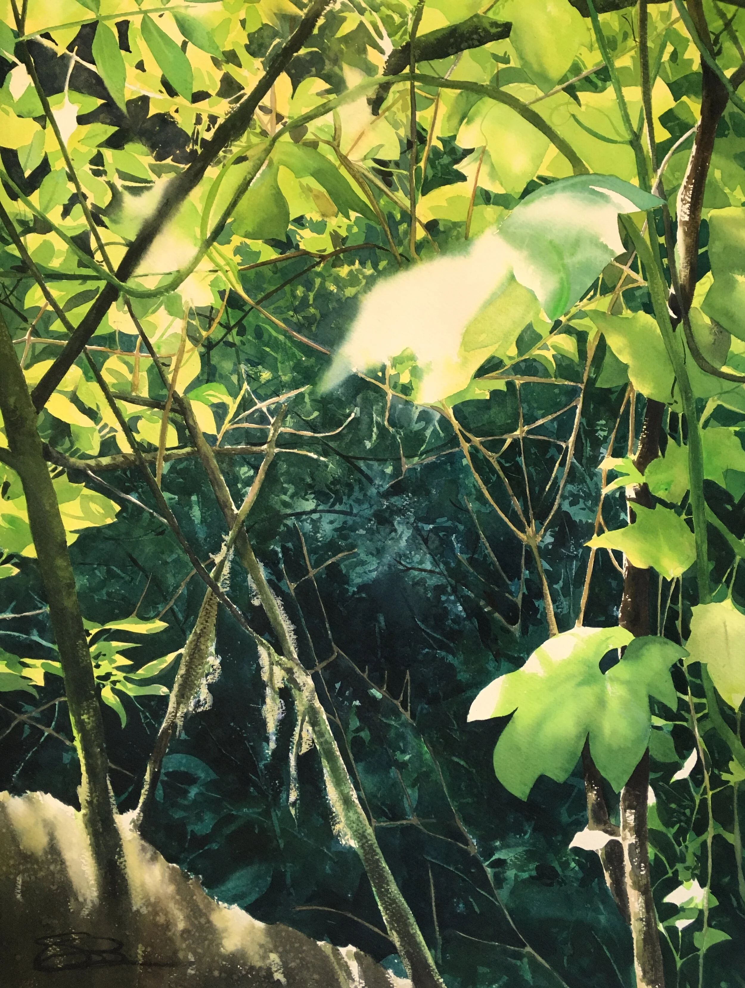
Zooming In & Separating Values—
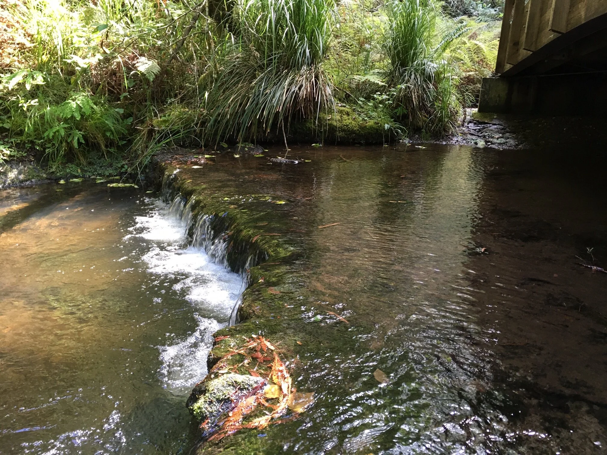
Here you can see the photo, which shows how far away everything really is, then the 6 x 4 notan, and then my 15 x 11 plein air piece. What the photo makes clear is how busy the location was visually— ferns everywhere, branches and twigs and such. My goal is to simplify and tell a story, and to capture the feeling of a place, the sound and smells. Our eyes do a very good job of pulling out objects and separating them from all of the hubbub, but photos do not. I know, from memory, that the site didn’t look as crazy as this photo. This is where the notan is very useful. Drawing it helps my mind see what my eyes see. This informs the painting process a great deal.
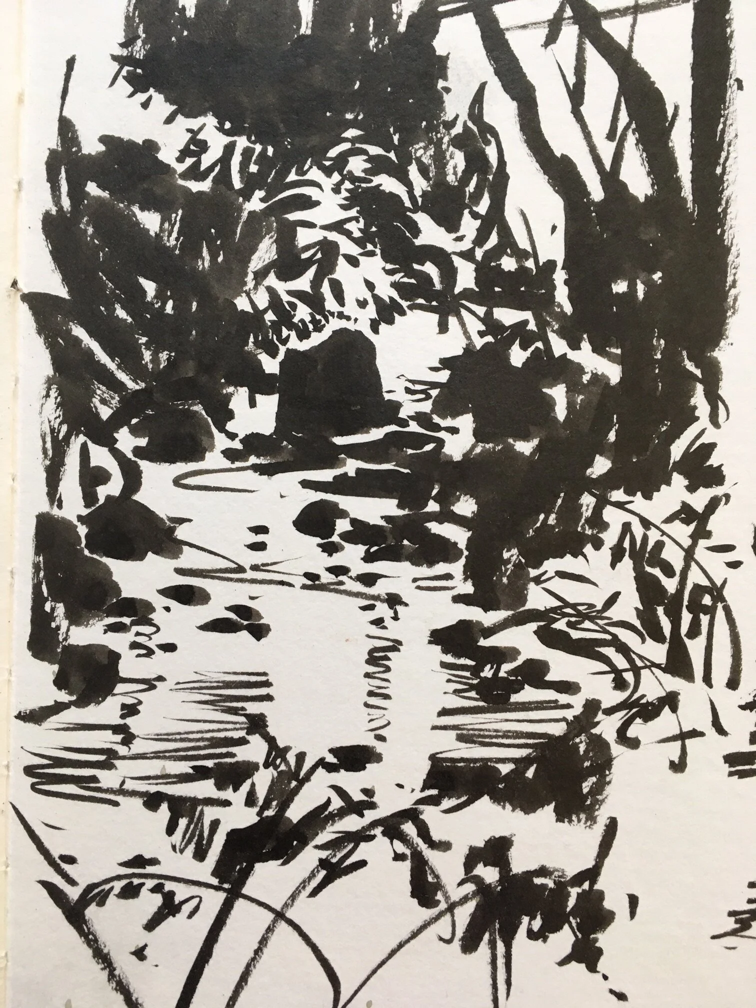

Notice too, how the notan makes me choose— all shapes must be assigned to the dark or the light. Some are very obvious— the dark stone is very dark, the almost white background is almost white, etc. It’s the mid-values where most of the really important choices reside. The creek, for example, is much darker than the background, but I assign it to the whites, to help it define the shape of the creek edge. The trees and foliage on the right, clearly much lighter than the primary stone, are brought in to the darks, to create the necessary transition from midground to background.
Difficult Images That Don’t Have Solutions-
Sometimes the notan shows you how hard an image will be to paint. Or that you don’t have the answer… yet!
Here, I stepped down from a bridge to the bank of a creek, and was pondering painting this little waterfall. The notan convinced me otherwise.
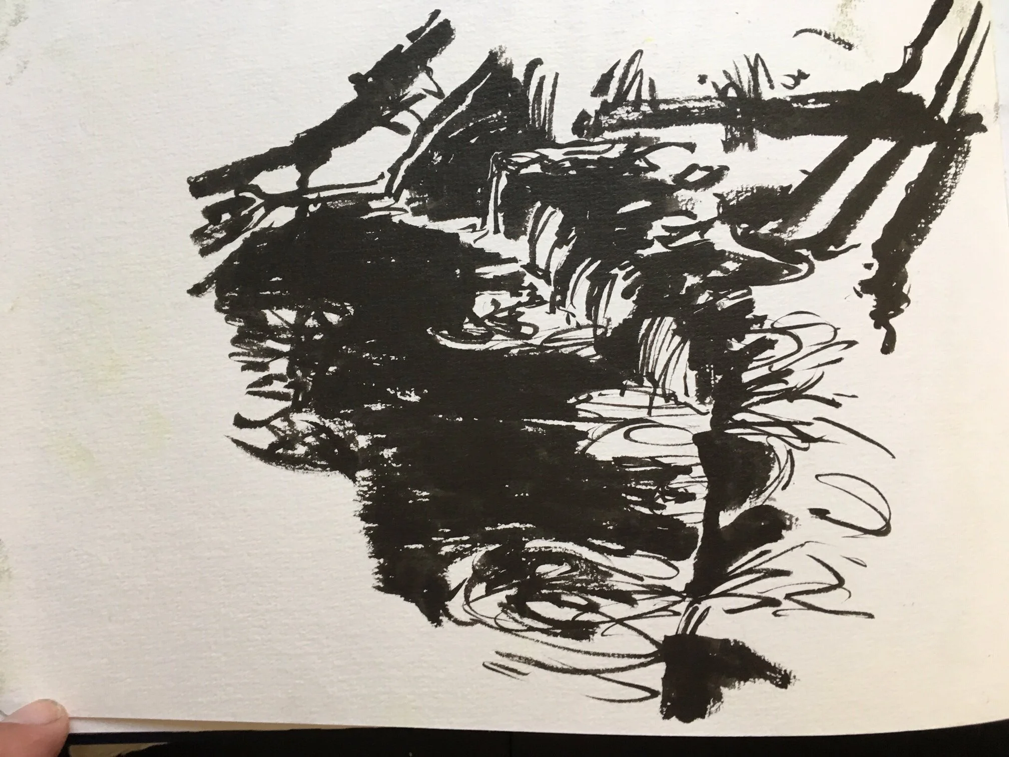
I was having a very hard time gathering strong enough black-on-white-on-black transitions to build the shapes the way I wanted too. A really big part of the image is entirely mid-values without much separation. That’s tough! There may be a painting in here, but I didn’t know how I was going to approach it. So I enjoyed the sketch, stepped back, and moved on to another site.
Choosing Your Details-
In the studio, I’ve also been doing notans. I was interested in doing the image below, and I knew, even before I began, that it would be difficult. It’s a mess of shapes. I wasn’t sure I could do it. Doing the notan actually convinced me it could be done. It helped me simplify, choose my details, and assign them to the darks or the lights. You can see how I corrected as I went— there are spots where I went back in with gouache to push the lights again.

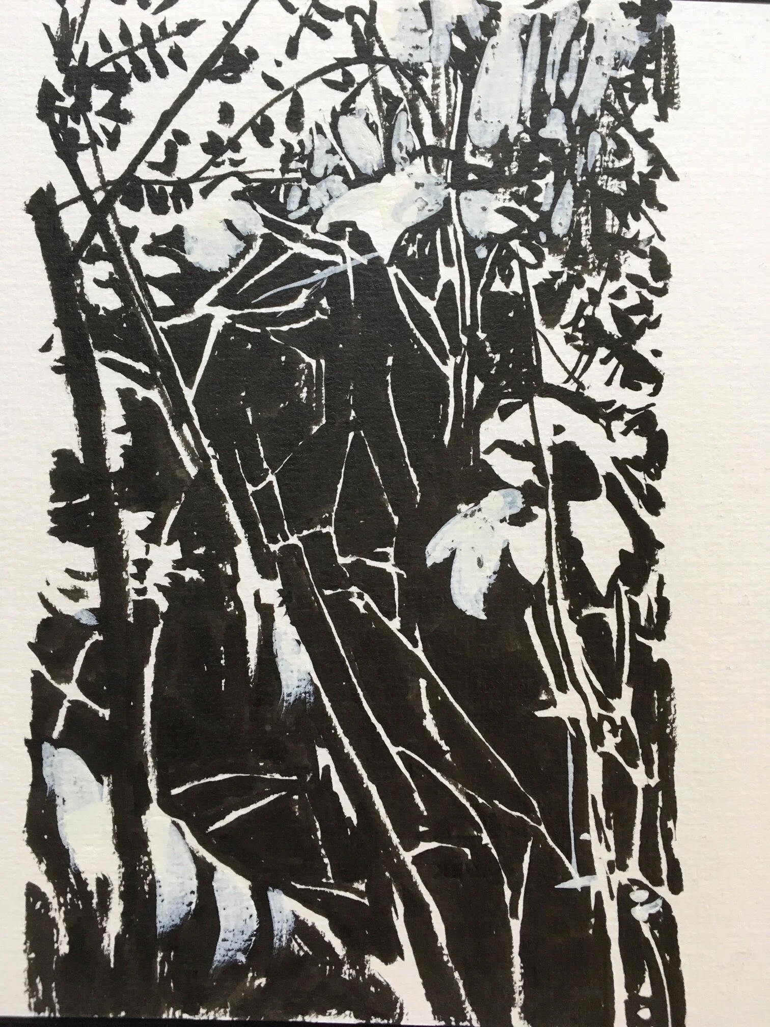
The thing that became clearest to me was that there were just two big shapes— the light horeshoe up top (almost an “O”), and the darker insert down below. Whatever sophisticated detailing I wanted to bring in, or nuance of color shift, those two shapes needed to clearly remain. Towards the end of the painting, I also recognized a mistake in the notan, where I did not follow my own thinking— I had left those little slivers of white branches in the dark background area. It was too dominant. In the painting, they recede and are bonded to the darker background, as they should be, if I want the lit leaves to glow. I very deliberately darkened them towards the end of the painting process.
Dark to Light to Dark—
When you don’t have forms that read correctly, you have to change things to make the forms stronger. You have to push the experience of dark against light against dark. I’m interested in painting this broken tree from Muir Woods. It seemed like a very strong shape. However….
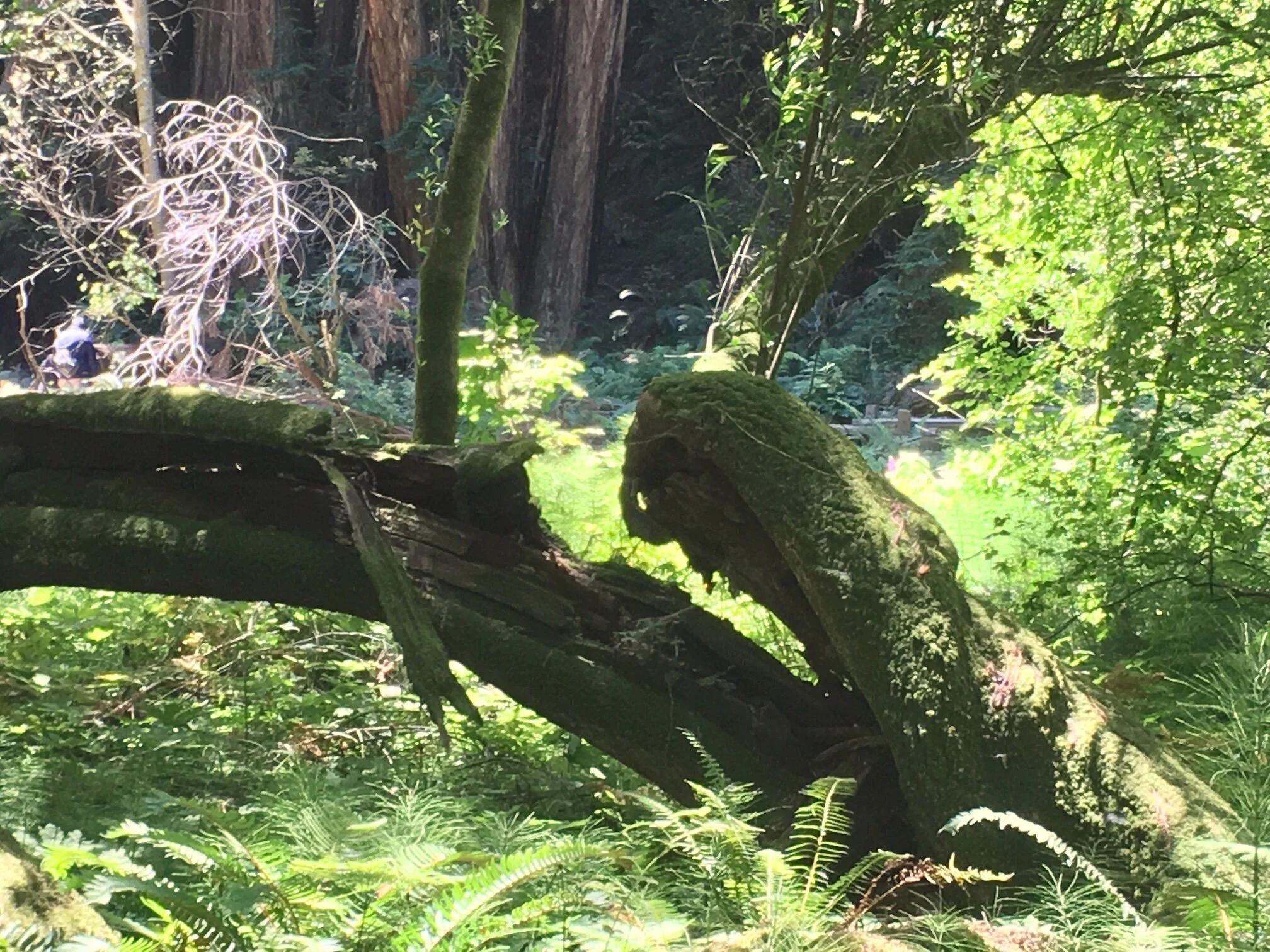
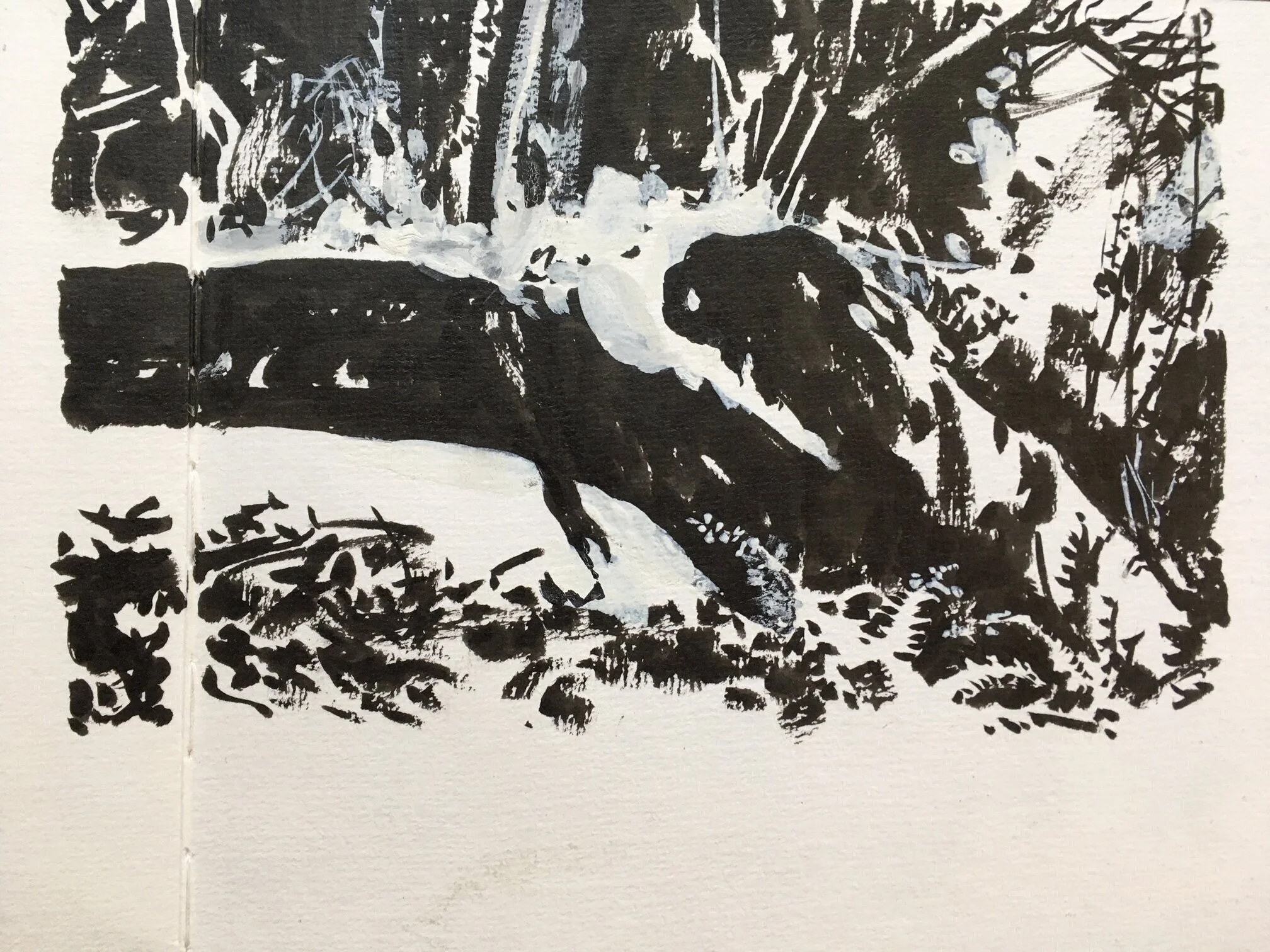
…what immediately became clear on doing the notan is that there are lots of mid-value shapes around the log that don’t let it “pop”. The area under the trunk is too close in value to the dark log, and the area above it has the same issue. If I want to paint this, those things will need to change in some way. You can see my white-gouache corrections in the notan, where I began to massage the image, creating contrast so the log will read more dominantly.
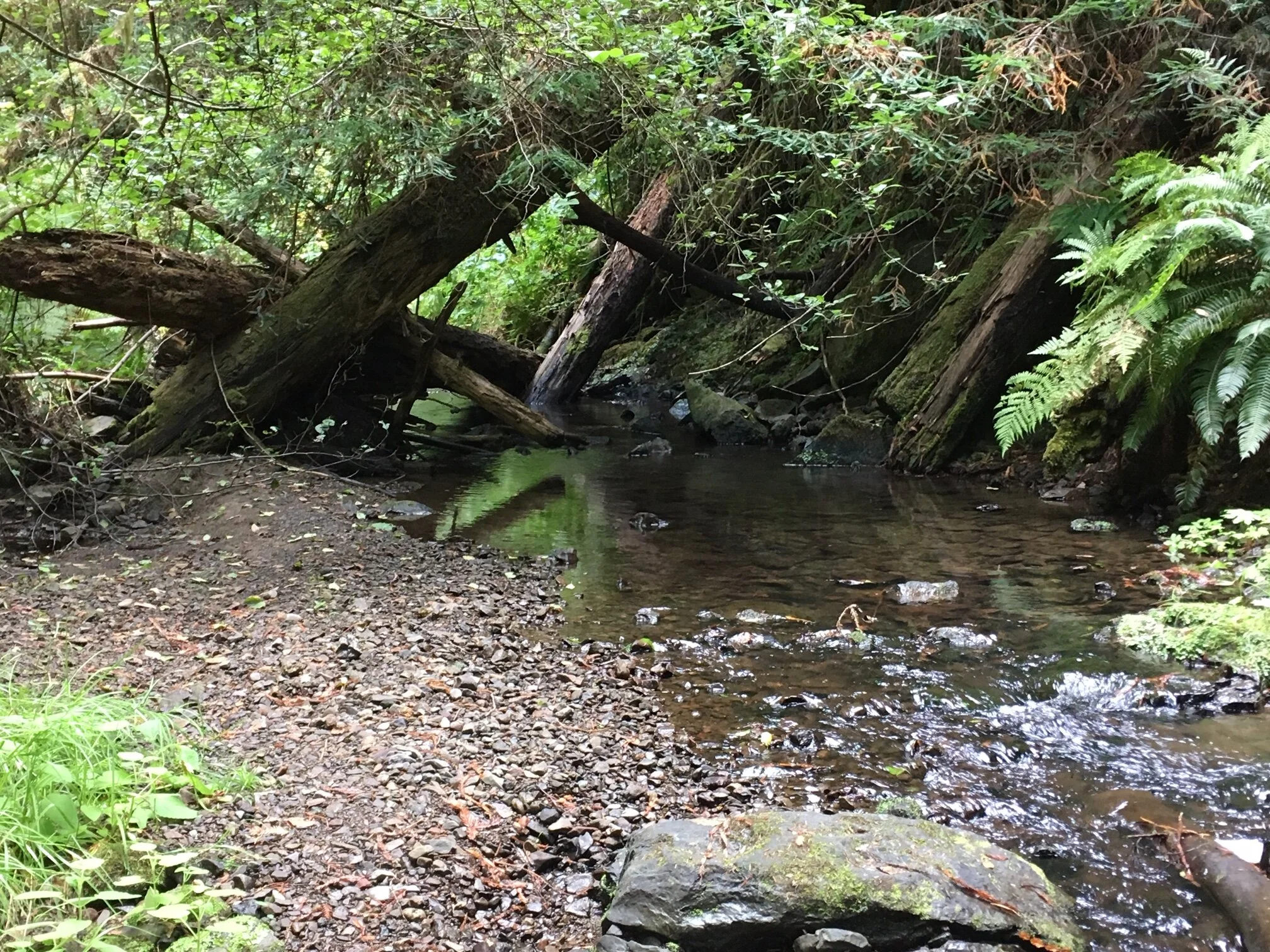
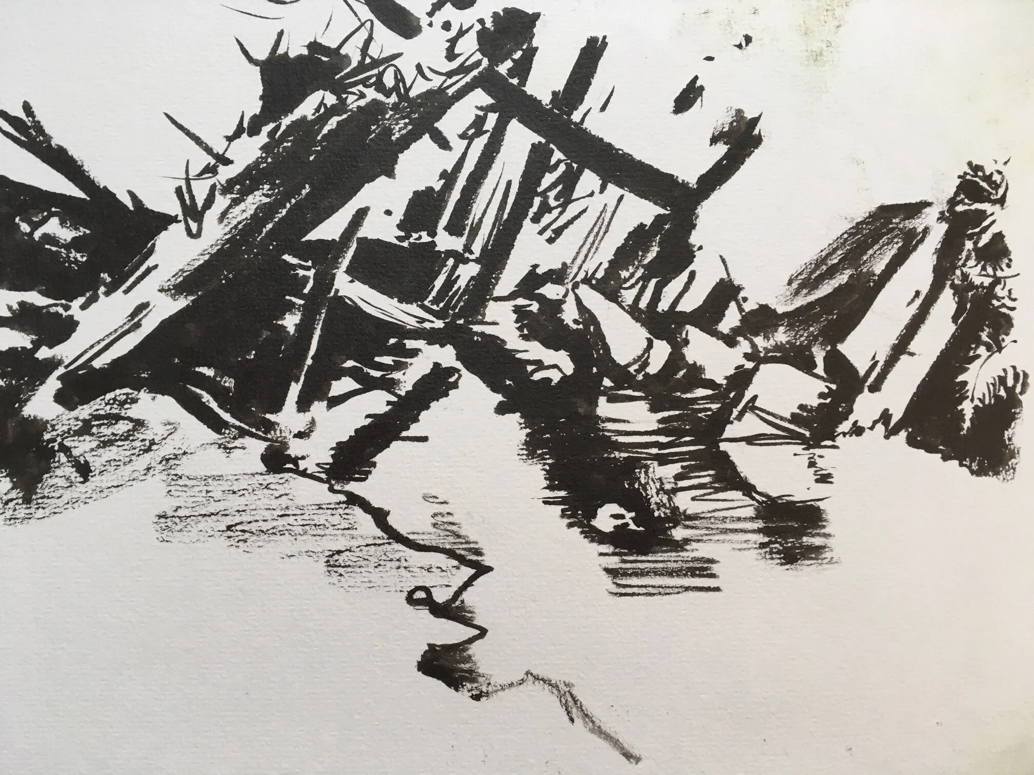
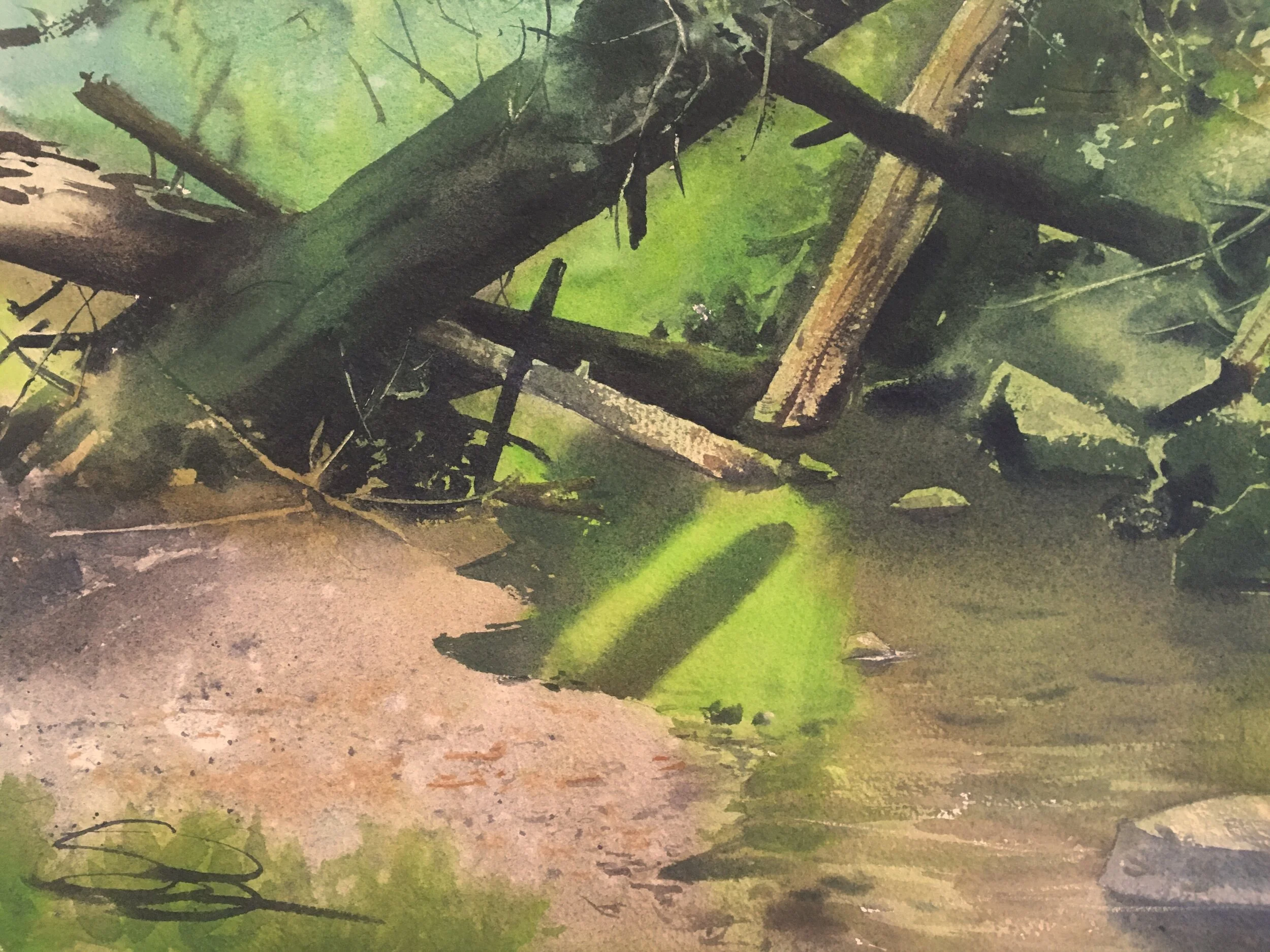
Unwinding Tangles of Shapes—
For this piece, I was very intrigued by the tangle of shapes in the logjam. I also knew that each log needed to separate itself in some way, so it could be tracked across the image, if it was going to be legible. This was a big push with the notan— how to reduce things, remove things, and by doing so choose what is essential. Note how much foliage and how many stones in the stream I removed. They’re both still there, but the story is about the logjam.