A Reading Guide to Dow's "Composition", pt. 2- Principles of Composition and Good Spacing
Overview
Art= 5 Principles + Good Spacing
Good Spacing= Appreciation
Appreciation= Comparison + Practice
This simple sequence of mental equations will guide us through this post. Again and again Dow notes that art comes from applying the 5 Principles of Composition with Good Spacing (both concepts we’ll go over below). Knowing what Good Spacing is comes from developing Appreciation. Appreciation is developed by studying and copying masters and teachers, and by doing progressively more complex exercises that help us develop our critical ability to compare and assess. That’s the gist anyways.
This is a big, dense post, but we’ll gobble it up just the same. In the words of Peter Pan, “Here we… goooo!”
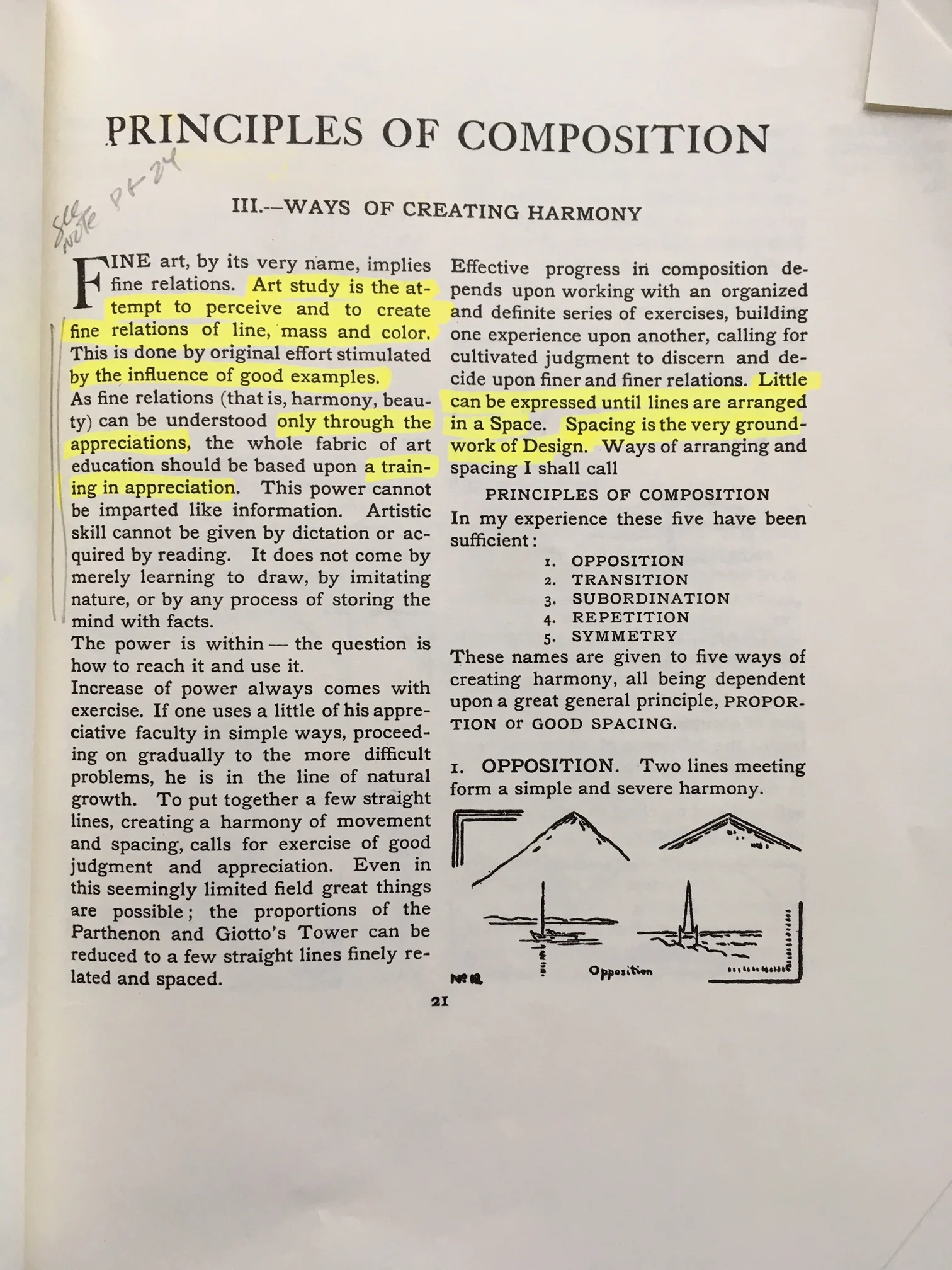
Dow’s Five Principles of Composition-
This is the guts of Dow’s mental approach. These are the building blocks with which we divide space. For one to get the most out of the sections on Line and Notan, we need atleast a basic grasp of this. There are some clear limitations to it, but it’s important just the same to wrap our minds around it. Let’s dig in.
Dow proposes 5 principles regarding how shapes and lines divide space—
1) Opposition—Two lines meeting for a simple and severe harmony (i.e. a cross or a square or a boat on a horizon, etc)


2) Transition—a tool by which you connect and soften opposing lines and shapes (i.e. filigree in the corners of a cross)

3) Subordination—the principle that a single dominating element, line, or shape will determine the character and arrangement of others (i.e. the branching of a tree leading to the trunk, or the flowers of a petal)

4) Repetition—the opposite of Subordination, where the production of beauty is created by repeating the same lines in rhythmic order (i.e. pillars in an edifice)
5) Symmetry—the placing of two equal lines or shapes in exact balance (i.e. two halves of a split apple)
Combining different elements creates tension between opposing forces, and that’s what makes for compelling visuals- dark versus light, big versus small, vertical versus horizontal, red versus green, patterns versus singularity. Order and chaos. The most compelling and useful of the set is easily Subordination versus Repetition, or as I see it “hierarchy versus equality”. This is a duo Dow brings up quite a few times as he tries to illuminate what it means to create the dynamic sense of disorder that we find in nature, that sense of a balanced yet asymmetrical arrangement that somehow feels found even as we order it ourselves.
Still, in and of themselves they’re just vocabulary for interesting ideas. Even Dow recognizes this— “Principles of Composition,” he says, “are only ways of arranging lines and shapes… They are by no means recipes for art, and their names are of little consequence… It is possible to use all the principles here discussed, and to complete all the exercises, without gaining much, if any, art experience.” Thus, it’s not using the principles themselves that is important (for we all use them when painting even “bad” paintings), but how we do so that matters.
“Good Spacing” and Learning Through Comparison-

“Fine art implies fine relations” is how Dow begins his section on the Principles of Composition, and indeed… when we’re creating a composition, we’re creating a web of relationships spatially, tonally, in terms of color... All the different parts of the painting are talking and communicating with each other, whether we are in control of them or not. So instead of saying “I find this Composition really interesting!” we could just as easily say, “I find these relationships interesting!”
How do we know if those are relationships are compelling? “Good Spacing”, as Dow calls it. To Dow, “art is not produced by (the Principles of Composition) unless they are used in combination with… Good Spacing.” Good Spacing is the Five Principles in action, where our sense of proportion and the relative location of shapes and lines is compelling. So how do we know if something is spaced well? How do we develop our ability to see and create compelling compositions? Ah! Therein lies the rub.
This skill is acquired “by original effort (aka practice) stimulated by the influence of good examples. (And) as fine relations can be understood only through appreciations, the whole fabric of art education should be based upon a training in appreciation.”
At first, I really thought Dow was full of crap here, that it was just a cop out. “Good examples”, “fine relations”, “appreciations”! Come on man, just show me the good stuff!! My book is full of notes on it. Sometimes, he’s very clear, and at others he can be so ambiguous. It’s infuriating! It was like a magic trick he could do, but only if he didn’t show us the mechanics. He could only point at it happening, but couldn’t describe it.
Well, it only took me two years of teaching to change my mind. :P Watching students struggle, I now really believe you have to do the basic hard work yourself. Even when guided by a good teacher (which is sometimes essential!), you have to go on your own journey and decide for yourself what you think. No one can “develop your eye” but yourself. Even if Dow had it all down to an equation he could impart, it wouldn’t matter. Would you really believe him if you didn’t figure it out on your own? I sure wouldn’t! I’m too damn stubborn and opinionated. However, a good place to start is studying those works you love best, and trying to figure out why they work. Iterating your own work and developing the skill of “choosing” is another.
The key here is to essentially improve our ability to assess quality on an individual case-by-case basis by first exercising and developing our ability to assess quality comparatively. Here’s Dow talking on the point of “original effort” some more- “The main thing is the striving for the best, the most harmonious, result that can be obtained. One way to accomplish this is to compare and choose continually— making many designs under one subject and selecting the best.” It is sometimes quite difficult to know how we can improve a painting viewed on its own. But it’s much easier to assess why we like one better than another. This is part of why I go on and on and on about iteration in our own work. It’s not the only reason I suggest it, but it’s part of it. Self-assessment is a huge part of growing artistically, and when we iterate an image we shrink the sand box. Fewer variables to control helps focus and clarify our comparisons. Iteration helps us learn to choose.
So, rather than pointing us in the right direction within the book itself and telling us how far apart to place things within the picture plane depending on its ratio, and at what kind of frequency, and at what kind of comparative size, etc. etc. Dow instead chooses to show us a path outside the confines of the book. We need teachers to help us, and we also have to try to suss things out on our own as we learn by either a) doing the exercises he provides in the book, or b) thoughtfully viewing and copying the masters (a bit more on that down below). Which, on a certain level, is true… How do you learn if not through practice and developing the ability to judge your own work against itself (and the masters you admire) critically? I say this sort of thing repeatedly to students in workshops.
And yet... One still hopes for a bit of guidance in the early stages of learning. What are some cues we look for when self-assessing, or what Dow calls “developing appreciation”? What artistic elements (like Subordination versus Repetition!) should we note, as we explore different relationships we can change and nudge around?
How do we get from this-

To this?

To this?

What are some pitfalls we can actively try to avoid? Fortunately, we have the thinking of Chien Chung Wei to help elucidate for us. Lead the way, Chien!
Chien Chung Wei’s “DNA of Beauty”-
On a curricular level, the most important thing Chien provided in his workshop was a sort of 10-point cheat sheet to begin tuning your eye to better judgment or “appreciation”. These points are not the “what” of composing. They are not the Five Principles. And they also don’t tell you about brush technique or color contrast or tonal contrast. Instead, they suggest how to apply those contrasts in compelling ways spatially.
Only some of them apply to Dow’s approach, so I’m focusing on those 5 here, but if you’d like to read the whole post (it’s a list of 10 concepts in the original post), I think it’s absolutely very much worth one’s time. I can’t sing the praises of that workshop enough. His “DNA of Beauty” spoke very clearly to me. Chien’s approach is based a lot on pattern recognition and how to use it as you construct your own compositions. The goal, as I see it, is to mimic (through the use of man-made patterns and that ever elusive “good spacing” Dow speaks of) the randomly generated “active balance” we sometimes see in nature.
Here’s the maxim I created to express the idea— "If beauty in nature is discovering patterns conjured by chance, then beauty in art is discovering chance conjured from patterns." So, as I see it, that’s what we’re aiming for.
Big, middle, small-

Look at how even the arrangement of windows and lights echo the “big, Little, Small” Mantra.
This seems very simple, but is probably the most basic, consistent compositional element in his paintings. Just like DNA, it starts with his smallest gestures (literally his brushstrokes), but the principle builds upwards and he uses it to construct his largest shapes as well. Always, he’s thinking about his brush strokes and his shapes. He makes a big stroke, then uses some dots and a dash to tidy things up. Small shapes are accompanied by others. Big planes relate to smaller planes. Nothing is painted alone. “If you're painting has a,b, c, d,” he said, “you cannot just paint a. You paint a, but watch b, c, and d. They have to relate to each other.” Remember, Composition is Relation.
Major, minor, jumper or Kings and Princes-

look at the arrangement of yellows and how important the figure in yellow and the little light on the far right is for a sense of balance. Major, Minor, Jumper.
"Major, minor, jumper” is all about spacing things out and creating a sense of “active balance” by distributing points of interest in different parts of the picture plane. This has everything to do with the ever-critical Spacing that Dow brings up. What’s important, of course, is how the major, minor, and jumper relate to each other.
First, of course the “major” is the focal point of your image. The minor is a strong secondary point of interest. If the major and minor are too far apart, you need to add a "jumper", to bridge the distance- a third point of interest to help the eye move from point to point and circulate through the image. This, along with “Big, middle, small” and “Diagonal”, was one of the most repeated concepts over the course of the workshop. Over and over, simple and consistent.
Chien sometimes referred to them as the “king and the princes” as well. The goal was to create a sense of dynamic balance. Nothing too static or centered. This keeps the image engaging and lets your eye travel. If there is a jumper, it is always the smallest of the "big, middle, small". It connects the farthest prince (or minor) to the king.
"The prince that is furthest way is the most important, because it is for balance. Those closest princes bow to the king, the farthest create tension."
"When you paint plein air or take a picture, you always need to find the major first. But the minor and the jumper are (almost always) of your own design."
Gather, disperse, extend-
"You can't have a kingdom with just a king. You need others to control him."
This is Spacing and Hierarchy, applied. It’s all about taking elements similar to your focal point and placing them in different parts of the picture at different levels of intensity.
For example, if you have a powerful red sky or object, you need a bit of red elsewhere to control it. Use less and less as you go outwards, like ripples. If something is too strong, you just extend and soften it, to more fully integrate it with the whole image. It can be a color, a value, etc.
No wholeness-
Nothing too exact. Nothing too strong or geometric. Break your shapes and lines. Remember- even when you break up an object, use big, middle, small. Often, when he would paint an edge, he would “break it” and deliberately not let it be too clean. No complete squares and whatnot. They just take over everything. They’re too strong. Instead, he would imply the shape with a great deal of skill.
If you want your shapes to relate to each other with Good Spacing, you need to integrate the shapes- buildings have windows and trees and awnings in front of them. Skies have telephone poles and trees and the masts of boats breaking them up. Fields have posts and paths and bushes. Always, you should be thinking about relating shapes to each other, creating different proportions and such. If you think of Chien’s “Big, Little, Small”, huge whole shapes are all big and no small.
No sameness-
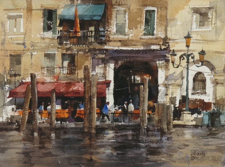
note the arrange of the pylons, how they’re gathered, and the spaces between them. No sameness. Look inside the big dark portal too- no wholeness. The window that lets us see through into the distance is very important for making the portal compelling.
Change the distance between things, the height of things, the shape of things. Give the eye something to hold on to. Don't use the same frequency or size. You’ll see, for example, when Chien paints things like windows, that he’ll do a few, but they’re all a bit different. Different values, different levels of detail, slightly different chroma. From there, he would let the rest be indicated.
Exercises to Explore in “Composition”-

Throughout the book Dow provides a variety of exercises to try out. What can I say? Some seem compelling and well thought out, and others seem almost incomplete, just an idea for a teacher to flesh out later. Here I note some of the ones I think most productive to explore.
4 Exercises— pg 54 (#1), 24-25 (#2), pg 45 (#3) & pg 48 (#4)
Drawing lines, flowers, fruits and stems, and landscapes in different picture planes. The gist of this sequence is first to start with a composition using the most basic division of space (lines of varying thickness and spacing), and to tackle more and more complex subjects with each exercise. Each exercise is based on a set of subject matter that we then have to alter and shift as needed to best relate to altered picture planes- square, portrait, landscape, extra vertical, etc. This is good stuff!
The image can’t stay the same, and you can’t just crop the composition. You have to explore and alter it to best push against the new boundaries. Dow moves us through a variety of subjects that get progressively more complex, but the truth is the muscle we’re developing is always the same— assessing the picture plane, dividing the space within its unique boundaries with lines, and creating interesting proportions by arranging combinations of line-shapes. Yes, they’re trees and flowers and other things, but at root they are all the same as what I’ve labeled as the first exercise— lines arranged in a flat plane. We’ll deal with blocks of mass in the next post, when we talk about Notan.
Here’s Dow talking about the idea— “The designer and picture-painter start in the same way. Each has before him a blank space on which he sketches out the main lines of his composition. This may be called his Line-idea, and on it hinges the excellence of the whole, for no delicacy of tone, or harmony of color can remedy a bad proportion. A picture, then, may be said to be in its beginning actually a patter of lines.”


#5- pg 39
Learn through osmosis; study the art-structure of a great creative work. This isn’t actually an exercise, but it should be. Dow says, “The most important fact about a great creative work is that it is beautiful; and the best way to see this is to study the art-structure of it, —the way it is built up as Line, Notan, Color,— the principle of composition which it exemplifies. See what a master has done with the very problem you are trying to work out.” It was when I read this that I came to presume Chien was inspired directly by Dow as a teacher.
In Chien’s workshop, he had us try to make an abstract for an existing painting. Here’s a link. It’s worth the read. This was a fantastically illustrative (and difficult) exercise, and should be done by others. Making Notans from paintings we love is also an exceptional way to understand the value-patterns of its composition. I remember Chien saying, “Study a master every day, make an abstract like this, learn how they made their paintings work, and in time you will know everything there is to know about composition.” We’ll actually be talking about this in the next post, when touch on the idea of studying what Dow calls the “spotting” of master-images.
Next week we’ll dig into Notan, and I’ll share some exercises and real world applications. Below’s a quote from Dow that I loved. We can close on this for today-
“Mere accuracy has no art-value whatever… One uses the facts of nature to express an idea or emotion.” We should “value power in expression above success in drawing.”