Creating Good Artificial Lighting for Your Art Workspace

Given work, raising a family, and the short days after the New Year, I’ve recently been trying to find spare hours to paint when it’s not daylight. As such, this past winter I did some research and set up better artificial lighting in my “studio” space (aka, the back table). What a pain! LOL. But my pain and research shall be to your benefit! Read on, and learn about what makes good lighting in your work space and what you might buy to achieve it.
First, what is the measure of success? The goal is generally to attempt to duplicate the experience of good, indirect northern light on your paper. This is much like the kind of cooler, ambient light we get in well lit homes, and the kind of light we generally get in galleries and such. So if you’re planning of sharing your work in spaces like that, then the goal is to create lighting situations that, as close as possible, replicate that experience. Much like this—

This is where I normally paint, when I paint at home in the day. Lots of cool, northern, ambient light coming from in front of me. No shadow cast onto my paper from myself. A sliding glass door to my right as well, facing east, for a bit more indirect light in the afternoon.
This is a lovely place to paint by day. The issue was night.
I already had overhead lights, of course, which I used in the evenings from time to time and thought would be fine, but I became increasingly unhappy with the setup. Why go through the hassle of changing the whole setup? A few basic reasons—hue shift, inaccurate values, and cast shadows.
How Bad Lighting Affects Your Paintings
Most of the time, we’re not looking at paintings in the evening under warm yellow light, and it can greatly affect how we see color. Just how yellow is typical indoor light? In this photo you can see my overhead lighting, with two of the original warm, yellow bulbs in it and one of the newer bluer bulbs for contrast—

How much of a difference does that kind of lighting make on your painting? Here on the left is a photo of a painting I did outdoors, and on the right is the same painting photographed under the typical yellow lighting one might use at night at home. Note how the sky is no longer a clean, cool blue, but instead an off gray, while the cool gray shadows on the mountain have become a sunny warm grey. Also, all the whites have a gentle warm cast to them now, in the indoor photo on the right. Additionally, in the dimmer lights, middle values read darker. I find this particularly so in the trees in this image, if you look at the trunk on the left or the foliage on the far right. All of this is just based on the lighting.


Of course, it’s one thing to have the lighting change the way a painting looks after you’re finished, which is a pain, but this shift in hue and value can also occur while you’re painting the piece. This can cause all kinds of problems later on, because lighting that is too warm and dim will make you over compensate with a palette that is too cool and pale. Come morning, you’ll experience that sad moment when you go to look at your painting (that one you were so satisfied with!), and find the whole thing has a very blue cast.
The second, and more obvious, thing that comes from bad overhead lighting is that you yourself often cast a shadow upon your painting, like this—

How Good Lighting is Measured—
First, the good news is that other people, like this fellow Will Kemp— http://willkempartschool.com/art-studio-lighting-design/ --have done a lot of the heavy lifting for us about this sort of thing. Follow the link and read up as much as you want. It’s a really wonderful resource, and goes farther in depth than I do in this post.
I’m going to do the cheat sheet version here. This is where we get a little technical. If you just want to know what I bought and recommend, scroll down below. If you want to know more about lighting, read on! We need to track a few things if we want to set things up right, like
1) the color temperature (is it warm or cool?) of your lighting (measured in Kelvin),
2) whether the type of light it emits has a good “Color Rendering Index” (we’ll talk about that later),
3) whether it’s bright enough (measured in Lumens, not watts), and
4) the location and distance of your light source, relative to you and your canvas.
Lets look at them briefly, one by one –
Color Temperature—Most lights that we use indoors, as noted before, are pretty heavily yellow. They often run in the 2000- 3000 Kevin range. We need something around 5000K, which is supposed to be a cool, neutral light. If you put one in with that rating, you’ll be astounded at how “blue” things look. At the very least, I was. This is meant to replicate the kind of natural ambient Northern lighting I discussed earlier, rather than a warm, sunny, southern facing window.
CRI—Color Rendering Index— this is a measurement of how well the light source you have produces a full range of hues when it bounces off your paper. Think of old LED tubes, that made everything look blue in your our garage. That’s what we want to avoid. Instead, we aim for a cool 5000K temperature light that also reflects a full range of color. The closer it gets to doing that, the closer it gets to 100 CRI (like sunlight), when it accurately produces a full range of hues. Is there science behind it all? Yes. Do I understand it? Nope. LOL!
Lumens—this is a measurement of how much light your bulb produces. It’s used instead of watts. This is particularly important if you’re using a newer (much more advanced) LED bulb, where the wattage is far far less than for a typical incandescent bulb, but the volume of brightness is comparatively far greater, in terms of how much energy it uses. This is why they make such and such watt “equivalent” LED bulbs, so we have a comparison point for how bright they are.
Distance— this might sound simple to say, but, of course, the farther your light source is from you the dimmer it gets! That’s part of how Lumens are measured. It’s not just what the bulb produces, but can also be measured as the amount of light that arrives at a point (like your canvas). There’s a complicated equation if you go the reference page I linked to, but the short of it is that most typical lighting situations need about 1500-2000 lumens.
Position— This depends a lot on the type of media you use. There’s lots of recommendations online about lighting from above, but this almost always has to do with painting vertically with oils or acrylics. All the advice that I got (which turned out to be true!) is that a watercolorist needs the light to come from the side, from directly above, or from slightly over the shoulder opposite the hand you paint with (as in, a right handed painter would have light come from slightly behind his left shoulder). This does two things—it stops your active painting hand from casting a shadow on the area you’re working on, and it stops glare from bouncing off the wet paint into your eyes (which happens if you place your light in from of you at all).
Results and Tools-
There’s a lot of advice on the internet about lighting that involves Halogen lights and diffusers and stands and… and and and. This often has a lot to do with lighting that professional photographers use. I preferred the simpler route, which seems to be serving pretty well so far-- meaning my results are good enough that I can paint at odd hours, and yet my color and values still look correct they next day.
So, with that goal in mind, the good news is that there are now tools (bulbs) that we can buy that provide basically everything we need, and cheaply.

https://www.amazon.com/dp/B01AVRMSYC/ref=twister_B00YG7F1ZW?_encoding=UTF8&psc=1
I picked these up from Amazon for about 30$ for a lot of 4. They’re bright 100w equivalent LED bulbs that only use 16 watts, so they’re energy efficient. They each produce 1660 lumens (the equivalent of 4 of my old incandescent bulbs!). They have a CRI of 95, and they have a 5000K temperature. They even have an E26 base, which is the label for bulb bases that fit a normal bulb bottom.
I tried these at first in two simple work flood lamps that I aimed upwards, but I found these too indirect and dim, like this—
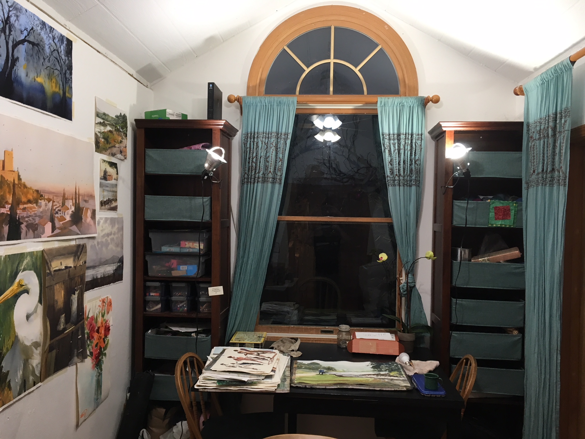
Instead, in the end I took the advice of others and chose not to remake the wheel! I got this toJane lamp for 40$.

With its super flexible triple-hinge system on a swiveling base, I’m able to place the lamp exactly at the location I want, at the distance I want. And in the end, this has also allowed me to flexibly shift and place the lamp exactly where I need it, as I work on different parts of a painting.

And that’s it for now! If you’re interested in improving the lighting setup in your art making space, I hope these notes from my own experience help you along the way. For perhaps 75$, in the end, you can do it pretty simply, as long as you know what you are supposed to be looking for, and what to do with it! :P