Recent Work- What We Can Learn From Photographing Our Work
Today I am going to touch briefly on the interesting experience of photographing your painting and figuring out that you actually prefer the photo. !! This can be disconcerting, but it’s also very instructive. There are clearly times I prefer my painting over the photo, and photo work (of the iPhone variety) is definitely limited in terms of the of color-diversity it can accurately capture. If you are pushing contrasting hues, photos will almost always push a Mother Color and nudge everything one way or the other. But photos are also very good at pushing contrast, and there are times when this is what a painting really needs.
Here’s my reference photo. It’s not much.

I took this last winter in Yosemite, as the last light was setting behind me, and the mountain across the valley was lit up, misty and glowing. Crappy photos like this (LOL!) can sometimes be good reference photos. They provide the basics of shape relationships but they’re deficiencies also leave a lot up to memory and artistic interpretation. I very much remember the mountain being warmer, and the foreground trees being cool and shady. Sometimes, after I take a photo, if it’s not quite correct (like this one) I even type out some sort of color notes as well, for future reference. So, here I relied on memory and got to painting.
This is what I got on the first-go around.
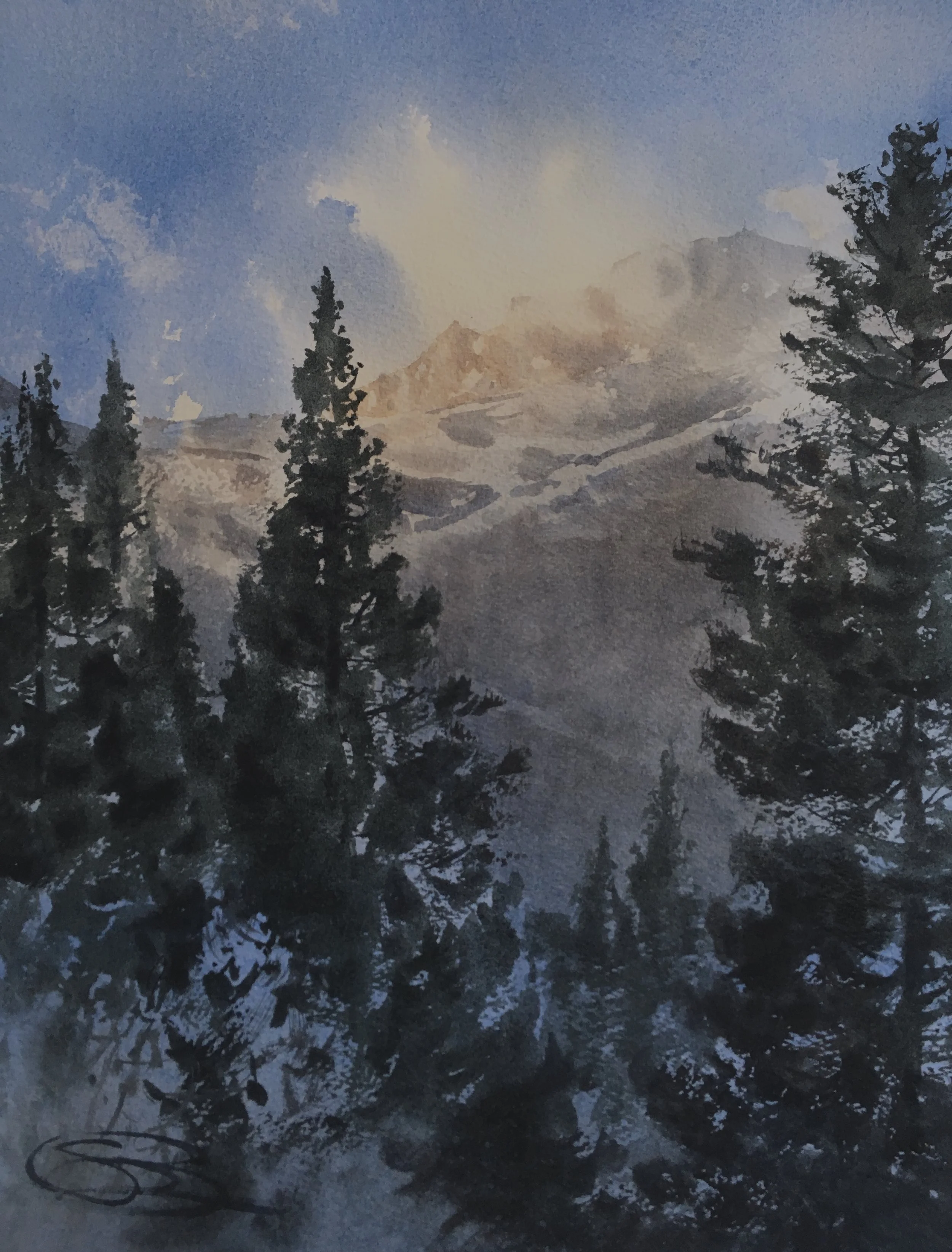
A successful piece, to me. Muted and cold, with that nice wet, soft-edged mist up top. Done, right? Well, what was interesting was that this is the photo I actually took first, before I color corrected things-
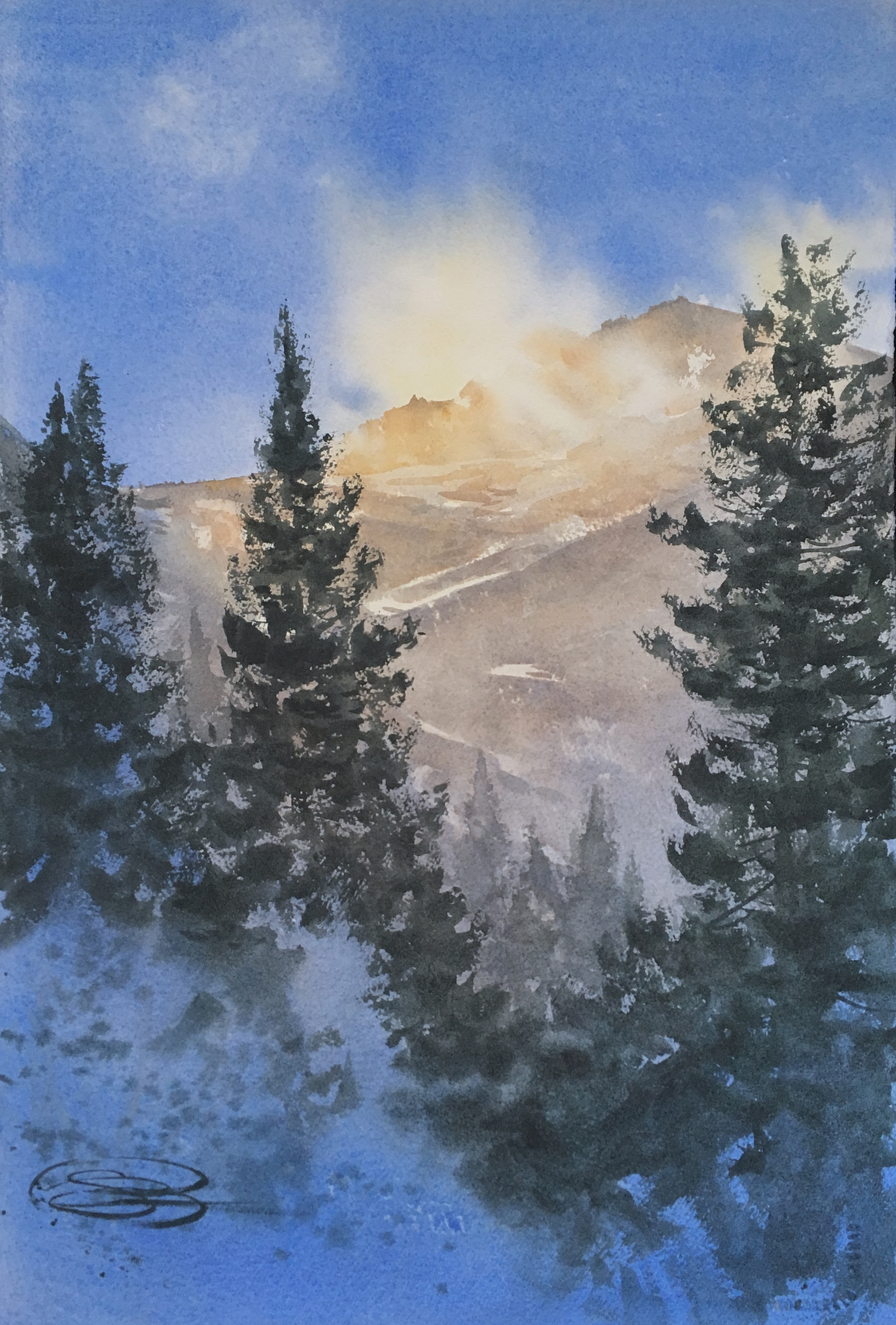
I really liked some of what the photo did to the image. The contrast is definitely stronger. This was achieved by opening up and brightening the paler area. Notice also that everything has a gently warmer cast. To me, in this image, it works- mostly because the image is so cool already. By pushing the warmer elements a bit more, it actually creates a richer complimentary hue-contrast.
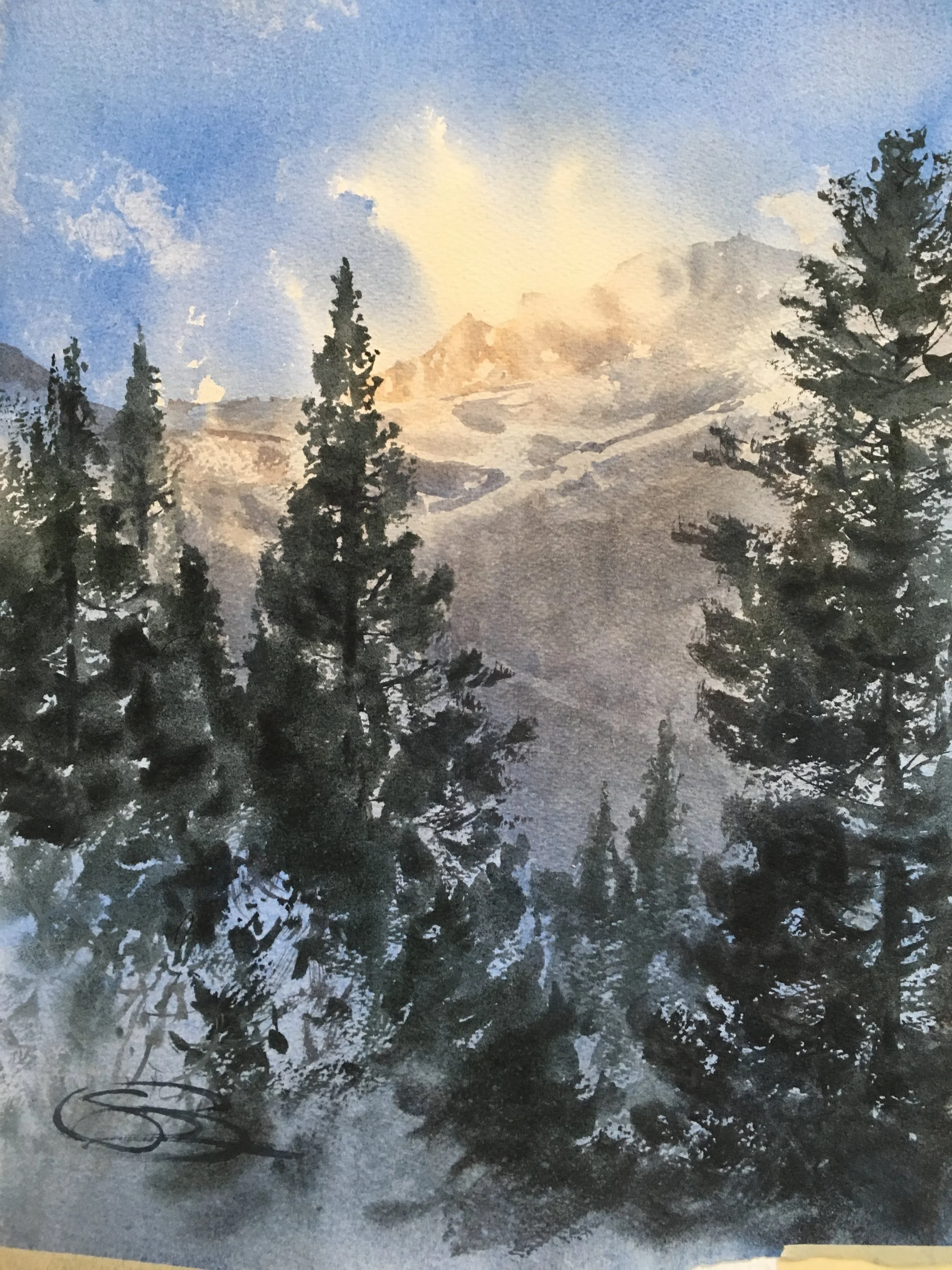
A week later, I set to work, repainting the image. Of course, being an artist, this was painted on the last possible day to submit to the Yosemite Renaissance show. So, it was either hit a good one or go home. LOL! I used my memories, the original painting, and the skewed photo as references, and went for it. I focused on two basic things- keeping the central area paler and warmer, to provide a honeyed backdrop for the darker green trees to pop against, and pushing the blues down in the foreground to really accentuate the hue-contrast and make the mountain glow.

Is it better? I don’t know. It’s definitely different though, and was what I was aiming for. So, by my judgement, yes.
As always, part of the charm of working in watercolors (to me, atleast) is that every image is it’s own. You can’t futz with it too much, to get it “just right” the way you can with acrylics or oils. Instead, you have to keep moving forward, iterate an image if you want to do it differently, and accept each painting as it’s own artifact from a moment in time.