A Basic Primer on Watercolor Pigments, pt. 4- My Current Palette
The Basics-
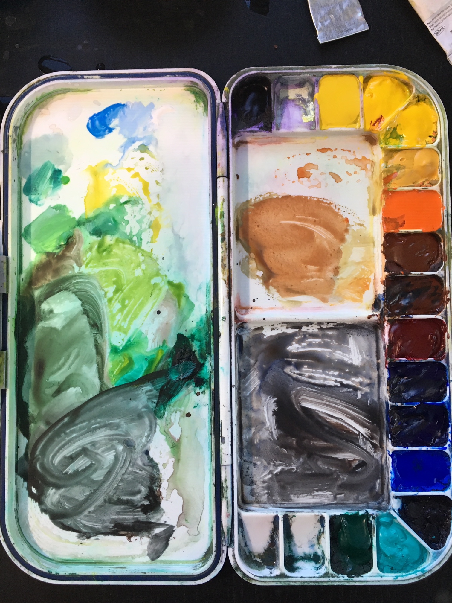
At the bottom of this post is a list of the pigments in my current palette, full of brands and pigments based on my own idiosyncratic painting process. My palette is composed of lightfast, single pigment color choices. I skip common “convenience mixtures” such as Sap Green or Hooker’s Green, etc. My opinion is that single-pigment colors allow for better prediction of color-mixing outcomes. Additionally, I only purchase paints in tubes, which I then distribute into the wells on my palette. My experience is that paint purchased in tubes (and applied while still wet) allows for a “juicier” application of paint when needed. This will let you get rich, pigmented darks and more chromatic washes with much greater ease.
What Details I’ve Included in the List, and Why-
Beyond those basic recommendations, please don’t feel I’m suggesting that folks use only these pigments or only these brands. Most pigment choice has to do with how we navigate the color wheel from hue to hue- not that each pigment or brand is essential (of course, there are exceptions, but that’s the gist of the idea). As such, I’ve included in the list below the alpha-numeric label for my pigments, so you can substitute alternate brands as needed, as well as some hue-similar alternate pigments, if you don’t care to use the exact pigments I use.
If you are interested in purchasing only a very few pigments to start off with, I’ve labeled what I view as “essentials” with an asterisk. These are spread around the color wheel, and with a bit of mixing control, you can achieve a very wide gamut of color with just 5-6 paints. The real goal is to make sure you have a good distribution of hues to allow yourself a wide color gamut for mixing purposes.
Finally, as an aside, I’ve noted commonly used hue-similar fugitive paints that should be avoided (how’s that for a mouth-full?!). Please don’t use these pigments. I’ll be frank and blunt- although people sometimes debate these things academically, in my opinion you’re giving watercolors a bad name by doing so. If you love watercolors, do the whole medium a favor, and only use lightfast pigments. Ok, PSA done. ;)
How Do I Choose What Goes on My Palette?
It’s probably also worth saying that I’m not one to buy a pigment because I find the color attractive (or unattractive, for that matter). And I never think, “Ah, this paint looks just like bricks, or beach sand, or pine trees, or sign posts, etc.” Of course, sometimes all of those things do happen, but truth is that I include paints in my palette because of how they’ll work with other paints. The goal is always to assess how your paints will work in cohort with each other. That is the most important point. Below, you can see one of my color doodle-sheets, where I explore different reds and how they mix with greens, to mute them, and how I might apply the red. From swatches and explorations such as these, I decide what to include in my palette-

So, the introduction of pigments into my palette is all about finding good mixing compliments or creating mixing lines for hues I want to arrive at more easily. Paints never work on their own. I’ve always got some basic sort of plan for how I might use a paint, for what sort of subjects, and in conjunction with what sort of other pigments I have available. Even if applied straight from the tube, without mixing, they’re always a team once they’re on the canvas.
As such, I’ve included a short description with each pigment, describing why I have it on my palette, and what I use it for, what combos, etc. Just to give you a sense of what goes through my mind, and why I chose these pigments specifically.
(Interested in knowing more about how I approach and try to control mixing outcomes? Check out these posts on Color Mixing, Mixing Greens, and Navigating Color Space.)
The List-
*Cadmium Yellow (PY35), American Journey
Lightfast Alternate- Benzimidazolone Yellow (aka Azo or Winsor Yellow) (PY151 or 154)
Common Fugitive Example- Aureolin Yellow (PY40)
I mix a lot of greens with this yellow. I use Cad Yellow because it’s mildly opaque for a yellow, is a strong mixer despite it’s light value, and is relatively “pushy” wet into wet, and yet won’t explode across the page. It also works well with Dioxazine Violet as a mixing partner. I recently decided to give it two wells, because it’s my primary yellow mixer for a lot of greens.
Yellow Ochre (PY43), M. Graham
Lightfast Alternate- Raw Sienna (PY42 and PR101)
This yellow-brown is rather opaque and gooey, which has a use. It will hold it’s own spatially, and yet is inactive (inert), wet-into-wet, like Cad Yellow. This works great for muted greens, and makes nice browns with Dioxazine Violet.
Cadmium Orange (PO20), American Journey
Lightfast Alternate- Pyrrole Orange (PO73)
Redder Lightfast Alternate- Cadmium Scarlet (aka Cadmium Red Light) (PR108)
What can I say? I like clean oranges from time to time, and they’re almost impossible to mix. I don’t use this straight very much, but it’s a very useful mixing compliment. I use this to mix strange, warm greens and also to make browns get punchier and more chromatic.
*Burnt Sienna (PBr7 or PR101), American Journey
Darker Lightfast Alternate- Burnt Umber (PBr7 or PR101)
An essential part of the Ultramarine-Burnt Sienna combo. Makes lovely natural greys. One of my most used pigments. This combo provides me one of my darkest, most versatile mixes. It gets two wells just to save time refilling them.
*Permanent Carmine (PR176), Winsor Newton
Lightfast Alternates- Permanent Alizarin Crimson (PR206), Quinacridone Rose (PV19),
Quinacridone Magenta (PR122)
Common Hue-Similar Fugitives- Alizarin Crimson (PR83), Rose Madder (NR9), Opera Rose (PR122)
The endless quest to find a replacement for Alizarin Crimson continues. I like this paint mostly because it mutes and darkens greens well. Other reds that are warmer (like Cad Red) make by greens turn brown. No way, Jose. Lovely in skies from time to time. Combined with orange, it also can mix a pretty good red if need be.
Dioxazine Violet (Winsor Violet) (PV23), Winsor Newton
Lightfast Alternate- Manganese Violet (PV16)
Dark as hell. A good darkener in general, and a good mixer with greens, to mute, darken, and cool them.
*Ultramarine Blue (PB29), American Journey
Lightfast Alternate- Pthalo Blue (aka Winsor Blue) (PB15)
The most useful blue, IMO. Good for skies and water, etc. Part of many mixing combos. Used to make greens, but also browns and cool grey-blue shadows. It gets two wells for a reason. Lovely granulation.
Cobalt Blue (PB28), American Journey
Similar in hue to UMB, but paler in value and slightly greener. Good for skies and water. A lovely secondary blue for me.
Prussian Blue (PB27), American Journey
Lightfast Alternate- Phtalo Blue, Green Shade (PB 15:3)
Not often used, but it’s also very dark, which can be useful from time to time. It makes great dark, dusty greens when mixed with Yellow Ochre.
Cobalt Turquoise Light (PG50), Winsor Newton
Lightfast Alternate- Cobalt Turquoise (PB36)
I use this sometimes to mix punchy greens. Has a nice, mildly opaque cast. Hard to mix the hue, so I keep it for very occasional use.
*Viridian (PG18), American Journey
Lightfast Alternate- Pthalo Green (PG7)
A dark, opaque green. Good as a starting point for many greens. I almost never use it on its own.
The Visitors-
It’s worth saying that I keep a little ziplock bag in my painting backpack that has a small variety of additional paints in it. I don’t keep them on my palette, but they’re useful to have around for certain subjects and effects. They include- Pthalo Yellow-Green (PY3, PG7), Quinacridone Rose (PV19), Titanium White, Perylene Green (PBk31), and Pyrole Red (aka Winsor Red (PR254)
Additional Good Lightfast Options- Cadmium Red Deep (PR108), Cerulean Blue (PB35), Perylene Maroon (PR179)