Hawaiian Sunrise- Exploring Color

This large piece (30" x 41") is something I recently completed after a long series of exploratory paintings. I wanted to document and share some of the steps I went through as I explored the composition and color scheme.

This small quarter sheet was done last summer, on site in Hawaii. I had a hard time catching the sense of light I got from the clouds at sunrise. And yet- there was something I liked about the plein air study and the reference photos-

There's a layering of cloud and sky forms that occurs in the photos. There's the blue of the sky, the orange/pink of the clouds, and the darker grey-purple clouds in front of them in the foreground. This is part of what I really liked about the scene, because it gave the sky a heightened sense of depth. I also wanted to capture that sense of the water lapping at the shore on a warm Hawaiian sunrise- so... calm waves, and the clouds reflecting on the water and wet sand. But I also felt it was beyond what I was really capable of painting last June. So I put it away until the winter time, almost 6 months later, where I began to doodle again...
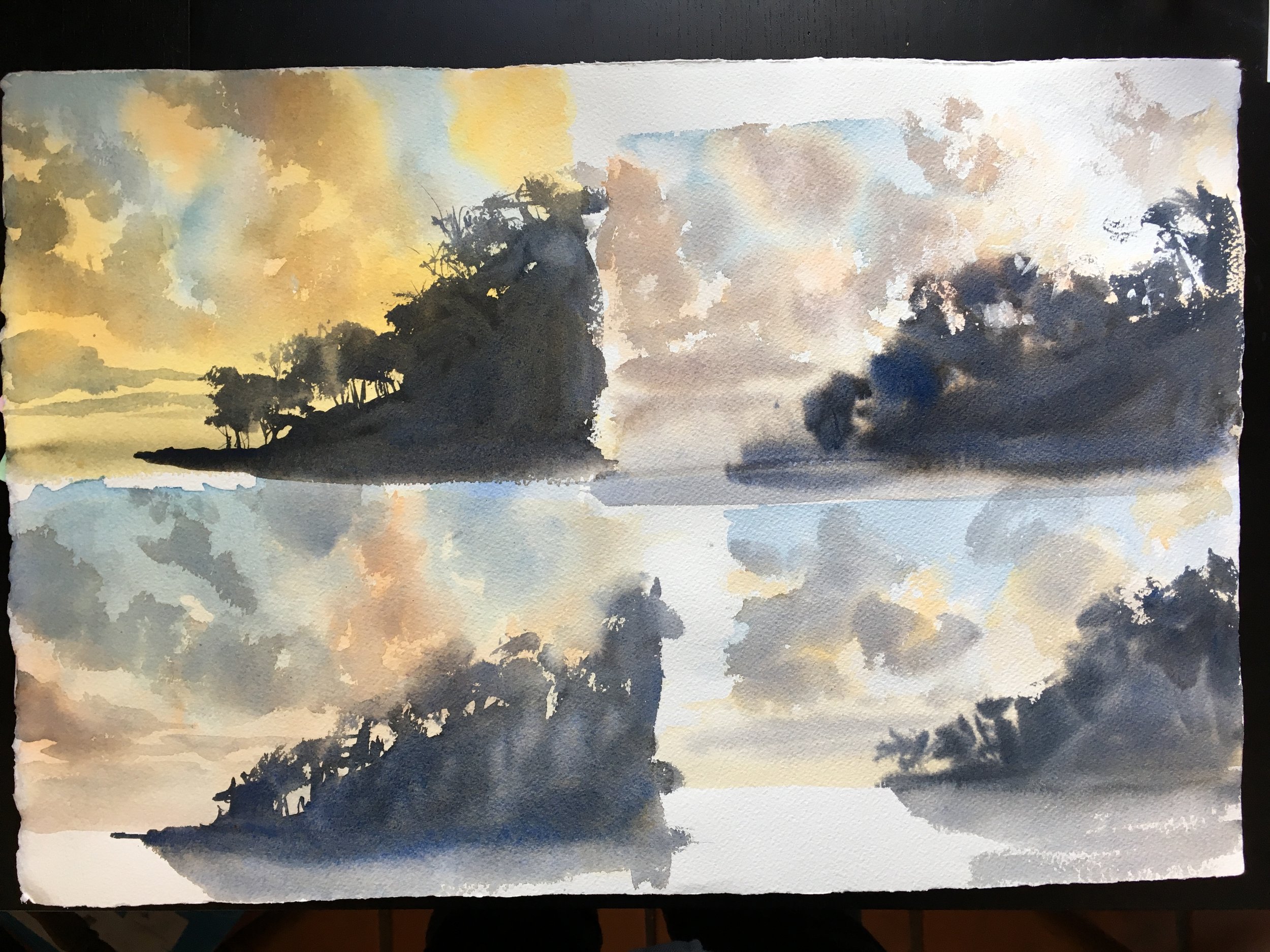
...looking at color schemes and methods of painting the scene. None of these are meant to be finished paintings. Each 1/4 is only about 7" x 5". The goal is just to spend a couple of hours exploring color schemes and to assess the logistics of how I'm going to paint the scene. I tried wet into wet approaches (top right) and more patient layering (both left pieces). Patience has its value! I decided I liked the bottom left one the best. A few weeks later, I took that approach and applied the color scheme and layering methods to the my next painting. I got this-

1/4 sheet

1/2 sheet
These two were done in close proximity time-wise. By now, I knew what I was doing in terms of logistics. The composition is straightforward, so it was really an exploration of color relationships. Note the shift to a richer red-orange for the clouds in the 1/2 sheet, and the introduction of yellow to the trees on the spit of land. By the time I went to do a demo at the Harrington Gallery, I had some sense of what I was doing. Phew! LOL. It's not the greatest piece I've ever done, but considering it was the first demo I'd ever done, I thought I did alright.
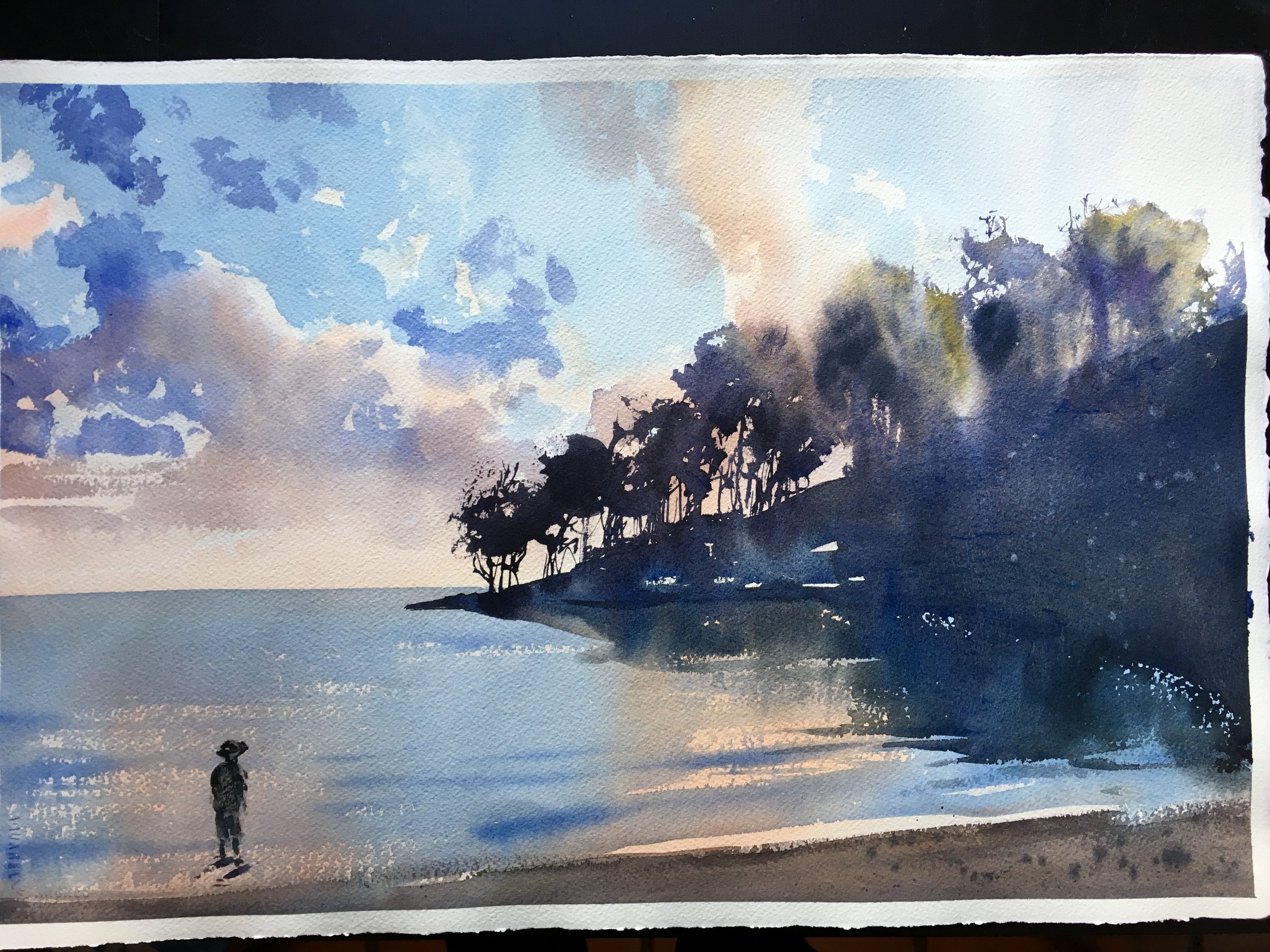
1/2 sheet demo piece
When I came back to the painting on my own, I grew it to a full sheet and warmed up the palette of colors. Much warmer- the oranges veer towards red, and the blues move to an almost-violet on the water. I felt that my demo piece was too cool. I also decided to push the vibrant hues in the trees (something not there at all in the original photos, but I liked the effect and how it expressed the light).
full sheet
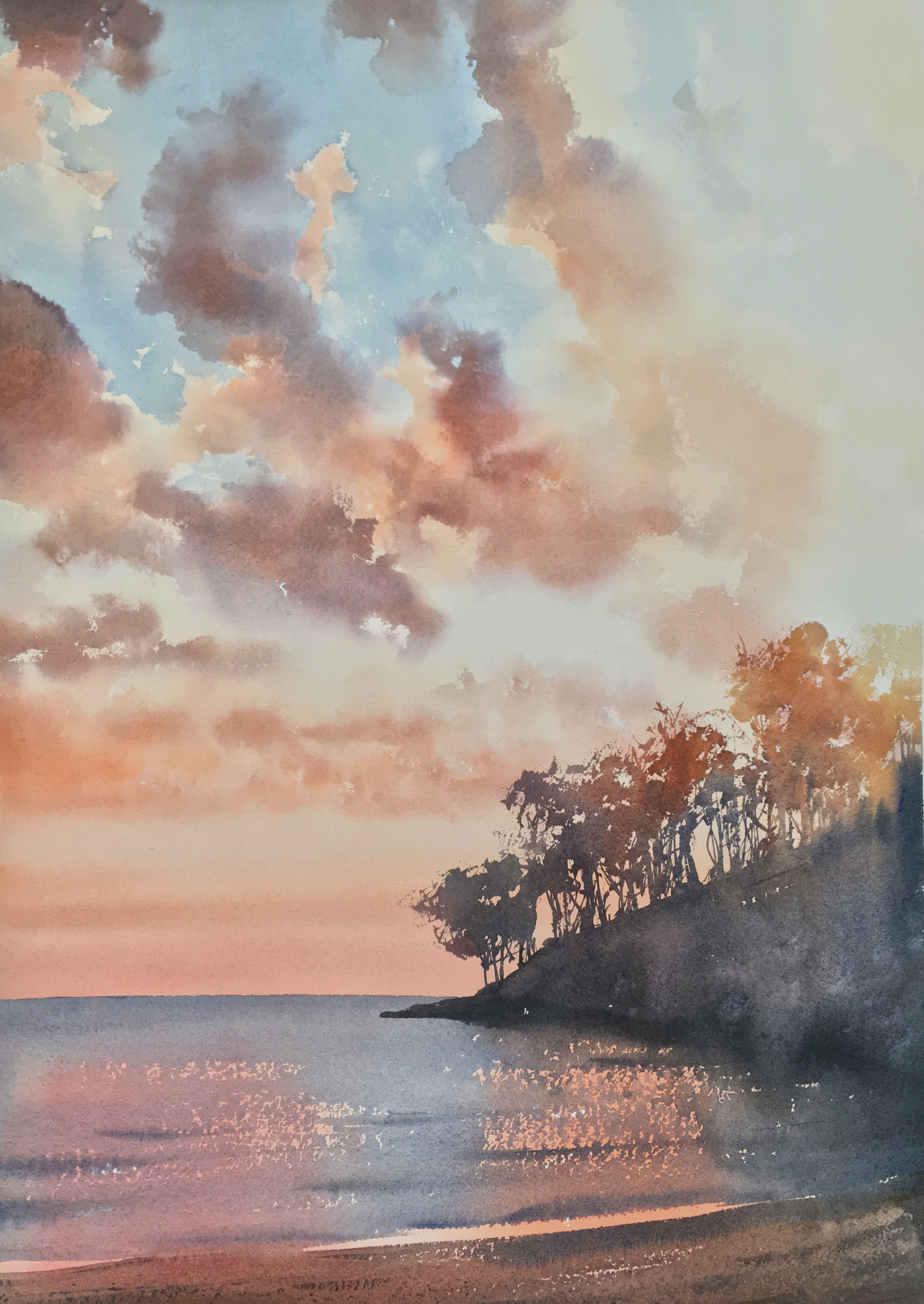
Finally, I come to the fished piece. This is MUCH bigger. It's an Elephant Sheet. 300 lb, 30" x 41". I had to make a special mount to fit this size. Ha! Same width as the Grenada piece I did, but much taller. Once again, I shifted the hues. I wanted to keep the warm clouds, but somehow cool off my blues and have more chromatic darks (instead of having them just be black). Looking back at the photos, I noted how I also liked the sort of steely blue of the water. Once again, I felt it's more muted tones allowed the oranges in the sky to really shine.

Let's assess how I built this piece-
1- Blues for the sky go in first, on dry paper. The board is flat. I have a clean bowl of water and a dirty one. One is used for mixing and one is only used for softening edges. So, I went along painting the sky, soften edges here and there, and keeping others hard, using two different brushes (one is only for water!). I shifted to a Pthalo Blue, instead of Ultramarine Blue for this final piece. You can see how much greener the blues are. I really wanted the orange clouds to pop, and (to me) that meant the sky and water needed to be a stronger contrast (not so red). In earlier versions, the blue was much redder, and I felt that it lessened the contrast the sky could have provided against the clouds. The choice hear did much more of what I was wanting. The blues go from a slightly purple-blue (Pthalo + Dioxazine Purple) in the upper right, to a warmer greyed out blue over the sun on the right (Pthalo + Transparent Red Oxide), getting paler and paler as it moves left to right.
2- After it dries, I go in and paint the orange clouds. With such contrasting colors for the clouds and sky in this painting, I got odd color mixtures if I did them wet into wet. It's MUCH easier to regulate the colors and edges if you paint the blue sky and orange clouds as different shapes, and let them dry in between. As before, I have two bowls and two brushes, and one is kept clean and is just for wetting edges. So, here and there, I want soft edges to the clouds and sometimes I wanted hard edges. Also, just like with the blue sky, the hues shift as I move closer to the sun- darker pink/orange on the left to orange to pale yellow on the right-bottom. Finally, as I approach the horizon, I drop the orange and pinks all the way down to the bottom of the page. These will be my highlights under the darker blues of the water later on.
3- I let the painting dry again. I tape the horizon just below the water line and paint the darker foreground clouds up top . These are much greyer than the set in the previous painting. I felt they were too purple-red, and I wanted them to feel diaphonous and cooler. Once again, I wanted the orange clouds to pop more, so this time I made the foreground clouds more neutral in hue. When these go in, the paper is dry. I drop them in with a hard edge and spray them with my water bottle. The clouds gently move about on their own and soften. In other areas, I do the 2 brush-2 bowl system, softening edges as I go along. Also as before, I move from a darker cooler grey-blue on the left to a purple to (down on the bottom right) a pale yellow-orange for these clouds. Last, the plum clouds along the horizon go in. When its dry I remove my tape.
4- Finally, I begin work on the bottom area. Once again, I tape the long straight horizon (this time above the water line). I dry brush in the water with a big mop, keeping the sparkles. I paint in the beach too. The water dries up, and I drop in the island. This all happens in relatively quick sequence. From there, I build the trees and the dark form of the spit of land. When I drop the yellows and orange into the wet trees, using a Pthalo Blue mixture for the darker shadows really pays off- the warm colors cascade down and give me a lovely shimmer of greens. This was something I felt was missing since my original plein air sketch- there are greens in the leaves in real life, but the photos don't accurately show that. The diluted wash goes down into the waves for the shadows the land mass casts on the water.
5- Fiddly bits. I drop the dry-brush waves in to the water. I do a light wash over the shiny wet part of the beach, moving from a duller red-purple on the left to a paler pink-orange on the right. The goal is to trap that brighter, more chromatic bit that "points" you up towards the silhouetted trees and really make it pop. I darken up the crease where the wave is breaking, and put some splatters on the beach. Then I'm done. Phew!
About 80% of the painting, time-wise, is dedicated to the sky and clouds. The water, beach and island are the "quick and easy" part. Here's the original photos and my finished piece again, for comparison. They're all similar, but in the end, the painting is it's own beast. No being a slave to the photo! :P

