Finishing Touches
At the end of the painting process, after a work is "finished", and I've set it aside and am considering moving on to my next subject, I often come back to it and see it with fresh eyes. This is where a wonderful process of exterior assessment comes into play. Sometimes me and my wife critique it together, and a needed change becomes obvious. Sometimes I compare it to the reference photo and see how it has shifted in an unplanned way- sometimes a key wash was too weak, or a detail was omitted. Other times, once I'm done with the flurry of painting, I can better examine it as a composition of shapes and more clearly track the movement of my eyes.
Whatever the case, this is when I often walk a tightrope between leaving it alone so it can be what it is (rather than what I intended), and recognizing the changes I could make to it, to better serve the image as it is (rather than what I intended). Of course, there's lots to be said for leaving a painting alone and not overworking it. This is a dreaded issues for many novice painters. Many paintings are ruined by trying to fix them. As I like to jokingly say, "There's always lots of time left to ruin a painting!" And yet, "Nothing ventured, nothing gained!" I don't like painting fearfully. If I see a way to improve a painting, and make it "more itself" I often go for it. The worst I can do is ruin it, and at best I often add just that last bit that makes it sing. That's how we learn when to hold back and when to let it rip.
Below are a few examples of photos I took when I thought a painting was done, and what I eventually added to the completed piece.
Waiting-
In this piece, I had completed the painting, but I felt I was lacking my darks. Part of what made the light glow was the value contrast the columns created. I also felt like the dim lights up above were competing too much with the light around the figure. I rewet the back, stuck it back on the board, and using a big mop I went about the process of layering in a warm dark over almost the entire dark shape- the upper area, the columns (where I switched to smaller mop), and the lower area below the figure.
By the end, I was very glad I'd done so. The value contrasts were finally strong enough, without being overpowering, and I felt the "glow" I was looking for. One little detail that seemed important to me though? I made an effort to connect, with some dry brush work, the new wash on the pillars with the horizontal shadows. I liked how the shapes bonded in the first go around, and I didn't want to lose that.
Lady Washington-
I did this plein air, so values are sometimes hard to see in the field, but when I was done and inside, it was clear the sky I'd done was far too pale. The depth of the sky did many things I hadn't recognized. That sense of rich color being reflected down in the water was lost, the rigging and structures on the masts stood out too much, and the white of the sails and the chroma of the flag didn't stand out enough.
Back at home, I went about dropping in a richer valued sky, careful to go briskly and gently over the line work- no muddying things up with overworking! I helped create a bit of depth along the horizon by reducing the value, then I brought the blue back in to tie the sky more to the water. There are little issues with the wash, but in general it's a decision I was happy with.
Afternoon in Barcelona-
After I had finished this painting and put it away, I noticed two things I felt were an issue. First, the footbridge in the foreground was listing to the left, and two, I felt there wasn't enough pop and value contrast down where the focal point was. I wanted something to draw you in. Correcting the bridge wasn't very hard, though it got darker than I would have liked- a casualty of the "fixing bug," and something I would remedy by simply paying more attention to my horizontals right from the start, if I were to paint it again. For the light in the distance, I busted out my Chinese White and carved it out of the shadows with thick goopy paint. You can also see some very delicate highlights I added to the railing, to carry your eye across to it. Note the dollop of white added to the man's left shoulder and head, to express the sun.
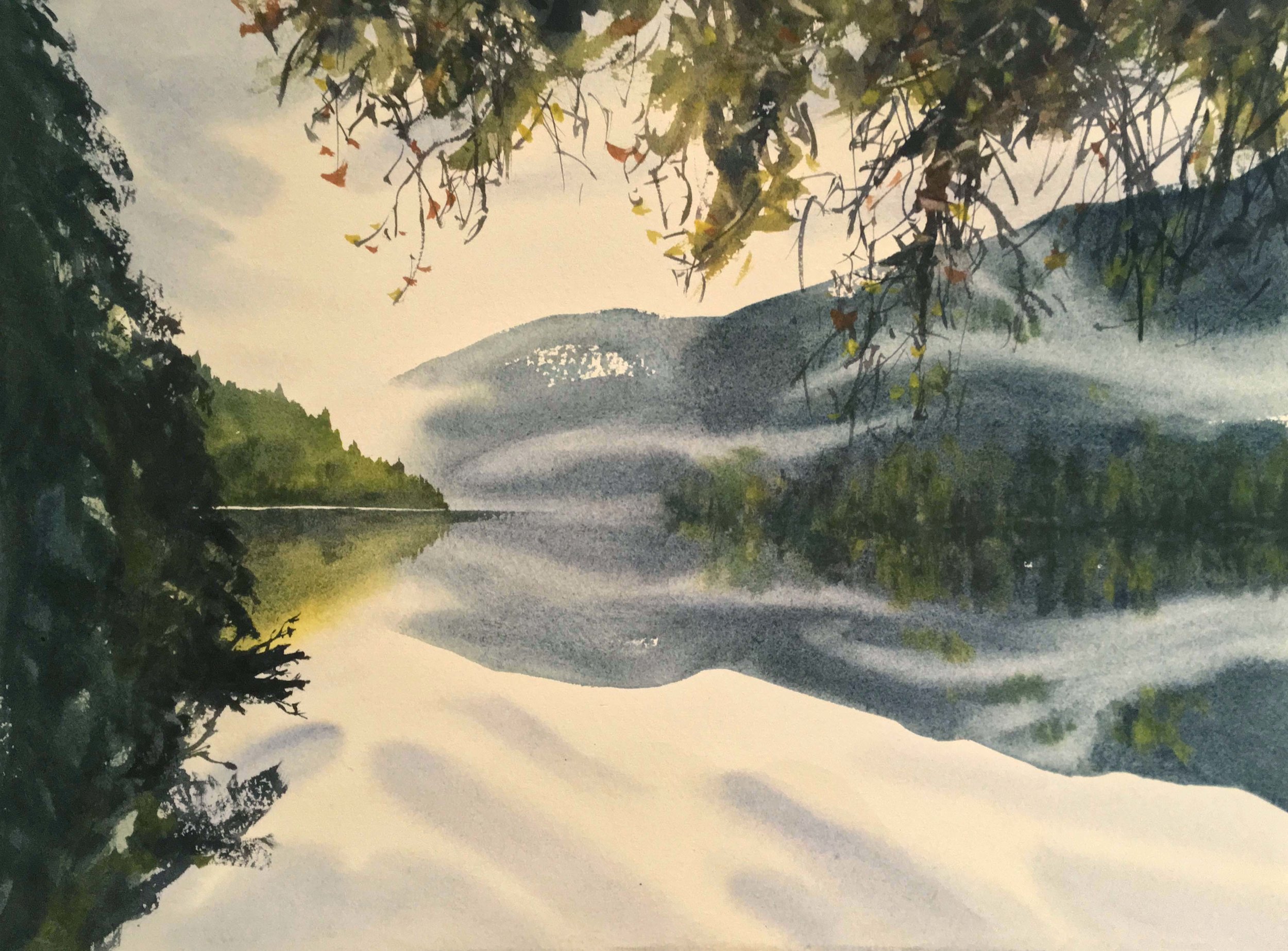
Reflections-
The changes in this one are small, but they made a difference to me. After I was done, some thoughtful looking helped me recognize that the clouds weren't properly duplicated in the sky. Once again, with my trusty mop, I gently rewet the area in the sky, and dropped in a few quick strokes of the grey-blue, to better create the illusion of a reflection. I also gently went through the mountain to the right and scrumbled in some darker green here and there, as I felt the mountain too uniformly blue. For now, the Rorschach effect is better, so I'll call this one done.


