Using Color Space- Different Kinds of Color Contrast
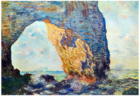
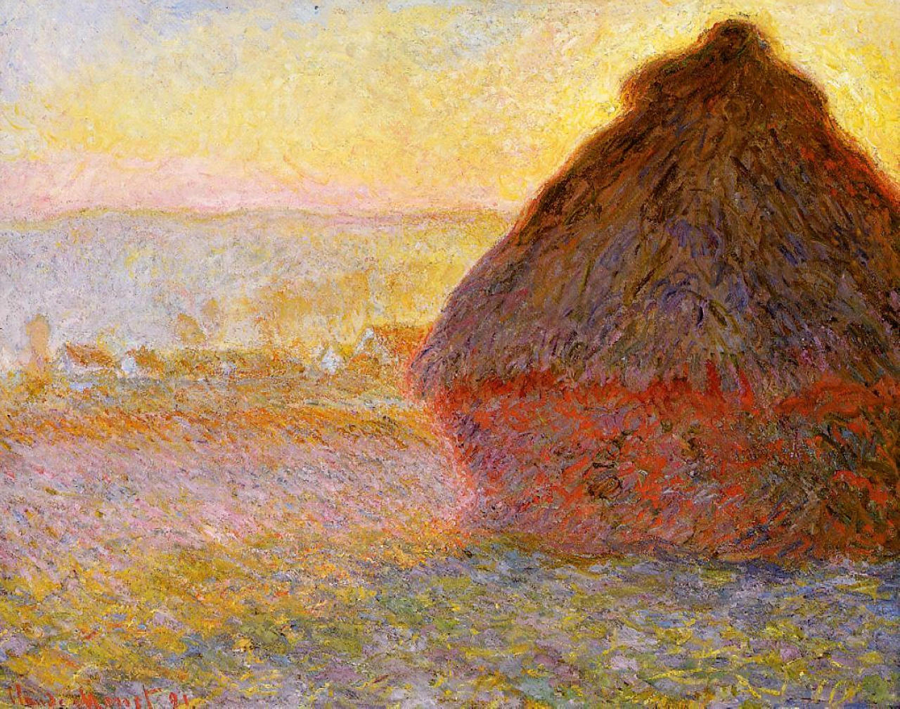
A few weeks ago, I took a 1 day class on using color. After all of these recent paint outs, I've had the opportunity to see my work in the larger context of many oil painters. Experentially, my opinion now is that good oil painters often have a more sophisticated command of color-usage than many watercolorists, who (generally speaking) have a more powerful command of value. Yes, I know, that's a pretty damn broad statement. Anyways, I think a lot of it comes out of how the mediums function. You can gently layer and optically co-mingle colors of equal value when painting with oils- letting one peak through, for example, so that the two colors combine in the mind's eye. We see this in something like Monet's haystack below. Look at those pale yellows and pinks and blues in the sky! The dull browns and vibrant reds in the shadows that are almost the same value! Sigh....
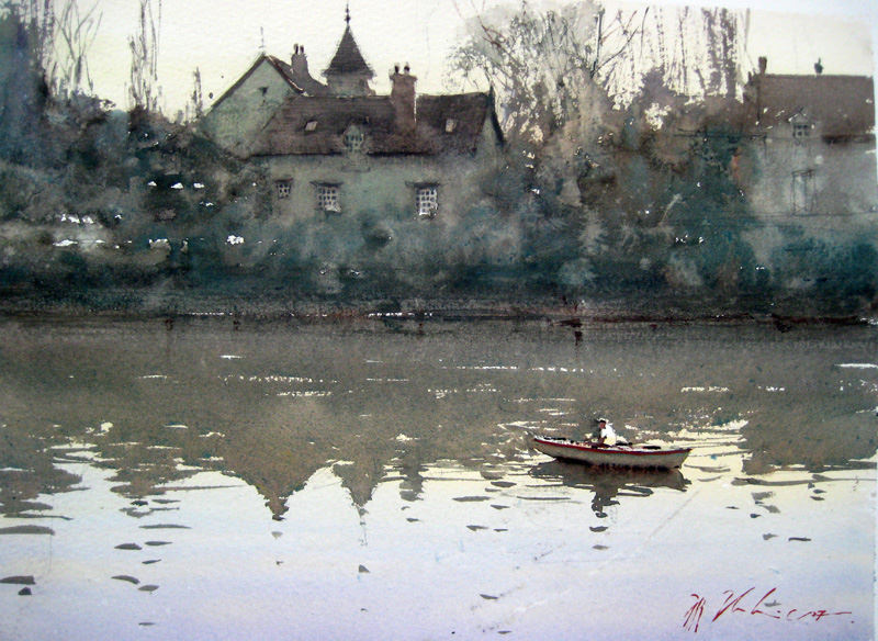
This is much harder to do with watercolors if you're painting transparently, because the hues darken as you layer them. But I could find this color experience again and again in Sorolla or Sargent if I wanted. It's part of the DNA of oils, as I see it. Comparatively, watercolorists generally build through the layering of value, and thus, you frequently find a more powerful command of it in the medium... in my opinion. ;) Here's a JZ for fun....
Yeah, JZ just got the privilege of getting compared to Monet. LOL! When you're amongst the best, you get compared to the best. ;) Well, all of this is the long way of saying that I want to bring that oil painter's color mentality into my watercolors and bond it with my approach to value. I want to mix...
JZ and Monet,
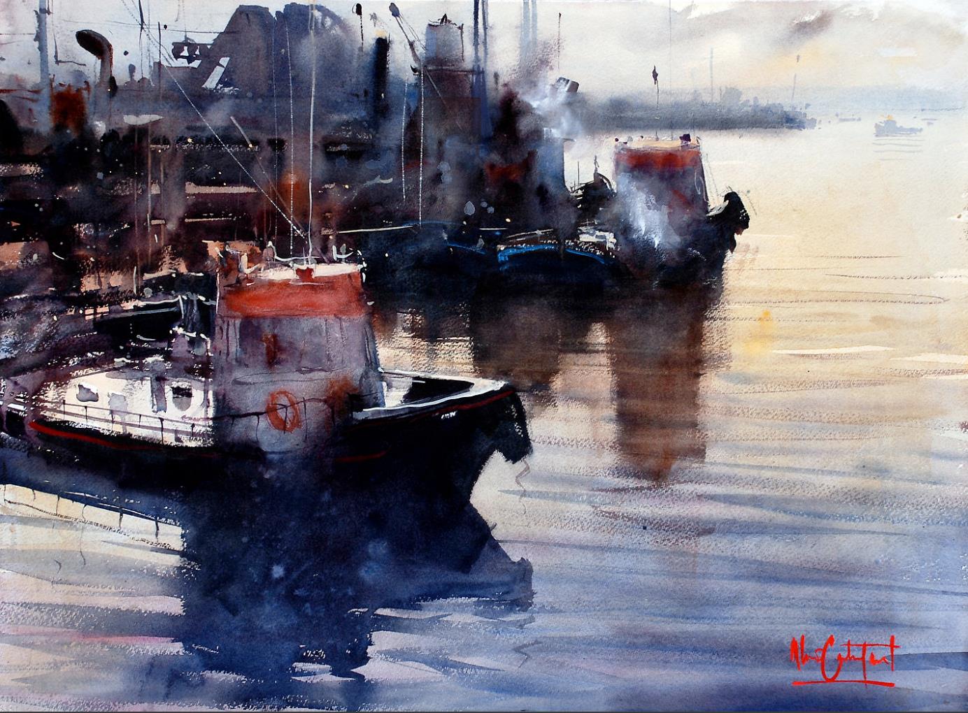
Castagnet and Sorolla-
Wyeth and Sargent-
Yeah, that Wyeth isn't even a watercolor.... but it could be! :PAnd thus... the class I took. It's a beginning.
The class was with a local oil painter based out of Sausalito- Louise Victor. She was good! Louise based a lot of her content on Johannes Itten's book- The Elements of Color, which focuses on his "7 contrasts of color". I've not read it yet, but will probably be buying a used copy of the book. The goal is to think about how colors relate to each other, so that we can get past just figuring out how to mix our colors, and get to the good stuff- namely, how to really USE color to best affect.
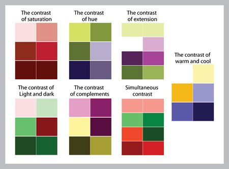
The photo below shares the 7 types of contrast. I don't pretend to understand it all, but what I do I'll share here. So, the 7 types of contrast-
1) Hue
2) Values- This is an interesting point to consider because it almost seems too simple, but, of course, colors have values. It's an inherent part of color. I'll come back to this later.
3) Temperature- Warm versus cold colors, much as discussed in the videos in the previous post. How many times did JZ talk about this?
4) Complementary- Opposites on the Color Wheel
5) Saturation- Muted (greyed out) hues versus high chroma hues. This is very much in the vein of Jean Dobie's "Making Color Sing", where she talks about the value of "mouse colors"- muted complementary hues that really make a more chromatic color sing, not just scream. It's also very compelling when you use a single hue at a variety of saturation points.
6) Simultaneous- Always nebulous to me, but explained as the experience of colors affecting how we view other greys around them. Basically, understanding it helps you understand more about how our own brains can change the experience of viewing and labeling color. Color is a nexus- the colors we place next to each affect how we view and compute them individually.
7) Extension- The power of spatial relationships between complimentary hues. How a green dot in a see of red becomes far more important visually than the red.
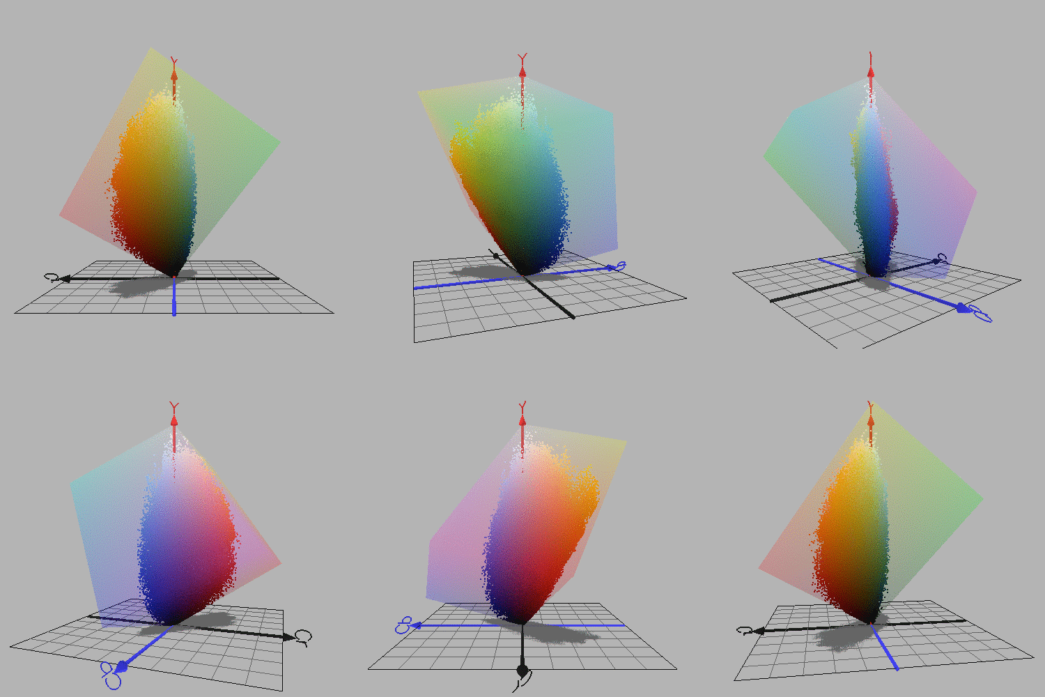
I wanted to end with this gif. This rotating shape is color space, as shared by David Briggs at The Dimensions of Color. If you really want to get lost in reading about color and color theory and how it works and how we perceive color... this is the place to go. I read a lot from there a few years ago, before I eventually set it aside. There's lots to learn!
Why is the gif so interesting to me? If we go back to #2- Value, what we begin to see here is that colors have value. Yellow is inherently brighter/ lighter in value than orange, orange moves to red, and red to purple. A "pure" yellow is very bright, and can often act as an expression of light in a painting, much like white does, not just as a hue. Similarly, if the local color of something is yellow, you can actually have shadows that are orange or red- they are darker in value. Similarly, a pure blue is naturally darker a clean green. It's all also expressed in this image from last week-
...but actually seeing it rotate in space was much more striking for me.
Why does this matter? Because when we begin to see pure colors as values and not just as hues, we can begin to use them in interesting ways when we mix them with muted hues of similar value, like Monet-
More on that next week...


