Step by Step- Kauai Beach

I've had some inquiries about the clouds and beaches I painted while in Hawaii, and so I wanted to follow up with another step by step. Let's take a look at my process here, the paints I used, and how my journey went with this one.
My Paints-
My pigments here consisted of entirely of paints I normally keep on my palette. Nothing particular. Dioxazine Purple, Cad Yellow, Pyrrol Orange for the sky. I muted my purple, but I don't remember just what I used. The truth is, to me, it doesn't really matter, as long as you get there, right? I often use a bit of mixed up green, sometimes I use existing mud, sometimes I grey it out with a bit of chalky yellow like Jaune Brilliant No. 2. The beach is primarily a muted Burnt Sienna- mixed with Ultramarine Blue. The darkest darks are mud. Blues often provide the base for these mixes because it's darker in value naturally (versus warmer colors), and I generally mute them with something like Burnt Sienna or Vandyke Brown. From there, I push the hues around the wheel, adding this or that, depending on where I want the shade to go. But a painting like this should be doable with, 5 or 6 colors max- Dioxazine Purple, Cad Yellow, Cad Orange, Ultramarine Blue, Burnt Sienna, VanDyke Brown. Perhaps I could throw in Jaune Brilliant No. 2 for the various opaque highlights I mixed up at the end.
Step by Step-
Step 1-
Here in the first pic, you can see the graduated wash I did. A muted purple into orange into yellow, then back up to the top with a bit more purple, to give it a more punch. I taped the horizon line to allow myself more freedom on the top half- no having to worry about the bottom. I don't normally do this regular subjects, but eventually, for sea scenes I found it useful, where the horizon is very powerful compositionally and perfectly straight.
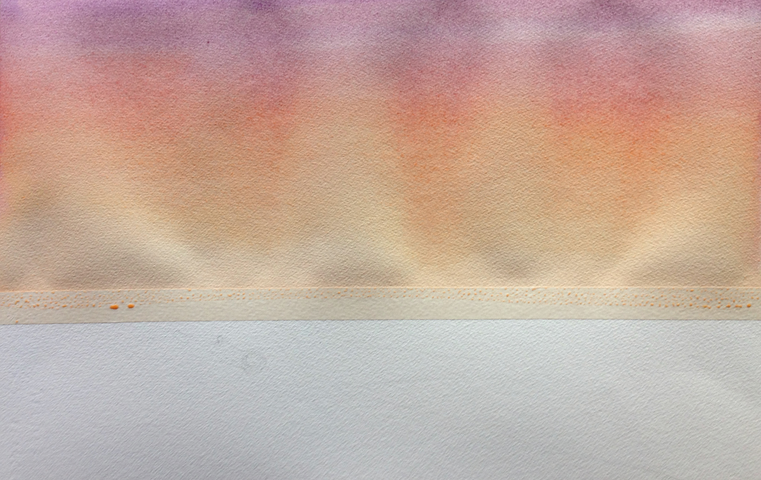
Step 2-
While the first wash is still wet (but not sopping wet!!), I mix up my grey-purple mix. All those little clouds go in with just a quick swipe or two. No messing around and smashing it into the existing wash- a quick, confident stroke will allow you to get those soft edges you're after, without the pigments mixing too much. Even so, you can see how the purple clouds down in the yellow area have actually "pushed" the yellow pigment when I introduced the purple. This is why some of the clouds have a bit of a darker orange "rim" around them, where the yellow has built up. Down at the very bottom, I brushed in a richer, darker, more purple band along the horizon. This will help later, when I separate the sea and sky. Also worth noting is how I still got a few dry brushstrokes on the left, despite this being wet into wet- things were drying up, and once I got them, I just left it all alone. Also, I knew I was going to have the dark bank of trees there later, so they'd cover things up.
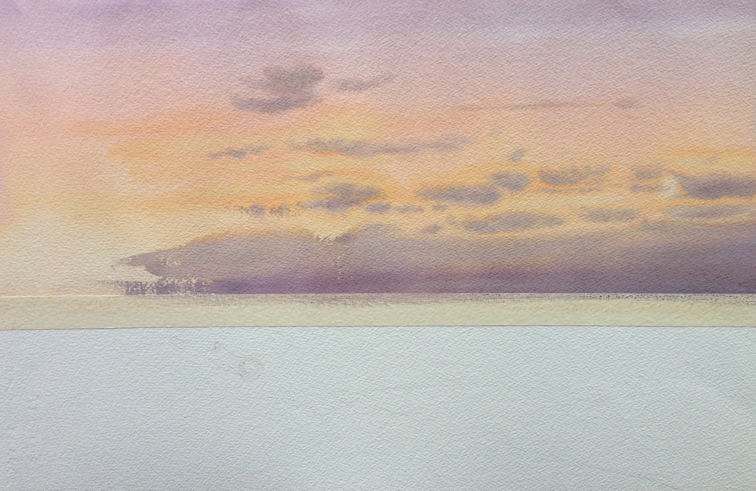
Step 3-
I removed the tape and put in the pale values for the beach and the water. Retrospectively, I can see how I might have done a complete wash from the sky down through the water all as one step, taping off the water horizon line after it had all dried in order to make the clouds as a separate step, but that would have been slower. This way, I did the tape first, and removed it relatively promptly once I was done with the clouds and they weren't going to drip. If I had done it the other way, I would have had to wait for the paper to be truly bone dry before I could have put the tape down. Otherwise, it would most likely tear or lift some of the paper when I removed it, or it wouldn't have made a good seal and the purple clouds wouldn't have had a clean seam on the horizon. Either way, my point is that there's a lot of ways to get to the finish line. The method I'm sharing today is just what I did that day. I like to experiment and see what I get sometimes.

Step 4-
I laid in my darkest darks next. This is a big step and an important one compositionally- we're creating heavy contrast.
This stage was difficult mostly because the area on the left can easily become a boring flat blob without any subtlety. As it was drying, I actually went back in and started to dribble some water in it, just to get some value shifts and interest. I also had to really work at keeping those ever so important pockets of light that shine through the tree. These are so important! Otherwise the trees become very flat and they lose a sense of "place"- they would no longer feel bonded to the sky and background. In fact, they were so important I actually mixed up some opaque colors and pushed a few holes back in. You'll really notice the difference in the next step if you pay attention.
Once I had done the big block, and it was drying, I dropped in the little spit of land that sticks out to the right. If I had done them at the same time, there would be very little differentiation between them spatially. However, with a bit of careful timing, I can drop the pale shape in on its own and we get a semi-hard edge that lets us have a fore and background. Comparatively, you can see how I pulled bottom of the larger block of foreground trees into the beach by softening it's edge with water. If I had left this edge hard, the two shapes (beach and trees), which are both in the foreground, would have been too separate for me. Softening the edge helps make them a bit more like one shape, despite the value contrasts. Finally, I did a darker wash on the water with some drybrush work near the edges, to help that earlier orange wash pop as little sparkles. Contrast!

For me, if you're looking to play with a composition like this, and you don't have much experience, step 4 is a good goal. The rest afterwards is just the details. But if you can get to this stage successfully, then you've got the basic logistics under control. You've got to do wet into wet work for the sky and drybrush work on the trees and sea sparkle. You've got to make a sky and the sea and the beach, and keep them all separate. And you've got to layer in your darkest darks while letting those new shapes integrate with the background.
A lot of this is sequencing and knowing when to let it dry and when to go in wet into wet. Where you want your soft edges and where you want your hard edges. Where you want to preserve your lights, and where you want your darks. Understanding the logistics of a painting won't really help you make a great painting, you need so much more than that, but if you don't understand the logistics, the sequencing, it's really hard to make a successful painting. It's one of those things that isn't very sexy, but you need it under control to move to the next step.
Step 5-
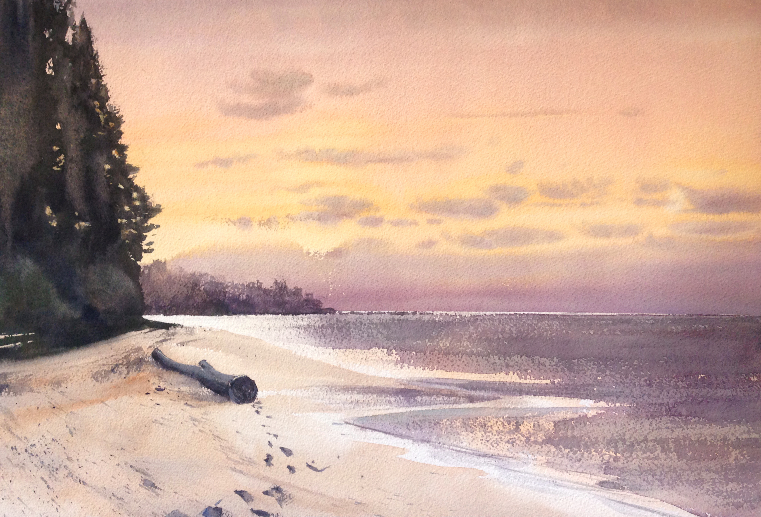
This is when the log goes in and all the other details on the beach are added. For those little streaks of stuff on the beach, where the waves were pulling stuff out, I spattered some paint down and then (while it was still wet) I took a tissue and swiped them in one direction. You can also see how I began to assess and change the background, bringing the spit of land out farther to sort of "hug" the midground log and frame it more. There's a little bit of drybrush work along the horizon where the spit of land extends, to help bond the old wash and the new extension together. At this point, at first, I thought I was done. I set it aside for a few hours, still taped to the board, but no.....

Step 6-
Painting is a process. When I'm new to a subject, I'm exploring what I want it to do. I often need to paint it to assess how the values are going to interrelate, or how the eye should arrive at the focal point. Then, if I do the painting again, I know where I'm headed and can drive to that point more directly the second time through. Here though, we see the exploration. So...
I decided to change a few things. The trees were too dominant, and it didn't look enough like those shadow minutes just before daybreak- the value of the water was too light. Some drybrush work on it helped balance the image. I also poked some more holes in the canopy of the trees on the left, as I tried to bond them more to the background. I made a concerted effort to work from a yellow to an orange to a muted purple for my light opaques, the farther up the tree I went. For these, I used the Jaune Brilliant No. 2 plus the appropriate shade from the sky. The mix is thick and goopy. Very little water. This lets me push the lights on top of the very dark form of the trees.
I set it aside and thought I was done. It was even hanging on the wall with the finished paintings. But a day later, nope. I took it down, taped it up and set to work one more time...
Step 7-
I still felt like the beach was still too pale, too sunny. The contrast of the footprints leading to the log was too strong. I also wanted to create a deeper experience of contrast where the water was washing up on the beach. So, in I went one more time, darkening the beach and letting that important little seam of water really shine and lead your eye to the log. And with this, I decided I was done.
The real goal, if I were to do it again, would be to have the right values from the get go. But sometimes the drying shift is strong enough that you misread things. Then, we come to glazes. But there's a kind of soft, wet into wet vibe about the earlier stages that I liked. If I had got the values right at that time, I could have had the best of both worlds. Always something to improve upon!
