Gathering and Preparing Helpful On-Site Info
I don't always have time to make a painting when I discover a scene I'm excited about. Life goes on! But I've hammered out a few good ways to gather all the helpful info that I can, in as short a time as possible. The secret? Sketching, if I can, with helpful photo-taking a close second (which doesn't always mean the best photo!), written notes, and some snappy Photoshop post processing. I'll be covering all four in this post.
So, first things first. Taking photos. When the subject is well lit, a reference photo is simple- it's a good starting point, provides color information, and helps you remember shapes that you'll later simplify. I still don't think they're as useful as a sketch- primarily because sketches engage with you with the subject, and require decision making. Photos have the allure of being "realistic", but actually a lot of change can occur when a photo captures an image, so its important to recognize that. Values can get compressed, the darks can get darker, the whites can pop more than your eyes say they do. Camera phones also tend to push the background farther back, and share a much larger foreground than people would include in a sketch. This is where a sketch has a lot of importance, because you're doing more than recording whenyou sketch- you're composing!
Compare this on site sketch with the photo I took of the same street-
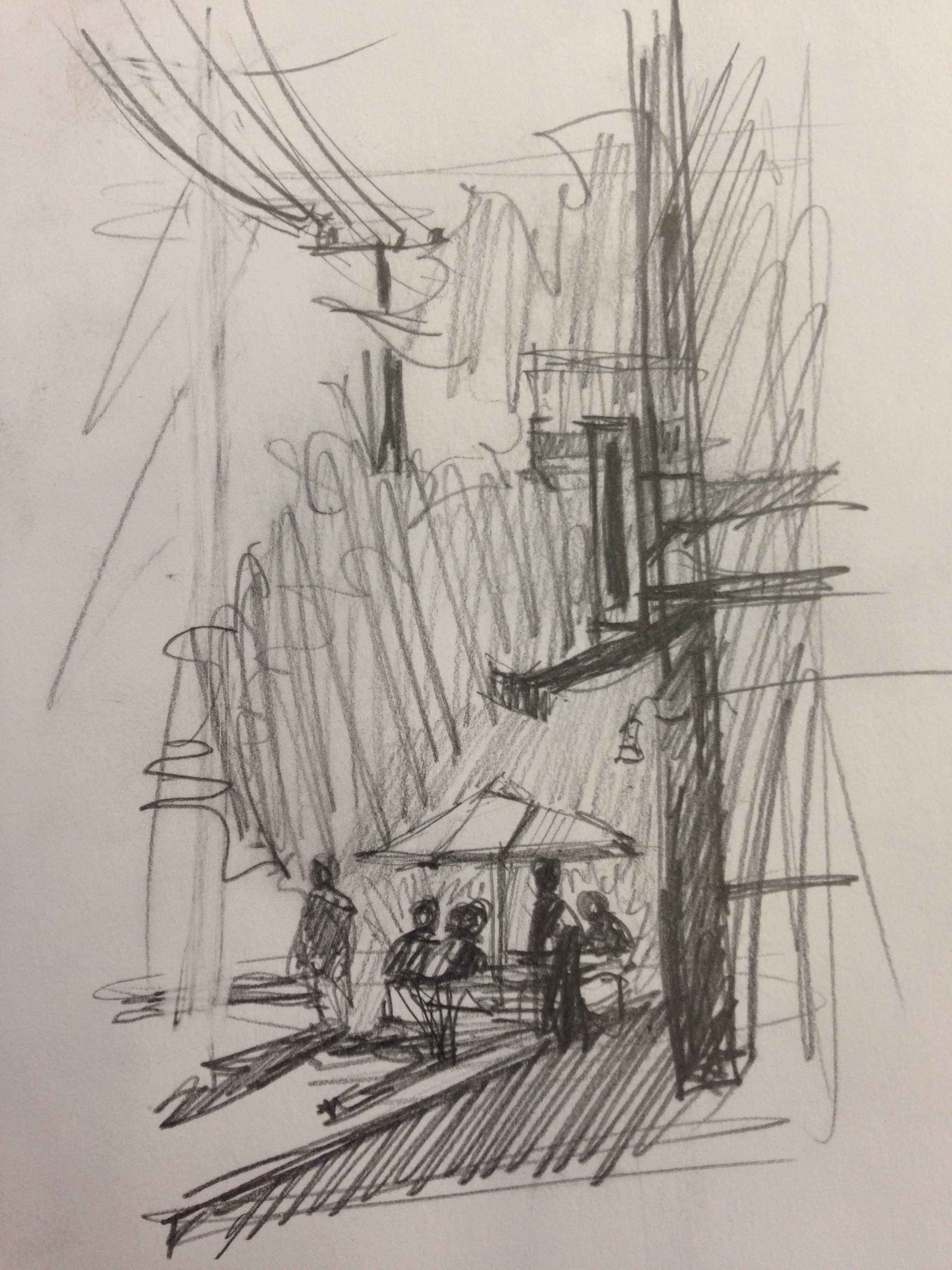

The composition isn't exactly the same, but what stands out is how far away the people and umbrella are in the photo. The foreground is far bigger than I would ever sketch it. The camera "sees" differently than my eyes do. The sketch better represents what I actually saw and focused on.
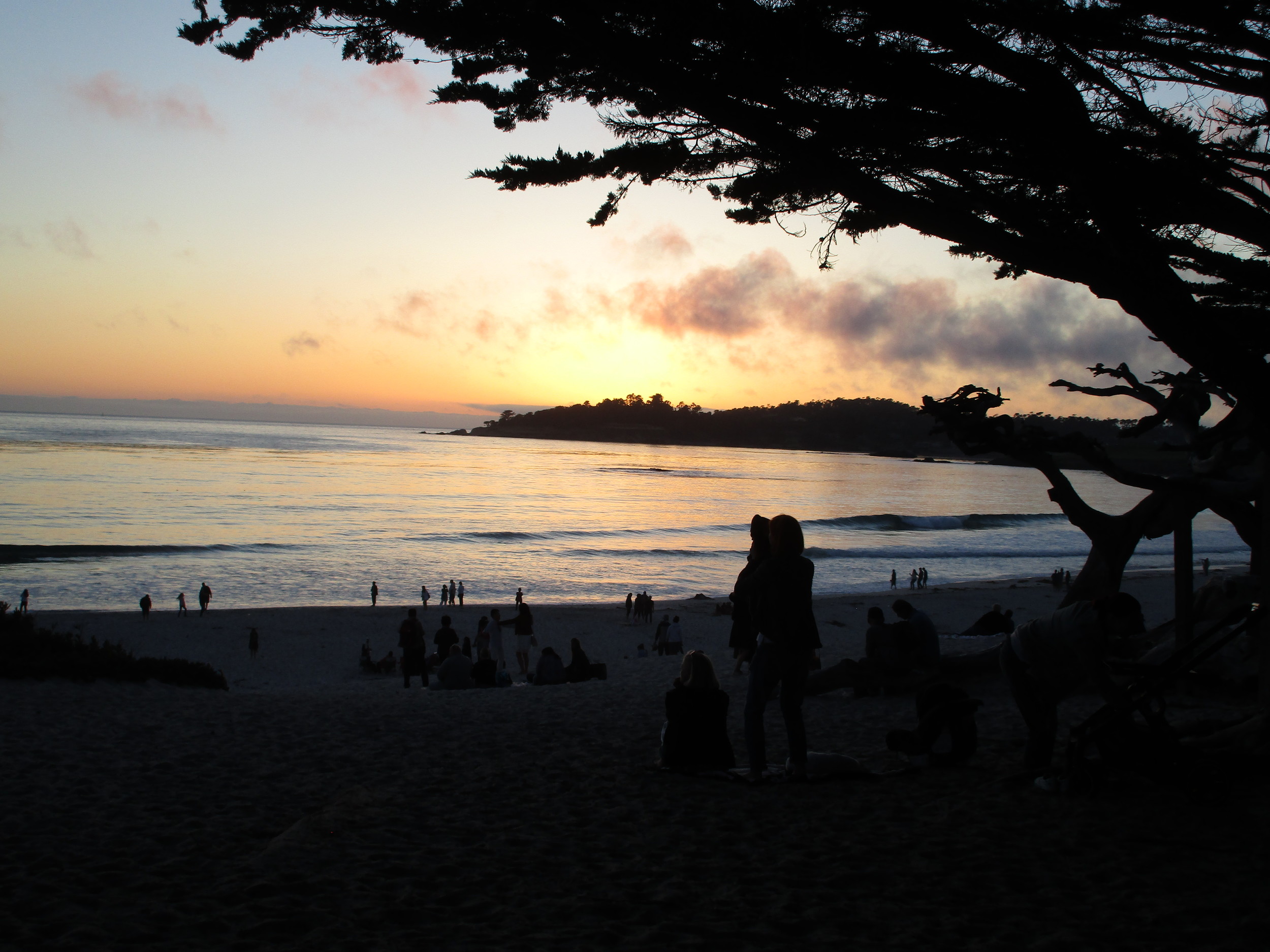
Sometimes, though, you don't even have time for a sketch. In that case, it's photos and notes for me. The major issue is when the light is very strong, and the photo pushes all the values out of control. For these kinds of situations, it can be very helpful to take two photos- one at each end of the exposure spectrum. With cellphones, you can generally do this by focusing on something that is brighter (in the sun) or darker (in shade). Here's a photo I took of a sunset in Carmel-

Hmmm, didn't quite do it. So I took this second one, focusing on the water. I knew it would be terrible as a photo right from the get go, but it gave me the complimentary value and color information I needed.
I also took color notes. Why? Because even this second photo is all distorted. The actual hues were more of a yellow. In truth, this is why we paint plein air- to capture what our eyes see and our hearts feel. Anyways, for this sort of limitation, I also sometimes dictate to my phone. It's full of grammatical errors, but it helps me remember color info and comparative values later on--
The water is actually yellow and there are little slits of blue shadows here and there. Far away in the distance the water is blue gray as it approaches the horizon. The hills in the distance are basically a dark silhouette. The clouds up above are bruised plum purple, and far away I'm on the horizon it's a dole orange rising up to the yellow ocher behind the purple clouds rising up to fail dusty blue up about. People down by the water almost silhouettes with the dogs. The dole clouds cast trails of darker shadows along the water to clear on the right-hand side. Far over to the right just past the silhouette of the tree the yellow disappears and the gray of the shadows becomes the primary color with sparkles of a spill steely blue for the highlights instead. The sand is a warm dog great. There isn't much green anywhere in the color scheme. Note how the sky is more of a yellow ocher running into orange along the horizon, but in the water it's a clean bright yellow everywhere. No orange at all in the water.
Sometimes, this is enough. I go home, print both versions of the photo, make a sketch, read over my notes and give it a go. After all, the point isn't to make stupendous photos, but to paint watercolors! These photos are really just references, after all. :)
Occasionally, however, I get ambitious and bust out Photoshop to help me visual things better. That's what I'm going to over over below. For this one, when I got home and had free time a week or two later, I sat down at my computer and whipped up some magic. Photoshop can be a pain to learn, but it can also be worth it. I altered the color scheme of my sea and sky photo, to better represent my color notes-

the original photo
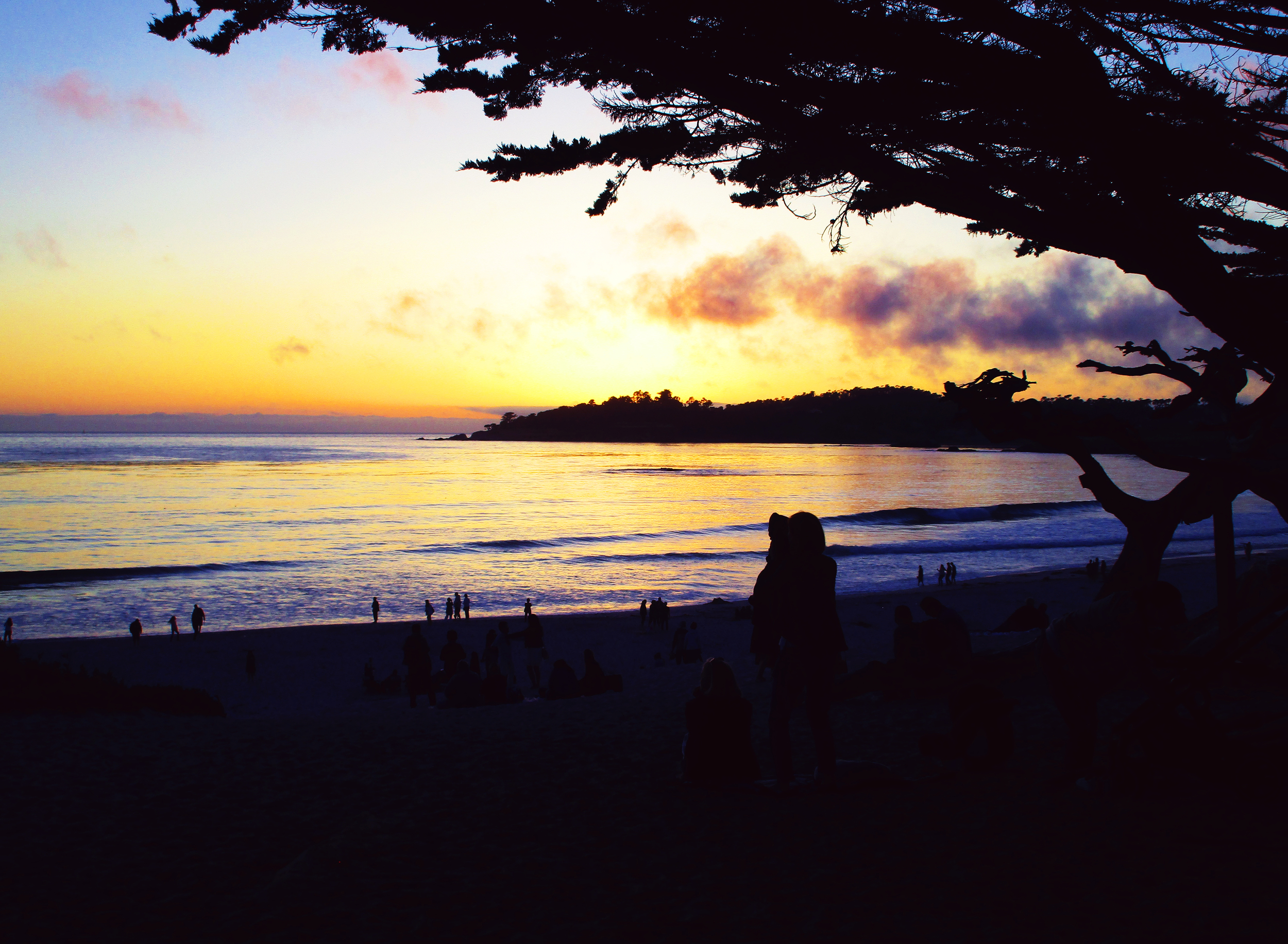
the altered one, that better represents my color notes and memory!
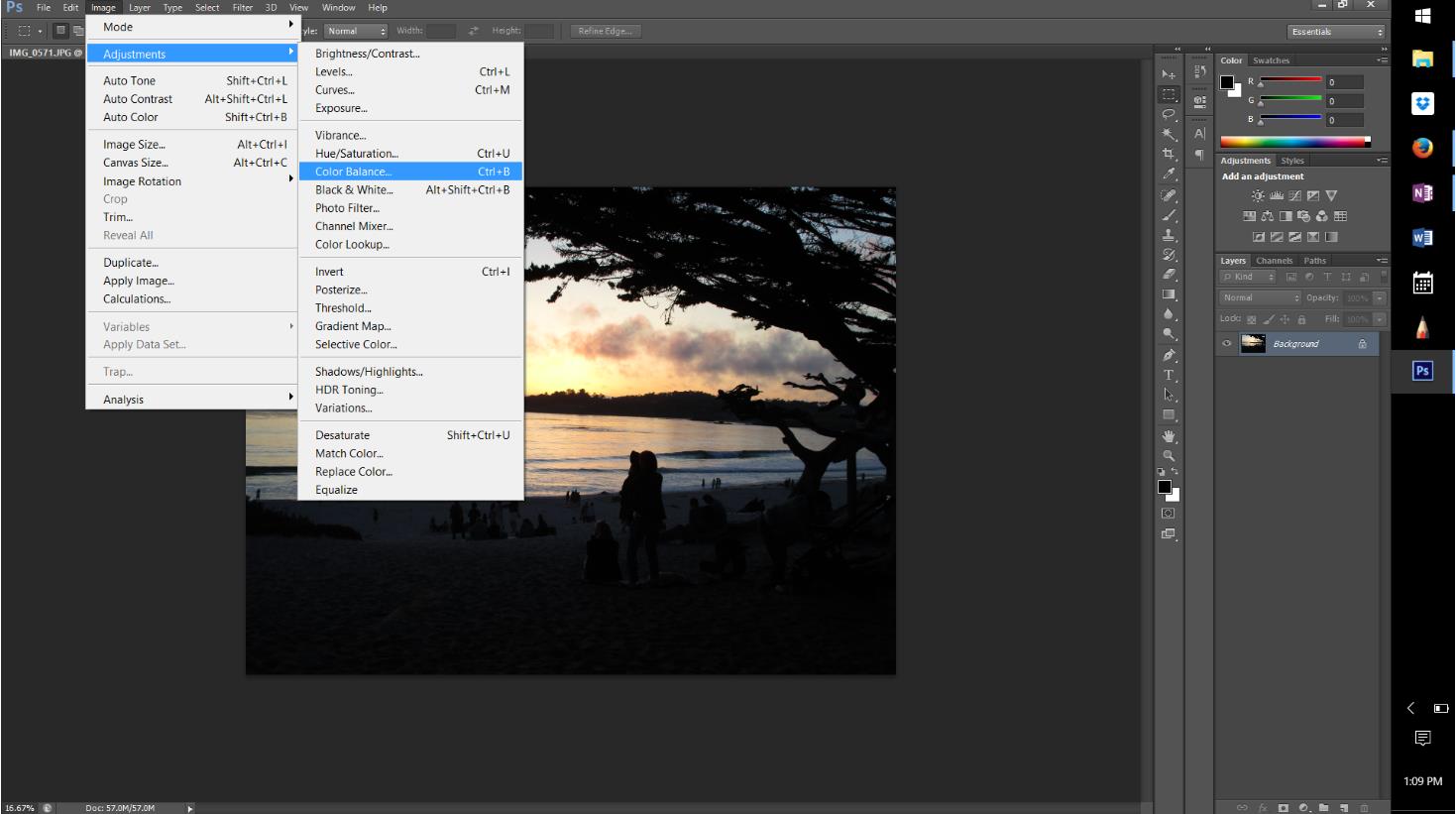
How? In Photoshop, there are a variety of Adjustments you can do to an image. Stuff I often explore is Color Balance, Hue/Saturation, and Brightness/Contrast. It's best to just explore them and see what they do. Did I take some class or get a degree? Nope. I watched Youtube videos and tried stuff until I figured out what worked. Below is the sequence of much of what I did. They're all under Image>Adjustments. Also, please always save your work with an alternate name right at the beginning- then you have a duplicate and a safe original!
The first setting is Color Balance. Color Balance allows us to alter the ratios of Yellows, Blues, Reds, Greens, etc. and Photoshop lets us separate it out, so that it affects the Highlights, Midtones, and Shadows individually. Very useful!
One option to check out is whether you want it to "Preserve Luminosity" or not. I made my highlights much more Yellow.


Midtones were made more blue.

... as were the shadows, per my notes.
It's also worth checking out Hue and Saturation.

It lets us do things like shift the hue of the whole photo, globally, which I did by moving it over. It became more yellow and less orange. I also increased Saturation and Lightness. As things become lighter, the Reds also become more Yellow, which worked well.

Finally, I tried Brightness and Contrast. Again, my goal is to push the yellows by making things brighter. I don't care if the foreground becomes black, because I have the other photo for other details.

It's also worth noting that you can put the photo back through a process you've already put it through before, and the affects are cumulative. When you increase contrast it makes harder edges to things. This can prove useful when playing with Color Balance later on, particularly since I'm not really interested in the photo as a photo, but more as a reference. So, I put this back through the Image>Color Balance, and made my Midtones much more purple (more Red and more Blue). It pushed things in the right direction.
For those who feel very fancy, you can also combine 2 photos. This is something I'd never done before. I found this video and followed it's instructions.
Here's the final result from my Photoshop work-


It's not perfect, but when you compare it to the two original photos its much more helpful to me. Are there some funny issues that come with combining two photos? Yes, like the man with his head cut off on the right hand side, or duplicates of people down by the water. But when I compare the final photo to my color notes and memory, it's closer to correct. Things like "the water is actually yellow and there are little slits of blue shadows here and there" or "The hills in the distance are basically a dark silhouette" or "Note how the sky is more of a yellow ocher running into orange along the horizon, but in the water it's a clean bright yellow everywhere. No orange at all in the water" are now in there! From here, I can paint, and use this as a color reference, as well as a value reference.
Or, you can just use the two photos! ;) But sometimes I just like playing with Photoshop too! :D