Yosemite's Winter River

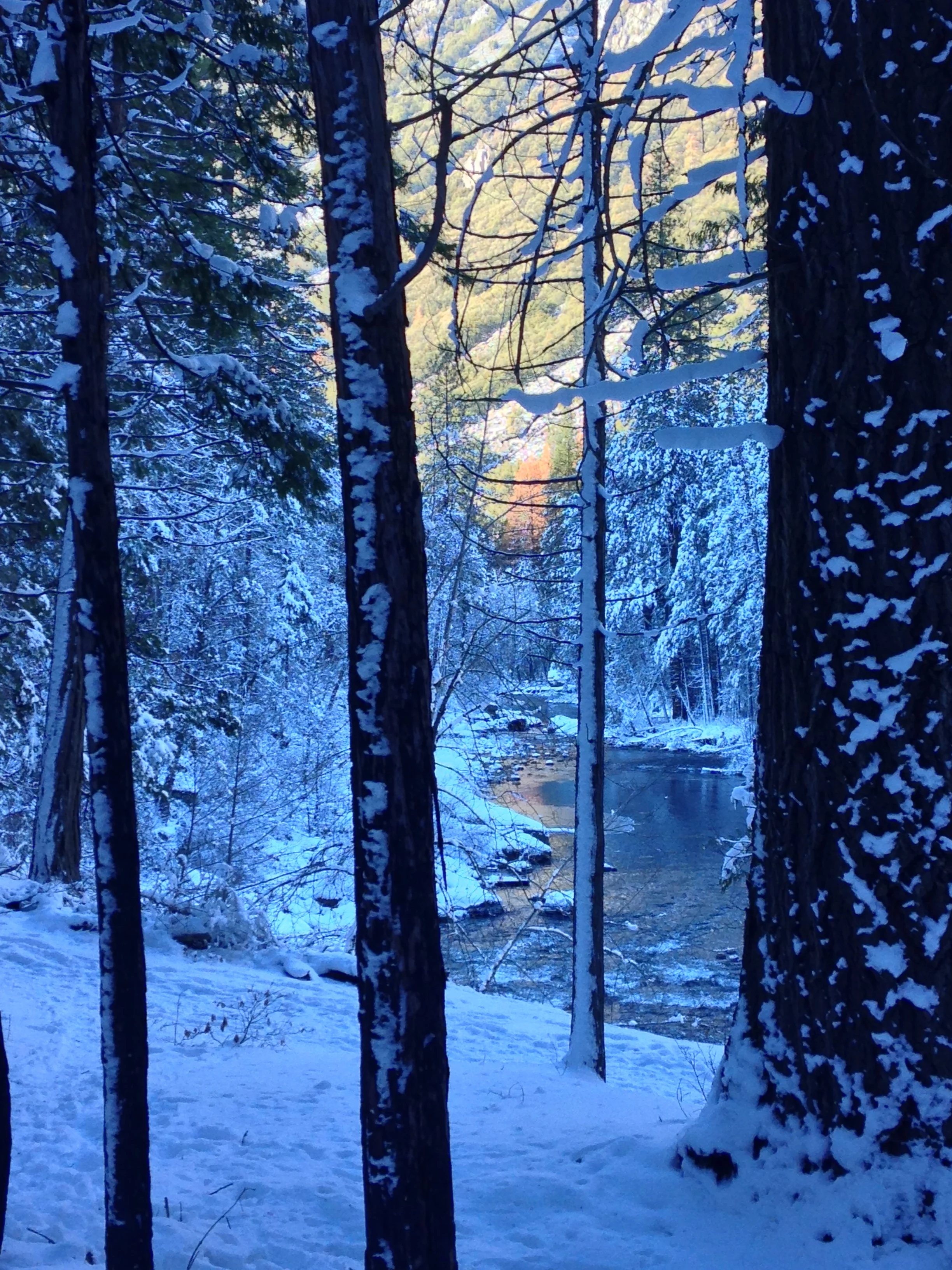
This December, right around New Year, we went to Yosemite for a family trip. From that, I got pictures for a few paintings. Yosemite in winter is lovely and quiet. Cold, serene, and stoically beautiful. If you can handle the cold, it's one of my favorite times to go.
For this first one, I used a new technique, where I wet both sides of the paper, lay it against a sheet of plexiglass, and let the water tension hold it in place. No tape at all. I'd read about this before, but hadn't gone through the process of purchasing the piece of plexiglass. Turns out a piece big enough to paint a 15 x 22 sheet on was only 10$ at Home Depot! It's also very lightweight. If you're interested in wet-on-wet, this helps things greatly, as the paper stays wet much longer, extending each stage of wetness like a stretched rubberband. I'm exploring ways to do this en plein air, but so far haven't come up with anything. If you've worked this way plein air, please educate us in the comments! :)
Here's my first go at it-
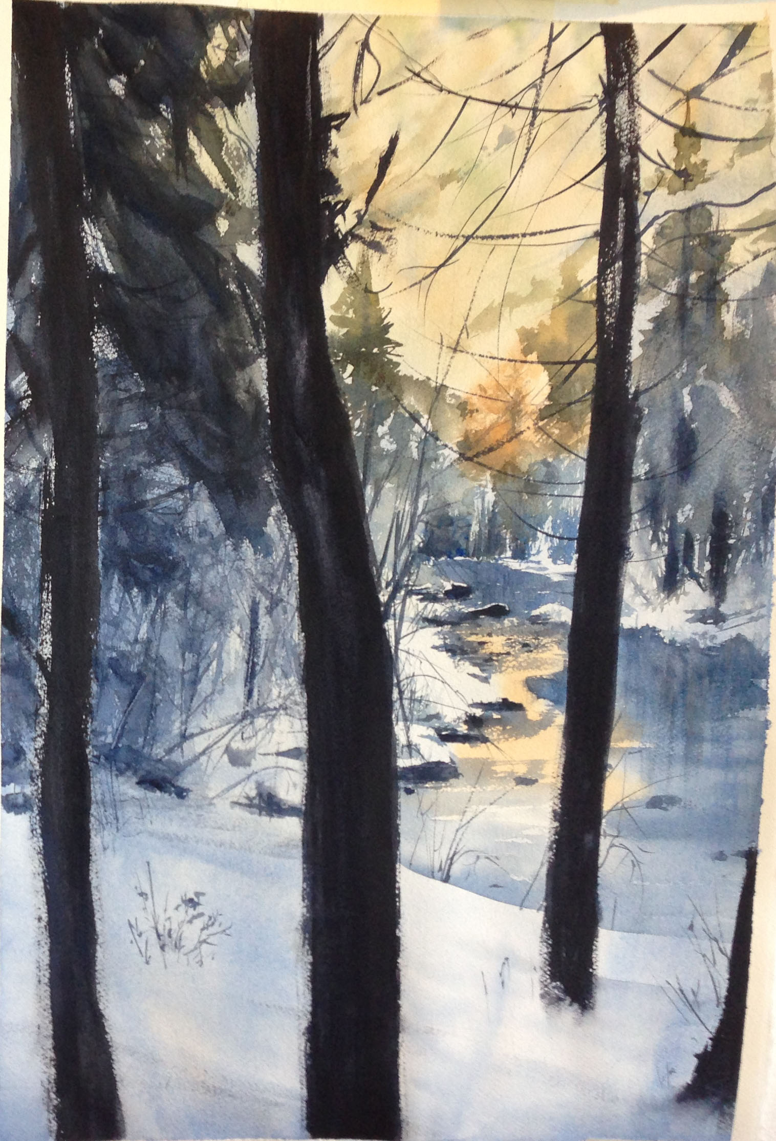
I decided there was not enough focus on the river. The foreground took up too much room and was too crisp. So I cropped the composition for the next go and did more wet work. I also felt it wasn't "cold" enough. I decided to make my blue greener and more pure in terms of chroma (instead of this dull purple-blue I had made from Ultramarine), so I used a clean, diluted wash of Pthalo Blue on the next one. I also decided that the far right side was too empty. For a better composition with more points of interest to balance things out, I added some orange highlights to that area, as well as a "tree" up top to mirror it.
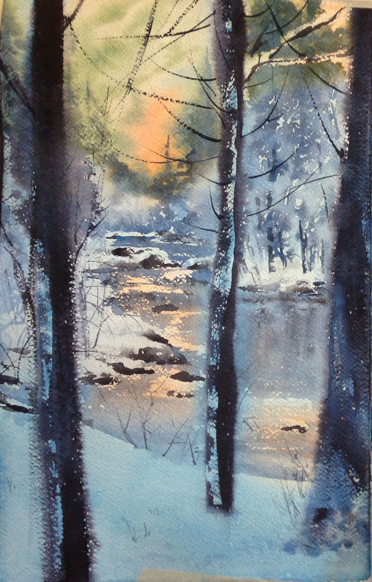
Here's a photo of the sketch for the final painting, as well as one from early on in the process-
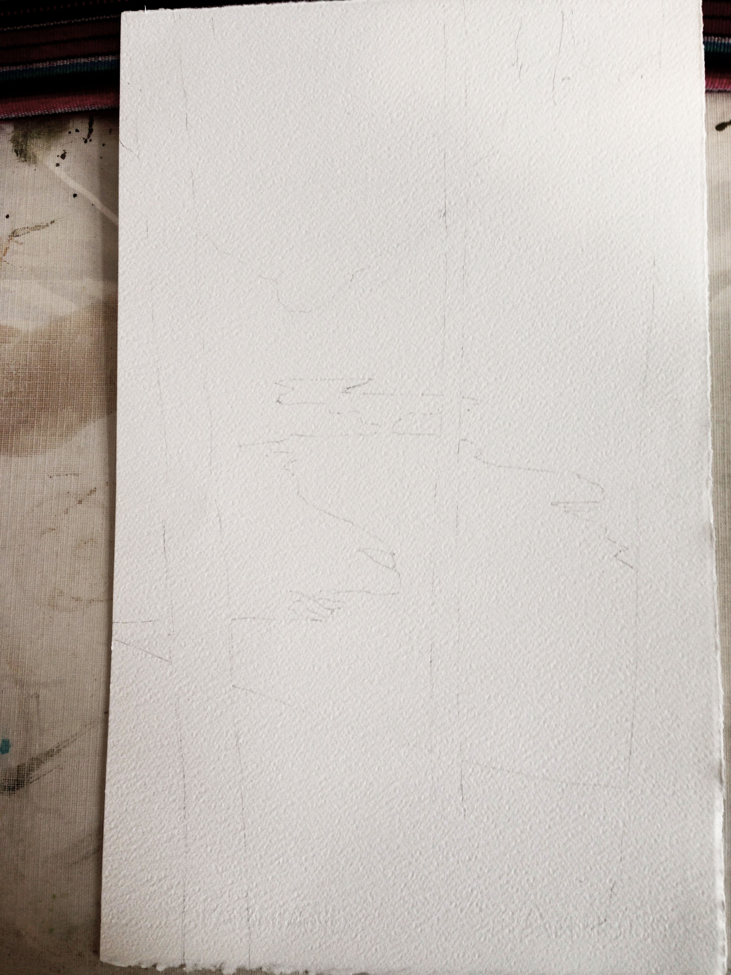
only the simplest of shapes. focusing on where hard edges have to go or spaces have to be preserved.

the blue and the opposing orange are much cleaner this time. The blue is also much greener.
It's actually "stuck" to a piece of plexiglass. You just can't see it because the edges are outside of the photo. I drop in colors, bit by bit, and play with the wetness of different areas. As it dries, and I wait very patiently, I can then drop in colors and the edges will stay tighter. It's a little dance, where I'm continually reducing the amount of water on my brush. In the beginning, I was using my squirrel mops, but towards the end, I either dried them out considerably (on purpose) or switched to a synthetic, in an attempt to not over-saturate an area with too much water and create bleedbacks.
After it dried, I added in the juicy, very dark dry brush strokes for the foreground trees, and then took a different, clean, wet but "thirsty" brush and "kissed" the edge of the dark dry brush stroke with it. This let me soften the edge of the foreground trees. My goal was to help a viewer look past the trees, while still getting to use them as framing devices. Thinking about Chien's "No Sameness" rule, I worked at making the spaces not equal. One tree borders the edge, the other side provides some breathing space. The base of one tree is completely off the page, but the other two provide a bit of depth by allowing us to see where the trunk meets the groundplane.
The last little bit was to put in the darks for the rocks and to add that sparkle to the river. For this painting, I experimented with a new paper- Fabriano Arstistico's Rough. A fine paper, but VERY rough. Here's a closeup of it at an angle, to capture the texture of the paper and dry brush work. Holy Moly! Dry brush work was a breeze though. LOL.

At this point I thought I was done, but once it dried and I hung it on my wall, after some humming and hawing, I decided to do a quick second wash over the water itself, to darken it some. I felt it wasn't drawing me in enough, and wasn't pushing enough contrast. As it goes with this things, there ain't no going back. So, I mixed up a batch of clean, diluted Pthalo Blue and went to work. Nothing to be done but go for it. Note the difference in the value of the water, and how it makes the orange reflections pop more in the "deeper" shade I've applied-
thought I was done, but...

nope. just had to do one more wash. wanted to push that feeling of cool, snowy shadows pushing against the warm, sparkling highlights.
Here's the photo it came from, and the final painting side by side. Of course, the photo is just a photo, and not reality. I use it as a reference and a way to explore my own composition and memories, not as something I have to stay true to. Like the rabbit hole, the farther I go down the process of painting it, the more it begins to distort reality and obey its own dictates.