DVD Review- Zbukvic's "Watercolor on Location"
The format of this DVD is different from “Atmostphere and Mood” (last weeks review), but is very similar to the setup of most of Alvaro’s- there are 5 paintings that Zbukvic does, and each gets about 15 minutes, for a total of 90 minutes. Zbukvic paints
-a rustic boat ramp
-backlit cedar trees
-a horse racing scene
-a quick sketch of a rider
-a small town street scene, and
-a beautiful painting of a broad open valley
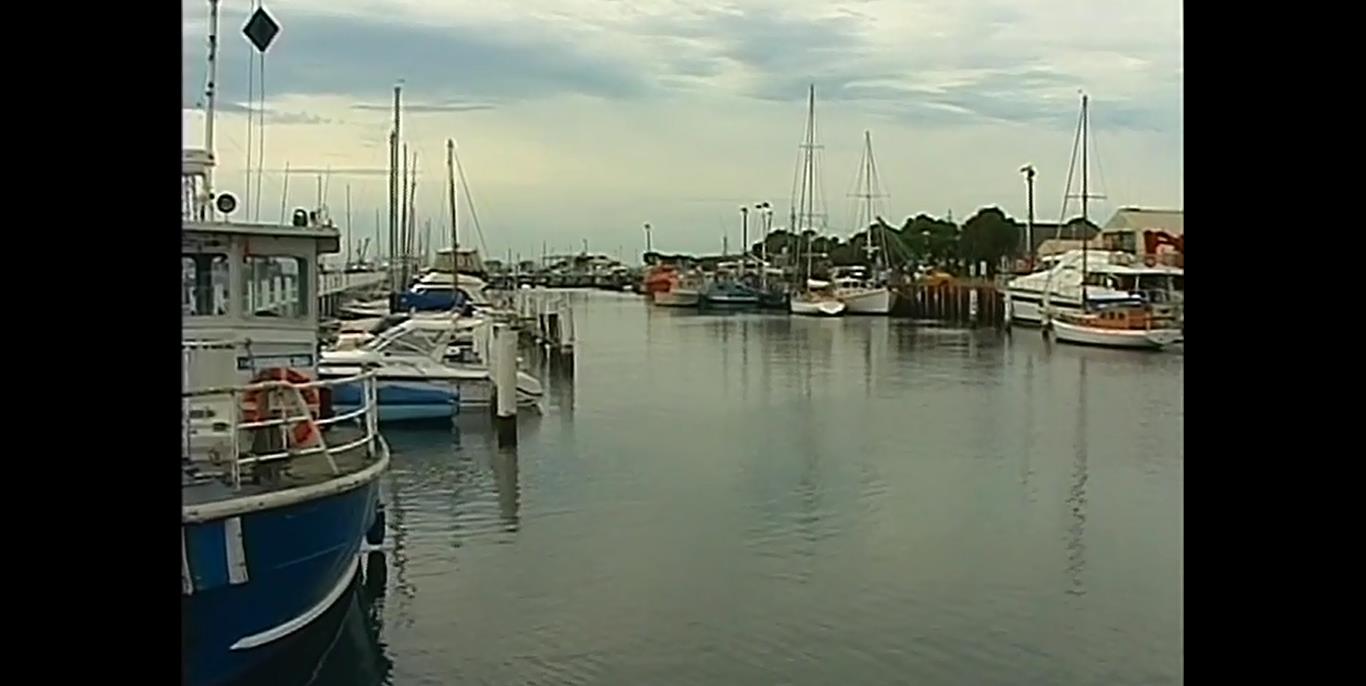
Of all the 3 DVDs I’ve watched of Zbukvic’s, this is my favorite. I love the paintings, and his focus on composition and simplification is direct and helpful. Much like Alvaro’s line about how painting watercolors is like golfing because “he who ends the game with the fewest strokes wins”, early on in this DVD Zbukvic talks about how the secret of good art is being able to figure out how to paint the subject the quickest way. “However, sometimes things look great,” he says, while visiting a busy dock, “but are not necessarily paintable.” Here's an example of a view he chooses not to paint from early on in the DVD--
Thus, his desire to keep things fresh and not overworked can sometimes butt heads with reality. He has to find a composition that he knows he can simplify. Having just done a whole bunch of plein air painting while on a trip, I can only say how important and difficult this is. Once you get some technique under your belt, you can, surprisingly, still produce some pretty subpar, boring paintings because of issues with composition. To help with this, if one pays attention, you’ll see that Zbukvic's paintings are often are divided into 1/3’s, where there will be a clearly distant background, a midground (where the “actors” are, on the “stage”), and a simple foreground to pull you into the subject. It doesn’t happen every time, but it happens more than once. So, definitely, the subjects he’s choosing are playing to his compositional interests as a painter, rather than against them. He’s not fighting the subject- he’s just picking the right ones. This was something I can only agree with whole heartedly.
Once he’s got the subject, he then goes about reducing shapes (cars, rocks, windows, trees, etc.) and also altering the hues or values gently, as needed, to improve the composition. Distant objects regularly get simplified into one massed shape, which he then sometimes reduces in value- both are done to push the distant background away. As he says, it’s only the setting for the real actors in front (the midground or foreground). Additionally, the foreground is often made a bit darker and more chromatic than it is in real life, to pull it into the foreground more. So, he’s definitely stretching the composition at times, to help enhance the illusion of depth on the paper.
Here's a view of the actual scene he paints for the first painting-
He specifically notes how he needs to reduce the chroma and value of the distant trees to push them back, and you can see that in the finished product. he also reduces the number of boats, while keeping the "feel" of the place. Here's the finished painting again, for reference--
Additionally, there are also times when he changes the hue or chroma of an object to better help the composition. For example, when he paints the first scene in this DVD, he changes the color of the boating structure. It’s yellow in real life, but this would draw too much attention from the focal point, which is the entranceway to the water. Instead, he mutes the yellow of the structure (in my mind, to reduce its importance) and makes it darker in value (to pull it forward). It’s still a warm hue, so it has some relationship to the original object, but, like all the things he includes in the painting, it obeys the needs of the composition first.
To me, what’s so interesting is that Zbukvic is, relatively speaking, a realistic painter in many ways—he focuses on certain details (like windows and little details on the face of a building) that a painter like Alvaro would blow over as “superficialities”—but when you compare the subjects he chooses and the completed paintings, it’s clear that the painting process is still a kind of alchemy. The painting and the real life subject are related, for sure, but a) he makes sure he picks a “paintable” subject, and b) he changes the value, hue, and chroma of objects as needed to improve the composition.
Finally, I just wanted to follow up on some of my thoughts from last week’s review, where I talked about Zbukvic painting “geographically” (a term I’ve totally made up). You can definitely see it again in this video. It’s strongest in the painting with the cedar trees and the painting of the small town. In the cedar trees painting, you can definitely see him giving different trees different hues and values, while cutting one shape around another to achieve the final look, rather than simplifying the values more or simply layering them. This also comes into play when he paints the different colored buildings in the “Small Town” scene. Here, his approach is noticeably different from Alvaro’s, and the focus on bringing in realistic detail is clear. Mostly, I just wanted to note that this method of painting is regularly occurring in various videos of his, so if you get the chance to view others, it might help you understand a bit more about how he’s “going about” what he’s doing.


