Narbonne to Barcelona
This is from a pic I took on the way back to Barcelona last year, after a day trip to Narbonne, in the south of France. What a wonderful birthday it was!! :) Here's the pic I started with, for reference, taken while speeding along on a train--
Throw in a bit of memory, a tweak or two in Photoshop (Color Balance is key, as is Brightness and Contrast), crop it, and voila! My true reference pic--
From there, I began painting. This first go, as is so often the case, was done on a 1/4 sheet- 11" x 15".
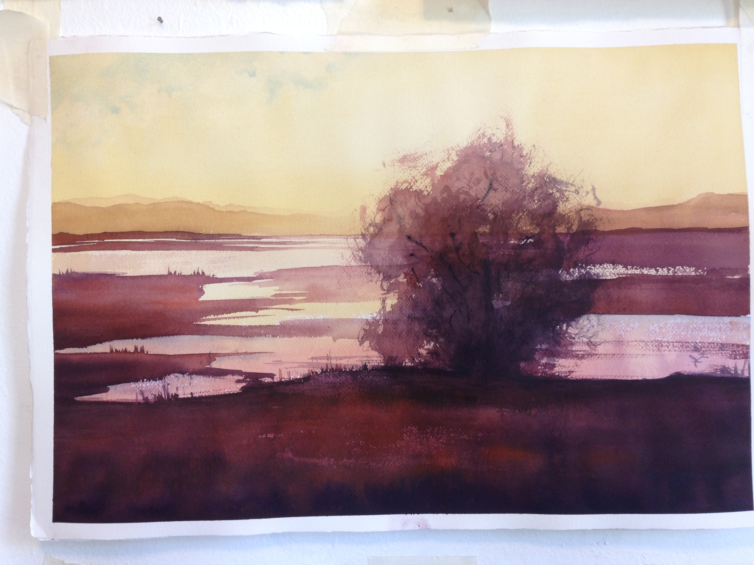
From there, I grew the image. This next one is a 1/2 sheet. I pulled in richer color to compliment the darks, and worked on giving the tree some dimension and a sense of light.
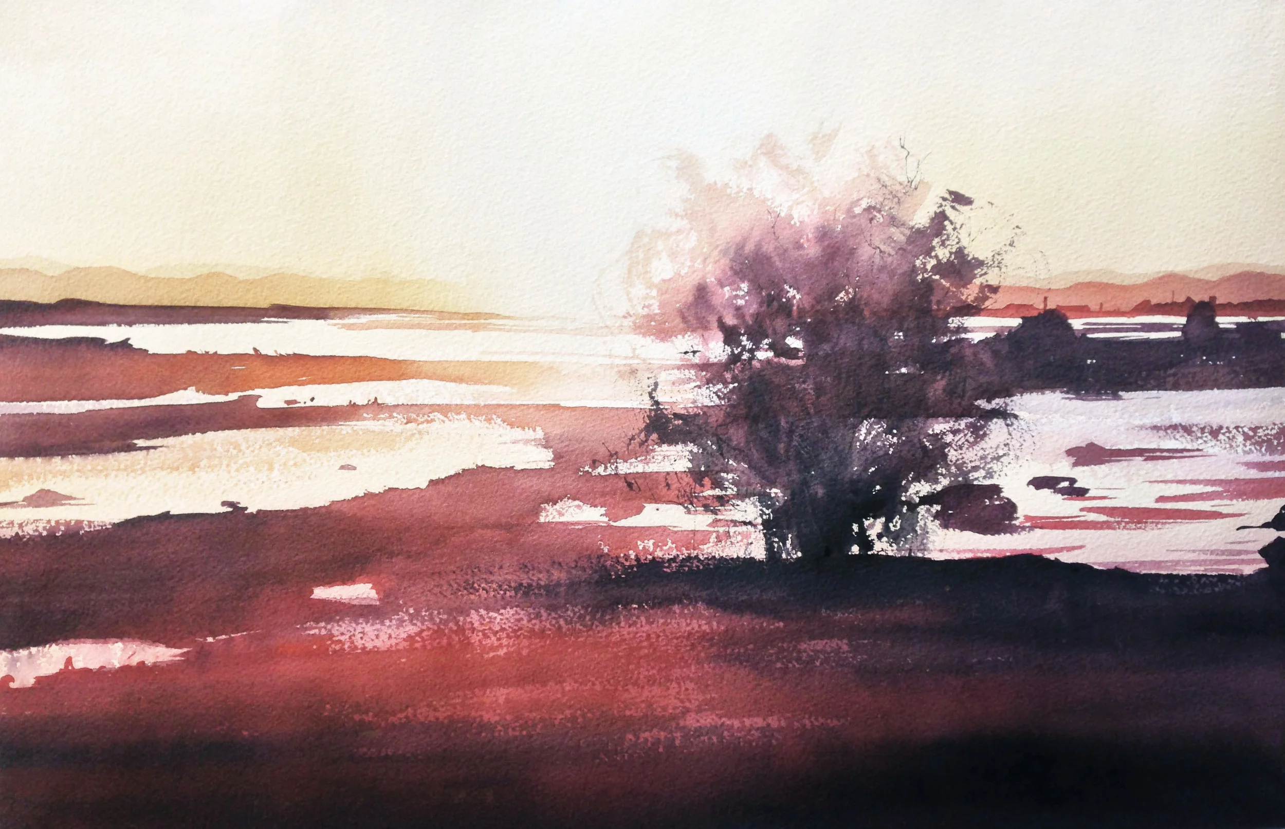
Still, after this, there were a few things I wanted to do. I missed the lighter sky of the first painting, and the glow of the white paper where the sun was. I also thought, with forethought, I could get the scruffy tips of the tree to really glow with that warm afternoon light. In looking over the photo, I noted some houses in the far distance on the right, and I liked how they gave a sense of scale. Finally, I thought, again with greater forethought, I could keep the foreground lighter and more chromatic, and give it that punch I was looking for.
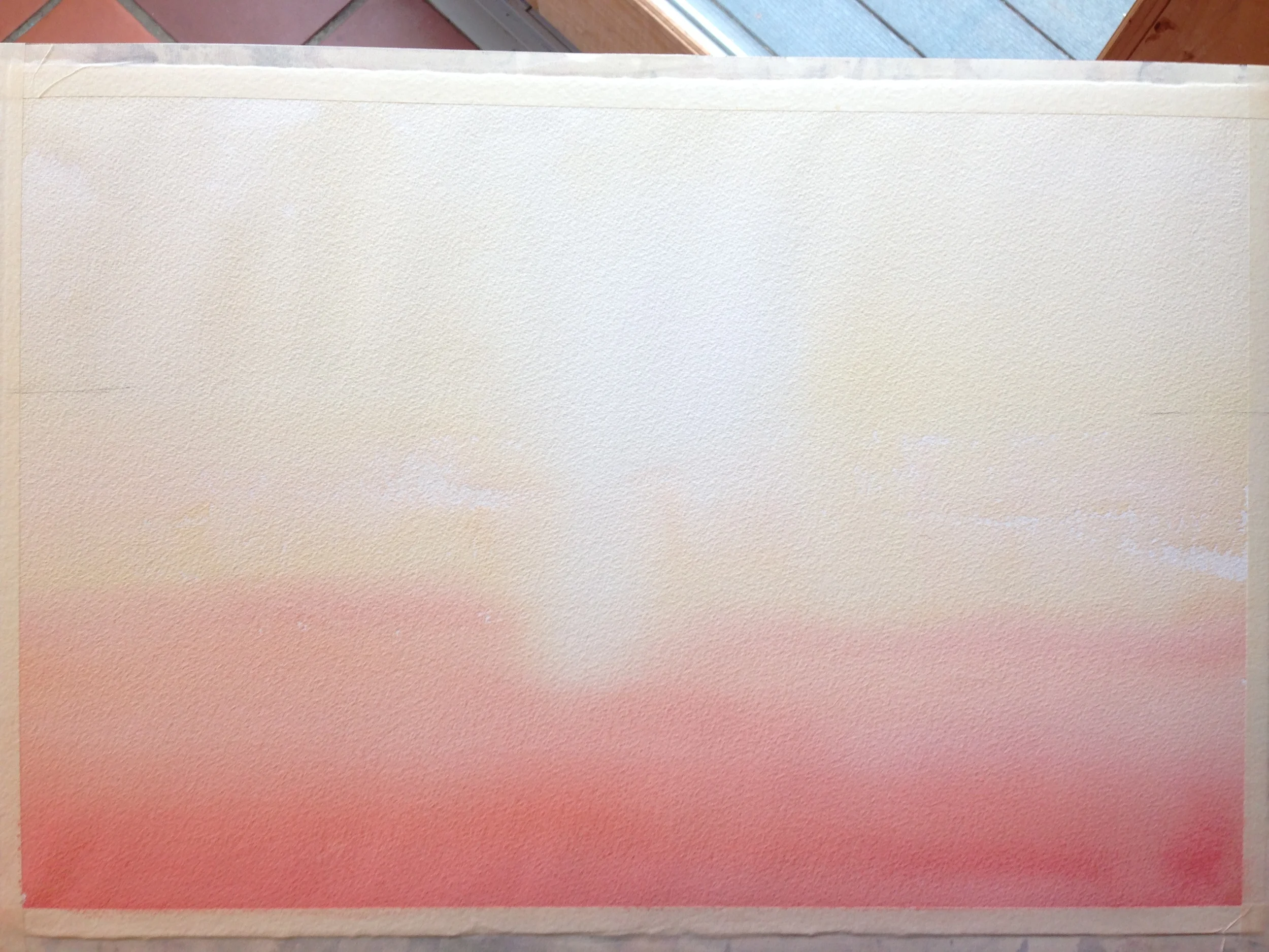
So, I laid in my first washes, making sure to do a bit of dry brushwork here and there, and always keeping in mind what my "lightest lights" will eventually be, later on. I'm using diluted Yellow Ochre, dropping down into Pyrrol Orange and Winsor Red, or some mix of the three. My goal is to keep the colors clean and bright. These will be, after all, my highlights for the rest of the pic- I can't get any brighter than these for the rest of the painting. Also, note the two tic marks on the side. That's for my horizon. I often sketch in a bit on my paintings, but for something like this, without buildings or people, I can dictate the shapes as I see fit, and it will all read very well. It's the light that is the big deal.
After that, I glazed in the two layers of mountains, blow drying the paper dry each time. After that, I turned it upside down and glazed over the whole sky (including the mountains) with a bit of Yellow Ochre, Ultramarine Blue, and Burnt Sienna. I still preserved the white paper for the sunny area as much as possible, but I wanted to tone the color down some and get a bit of "haze" up at the top. Through it all, I don't worry much about the horizon line. I know I'll paint over it with darker colors later.
Sadly, I forgot to take a pic in between this and the finish painting. Still, I painted in the land masses, all the color laid in wet into wet. After it dried, I did a quick wash of red over the bottom, to really make it pop. Then I dried it again, and did the tree, starting at the top with the cleaner, brighter colors, using two brushes. When I got to the bottom, I used Neutral Tint with a bit of Dioxazine Purple and Burnt Sienna. And that, folks, is that! :)
I'll be putting the paintings in the Portfolio, so if you're interested in purchasing any of them, please contact me. Thanks!


