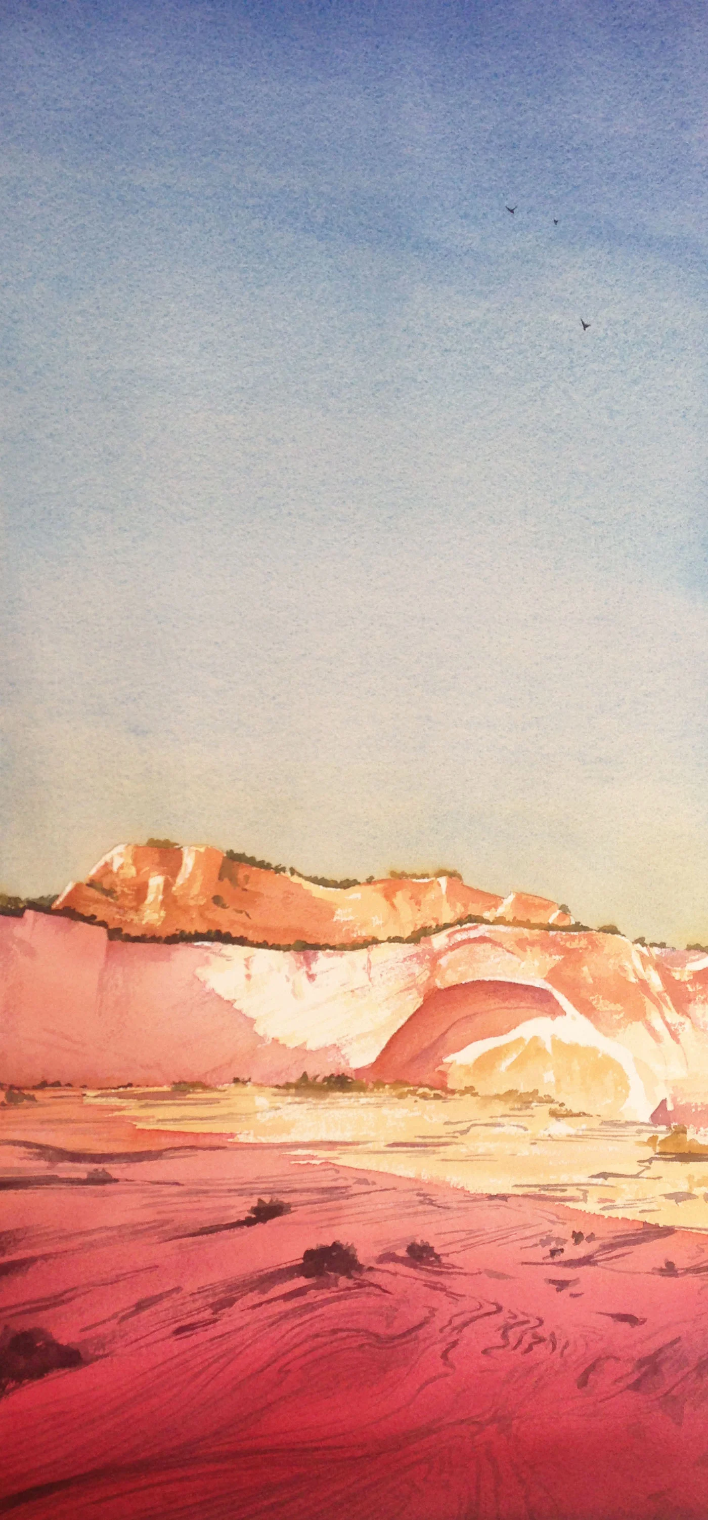
Light-Filled Shadows
Click on me to see a larger version
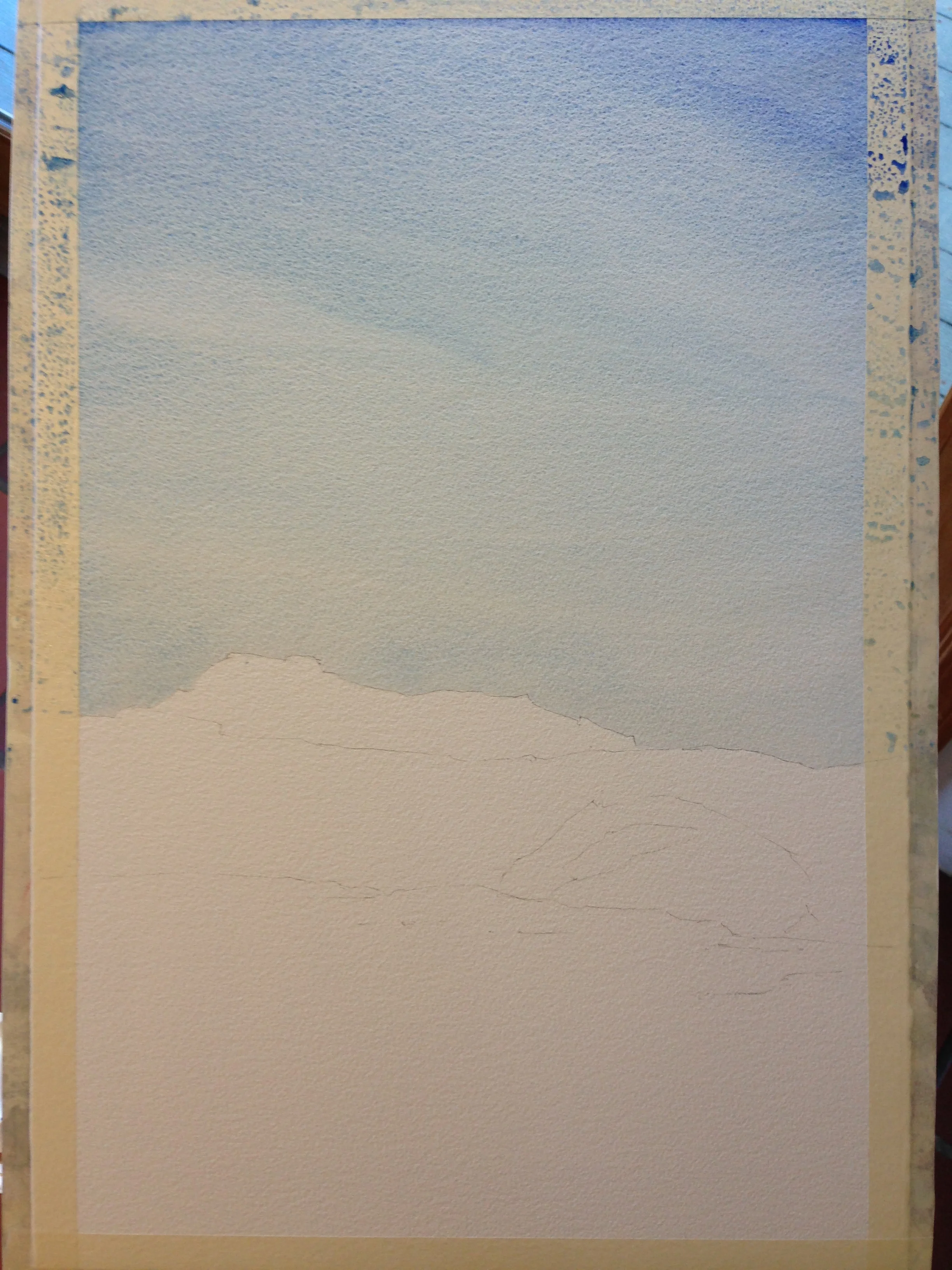
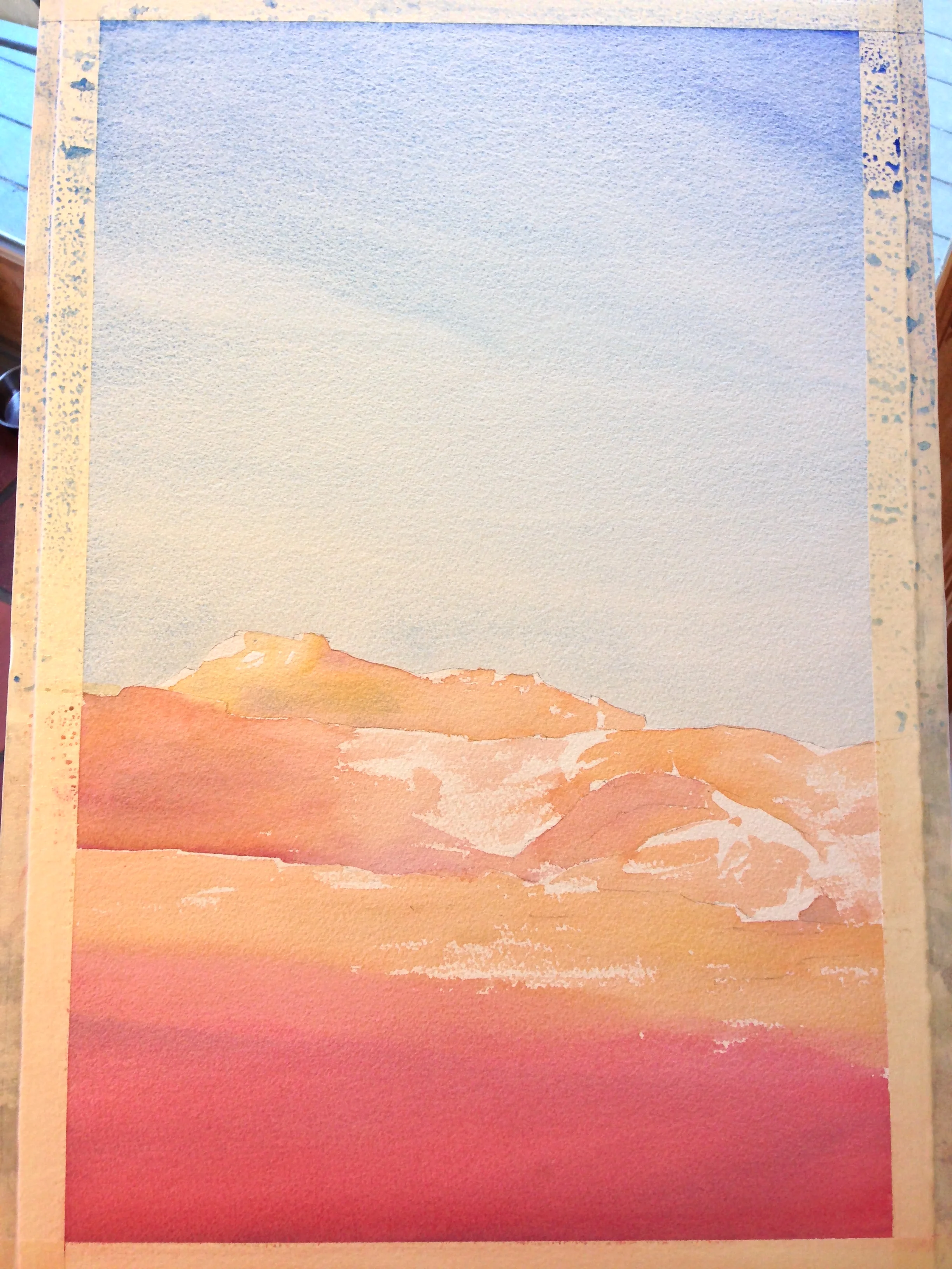
I started the above piece with this sketch, perhaps taking 1.5 hours or so, on a ¼ sheet (11 x 15). This is what it looked like.
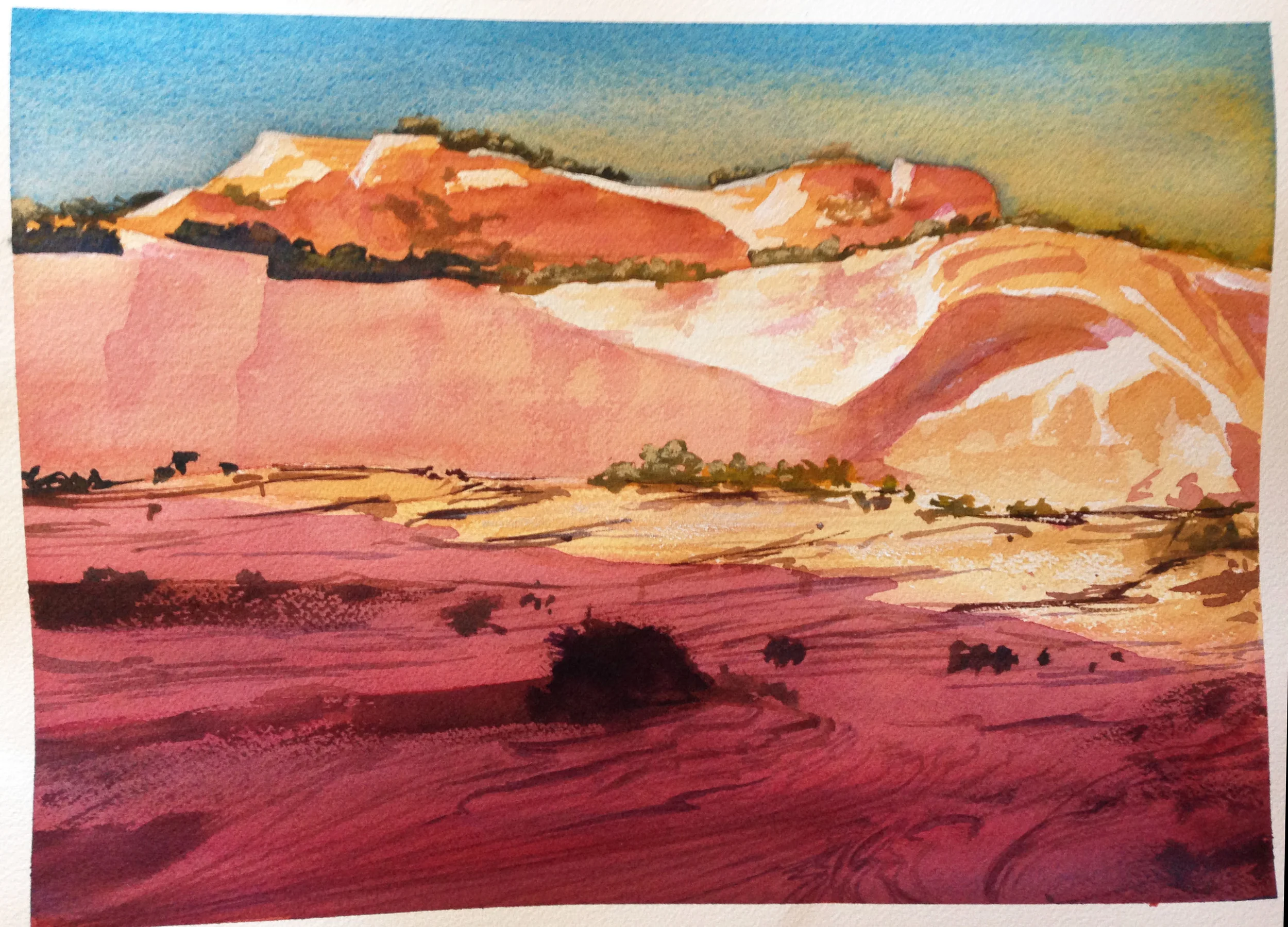
I did this a month ago or so. I was satisfied enough with it at first, but I shared it and got some good feedback. Primarily, it didn’t have the kind of “light-filled” shadows I was after. My colors were too muted. The foreground didn’t have enough detail to pull me in. So, on to the second version.
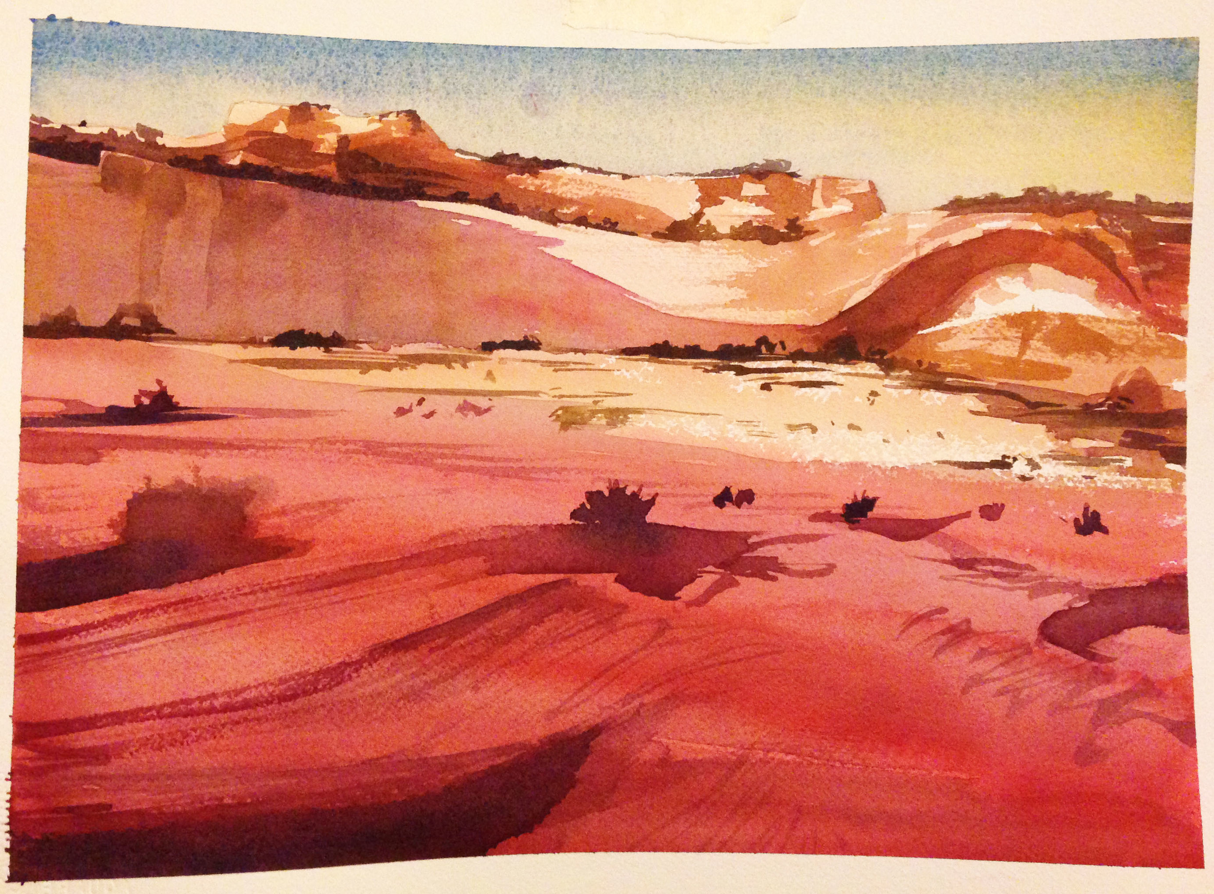
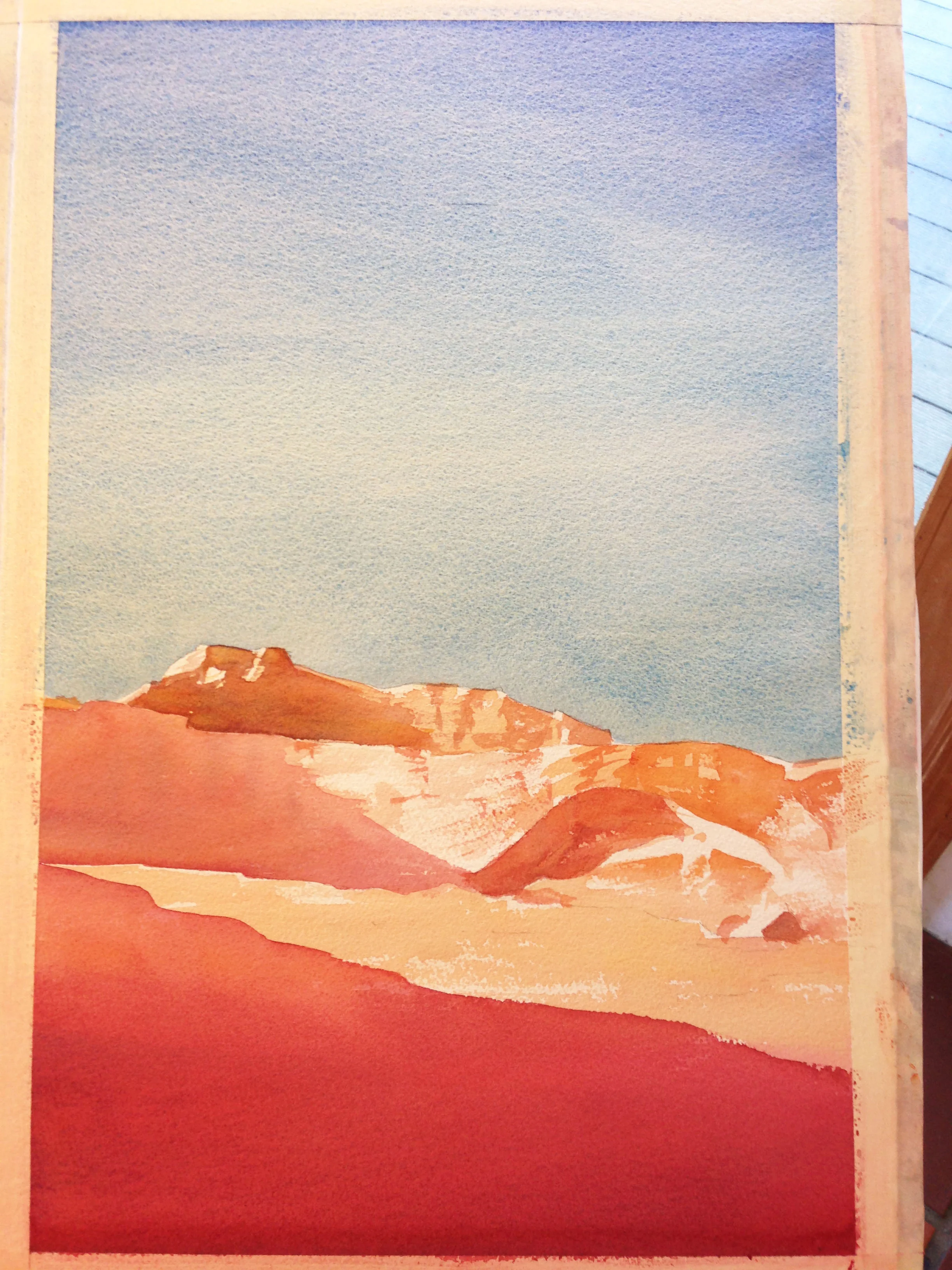
This one was also a quarter sheet (11 x 15), and took about 2 hours. I did it about a week after the first one. I let my lights be of much higher value, and the shadows were much better, which I liked. I also began to work on the contrast on the “brow” and getting that seam deep in the shadow to better show the form.
The issues? I felt like I’d lost that sense of distance I was after. The critiques I got were that my foreground was too short, and my trees too big and chromatic—combined they shrank the distance to and scale of the cliffs. Also, I still felt like my shadows, particularly in the mid-ground, lacked that “glow”. They were still too heavy, and not high enough in value. In the end, I liked a lot about this image, but just wanted it to be bigger, and to "feel" bigger, with more sky and vastness, etc.
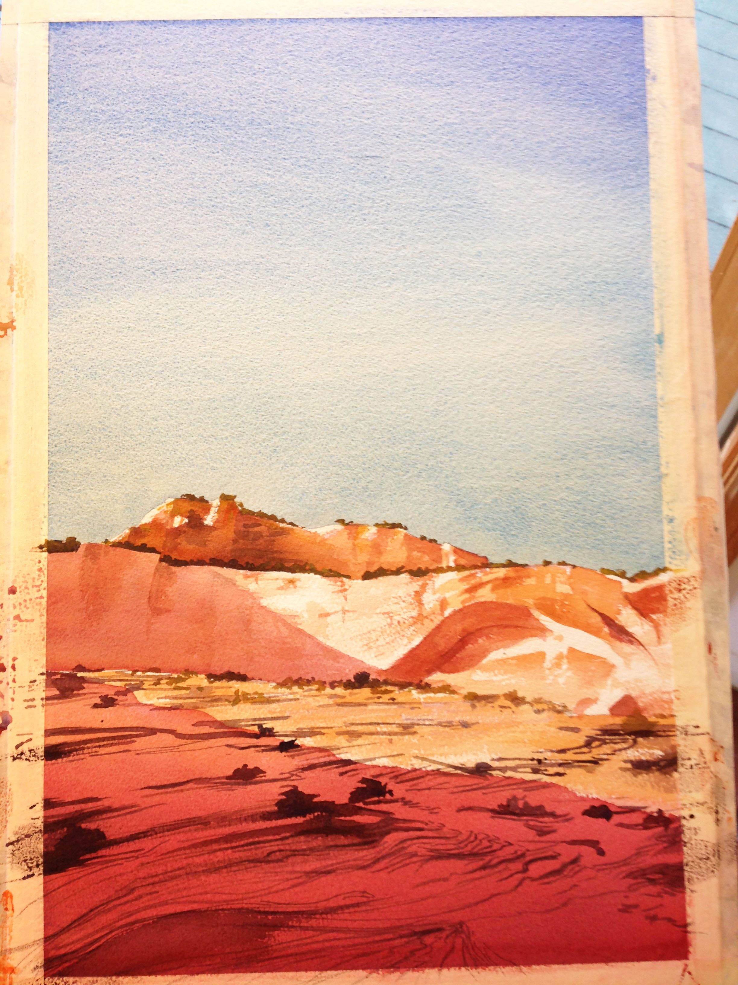
For the 3rd iteration, I worked on a half sheet (15 x 22), and it took me about 3 hours. I came back to it after a few weeks off. I grew the sky to get that feeling of vastness of was after, and opened up the foreground some too.
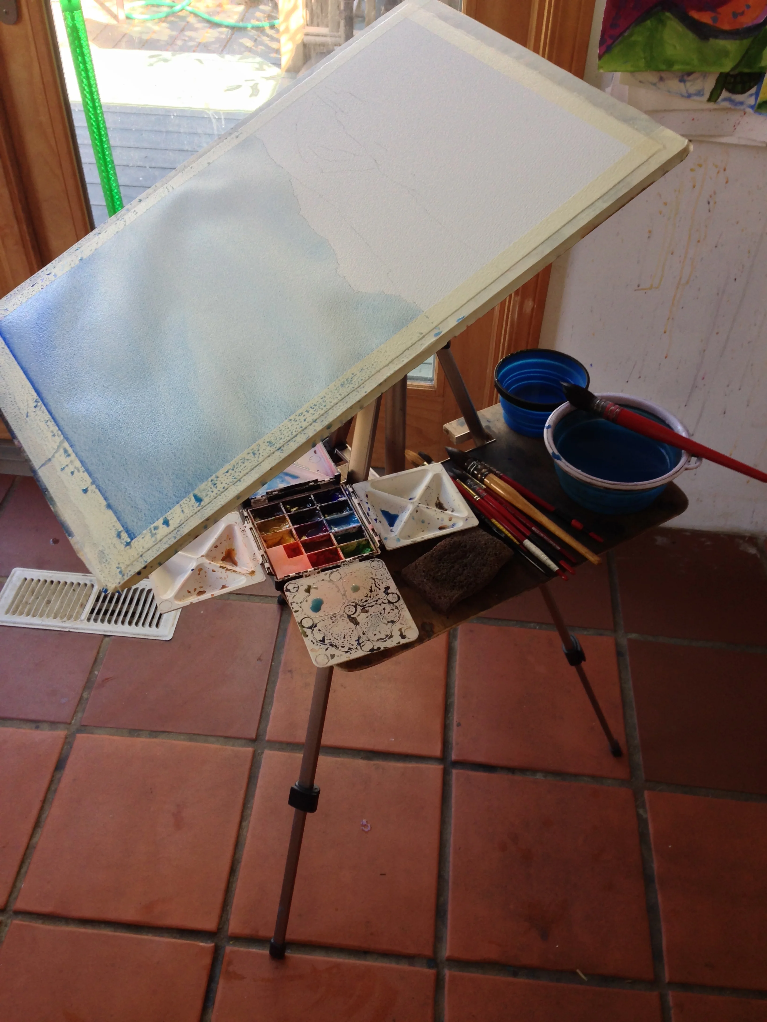
Here I'm painting the sky "upside Down", to get it lighter at the horizon and stop any drips from happening.
the finished sky, first wash
Unfortunately, before I knew it the uppermost mountain was darker than I wanted as I added the sort of jagged texture I wanted. The shadow on the left cliff face and the local color of the sunlit mid-ground were darker and more muted than I wanted again.
In the end, I also decided to add yellow ochre back in to the lower portion of the sky, which I liked. It helped to bind the sky to the mid-ground, but it also made the sky a bit darker than intended because it came late in the game. I darkened up the foreground line work, but it also ended up being darker than I wanted. I liked the image, but felt like, if I did it once more, I could really nail it. The contrasts were very bold in this one, which was cool, but I was looking for something “lighter”. Sooooooo….
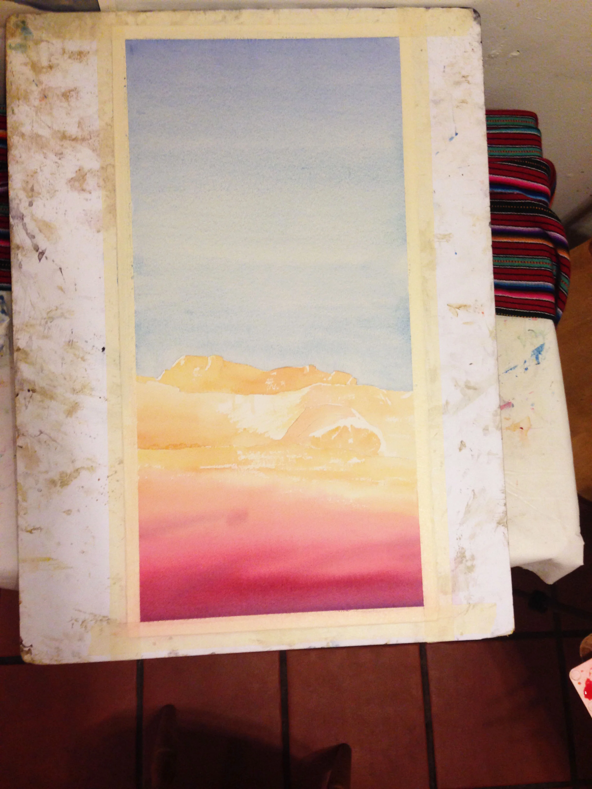
In this fourth version, I grew the sky and the foreground again, and decided to work on a slightly cropped full sheet (15”x 30”). It took me about 3.5 hours. I did it the same day as the 3rd iteration. Started around 900 and wrapped up sometime between midnight and 100. Phew!
One of the big changes this time around was that my first layer was much higher in chroma. The colors are pale and clean. I was also familiar enough with the composition that it was much easier to preserve my highlights.
Phase 2, I begin to cut my shadows, but used more chromatic colors for the shadow. This time I allowed my cast shadows (both on the cliff and the foreground) to have jagged, irregular edges. This was another change I was also happy with.
In this last image the earlier foreground washes were dark enough that I just painted the pale striations in one go. I also carried the diagonal striations on the cliff face across the shadow line, from light to dark, to bind the two areas together. The upper most mountain was kept paler, but more importantly more chromatic—the shadows are generally orange, instead of brown. Same on the cast shadows on the cliff face and “brow”—the shadows are pink or orange, more than brown. Even the foreground shadow is mostly a pretty clean and vibrant orange-to-magenta-to-dark violet.
Also, for fun, I added a few birds circling on an updraft. A sky that big needs a little something in it! :) Quite a journey.
If you're interested in purchasing one of these paintings, please visit my gallery, where I've listed them for sale.
