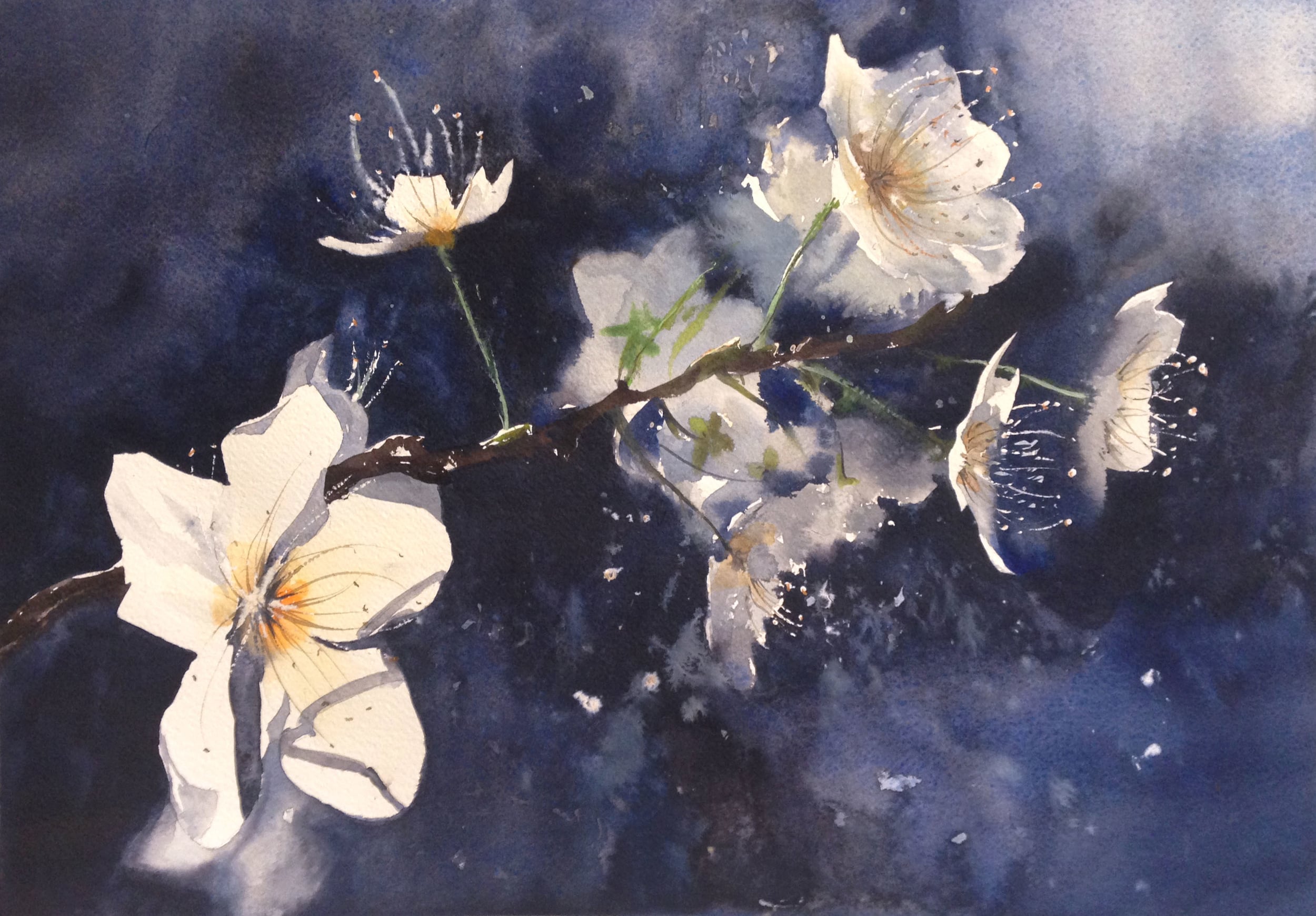
Apricot Blossoms

I took the photos from my apricot tree this last Spring one morning, but didn't jump into the piece until December. I've been wanting to do more wet into wet work, and I liked how the composition of this piece provided an opportunity to explore hard and soft edges, bright preserved whites and muted greys, high and low chroma, warm and cool colors. Contrast! Much like my recent thought that painting clouds and placing boulders are really very similar compositionally, these apricot blossoms don't have much going for them outside of pure composition- placement of edges and values, high and low chroma, organization on the canvas. I liked that idea, and wanted to explore it.
Here's the photo and the final painting side by side-

I liked the backlighting, but there's way too much going on here...
so I cropped the image and simplified the background
Of course, there were a lot of things I liked about the photo, but it also worth noting I just used it for inspiration. I ended up printing it out on 1/2 of an 8 1/2" x 11", and folding the paper here and there, trying out different ideas, until I got the composition I wanted. As I began to think and paint, I noticed little areas where I wanted a bit of "pop", to let the eye travel around, hopping from one point to another. Of course, the big flower in the bottom left 1/3 is powerfully bright and hard edged (it's the Major, the focal point), but it's the edges of the flowers in the far right that my eye lingers on- it's what Chien would call the Minor. That one upward facing flower in the middle? The very important Jumper. It helps bridge what are essentially two separate compositions, so the eye will travel between them. So, we're back to Major/Minor/Jumper.
I did a 1/4 sheet while painting at the studio of the Merritt class, starting out with a rough, loose wash of Ultramarine Blue and Van Dyke Brown. It's hard controlling a wash this complex. I'm busy cutting so many edges that the wash begins to dry up, which you can see with the blooms I'm getting. When this happens, I actually push back through and rewet the old area before my edge dries 100%. This allows me to bond the wash to itself more completely.

taken while the colors are wet

taken after they've dried.
Something to note is how the value and chroma shift as they dry. There's a definite shift between these two photos. The blues and dark brown-blacks in the middle and bottom are much lighter and greyer as they dry. The upper left is darker in the 2nd photo because I rewet the area to smooth out the blooms I was getting. In the end, though, some of the hard work was for naught- the wash was too pale, and I actually went back over it to darken a lot of values almost everywhere.

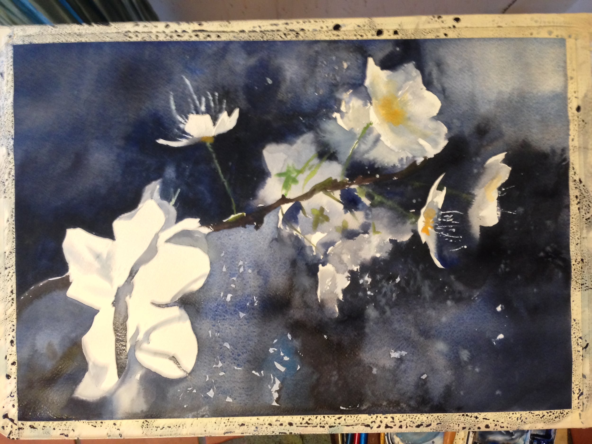
It's also worth noting how finishing the first painting informed my 2nd go at it. I liked the 1/4 sheet, but I found it a bit tight. I wanted a few more soft edges. I also felt like the middle values (the grey "flowers") were too dark and their shapes too diaphanous. I wanted them to be recessive, but still look like flowers. I kept these things in mind when I headed once more into the breach.
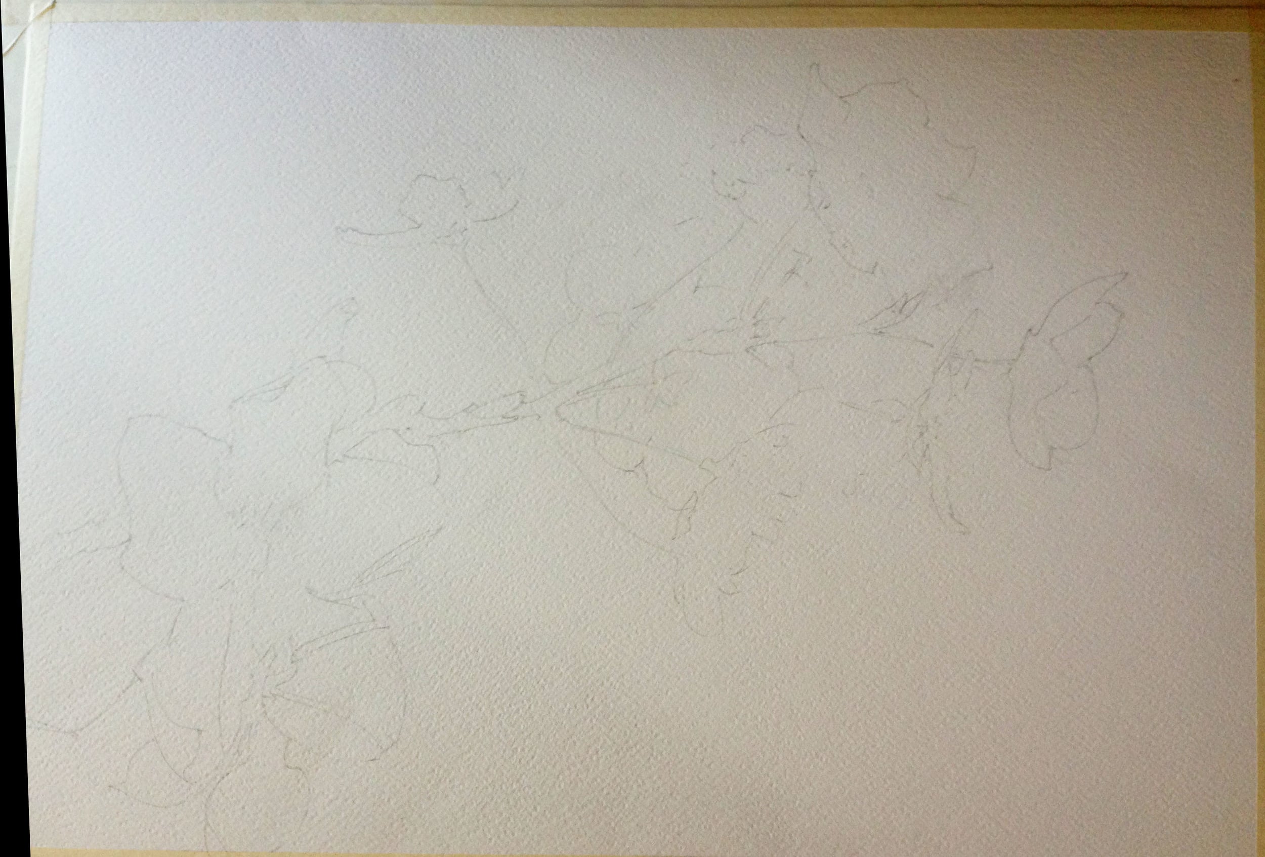
Here's the sketch for the final 1/2 sheet painting. A bit tighter than some of my sketches, because I have some very clear hard edges I want to preserve. For the hard edges, I keep the sketching process tighter.
You would think I would have learned my lesson after the first go, but nope- I thought somehow I could just get a darker first wash, but it didn't happen. I had the same issues as before- too many cut edges and my wash kept drying out here and there. No problem, I just did a second wash like before. At least I was anticipating it this time! Of course, even that didn't work. Ha! Part way through, I noticed that the area under the branch was decidedly lighter than the area above. Dang it! So, I had to go back in and do another wash on the bottom. I did this after it completely dried, and smoothed out the edges with the old wash by laying in clean water. You can see the difference in the final image way down below- the bottom half is much darker.

This is probably a good time to talk about the wet into wet work I'm doing here. I use Chinese White, and I also use a number of Holbein pigments that have white in them- Jaune Brilliant No.1 (a warm yellow), Verditer Blue, and Lavender. So I have absolutely no qualms about using semi-opaque pigment. The opaque pigments let me push lighter values into my wet into wet work, without having to always dilute the pigment with a lot of water. My experience is that these pigments are "thicker" and mix differently with the water- they disperse more slowly and not so smoothly. This can leave behind interesting delta-like"traces" of the water's work, which you don't usually get with pigments that fully disperse. They lift very easily and become very chalky very fast if you put a wet wash over them- so you have to lay them down and let them be. You can do thicker, darker work over them once they're dry, but nothing particularly wet. So, no glazing with these pigments. Of course, the dry brush work with sharp edges, for some of the pistils and stamens, is done with a thick, opaque pigment, after everything is dry. That's the easy part. But lets look at some of the other details in the photo below. This is all about the Watercolor Clock- how wet is the paper? how diluted and "wet" is the paint you're putting in? how will the two water ratios interact? which one will "push" into the other area?

#1- For this, I lay the pigment into the dark wash while it was still damp, using a thin brush with not much water on it. Don't do it too wet, or it will just disperse, like some of the edges in #2!
#2- I mix up the Holbein pigments to get this pale grey. It's a thick mixture- not a ton of water in it. This means it won't disperse too much. Some areas it does more, other less. It all depends on how wet the paper is in that area. If you go back and look at the pics of my wash, you'll see some areas were preserved white, and others I put the wash over. This determines a lot about how much the new pigments disperse. For the tighter edges, I painted the grey flower into the dry white area and let it "kiss" the wet edge just a little. In looser areas, I truly just dropped the pigment into an already wet area. It looked like a petal earlier, but quickly dispersed as it interacted with the existing wash. As the new areas dried, I then dropped in the flower stems and sepals. This is why some of them have soft or crinkly edges and others hard, dry edges- they went in at different times.
#3- For something like this, I have a preserved edge on one side, which I leave completely dry. Up close to it, I've lay a bit of clean water down. Then, I connect the dark wash with the water, using that thick, grey, opaque mixture. From there, the water does the rest. Sometimes it works better than others. However, wherever I want a clean, hard, white edge I leave the paper completely dry- not even water goes there, or the pigment will move in.
#4- It's worth saying that some of the work is just pure negative painting. I don't always use these pigments. Between the 1st and 2nd wash, I saved some thin areas. The edges are hard, but it's an interesting effect.
In the end, here's where the playtime and hard work got me. There are a few things I'd change, but all in all, I like it. When it works, the composition should guide your eyes around, based on placement of shapes (1/3's) and a pretty full array of contrasts- hard vs. soft edges, white vs. dark values, high vs. low chroma, cool vs. warm colors, open vs. busy space.
