Evolution of an Image- Barcelona Corridor
I'd been doing a lot of nature scenes lately, so I decided to get back to some geometry and try painting this scene from Barcelona! :) Who can't love those bold shadows? I like sharing the original pic when I can, because I think it shows how the composition has had to go through some sort of alchemy in my mind, before it comes out a "painting." I'm definitely not aiming for a literal translation-- otherwise, I'd just keep the pic! I'm pushing to capture that mood (and have fun while doing it...).
I went through 2 preliminary paintings on 1/4 sheet (11 x 15). Here's the first pencil sketch--
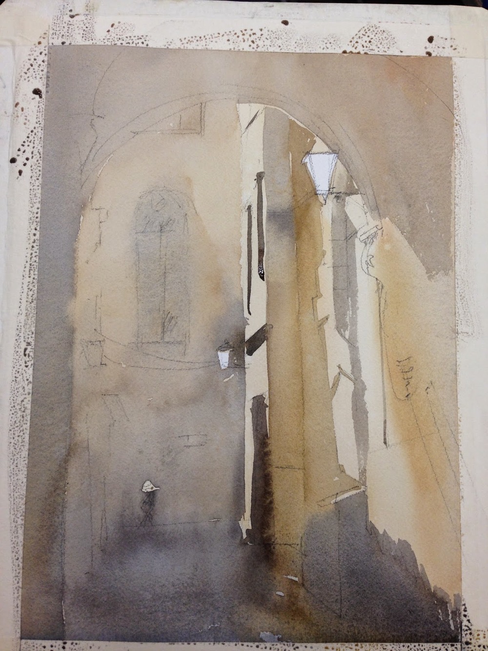
I drop my first wash in, and spit a little on it for texture. The truth is that most of this will get covered later-- I'm just figuring out what my lightest lights will be, putting in a background color, preserving whites. It's almost like I'm leaving notes for myself for the next few stages.
Start to lay in darker bits, and carve out some light.
This is the end of the first sketch. The truth is that the archway was much lighter on this on my first go, but I then did my second iteration, which had much darker shadows. I liked the "pop" it provided, so I went back into this one and darkened my darks. The image notably improved. That process of learning something on a second try and then doing a little touch up on an earlier version is something that happens now and then.
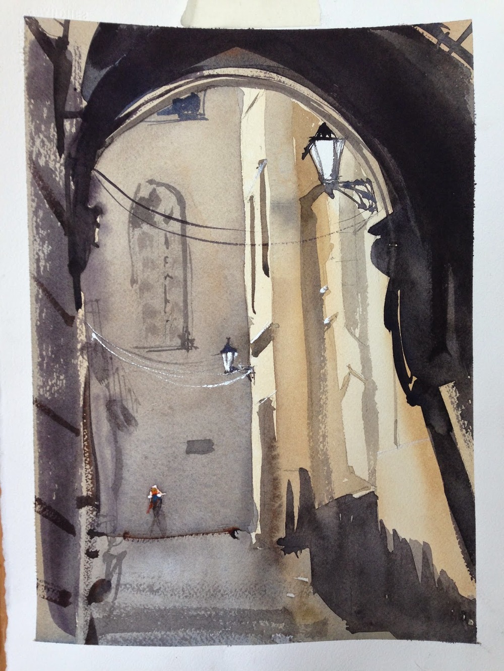
This is the 2nd painting- also on a quarter sheet. Done the same day. The darks were much darker from the get go, which was good. I also put more variety into the shadows, and let them blend more into a block.
This is the end of the 2nd painting. I had to go back in with some white on the lamp, as I lost my whites. It was better, but a bit too "graphic" for me with the shadows. I wanted more delineation of the form.
This is the final piece, which I did a few weeks later. This one is on a 1/2 sheet. (22 x 15). I made the figure bigger and more chromatic, and later on, I added the lamp hanging from the arch in the foreground (there was an object hanging in the pic, but it wasn't a lamp), to help pull your eye around into different locations (figure up to lamp, down the slanting shadow, back up the shadow on the wall to the figure along the line of the street). As the painting grew in size, it also began to call for a bit more detail in the central area. So, I added the motorcyle and the wires, a bit more on the church window, etc. That sort of stuff. I lost a bit of the lights in the foreground that I would have liked, but all in all, I'm pretty happy with it. It's very Barcelona! :)


