Exploring atists and techniques from the 2nd Biennial International Watercolor Show, pt. 3- Alvaro Castagnet
Alvaro Castagnet-
Of course, Alvaro was on the actual flyer for the show, so getting to see some of his work up close again was of great interest to me. I thought I would start with the painting on the front of the flyer. It’s gorgeous, and very typical Alvaro! It’s also very big (bigger than a full sheet?), at 4’ wide x 3’ tall or so, so it allows for a lot of very loose brush work (both wet and dry), and yet it’s still very legible when you back up. A wonderful combo.
Here’s a closeup of the people walking, in the bottom right of the image. I love how its almost pure gobbledy-gook when you get up close! You can clearly see lots of dry brushwork, and then a warmer opaque watercolor being applied for highlights. I saw him do something similar in the class this past April, and he was combining Chinese White with Yellow Ochre for this kind of affect.
Here’s the cars upclose. I was wondering if he actually splotched some water in there after he'd done the wash, to get those lovely washy bits, or if he did the opposite and actually had a very wet, rather pale wash in there, and then dribbled the thicker, darker pigment into it and let it disperse. The affect isn't what's so surprising to me, as I've actually gotten similar affects myself at times, but rather the control- where's all the water and pigment going when he paints this way? It isn't like it's running off the bottom of the page, since the shadow is trapped. That's sort of confounding to me. Also, you've got to have some tilt in there to get things to run, but it can't be much or it would get trapped at the bottom of the shadow. Perhaps he tilts it at first, then lets it dry flat, after he gets the affect he wants?
I was also intrigued by the very rough, dry brush work. You can see it on the pale valued shadows for the windows, but also down below, in a darker value, where the dry brush work is sort of scrubbed very loosely into the shadows above the taxi. That's quite interesting to me in particular, because the dry brush work isn't actually defining a form there, the way it is on the windows, but rather a darker value... which is something I might often do with a wash instead.
**
In this second pic below, what I was drawn to most were the shadows and headlight reflections.
When I pulled in close, I was surprised to find out that the reflections of the car lights on the wet road are all dry brush strokes. What a fun juxtaposition!
Again, as in the first image, you can see how loose he is with his people. Lots of dry brush work and opaque, light valued watercolor pigments. As I've seen him do before, the color/ value of the umbrellas and the base work for the figures is laid during the first wash, and then preserved and cut around. The thicker, higher chroma pigments for the faces and what not were done later, atleast when I saw him do them. Again, as with the headlights, the legs and and their reflections in the water are all done dry on dry.
**
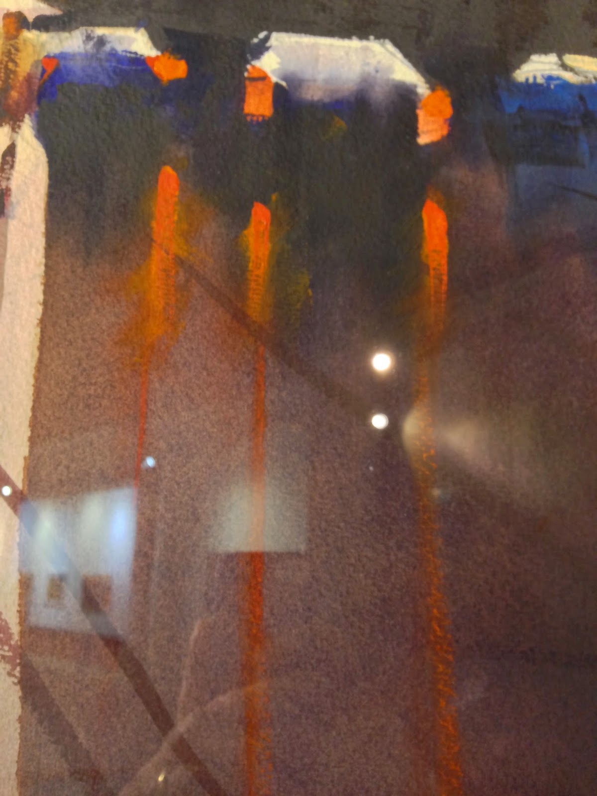
This is the 3rd and final Alvaro image that I have pics of from the show. This one, like the first two, was a full sheet (or bigger?), so each little section I'm taking a pic of is probably a quarter sheet or so in scale. Big stuff! In this one, I was struck by two primary things- the cab lights and the window reflections.
First, look how thick the pigment was on the cab lights. That stuff is gooped on like impasto! It’s also applied dry, as you can see the texture of the paper with ease. Here’s the closeup.
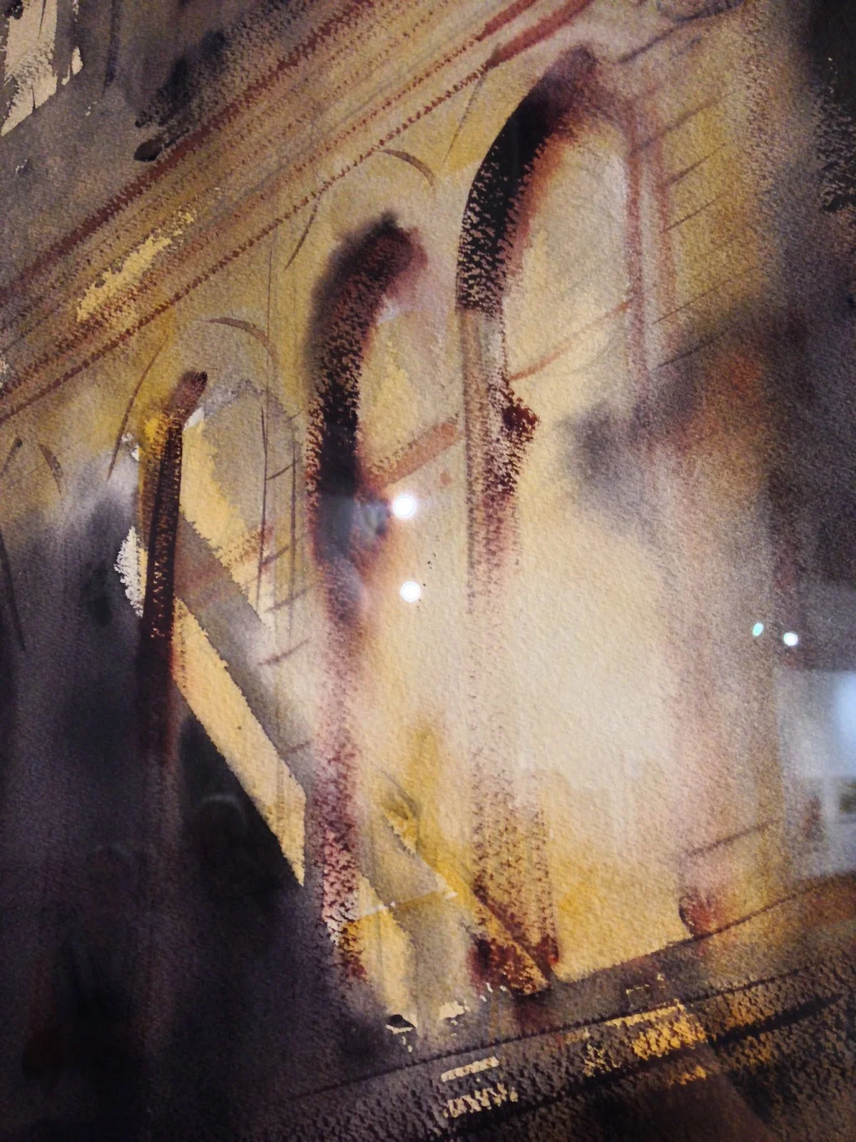
My favorite part though is this thing he does with the windows. As before, this section of the painting, in and of itself, is probably atleast a quarter sheet. So, he's playing rough and loose with his brushwork.
The glare that is captured there is wonderful. What’s neat is that he does almost all the shadow work there with very dry brushstrokes. You can see paper texture really show through with the brushwork. I also have to assume he’s pulling some of the red-brown pigment off the paper after the fact in that particularly “bright” area, though who knows? Still, I saw him scrub stuff out with a tissue, to bring back highlights for lamp posts, so perhaps he did the same thing here. Perhaps he just has some impressive brush control and lifts the brush in the right locations of each of the windows?? Either way, it's also subtly enhanced by the paler yellow wash in the center of the glare on the window, with the yellow "shadows" around them. Each element of the affect supports the other. I also enjoyed that strong linear shadow crossing the windows from left to right.
And that's it folks. If you've gone through the 3 posts, I hope you've found some artists or techniques you might want to explore more. Not having been to a watercolor exhibition before, and of such high quality, I can definitely recommend the experience. Getting to see stuff so upclose was wonderful and very instructive. I hope I've been able to replicate some of the experience for you here.


