Evolution of an Image- Granada series
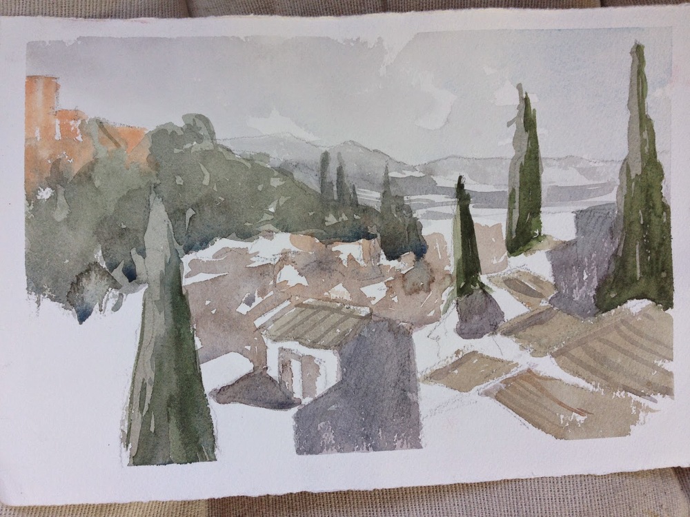
We were in Granada this summer. I did sketches of the Alhambra, and took many pics. Above is the final painting (11" x 30"), and below is the first sketch, done from the roof of our apartment-
I tried painting it while I was there, but was dissatisfied with the results. I got these quick 1/4 sheet sketches done.
Too literal for my tastes, and got none of the "feel". Also not enough variety in value.
Pure color, really, but I liked it better. Still, it didn't look much like Granada. Had more "feel" to it though, IMO.
Once we got back to the States, I started up the series again, here and there, over the month of August. I got these sketches.
This one seems better to me, as I'm beginning to get a value range, and use more neutrals. Still very very loose though.
I ended up deciding that I wanted to see more of the long horizon I liked so much in the original sketch, so I altered the format. I also started to shrink things, to help me reduce the image down to more essentials. It all seemed too busy. So even though these 2 below are 15" long, they're only 5.5" tall, as I went from the 1/4 sheets above to long skinny 1/8 sheets below.
Eh. Format's better, but it was time to give up the super-chromatic stuff.
Hey! Ok, This is starting to seem like something interesting to me.
I took that last semi-success and did a slightly bigger 1/4 sheet- 7.5" x 22". I varied the colors more, and focused again on that midground that I liked so much.
OK! I liked this one.
Although, interestingly enough, it started out as a failure. I wasn't controlling the colors enough and various edges were blurring and mixing. But once I added in a glaze of shadows, I really enjoyed the varied background those "mistakes" provided. Some spittle and droplets of water later, and .... voila!
I decided to grow the image and paint a 1/2 sheet (11" x 30"), something I'd wanted to try for a long time. I ordered a new, extra big sheet of Gator Board for my backing, and got it in the mail a few days later. Sat down to paint it, and I was finally well versed enough with the image, that it seemed almost playful. This photo is a little more yellow than the original, but it gives the appropriate sense.
Quite a journey! :)


