Watercolors- exploring Anders Zorn's bridge
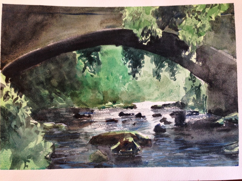
This is my copy of a Zorn painting. I discovered Anders Zorn a few months ago, a Swedish painter from the turn of the century. I particularly loved this image he did of a bridge over a creek. It's clear from viewing several samples of it, that different web-versions have very different color biases. Still, I liked his "green" version, which seemed so raw and vibrant, with some really bold value contrasts, and decided to learn from the image as an artist by repainting it.
The original, hanging next to where I did three versions of my own--
Version #1-
Not bad, but too blue and "cool" IMO. I liked the values though- I felt like the darks were dark enough, though I wanted more "sparkle" for the light. The greens were too muted as well. I did this before my Alvaro class, towards the end of March.
Version #2-
Done after the Alvaro class, in late-April. Better, IMO, compositionally. I went too yellow though, on the greens.
Version #3-
Done mid-May. Even better, IMO. The greens finally start to have some "zing" to them, and a feel a sense of distance in the background. Darks are dark enough, but I also feel like I finally left enough white to get that sharp scattering of light off the water, which always appealed to me in the original. I'd like more texture on the bridge, and a big more light in the foreground on the water. Still, I like where they're going! :) May try it again later at some point. It's fun to paint.


