How to Paint a Mural- Step Eight- What does sunlight pushing through a flower petal look like?
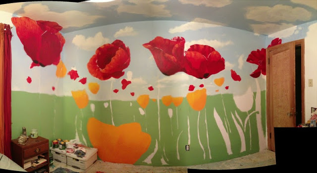
Late last month I did get to do some new work on the mural. I focused almost entirely on the existing poppies. What we've got now is this--
something which I'm much more satisfied with.
Why did I come back to the poppies again, for what was, I believe, the 3rd time? Well, I was still not entirely satisfied with the look of the poppies back in July/ early August, because--
1) there just wasn't that sense of being being "illuminated" and slightly transparent to them, the way a thin petal is with sunlight pushing through them,
2) everything looked very opaque, very dense, and
3) the form still read very flat, rather than rounded and three dimensional.
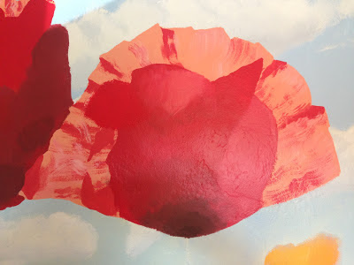
I had tried to get that sense of transparency in the first attempt, by adding white to the red paint to lower the value, but this just gave me a paler peach color that still looked opaque. I liked the affect of the shadows, but everything became very abstract, and the object didn't really read easily enough as a poppy. What I got was this, for those who don't remember that post from back in May ;) --
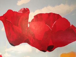
The second attempt included changing the actual form and position of the flowers, so that they could be more "open"-- thus allowing a person to see "inside" them and making them more easily readable as a three dimensional object. It also included pushing the color to a purer red-- poppies are, in essence, very saturated. Things read better, but there still wasn't that sense of sunlight, of the luminescent, transparent nature of a petal. Here's what that stage looked like-
But then I saw this image
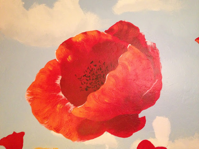
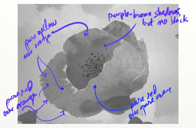
while browsing some watercolor materials, and it struck me-- sunlight is yellow, and thus yellow is the color I should be mixing in the red, and in much greater quantities than before, to get that luminescent quality I was aiming for. Towards the end, I got daring, and did some bristley, dry-brush work using pure yellow for the backlit veins, and pure red for the shadows in those same areas. I also decided to add some white to the poppies for glare highlights and some black to them as well, for those little dots some poppy petals have on them, as well as for the seeds. Partly I did it for representation, but I also did it to stretch the value scheme some, to give a fuller range. What I came out that experiment with was this--
Once I'd finished it, and felt like it really finally was starting to work, I wondered at the "why" of it. It's something I'd like to understand better so I can perhaps replicate it in the future/ apply the knowledge generally. What occurred to me was that the yellow was appearing lighter in value in the painting, even though both it and red were pure chromatically. Here's a black and white image of one of the poppies that shows this--
The short of it though is that by mixing more and more yellow into my red, I got it to appear both
1) lighter in value/ more washed out, so to speak and
2) more luminescent, as if the petal was "glowing" with light (the way it looks when backlit by sun).
My hope is that I'll be able to apply this knowledge to the grass when I break into it soon. I've penciled in the general shapes, and how they're going to be overlapping the existing flowers, so I hope I'll get to it soon!
So far, the math is something like--
5 hours prep, drawing concept image, sketching on the wall, and blocking in forms
20 hours on the sky, painted 4x
10 hours on the clouds, painted 2x?
15 hours on on the poppies, painted 3x
15 hours on grass??
15 hours on yellow poppies
10 hours on going back over stuff??? --> i.e. insane desire to learn and improve perception/ reproduction of the natural world to (by most standards) a meticulous level of detail
Of course, an artist is rarely satisfied, and I've since pondered a few additional things I'd like to explore on the painting-
1) What's the color of glare? First I thought pink but that wasn't right. Then white, but that hasn't played right either. Finally, I tested a bit of pale yellow, but I didn't like that either. I've just not been able to get it right.
2) I feel like there ought to be more cast shadows from the poppy petals on the upper left down onto the poppy petals themselves on the lower right, to get that sense of directional light.
3) I feel like the clouds that are closest, and most directly above, ought to have whiter whites and darker darks. I like the way the distance reads, but I think I could get more "pop" out of the closer ones.
We'll see though. Sometimes, you've just got to push forward, or you never finish anything... ;p
