How to Paint a Mural- Step Five- What's the color of the sky?
Wait a minute! I just figured out this is the same name as a post I made about 6 weeks ago! Sheesh. Am I making any progress? Yes, slowly but surely. Probably with the emphasis on slowly. ;)
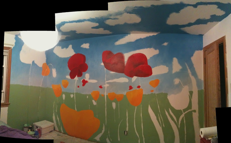
I started with a sky that was, in my mind, clearly too dark, so I repainted it lighter, and still found it too dark, so I repainted it darker and found it relatively light enough but way to pure of a color (baby-blue), so I painted it again, and I think I've finally got something I'm happy with.
Here's the sequence of pics from the last few months, showing the progression of the sky.
This one is the first, from late May. Very dark, high chroma blues. I found it rather "heavy" when staring at the ceiling.
This is the second, from Mid-June. I lightened it, but not enough. I also added more grey to the horizon.
Still too dark. So I lightened it again. This is from early July. The problem? I didn't add any greys to the blue, and it came out very powder-blue.
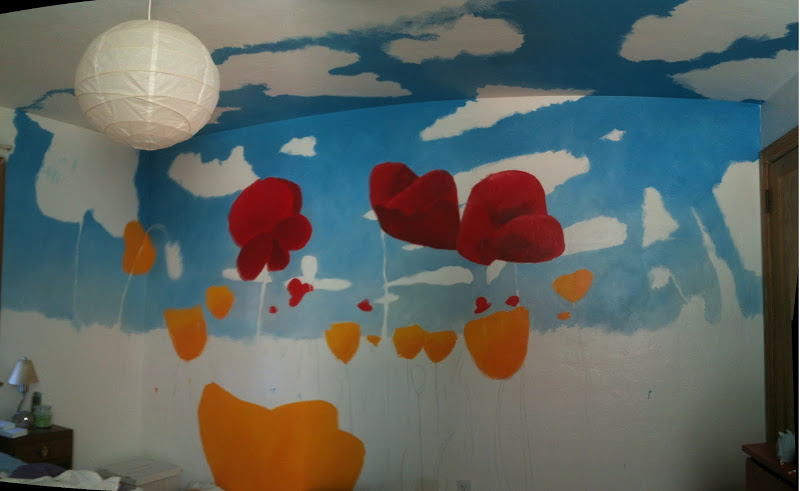
Fourth time's a charm? I admit I got a bit obsessive about this, but I just felt like I kept understanding what I was seeing outside better and better, and I wanted to capture that experience in the mural. So, one last time. I lightened and greyed the blue a bit, lighted the haze at the horizon and added some yellow to it, and added just a touch of red to the highest portions of the sky, giving it a light lilac shade. Is it perfect? No. But I like it, and am ready to go on. I finally really feels like a sky that I can gaze into now. :)
The pics don't really do it justice. The difference between the two final versions was actually quite dramatic when I laid the paint down. The lighting here makes both colors appear darker, but you can see the difference with the comparison, at the very least. Darker, more chromatic blue blotch is the old one. Slightly greyer, more lilac color is the new one.
Kat has been wonderfully patient and mellow about the whole process (repainting skies, repainting grass, etc), even though I'm sure I've added on atleast a month or more of time, and perhaps 10-15 hours of actual labor time, to the whole process. But part of the fun has been really having to pay attention to things in the world as I paint them, and that's led to wanting to get it right. I figure this is going to be on this wall for a long long time. I might as well make it something that relates pretty well to my vision.
What I'm slowly discovering is that skies are
1) paler at the horizon
2) greyer at the horizon
3) often a bit yellow or orange at the horizon
4) brighter/ lighter value than you think it is at it ascends
5) very slightly greyer than you think it all is (nothing with really high chroma here)
6) moving into some very gentle lilacs as it ascends
Anyways, now I look out my window, then look inside at my mural, and feel like they pretty seamlessly agree with each other. The sky being paler and greyer has also helped the painting feel far more open. There's a sense of expansiveness, openness.... distance to it that I find much more evocative. I figure a mural like this is to stare at and daydream with, so I want that "big sky" effect.


